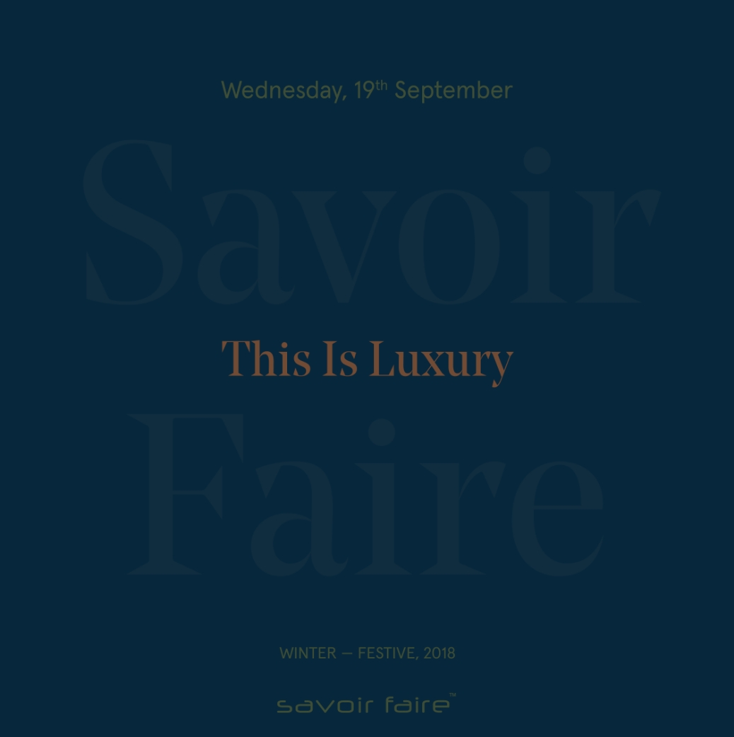
this is luxury - savoir faire winter festive 2018
visual identity and space design
this is luxury - savoir faire winter festive 2018
visual identity and space design
curated by
Gauri Bajoria digital advertising partner
The Hip Elementon site production partner
Eventz Inspiredcampaign photography & FILM
Uma DamleSavoir Faire is Calcutta’s only standout luxury exhibit that showcases timeless, modern and novel fashion and design.
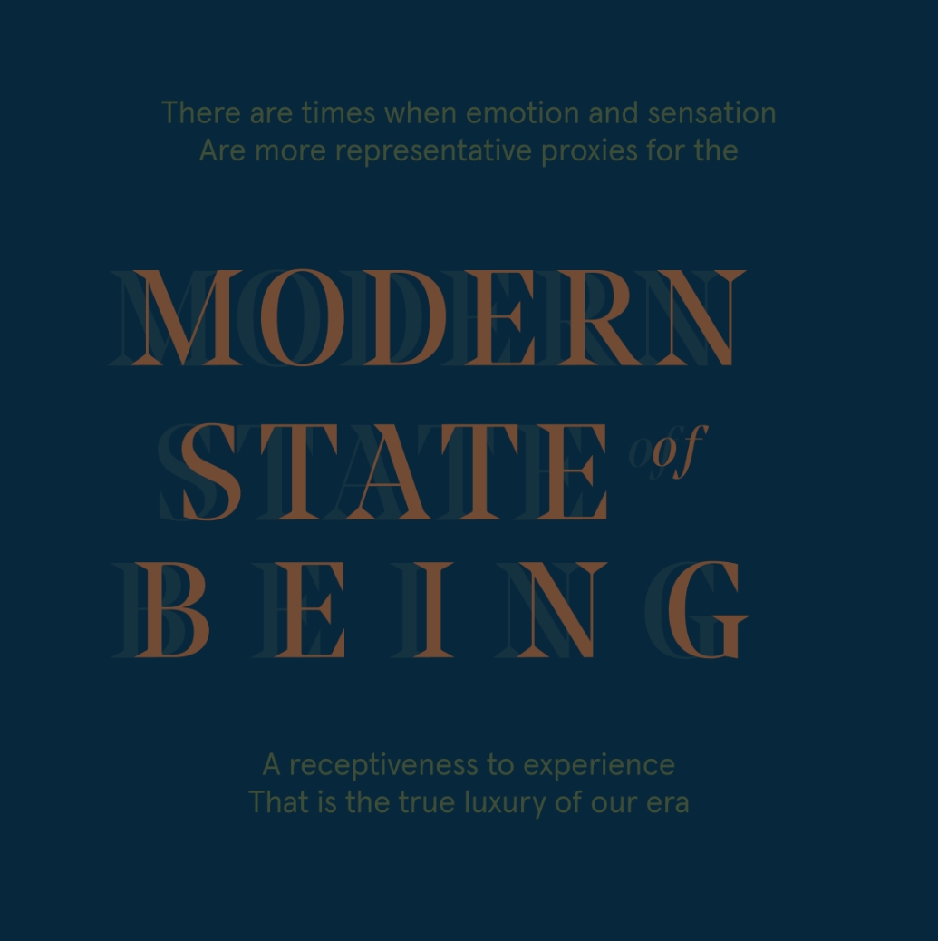
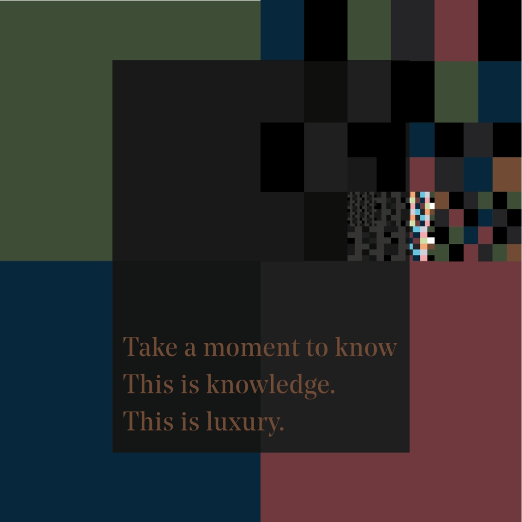
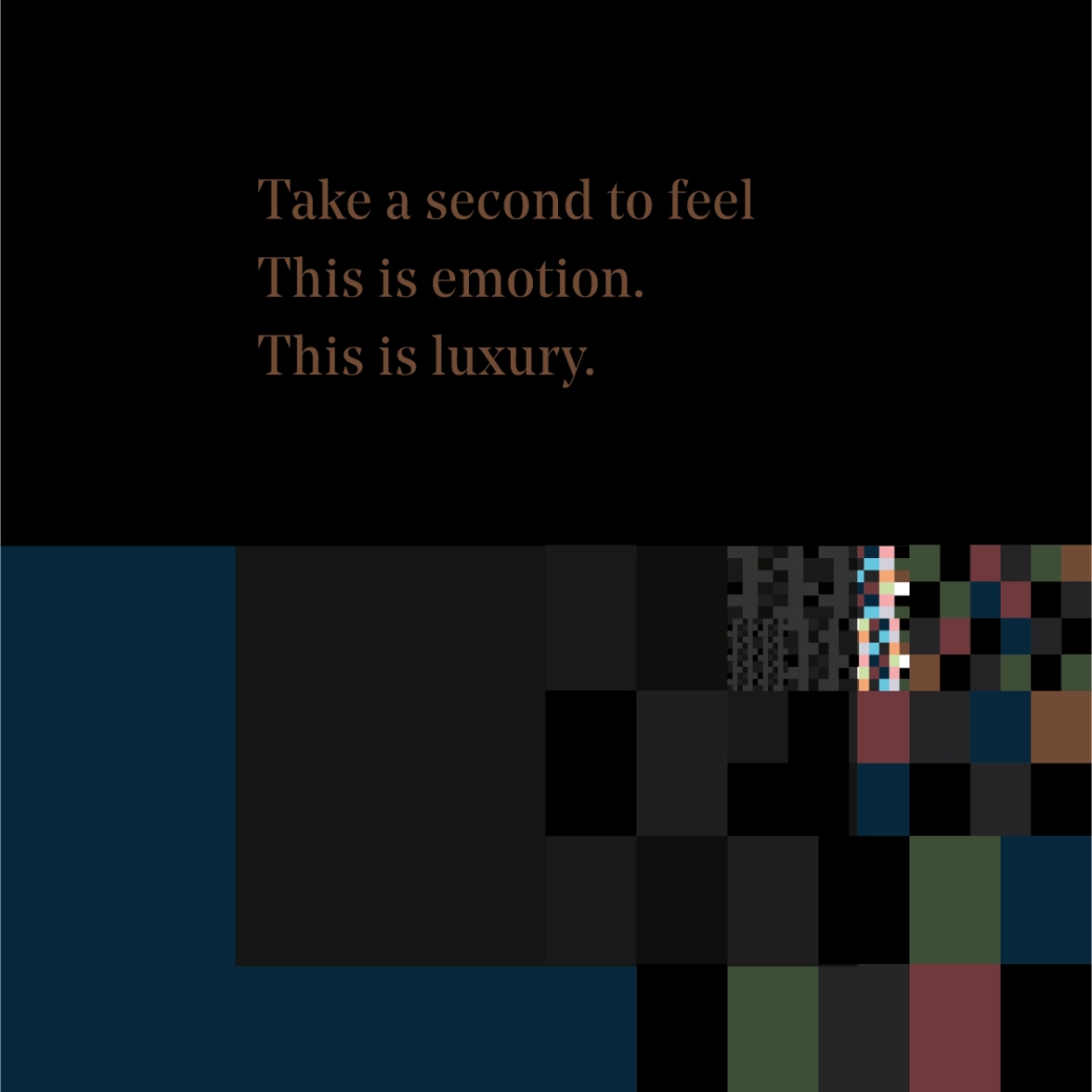
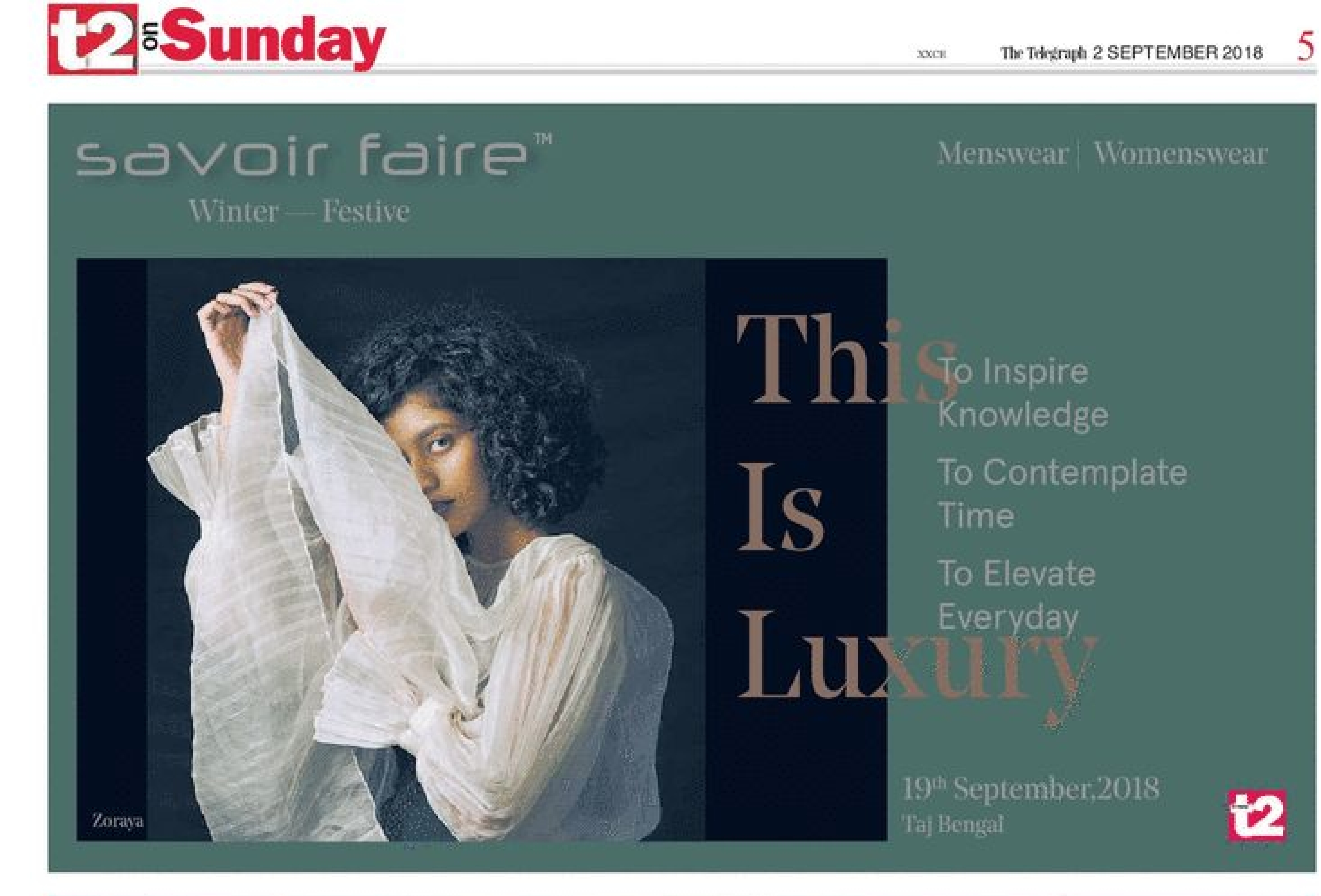
The concept for their winter festive edition — This Is Luxury — is an attempt to add emotive value to a term that’s often used to represent decadence. The campaign visualises this by juxtaposing the exhibits’ grandeur with frivolities that make life worth living.
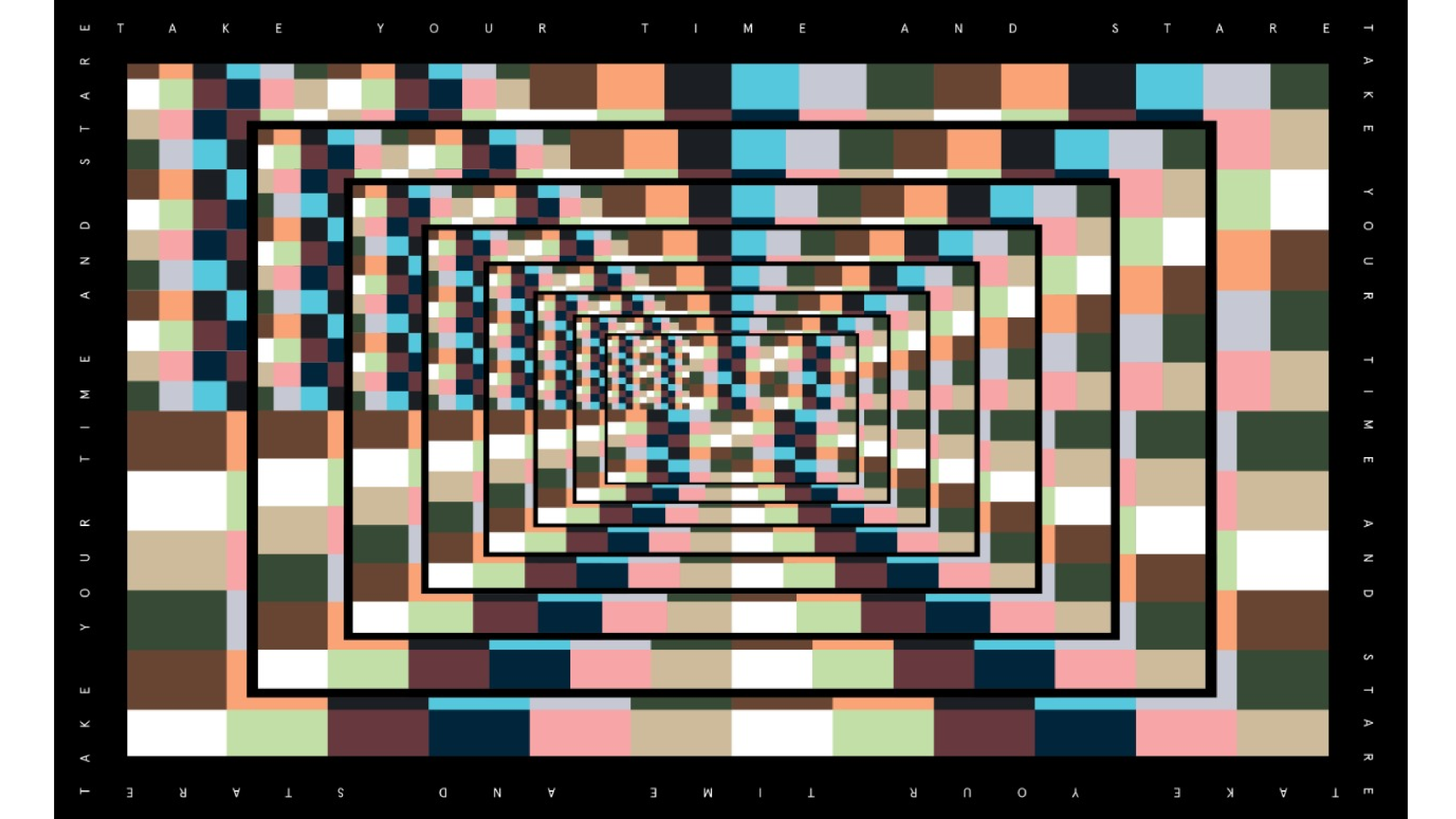
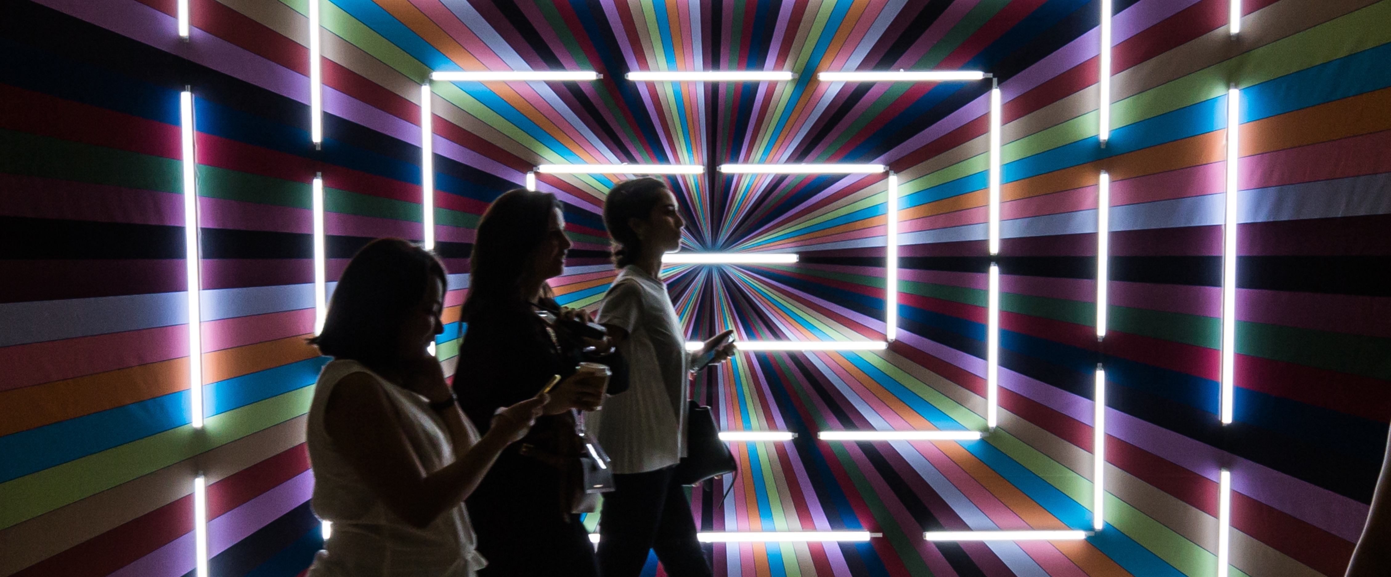
For the designs we aptly combined a bold transitional typeface, Noe Display with the subtle and simple Apercu. The campaign mood was conversational with bursts of videos that encouraged viewers to stop and stare. The primary design language is inspired by mathematical sequences, philosophy and that grey area in between.
Trippy Perspectives — A series of posters (shown below and the cover on top) designed by The Space At 9/2. It is a visual retelling of the Fibonacci Sequence, when viewed through kaleidoscopic eyes. These have been commissioned by Savoir Faire for use in digital media and a publication (coming soon). PS - #SafeTripping
The videos were created for the campaign’s digital presence
CAMPAIGN
In crafting our campaign video, we brought together individuals from diverse professional backgrounds, each eloquently expressing their unique perspectives on luxury, all expertly captured by Uma Damle.
EDITORIAL
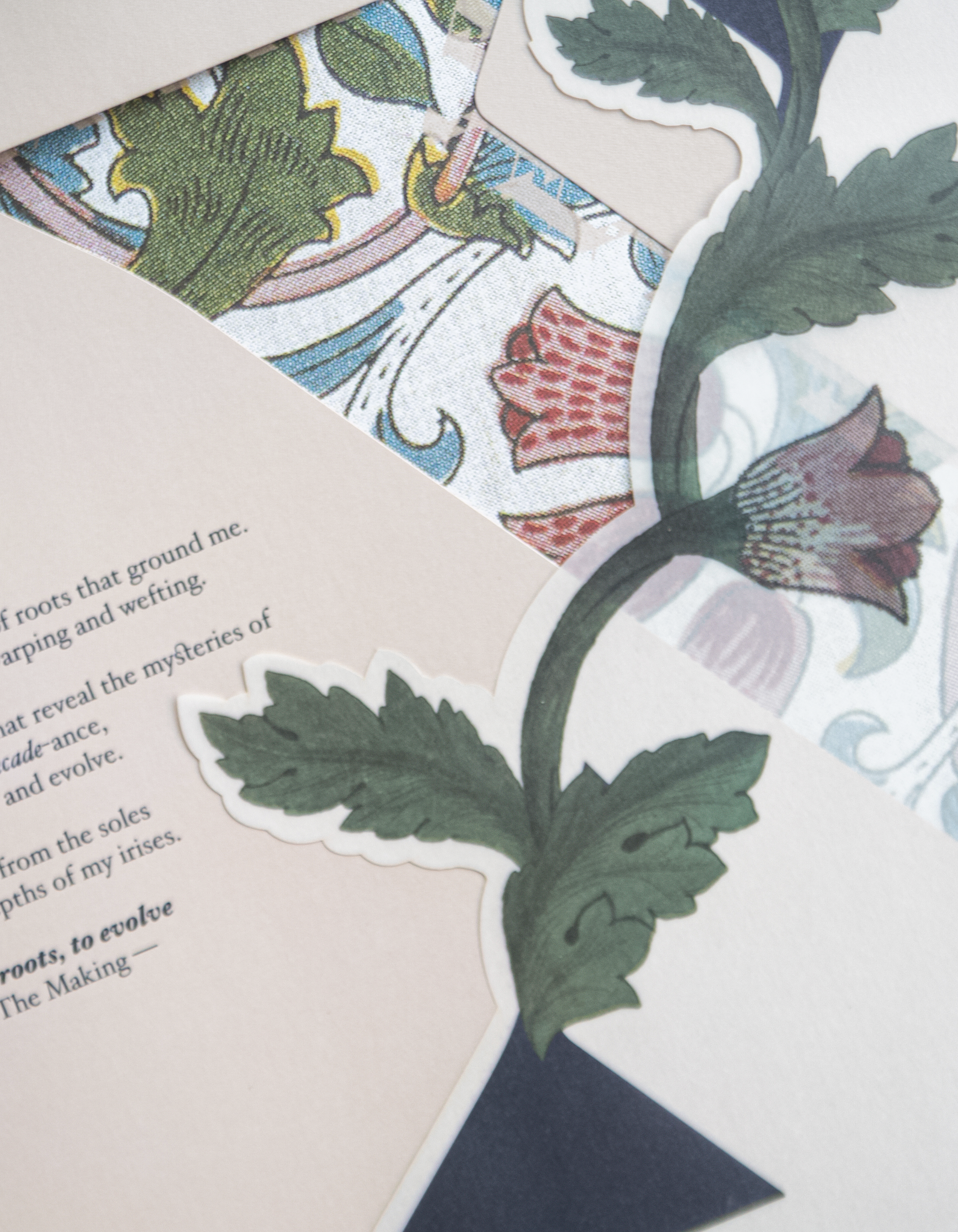
The idea to explain luxury in terms of emotive concepts isn’t new but one that is essential to be spoken about — as a marker for happiness and as something that together adds up to a sum of possibilities. The title of this publication and most of the primary designs have been influenced by mathematics, philosophy and that grey area where they connect.
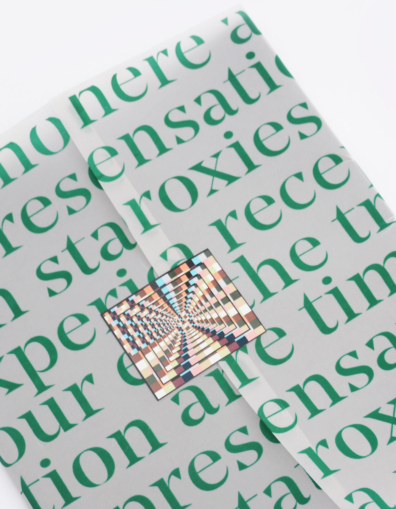
To read more, click on the image below

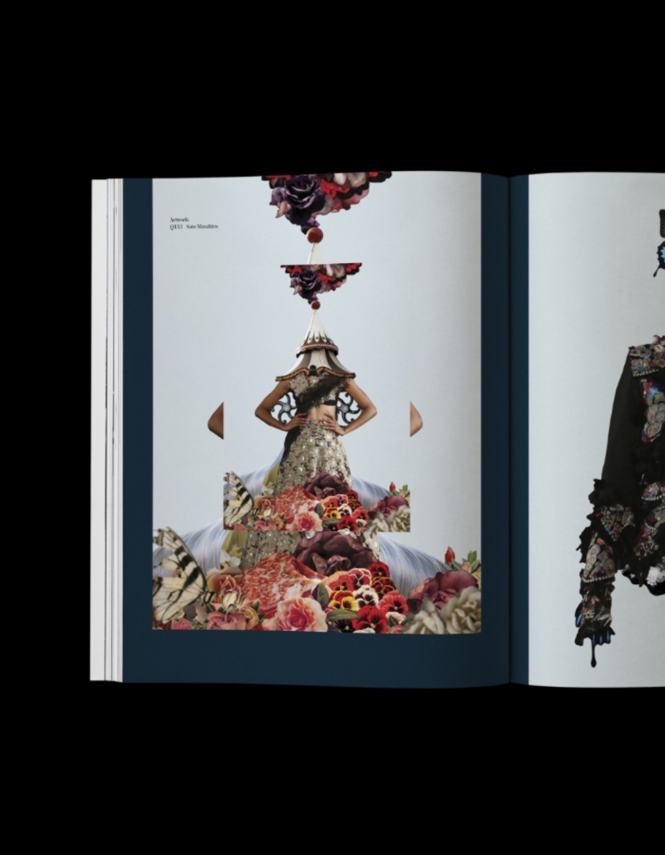
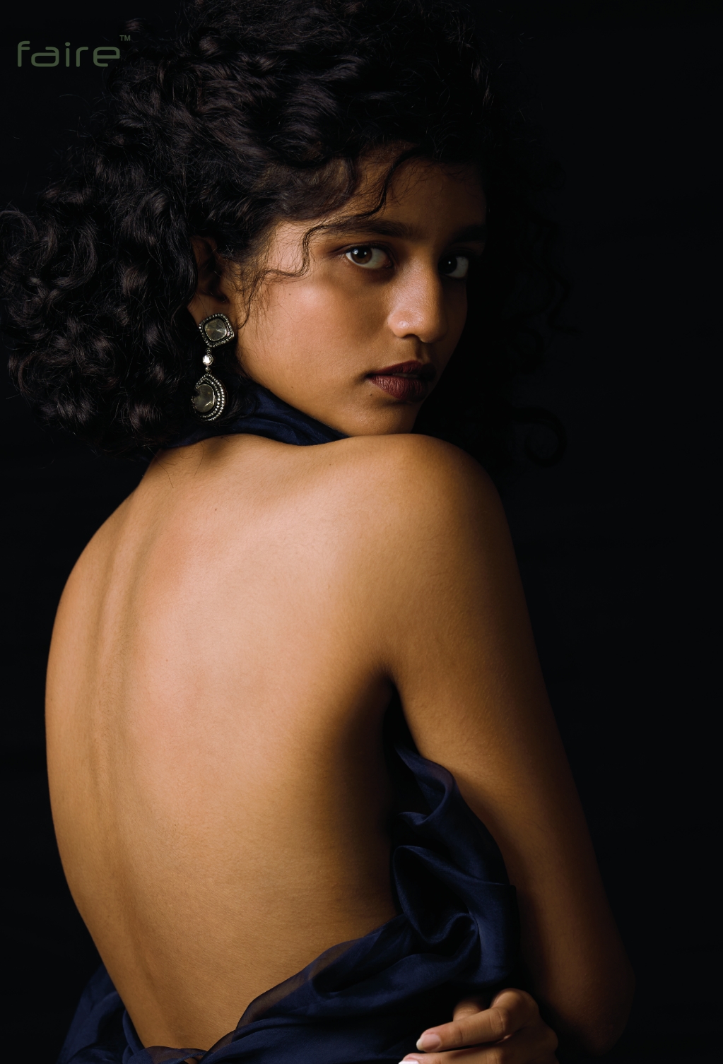
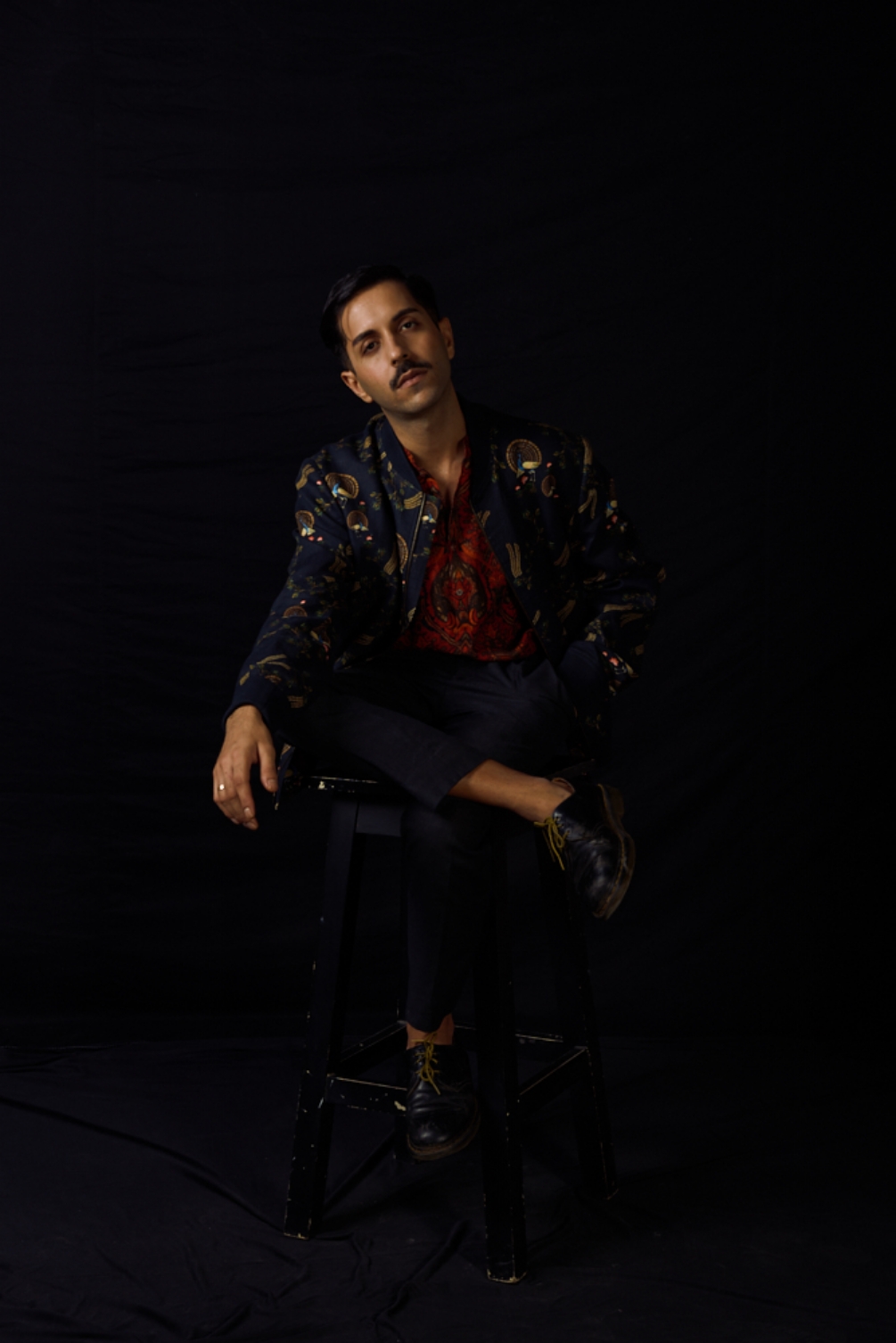
The direction for the photo series was to keep it dark, contemplative and brooding —


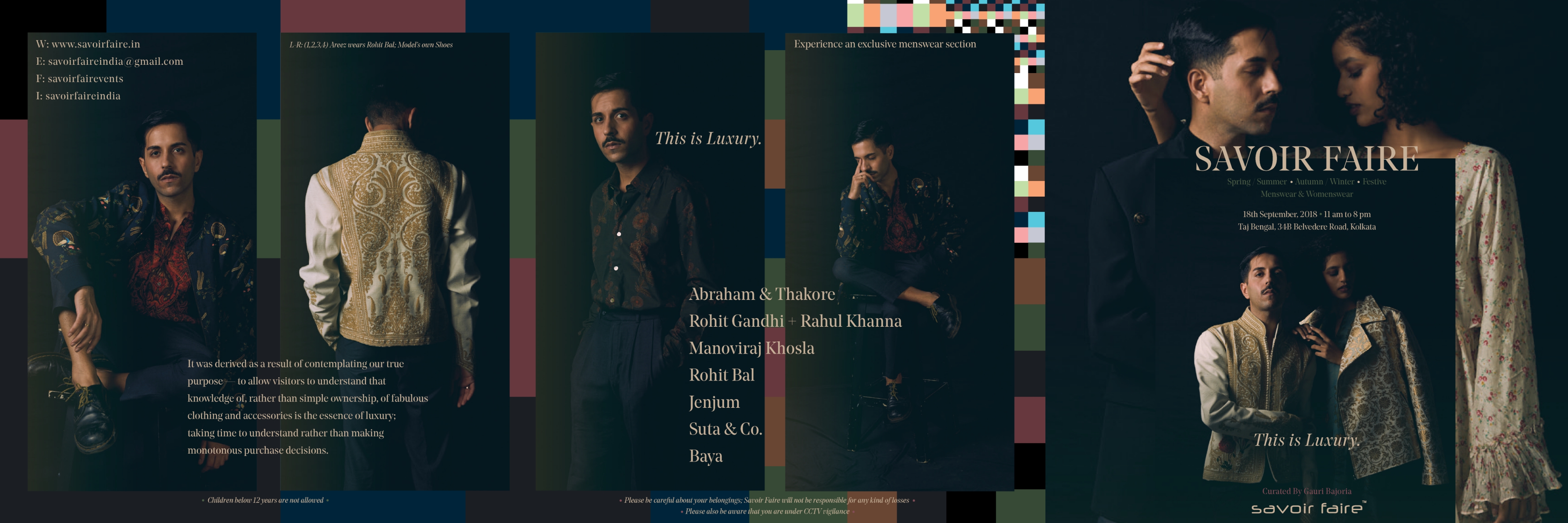
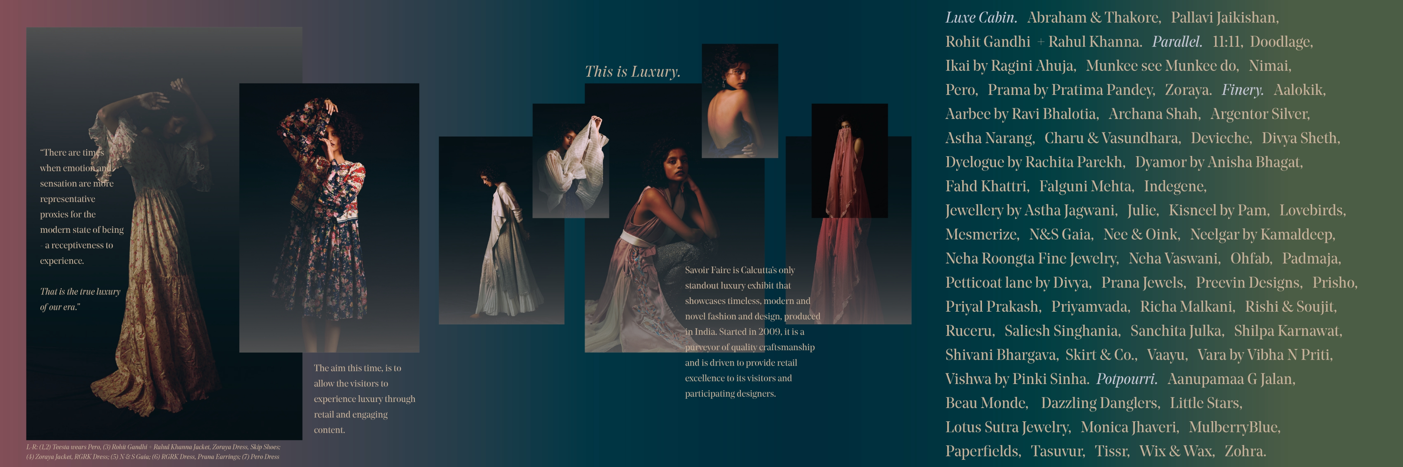
An exclusive invitation that was designed by us. Showcasing all the different talent and curation
The social media creatives that were designed for the event
The print ads that were designed before the event that featured in T2, The Telegraph.
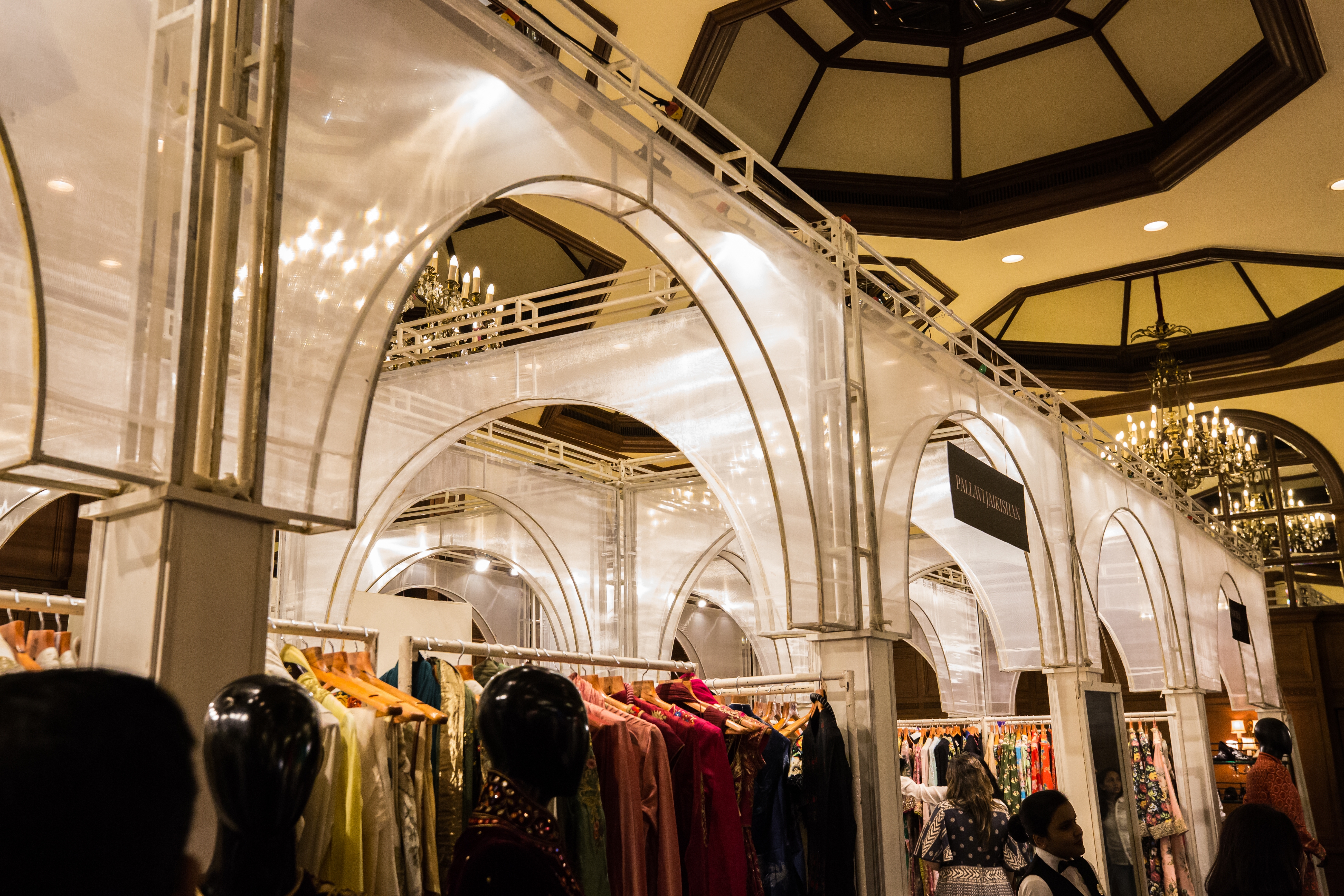
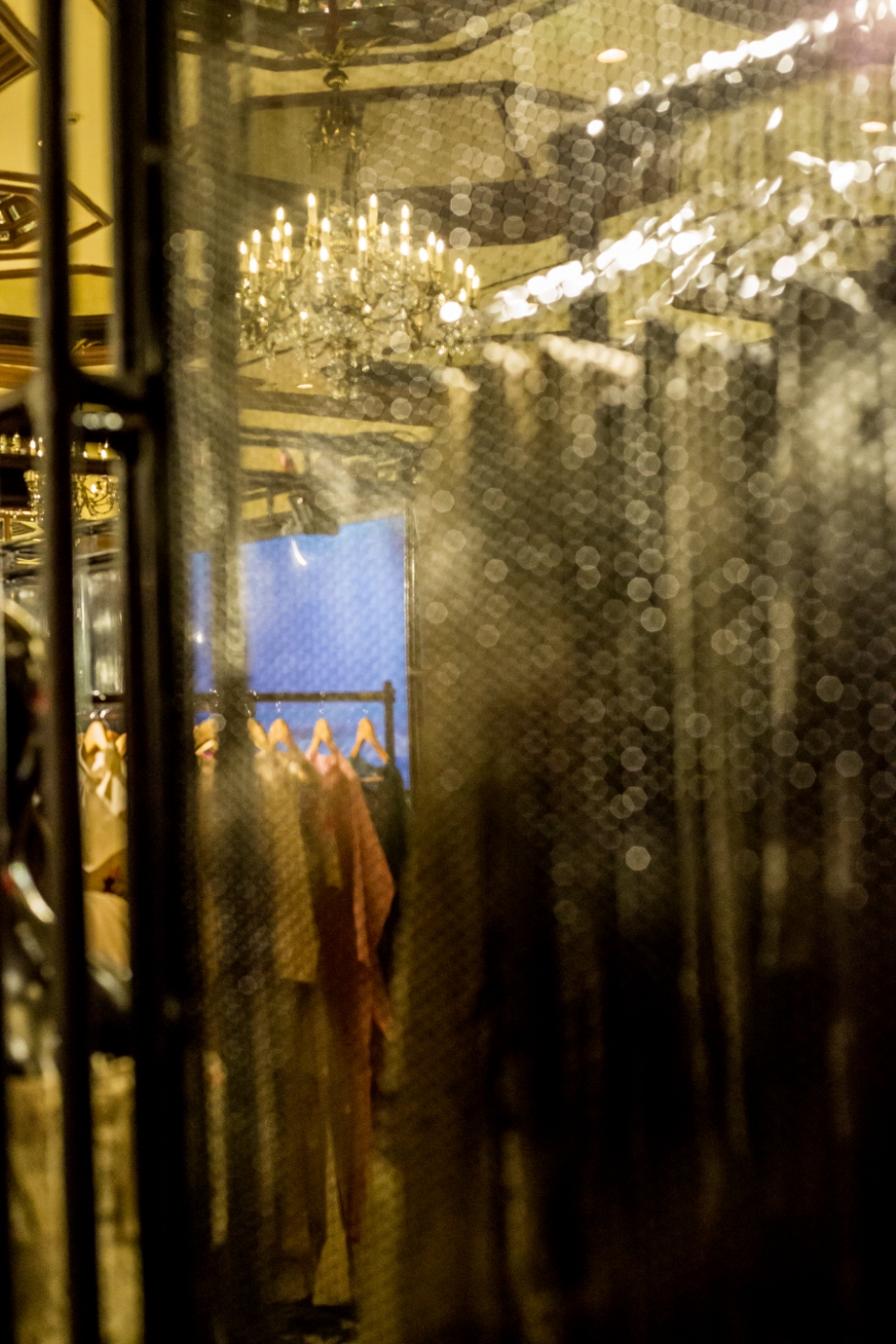
SPATIAL DESIGN
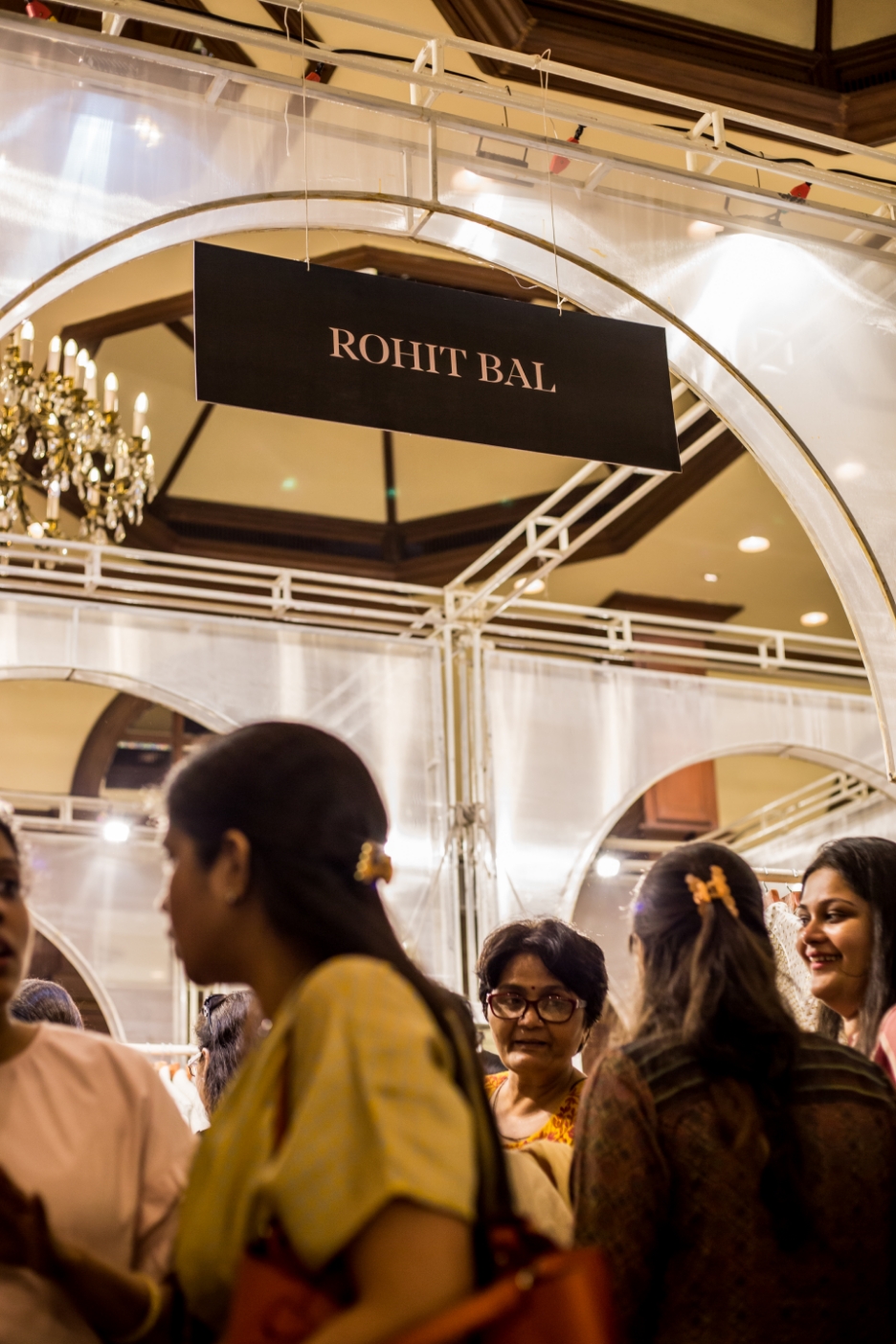

Started in 2009, Savoir Faire is a purveyor of quality craftsmanship and is driven to provide retail excellence to its visitors and participating designers.
The banquets at Taj Bengal, Kolkata were approached with a practical outlook, ensuring that the designs didn’t interfere with the main aim of the exhibit — retail. The elements and styles were strong juxtapositions: Arches + industrial; sheer fabric + metal sheets and acrylic.
We believe in creating a consistent and cohesive language that seamlessly ties together Savoir Faire’s brand identity across various horizons. Know more about our approach –