Sanaya
Branding & identity development

Sanaya is your blueprint to achieving visible results for your mind and body.
Grow older — feel younger
Grow older — feel younger
The brand recognises that fitness is a journey and a way of living. The core challenge the brand addresses is, “How can I achieve sustained fitness and go about goal-setting?”
In developing the visual identity for Sanaya, we have been guided by eleven key elements and concepts. These principles have influenced every design decision and can be felt throughout our brand.
logo
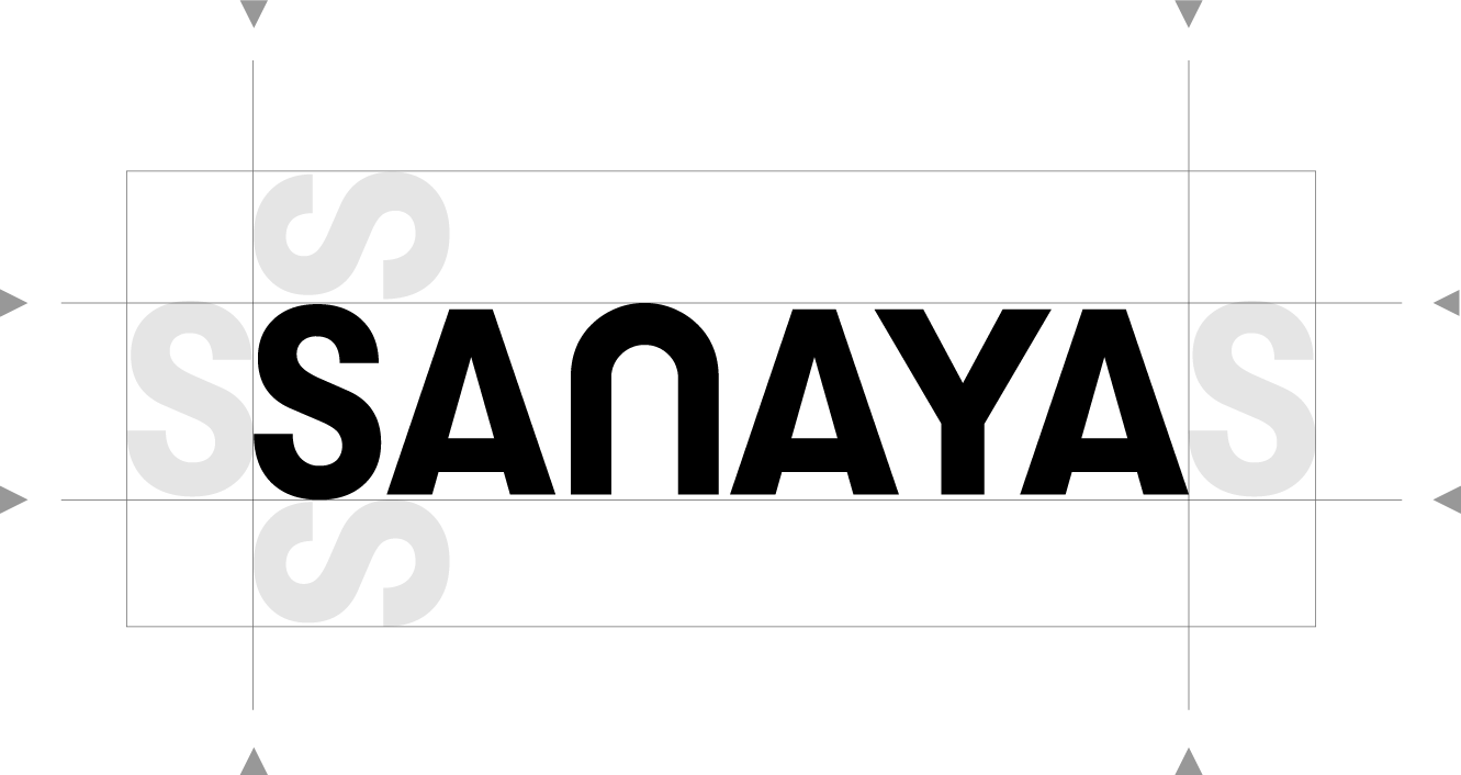
The logo for Sanaya is presented in a custom logomark using GT Walshiem. Upright, sometimes dynamic, our logo is simple, iconic yet highly expressive.
In the logotype, the letters are reduced to a simplified form evoking movement and balance. The strokes are all of one width, evoking the qualities of unity and technical precision. The curved ’N’ imparts a sense of dynamicity to the logotype and lends it a quality of uniqueness and contemporary character.
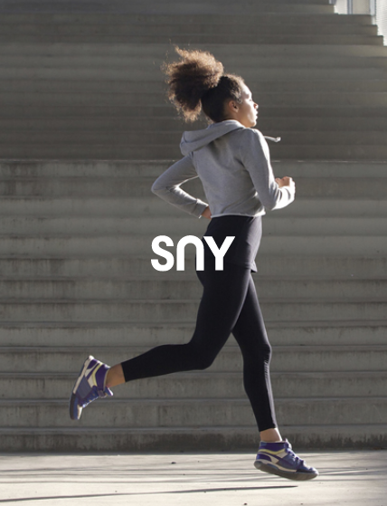
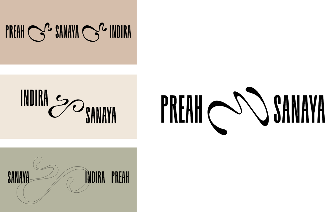
Primary & secondary logo configurations in different finishes

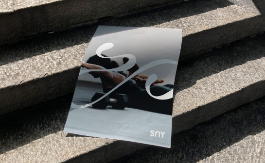
brand swashes
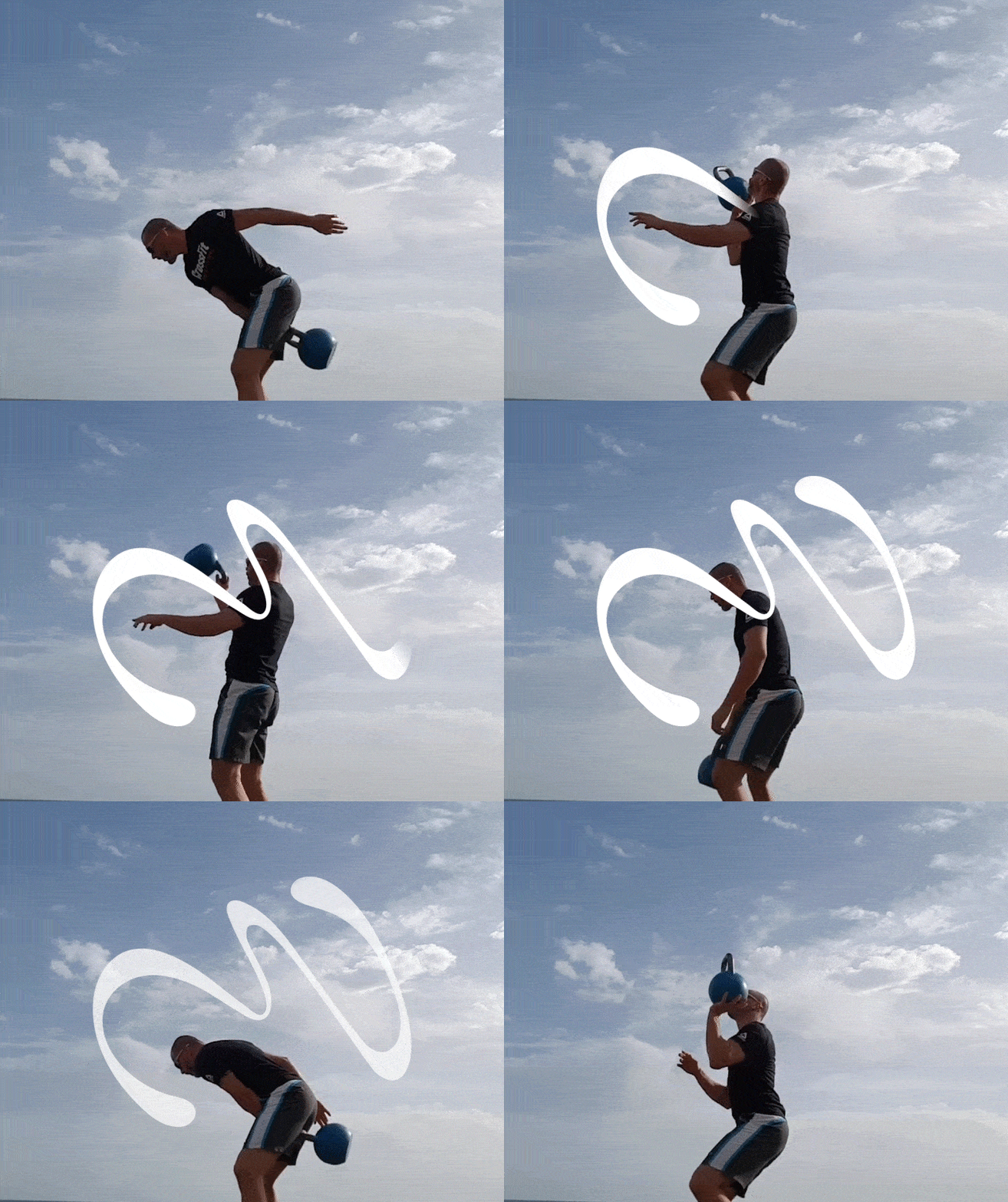
The swashes are a central element in Sanaya’s visual communications system. Through consistent and repetitive use as a signature element in all of Sanaya’s visual communications, the swashes become a visual recall which identifies the brand and symbolically embodies its activities, achievements and goals.

The swashes can Be
used in interesting ways


colour
palette
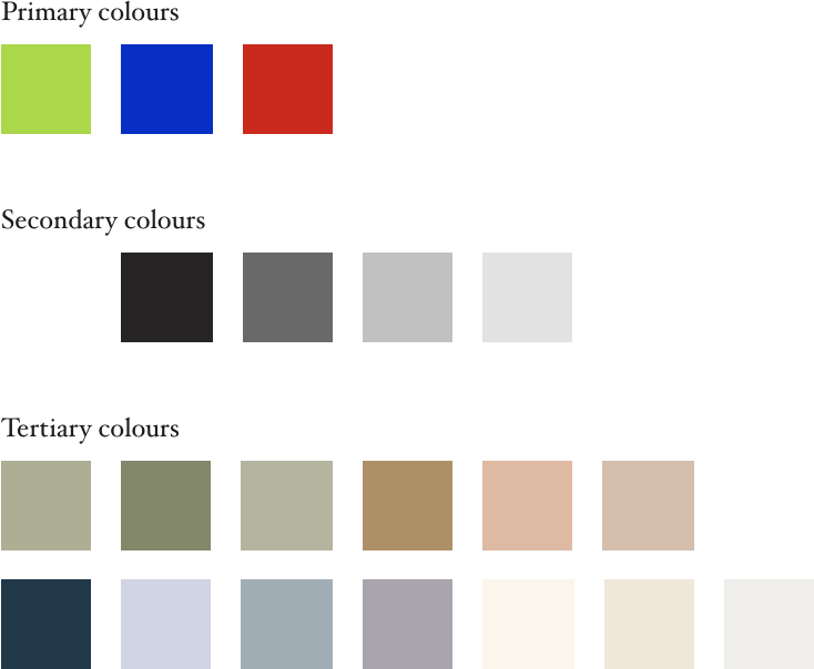
The brand color palette is broken down into three categories
1. Primary brand colors (accent colors)
2. Secondary brand colors (supporting colors)
3. Tertiary brand colors (extended color)



brand typography
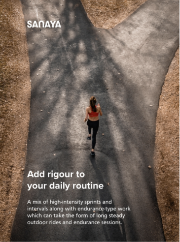
A typographic hierarchy is a system that uses typography — the size, font and layout of different pieces of text to create a hierarchical division that can show viewers where to look for specific kinds of information.

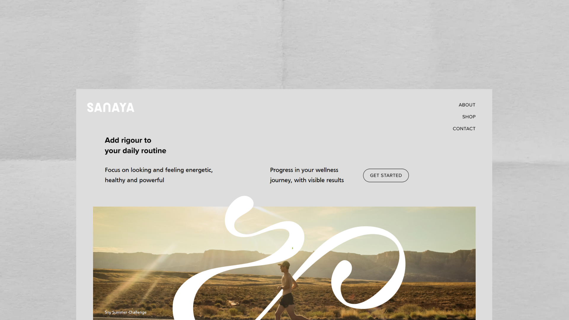
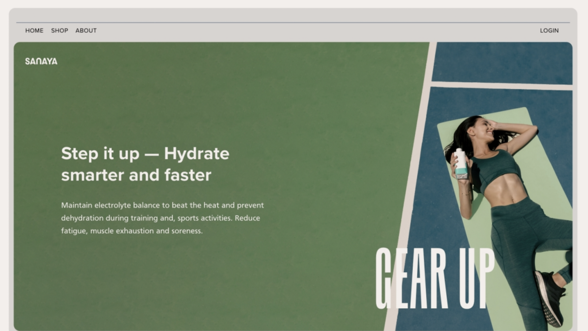
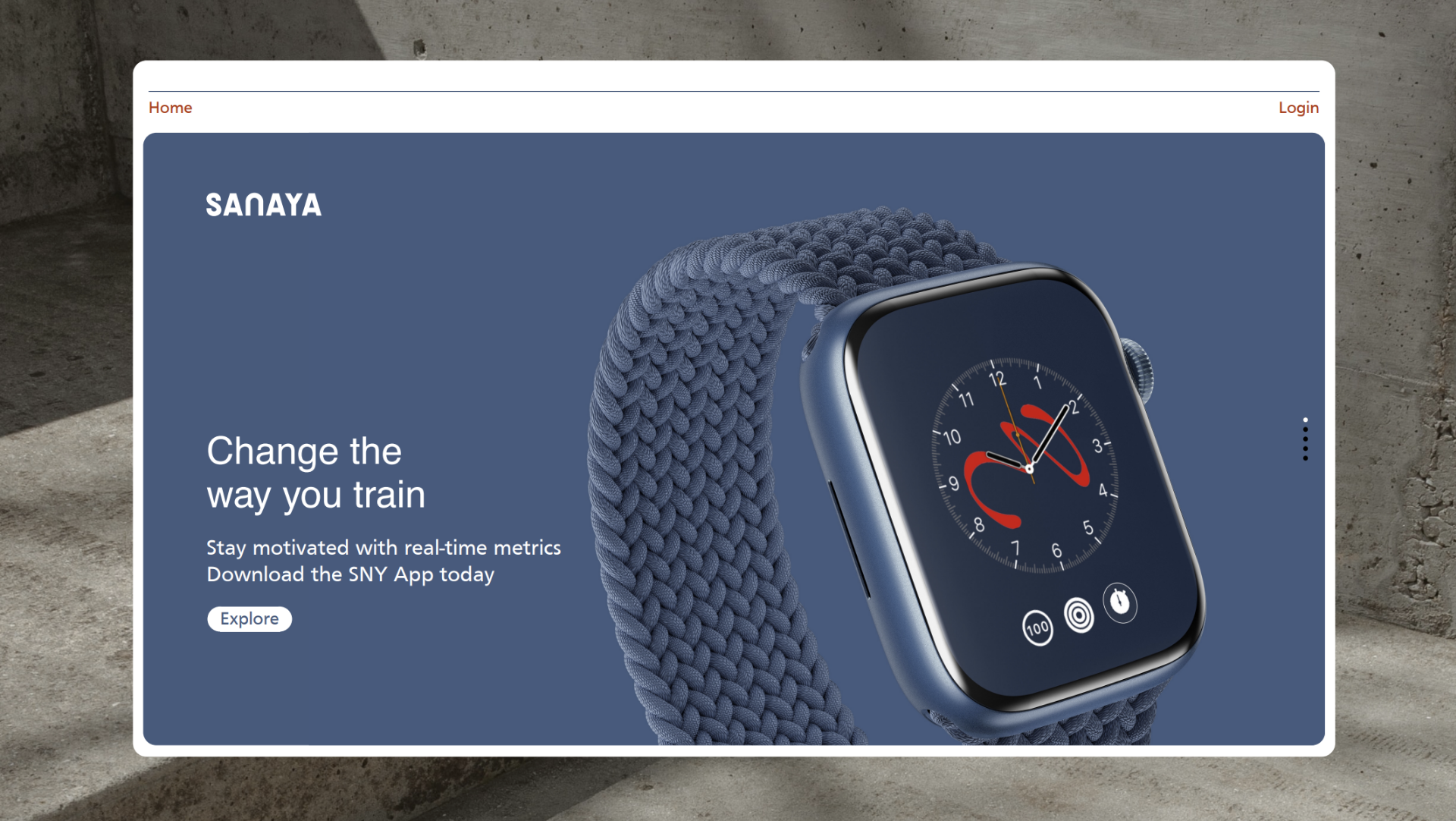

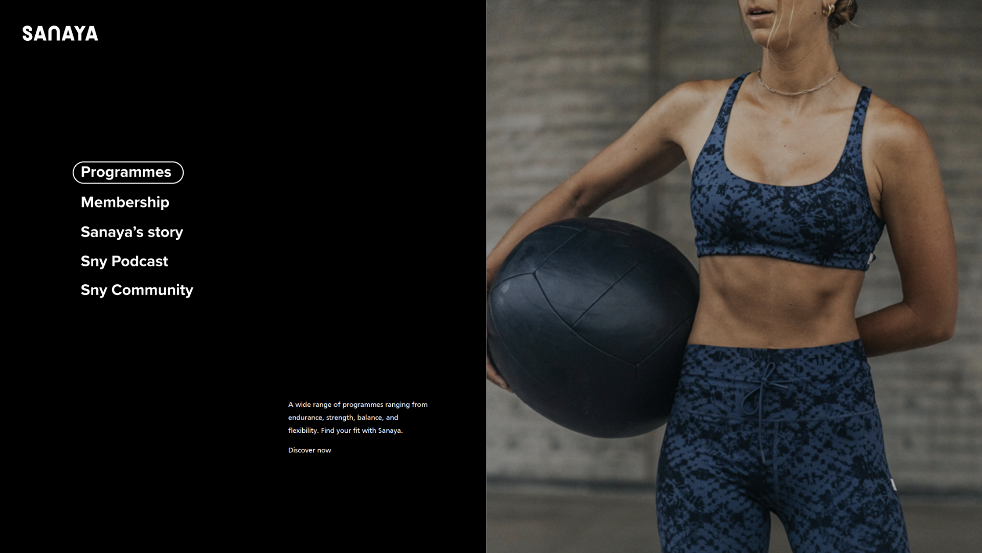
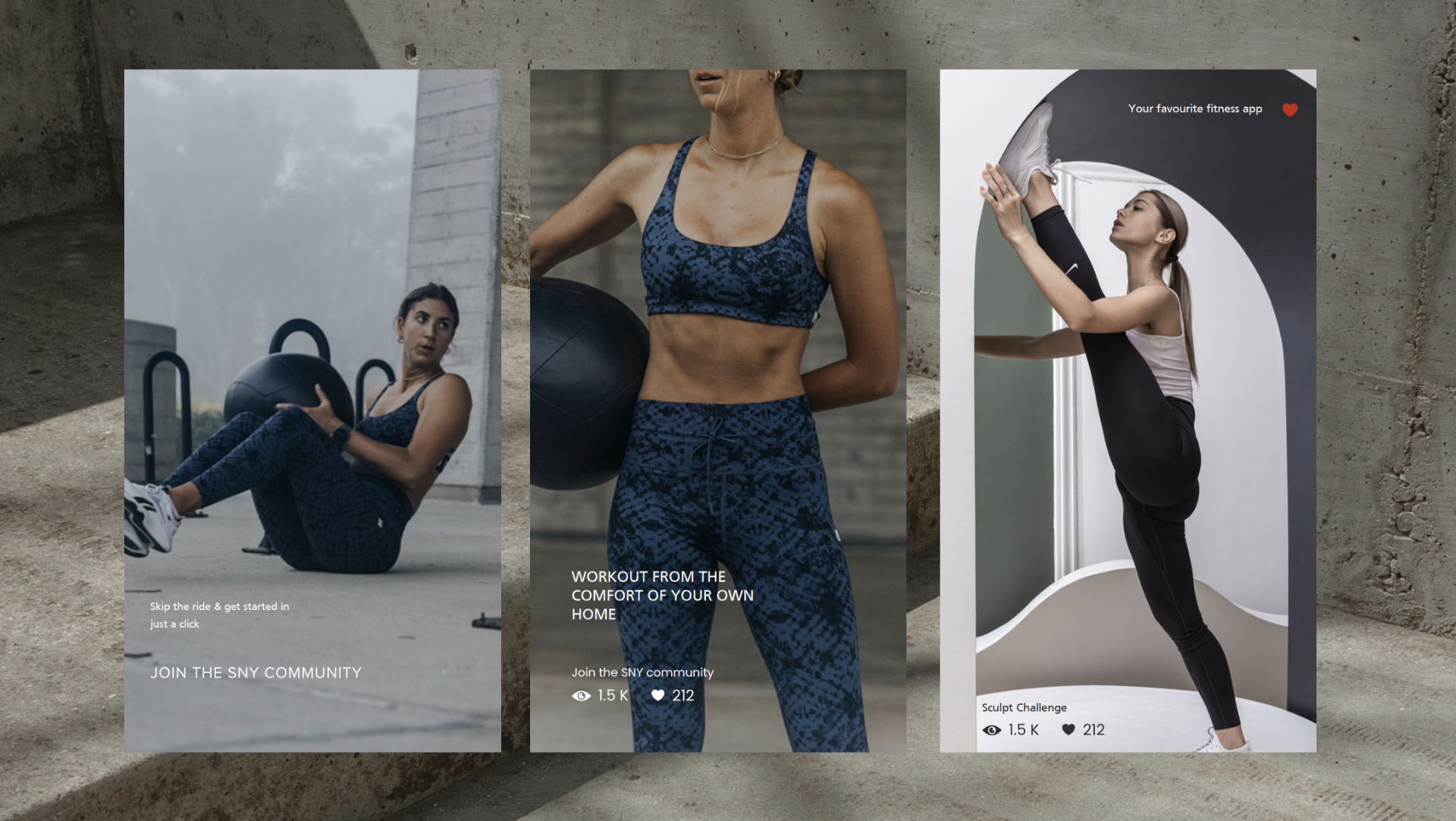

Website layouts


Know more about our strategic approach for Sanaya.

