
Ruchika Grover
Website Design
Designed on Cargo Collective
Ruchika Grover is an enterprising artist, who is leveraging a legacy business to bring forth innovative expressions in natural materials. Her vision to work with stone is based on exploration, honing details and unconventional thought. The visual identity and the website compliments this vision.
Enter the mind of an enterprising artist, like business women through this website.
Enter the mind of an enterprising artist, like business women through this website.

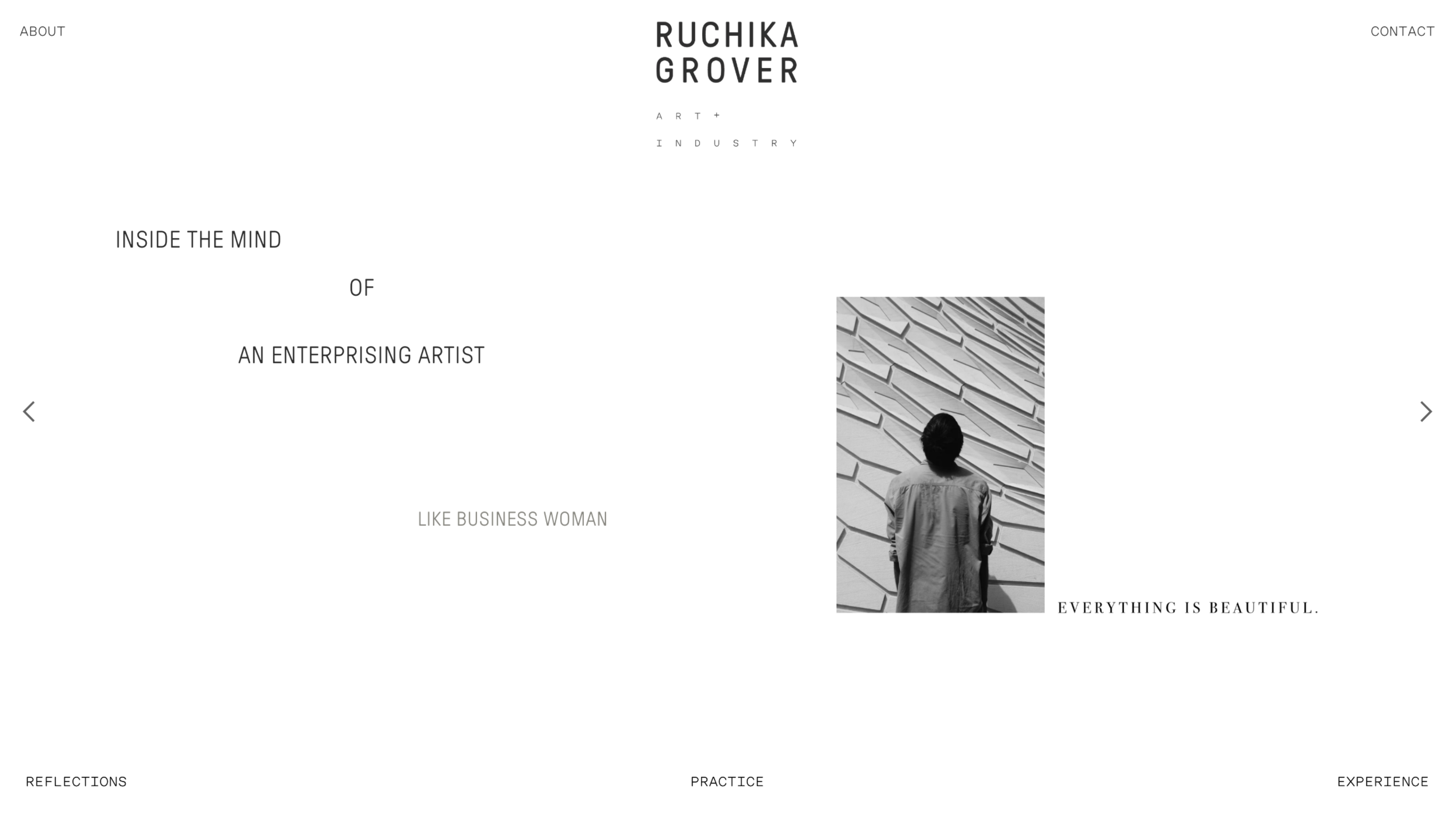
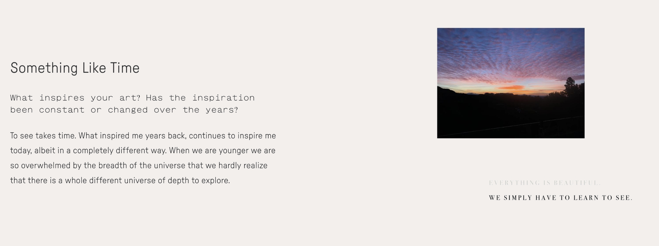
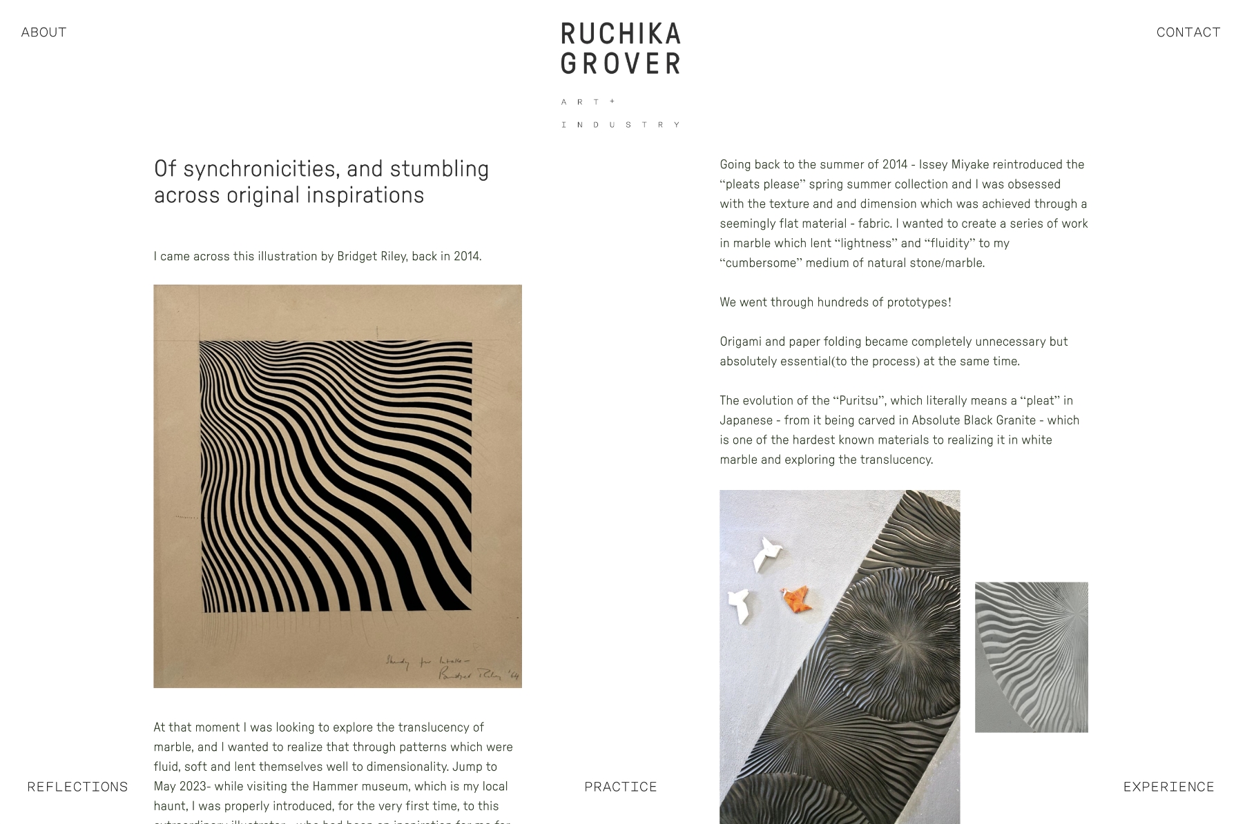
The landing page communicates who she is and most importantly, what inspires her. This becomes a way to communicate her unconventional way of thinking and expert practice. It is designed like you would read a book, perhaps her auto-biography written in the first person, but with prompts from an inquisitive on-looker. The writing style across the website is poetic but palatable. The typesetting is layered, indicating her approach to creating.
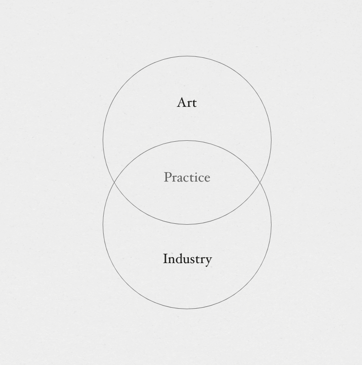
Strategic positioning of art, practice and industry
Ruchika works on the intersection of art, architecture and design. As an artist, she brings her creativity and expression to imagine stone in different ways.
As Someone who has been introduced to stone as a material since childhood, she is well versed with the language & expression of stone — which she leverages as an industry expert, where she consults others on the nuances of this material.
An amalgamation of art + industry allows her to create pieces for her practice
Communication Approach
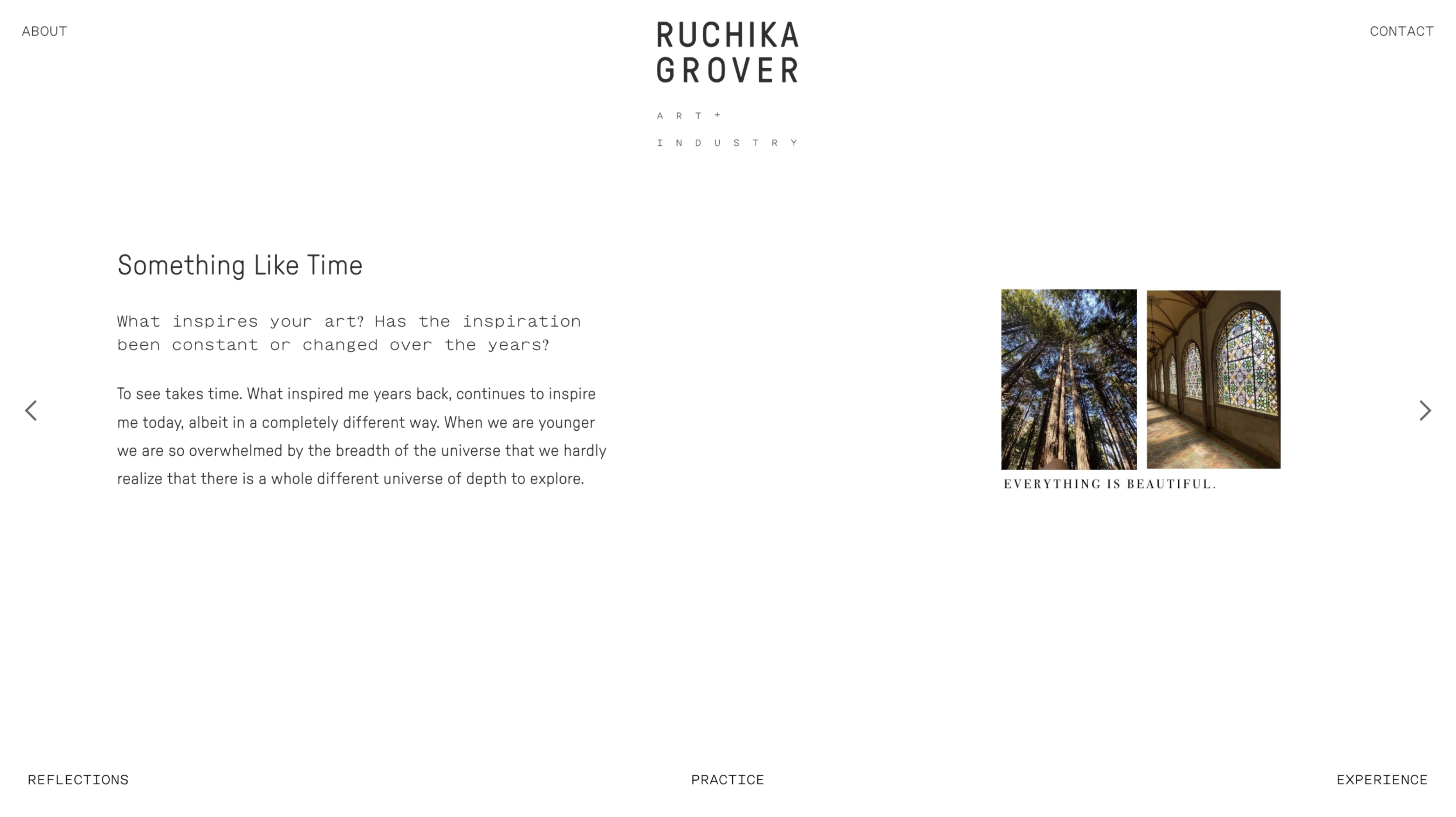
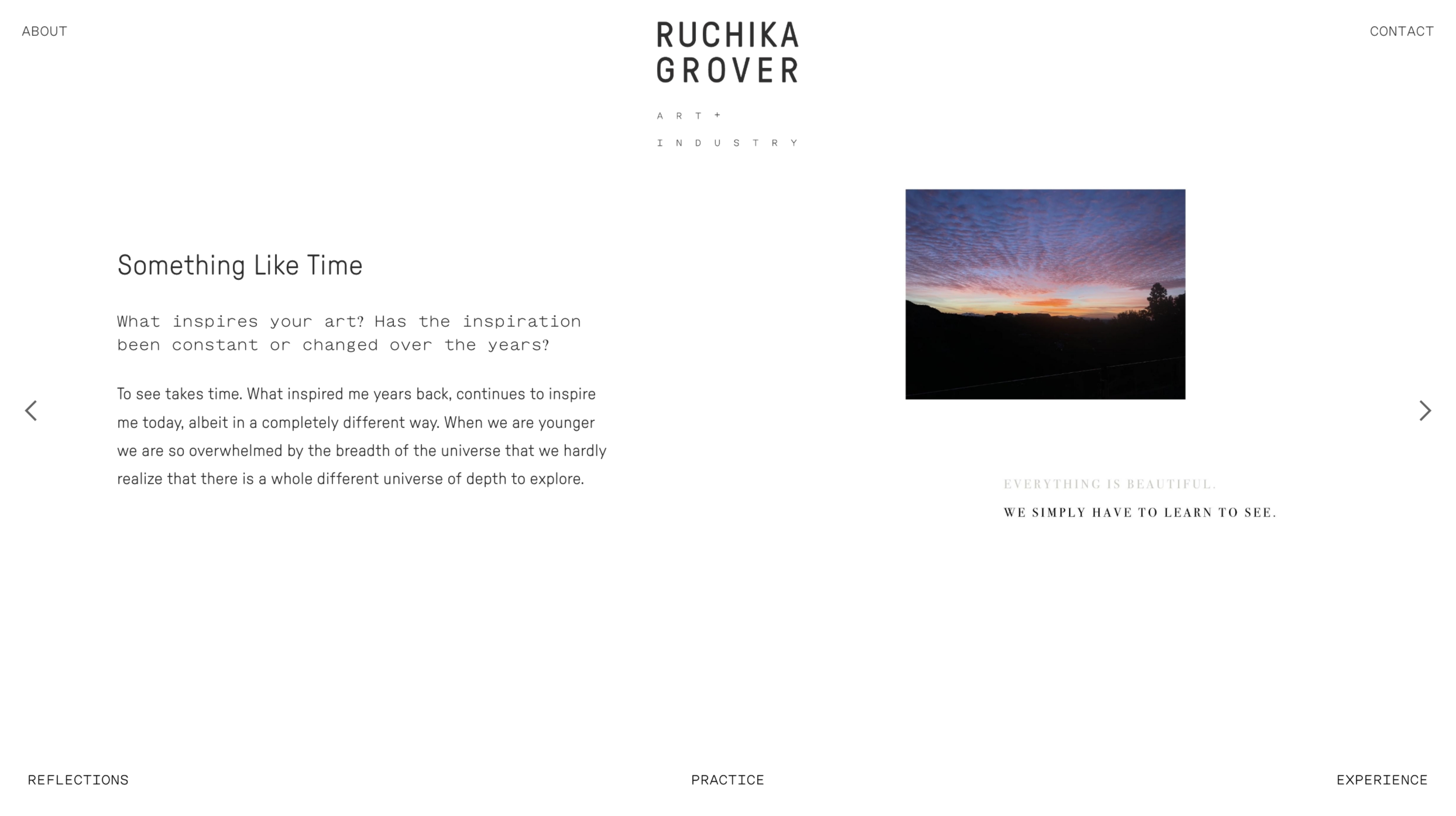
The website has been designed in a first person approach, creating a space where Ruchika is answering a series of questions.
The stopmotion overlap of images complements the answers written and also communicates the poetics of the space & conversations.
The website has been designed in a first person approach, creating a space where Ruchika is answering a series of questions.
The stopmotion overlap of images complements the answers written and also communicates the poetics of the space & conversations.
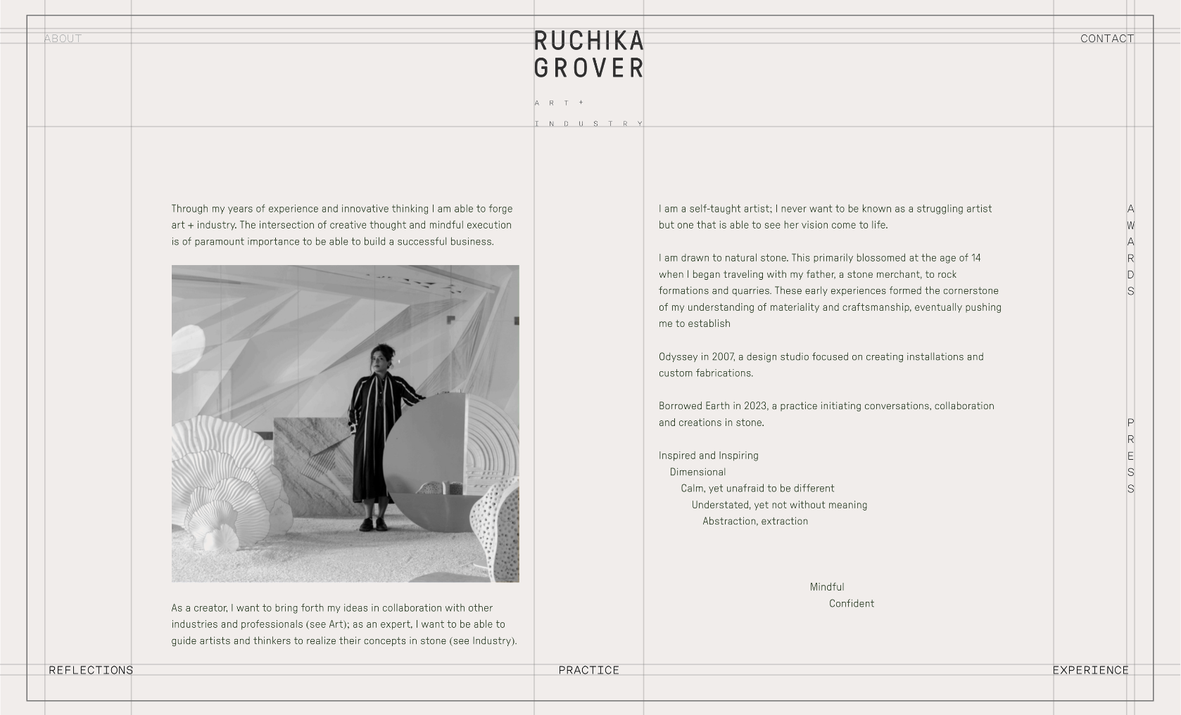
utilizing every space in the canvas
The layout is crafted uniquely for Ruchika, all the navigation elements are dispersed uniformly to the periphery of the canvas allowing the central part to be emphasized more.
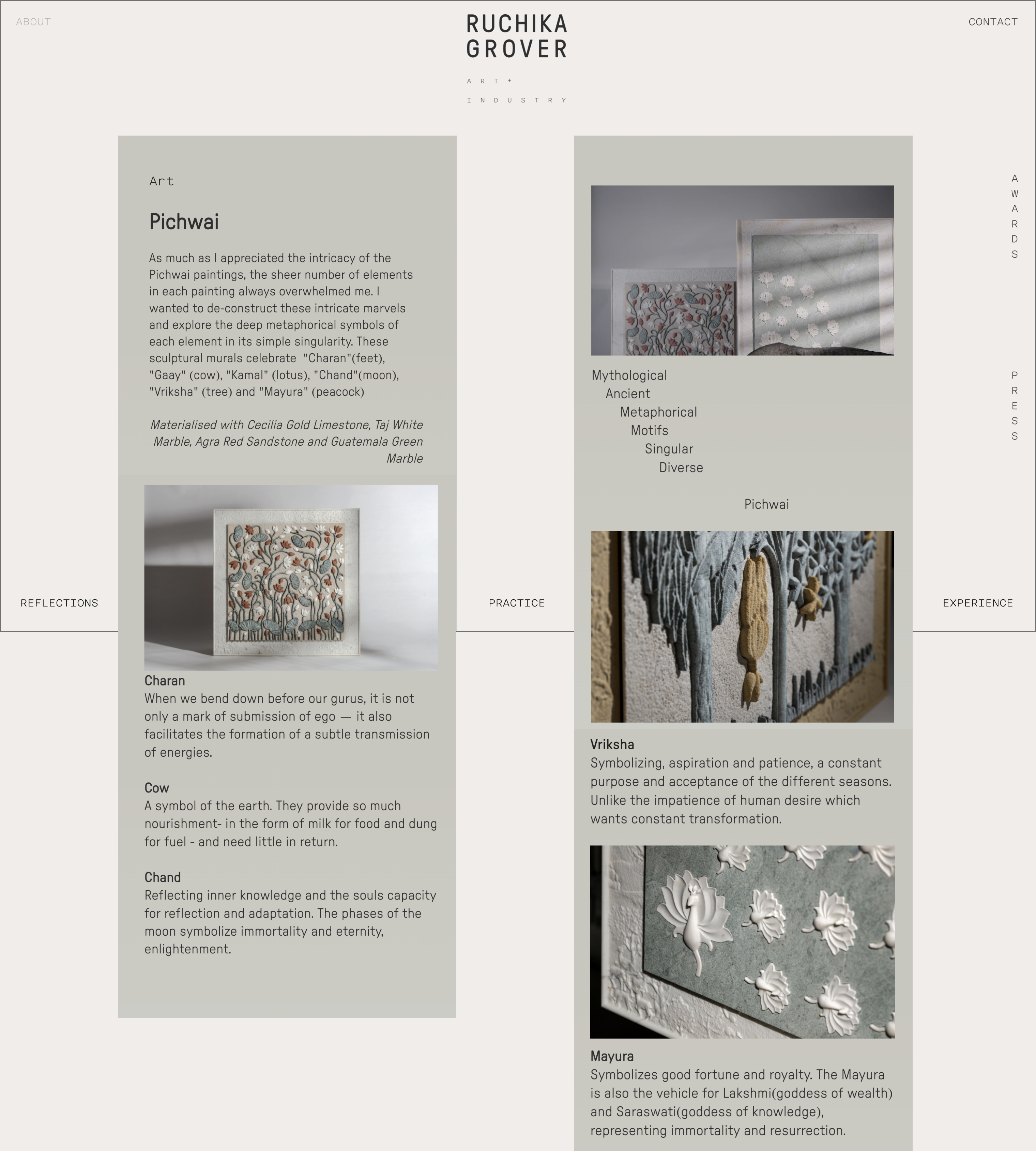
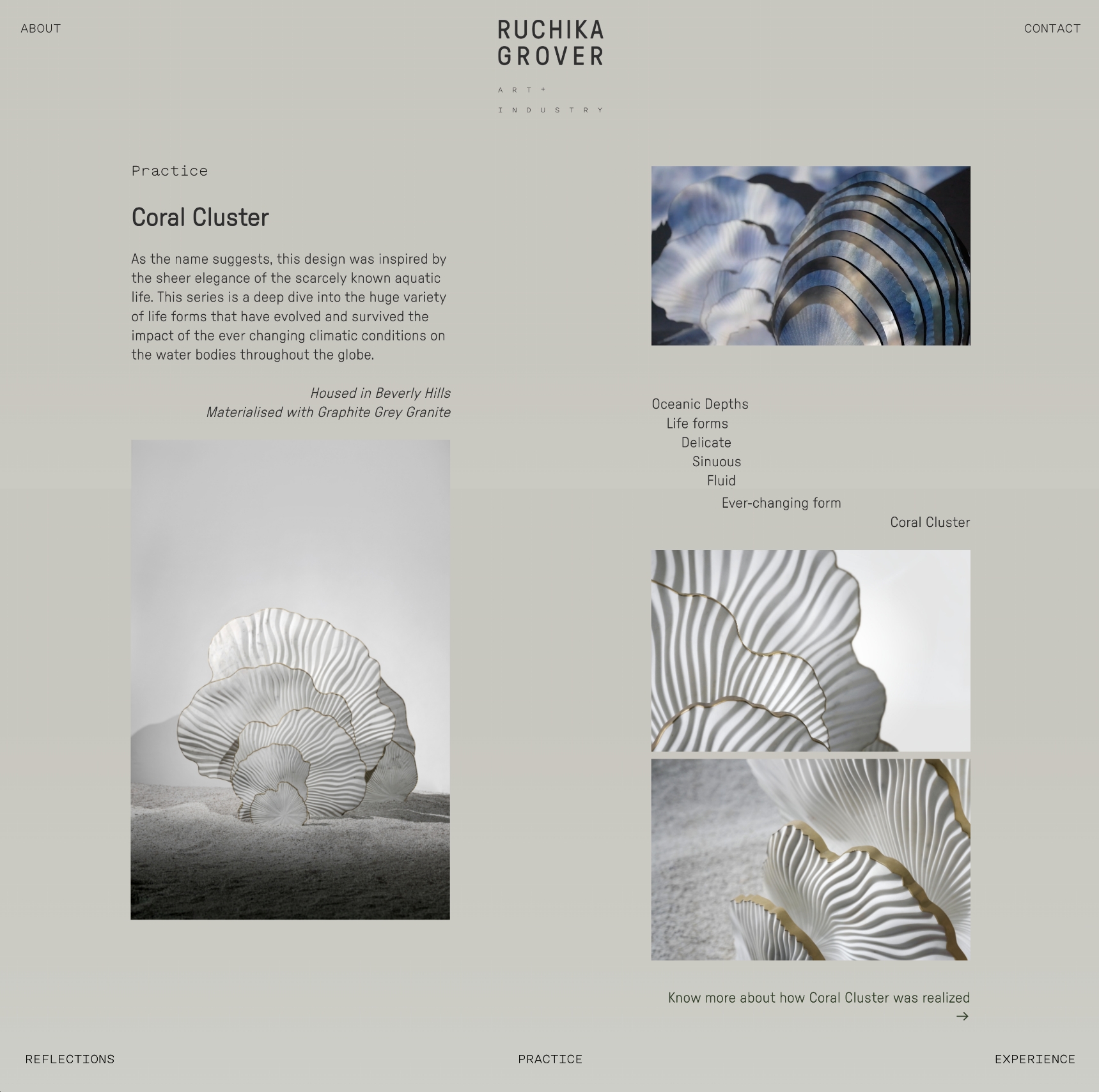
EDITORIAL LAYOUT
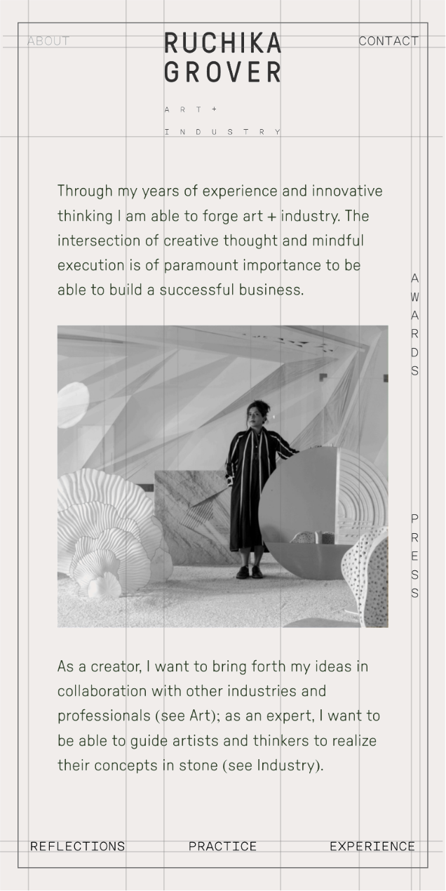
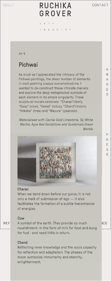
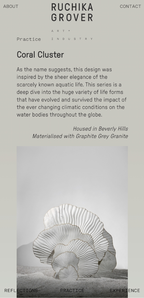
Inspired by editorials, the web page for the desktop follows a two column layout, which seamlessly converse into a one column layout for the phone.
Inspired by editorials, the web page for the desktop follows a two column layout, which seamlessly converse into a one column layout for the phone.
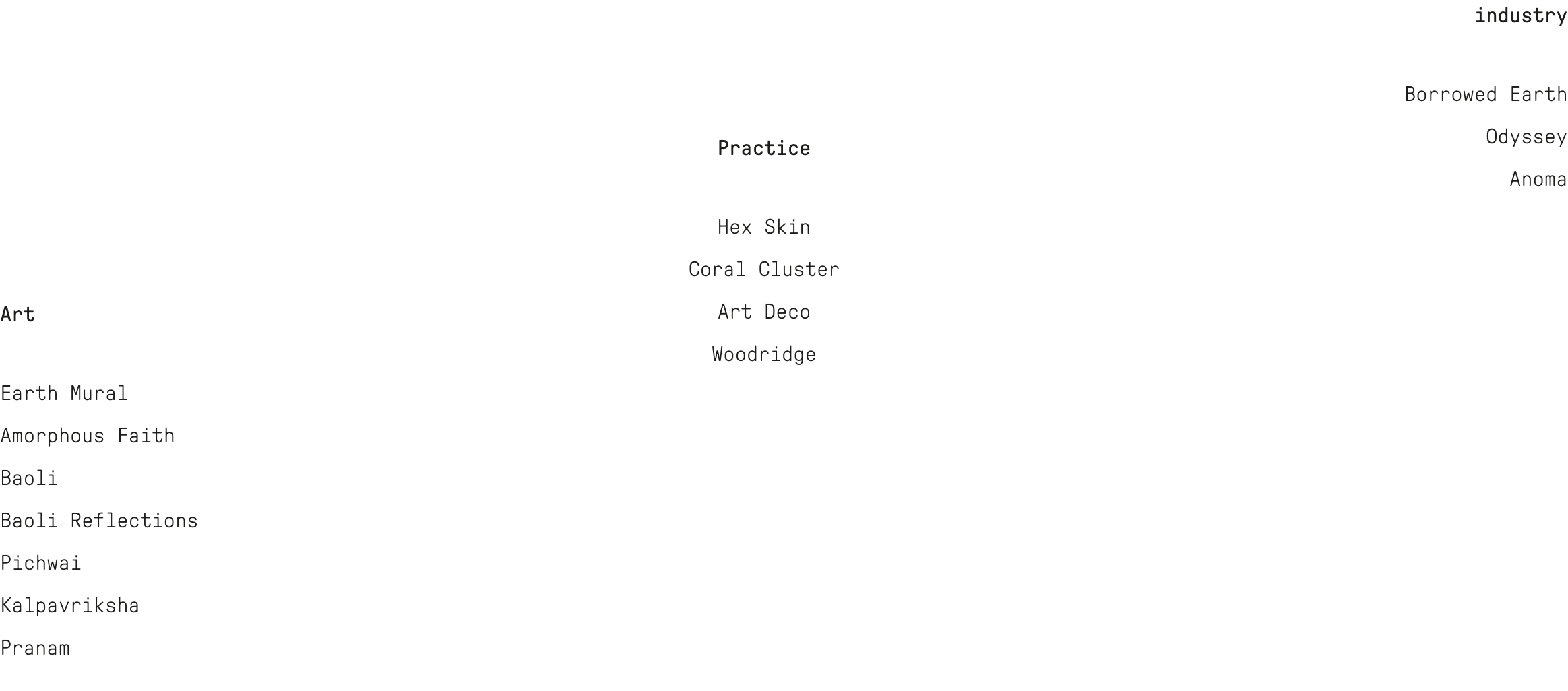
PROJECT SHOWCASE
Project pages have a different color, indicating that viewers have moved onto ‘case studies’ of her work. This transition from mind-space to work-space is subtle, intentional and necessary...
Project pages have a different color, indicating that viewers have moved onto ‘case studies’ of her work. This transition from mind-space to work-space is subtle, intentional and necessary...
REFLECTIONS OF THE Projects
![]()
![]()
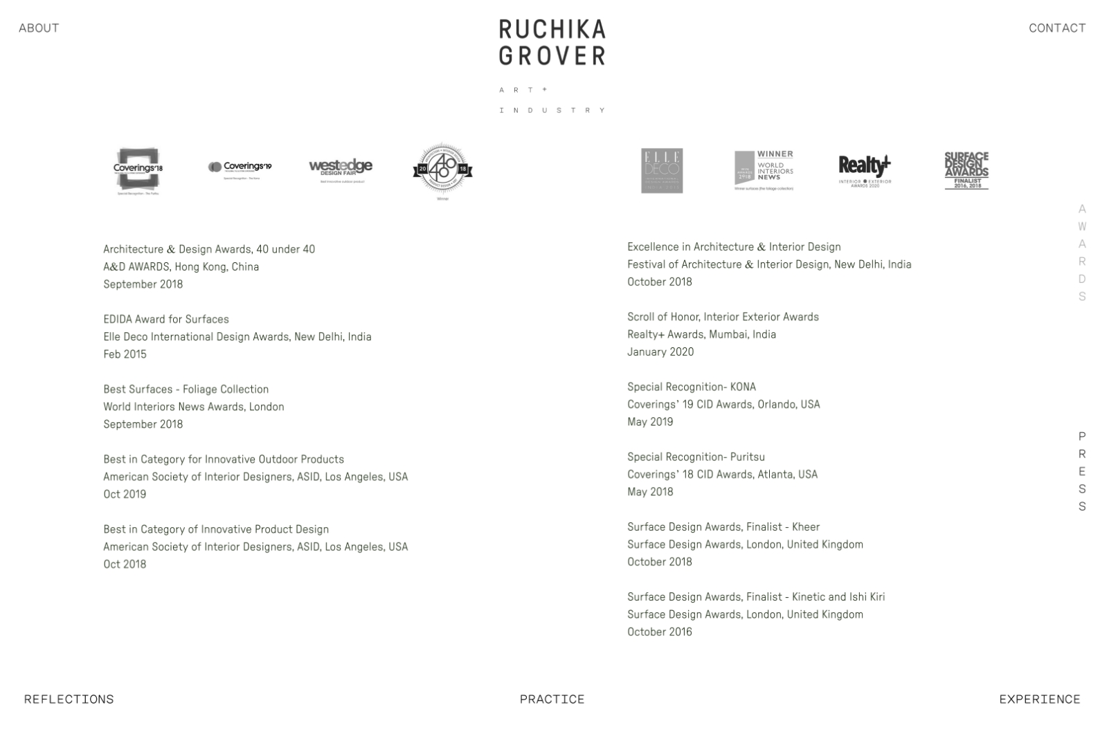
Minimalistic Awards and Press page with a clear typography
Wish to know more about our vision for Ruchika Grover’s Visual Identity? See our case study below:
![Ruchika Grover — Visual Identity]()
Minimalistic Awards and Press page with a clear typography
Wish to know more about our vision for Ruchika Grover’s Visual Identity? See our case study below:

Looking for a artistic website for your brand? Get in touch.