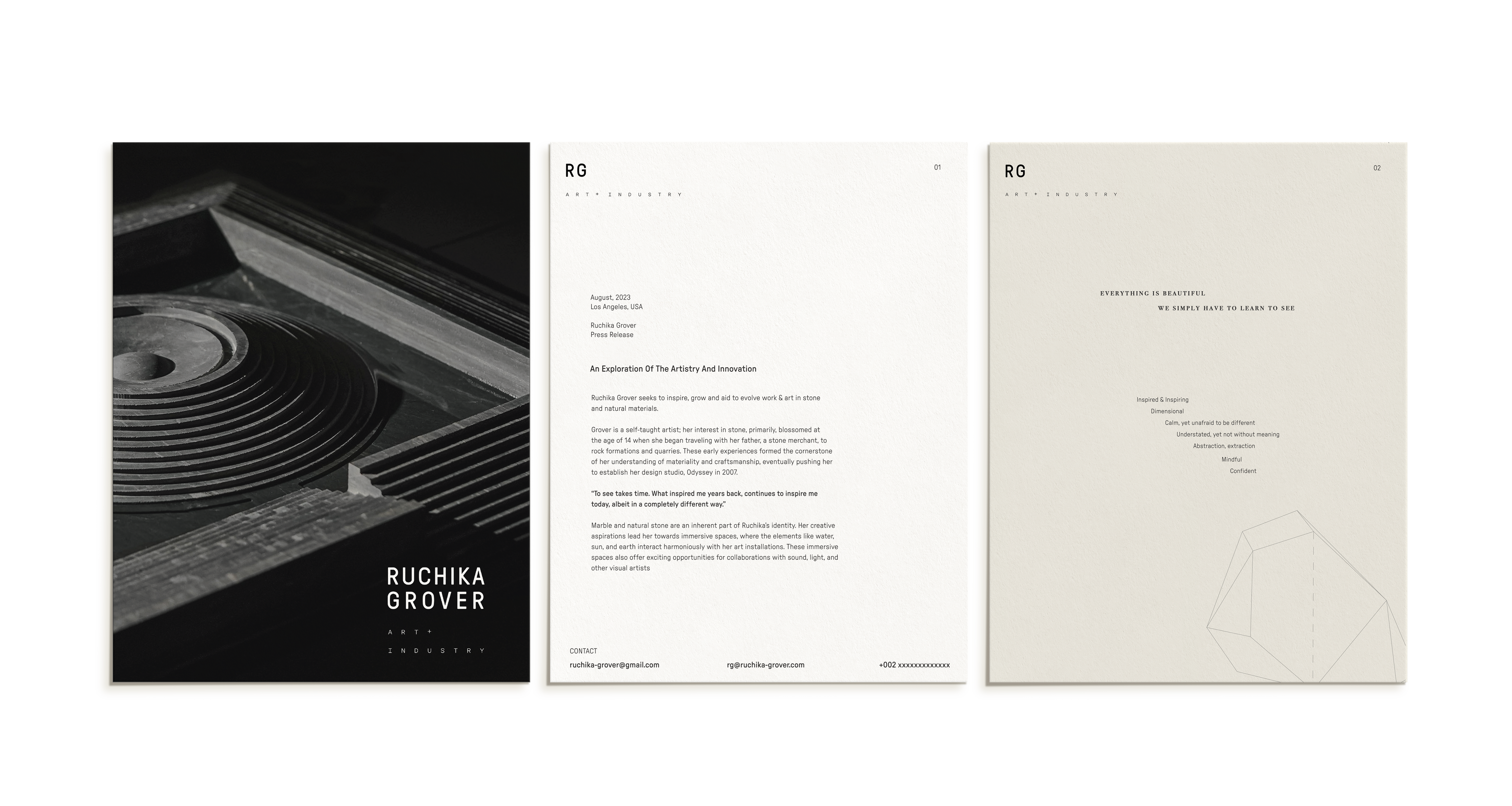
Ruchika Grover
BRAND Strategy BRANDING AND VISUAL IDENTITY
Ruchika Grover is an enterprising artist, who is leveraging a legacy business
to bring forth innovative expressions in natural materials.


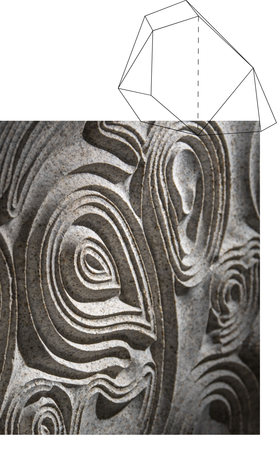
Ruchika Grover finds herself at the intersection of art and execution; business and thought - provoking designs. Particularly, she has experience and expertise in working with stone, which is a weighty material to work with – literally and figuratively.
![]()
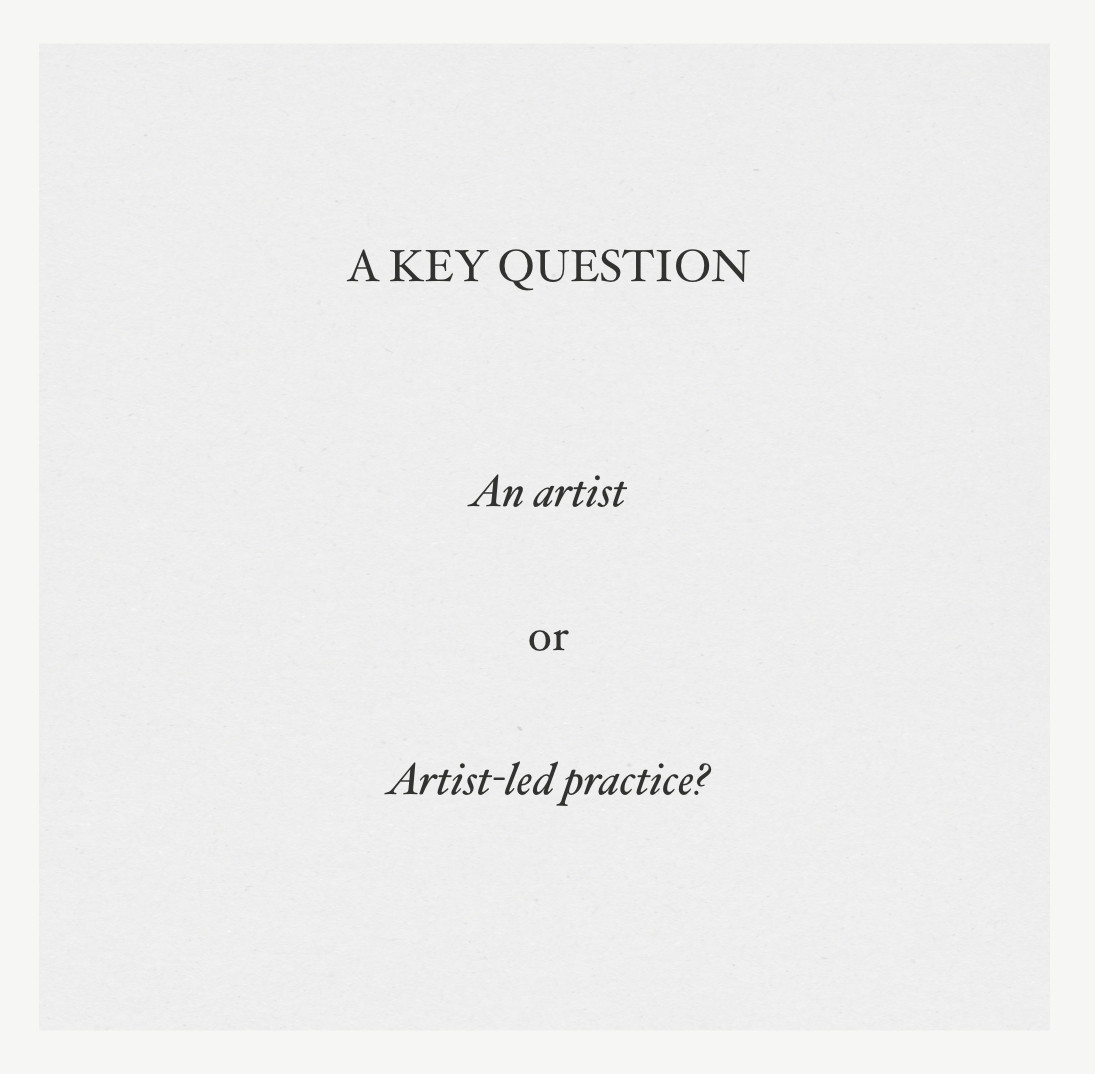
However, there is a need to be definitive — which in her case
— a clear division of offerings: art and industry
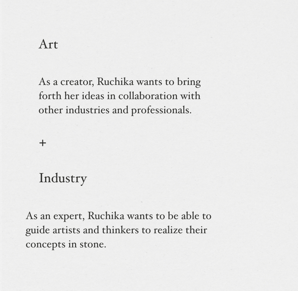
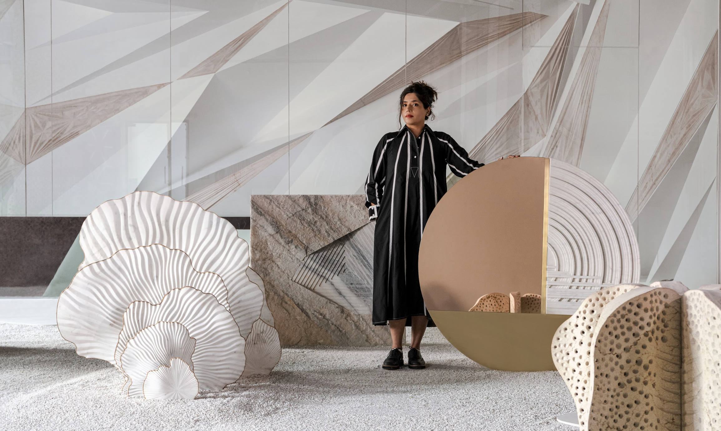
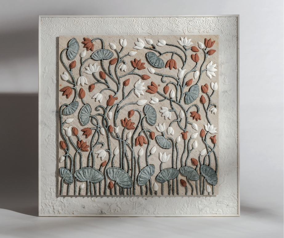
As an artist -Ruchika works on highly conceptual pieces that are based on her unearthing beauty in everything she observes around her.
As an industry professional, Ruchika experiments with natural materials - primarily stone, techniques and technology, at the forefront of new development, and makes it accessible to design professionals for iconic projects.
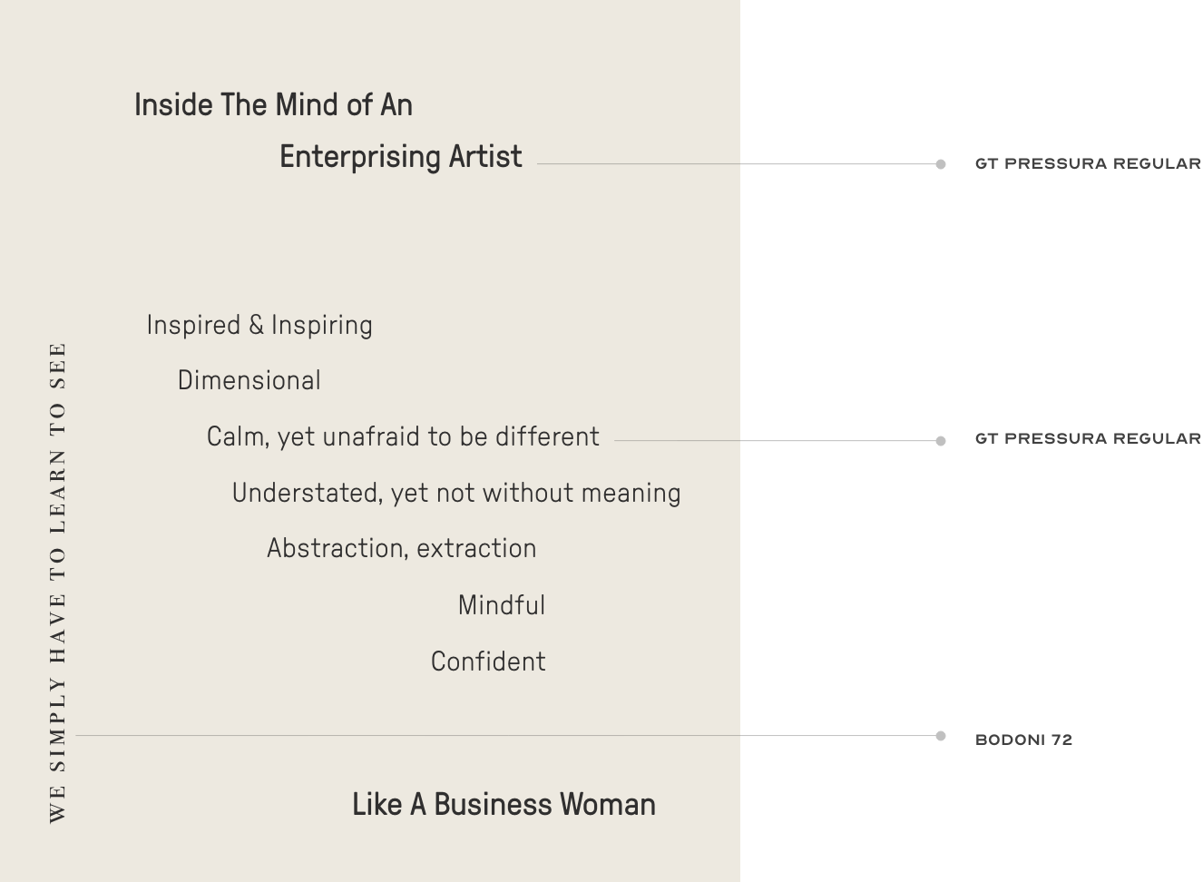
brand voice/tonality
For emotional resonance and impactful action

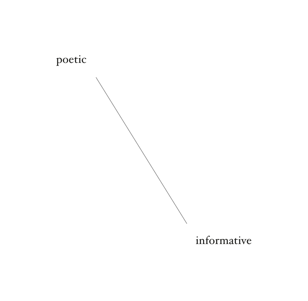
The communication was to be clear, yet poetic. The audience is to understand everything clearly,
yet Ruchika, as a brand, should stand-out for her conceptual applications to an otherwise commercial industry
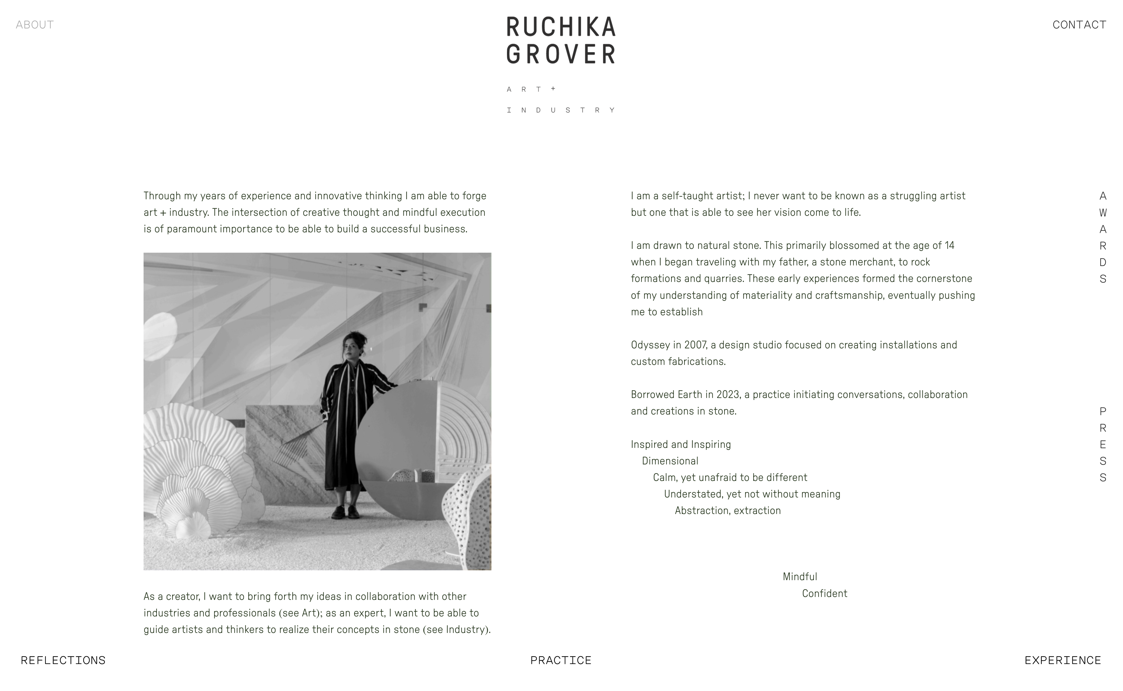
“Through my years of experience and innovative thinking, I am able to forge art + industry. The intersection of creative thought and mindful execution is of paramount importance to be able to build a successful business.”
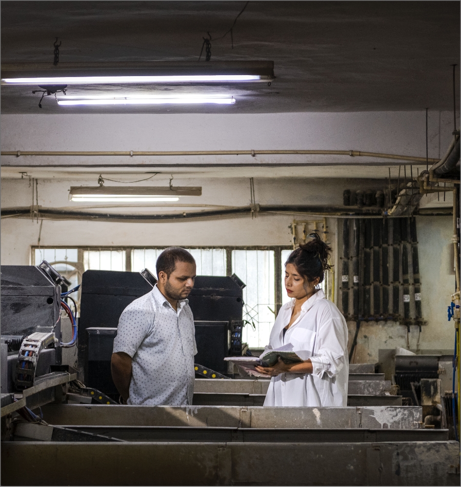
Ruchika has been drawn to natural stone ever since she was 14, when she would visit quarries and stone formations with her father, a stone merchant.
These experiences were a cornerstone of her understanding of materiality and craftmanship.
This led her to establish Borrowed Earth in 2023, a practice
initiating conversations, collaboration and creations in stone.
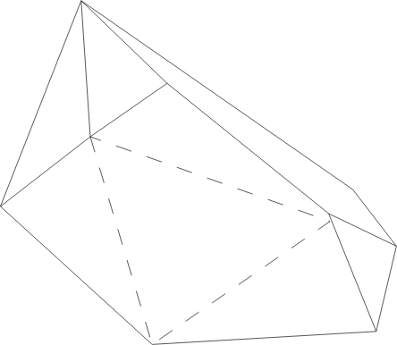
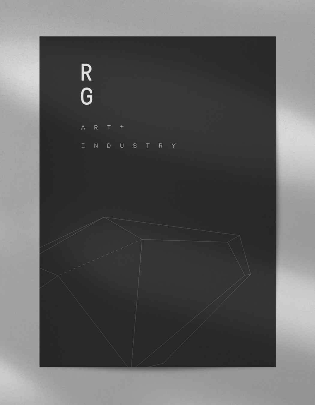
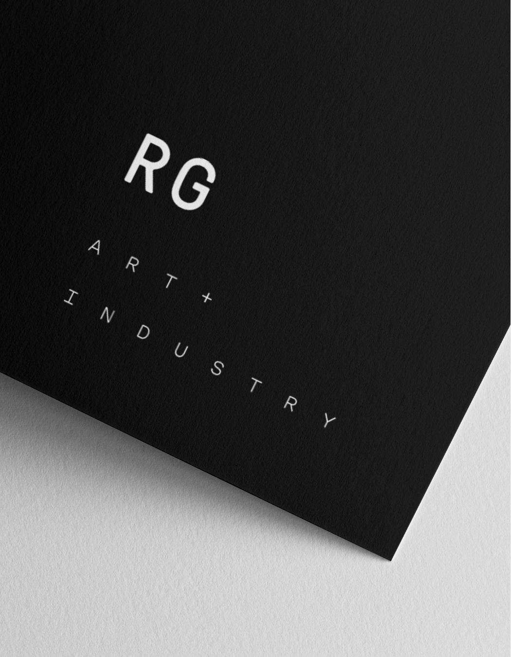
The Brand Logo

Objects that are reminiscent of stones
These objects can be stretched and used in miniature too.
These objects can be stretched and used in miniature too.
Take the stage and build your own composition — just move the shapes around


For typography - Lyrical layouts but with a clear and almost stoic typeface –
to have clear communication but in an unusual manner
shapes used across all collaterals.
to have clear communication but in an unusual manner
The ruchika grover logo and
shapes used across all collaterals.
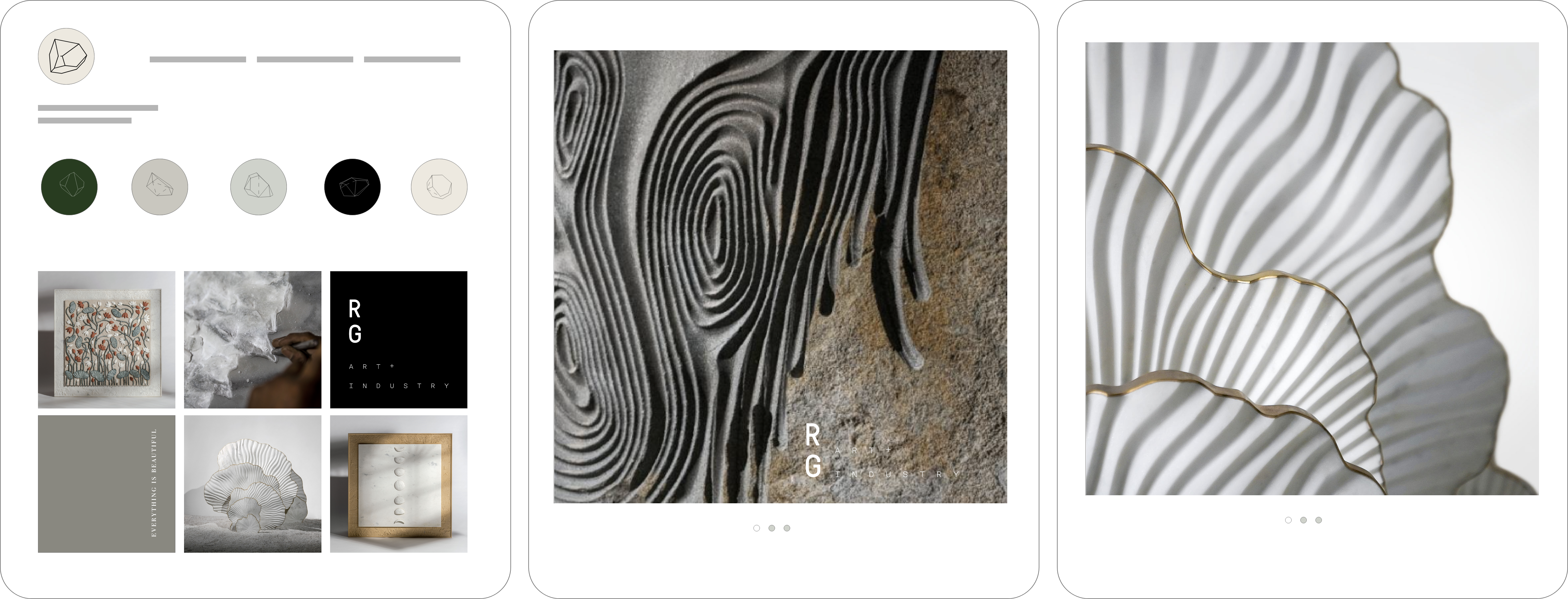
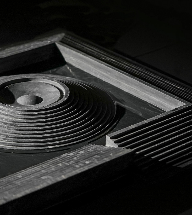
The branded photo content worked with light and details. Select pieces were also submerged in water for added effect.
Explore a cohesive extention of Ruchika Grover’s Visual Identity.
Learn more about Ruchika Grover’s Website here.