MAKAIBARI
branding & Visual identity
Makaibari is a historic, heritage & iconic tea estate in Darjeeling. Its teas are crafted bio-dynamically and organically — and proudly the first tea estates to do so. As the Makaibari brand has evolved, its range of offerings has grown across categories.
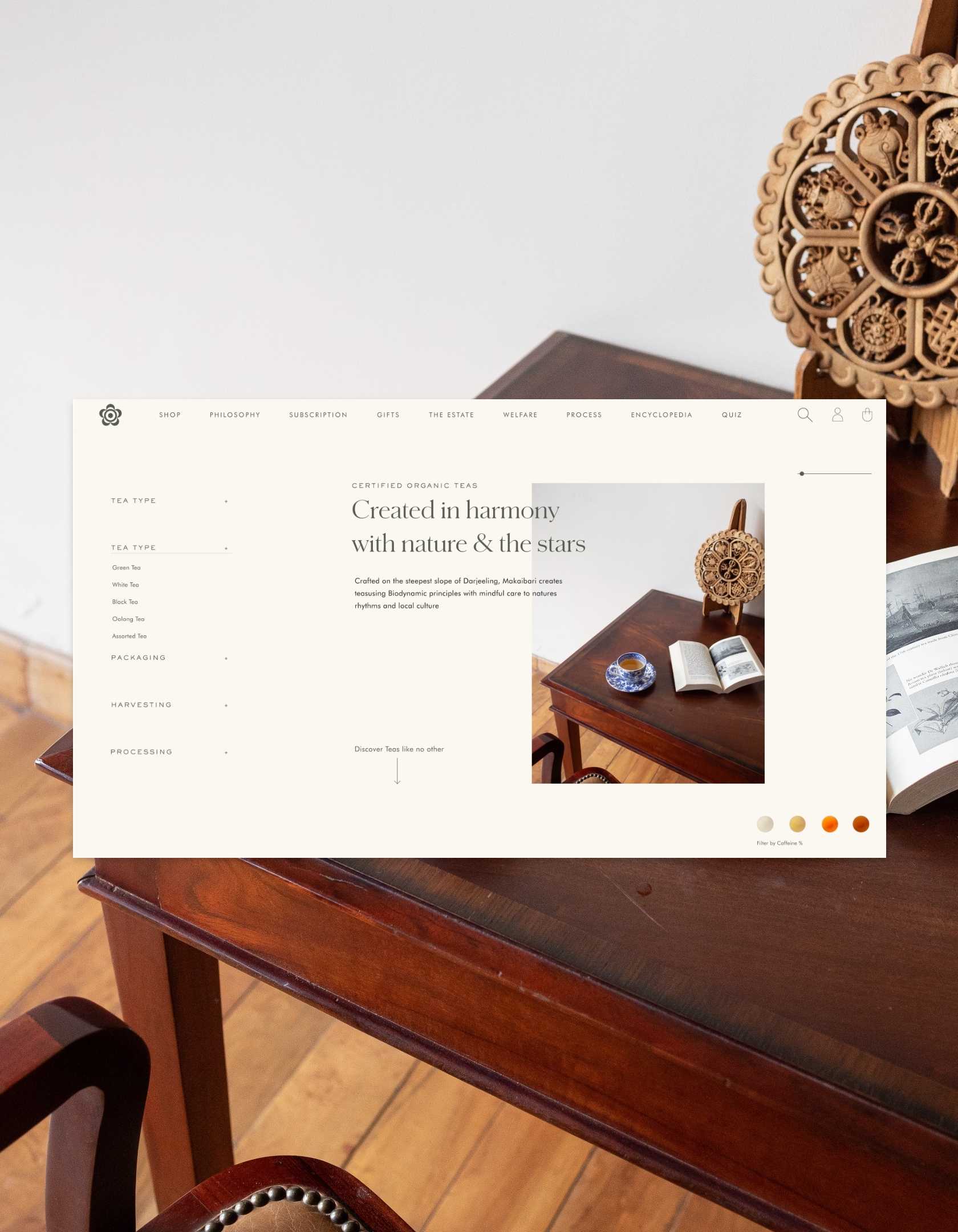
The challenge is to assess and implement a consistent and coherent voice, brand values & visual identity that honours the brand’s mission, vision, and innovation across its various channels of communication.


The logo is set in Centra, a typeface that embodies its simple spirit. We retained the logo mark, derived from the pistil of the Camellia Sinensis flower. The key words organic and 1859 are used in Sackers Gothic. These elements are used in combination or by itself (the logo mark) for defined use cases.
SECONDARY LOGO MARKS


The usage of pistil in isolation for brand confidence

Tea attuned to the celestial rythmNs

The Earth is a powerful influence on Makaibari’s tea profiles. It seeks an analogy with the rhythms of the sun, the moon, constellations, the cosmos and how humans live with and within it all.
To represent this, we derived a medallion. It includes a concentric circle that symbolises the biodynamic process. The medallion for Silver Tips Imperial — tea that is harvested on select full-moon nights — has consellations and the moon with details derived from antque astonomical maps.


The cultivation of tea at Makaibari follows the principles of biodynamic agriculture — it is a spiritual—ethical—ecological approach to agriculture


Typefaces
The typography intertwines practicality and expression. Schnyder X Cond is disarmingly distinctive and offbeat. This typeface exists comfortably in the grey area between type and lettering, drawing inspiration from the Beaux Arts era. Sackers Gothic Std is ideal for sincere communication and pairs well with display faces of a disparate nature. Hullist Script has been used as a discretionary typeface.

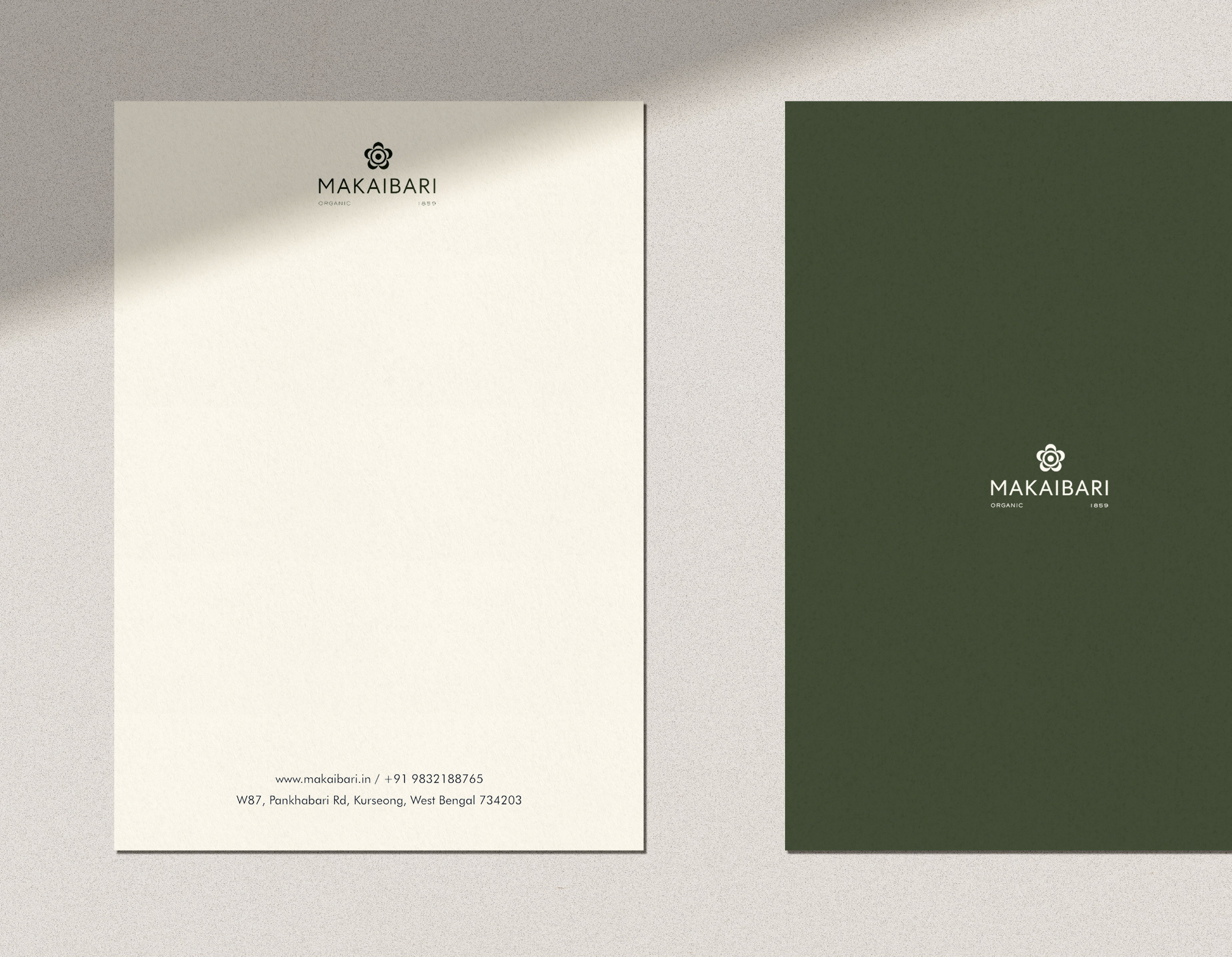
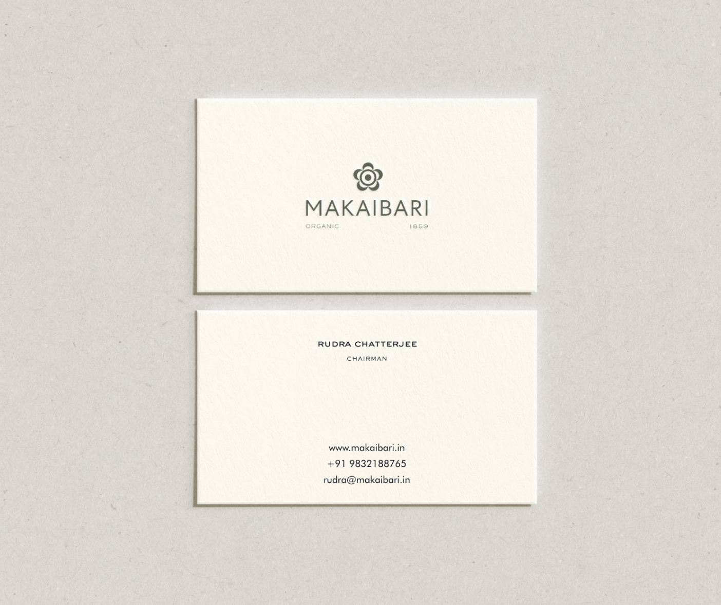
The Makaibari Collaterals were designed keeping in mind the intrinsic simplicity attached with the brands idealogy.

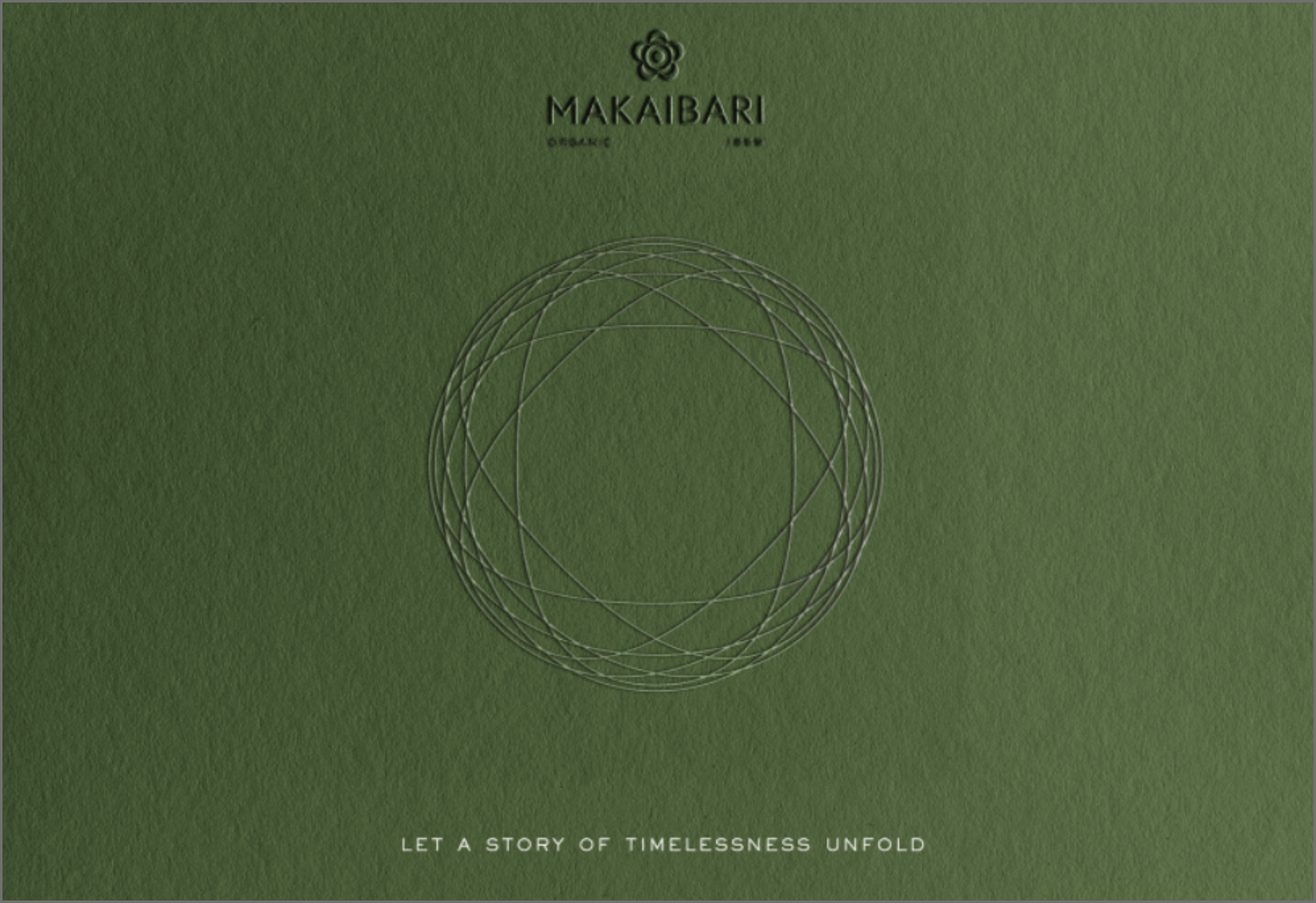

Gift boxes designed for the Tea Treasures range.
The inside flap with a debossed circular design,
The front of the flap with embossed celestial symbols.




packaging collaterals


