craZy belly
website deSIGN
Crazy Belly is a food truck brand based out of Zürich, Switzerland. After the development of the brand identity, a website was designed to further build the brand awareness, ease the process of ordering food and serve a larger audience. The website acts as an initial point of contact, thus building a customer-brand relationship.


Once the branding and visual identity of Crazy Belly was established and put into production, the result was a beautifully designed truck, with a great customer response. The website was to be an extension of that fun and craziness, yet still be esily understood by its target audience.
The website was created on Wix using a template provided to us by the client, however that did not limit us from designing a website that communicated the unique, fun and unconventional personality of the brand. A great emphasis was placed on making the website as dynamic and engaging as possible, therefore animations, scrolling banners and GIFs were used across different pages
The website was created on Wix using a template provided to us by the client, however that did not limit us from designing a website that communicated the unique, fun and unconventional personality of the brand. A great emphasis was placed on making the website as dynamic and engaging as possible, therefore animations, scrolling banners and GIFs were used across different pages

An integral part of the website was to showcase and highlight the various brand assets developed so far and translate them into visually interactive content. This was done by designing a collage for the home page— a combination of food images and GIFs created using catch phrases.




The homepage was essentially designed using the colour-blocking method integral to the visual language of the brand. A combination of images, illustrations and various other brand assets were used throughout to convey the story, services and core beliefs of the brand.
![Home page banner showcasing the tagline of Crazy Belly]()
![Sustainability banner in the home page]()
![]()


A set of stickers were introduced as an extension to the existing brand identity. This was done to add some fun and craziness to the website design. It also served as an eye catcher for anything important that the brand wanted to communicate to its viewers. These were animated using Wix’s in-built pop-up effect


One of the core pillars of Crazy Belly is “Sustainability”— the brand believes in using eco-friendly methods to serve its customers, there a separate page was dedicated to convey the message of the brand (Check out the branding here).
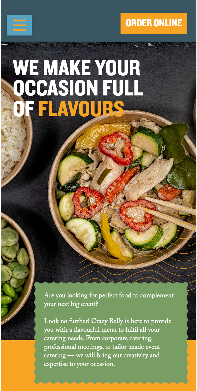
Crazy Belly not only serves people on the go, it also offers catering services, thus the website has a dedicated page that outlines the details of the services offered and gives the customers a platform to reach out and connect with the brand.

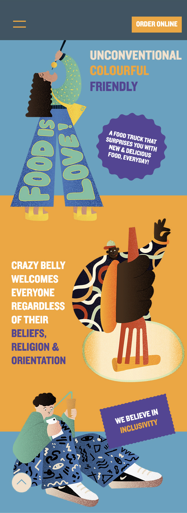
What makes the brand so special is the story behind how it came into existence, the About Us page was designed to narrate that story in a fun and visually driven manner. This page showcases all the illustrations, key to the design language of Crazy Belly. These illustrations also narrate the core beliefs of the brand and leave the viewer thinking about what each of the characters represent and mean.

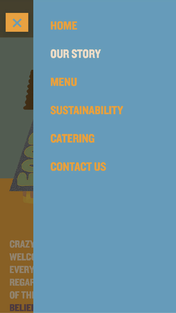
One of the key aspects of the web design process is to make the designs adaptable across various screen sizes. Here is an example of how the design of the About Us page when viewed on a desktop looks different from that on a mobile, yet reflects the same aesthetic and layout as that of the desktop version thus bringing out a sense of consistency.
Craving for some good food for every mood (and you happen to be in Zurich), head to Crazy Belly.


Looking for a good crazy website for your brand? Get in touch.

