craZy belly
VISUAL brandING AND identity deSIGN
Crazy belly is a food truck located in the business district of Zürich, Switzerland.
The food truck serves a new lunch menu everyday and has a wide selection from Asian and European cuisines.

As part of our research, the truck surroundings were studied in detail to understand the locale and how we can make the truck stand out. Considering the buildings around the truck were mainly muted or darker colours, the designs for Crazy Belly had to stand out with the use of colours and striking illustrations and bold typography. These features would also differenciate the brand from the other food trucks in the area.
For the logo, Knockout font in bold was used. A step-like format was created for the logo, to attract attention and the colour bands were used to add scaleable elements, should the need arise for its use

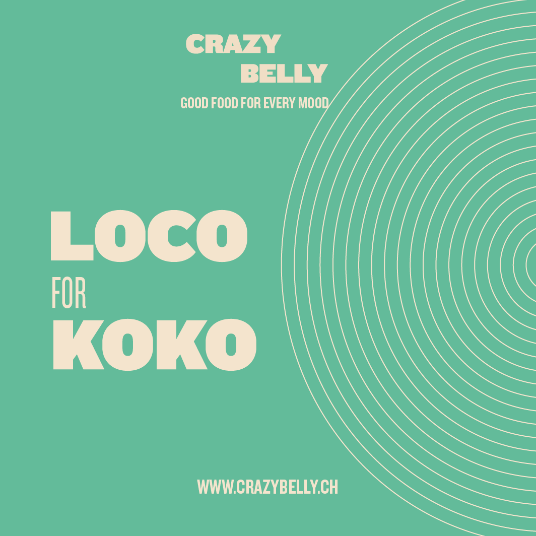
Creating the visual identity and its extensions was the next step. The craziness of Crazy Belly was taken through a series of over-the-top phrases that were used alongside soft geometric patterns. A colour block format brought these elements together, in a way that can be taken across digital and print media.



To bring in some dimension to the identity of Crazy Belly, a set of illustrations were developed. The main idea behind creating these illustrations was to break free from the more literal ways of drawing people and focusing on showcasing the diversity of the region, as well as combine elements that are associated with age groups.
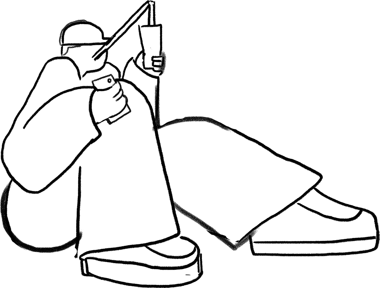


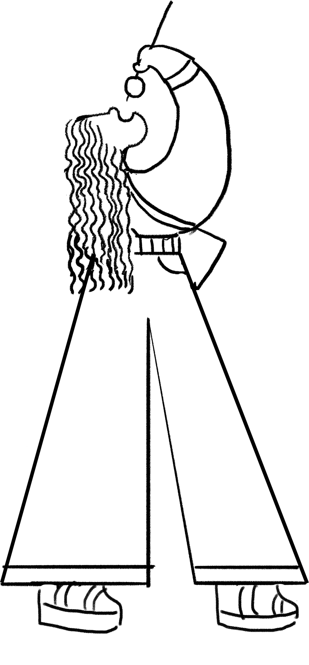

The illustrations are to express action and movement in characters, warp the human figure in surprising and fun ways and use bright colours to make for a bold and visible branding asset. While creating a brand personality, the language of the brand was kept fun and fresh. The tagline created, keeping in mind the diverse food offerings on the menu, was Good Food for Every Mood.
Multiple phrases were coined for some of the common dishes and some fun Did-You-Knows were used to establish the brand language.

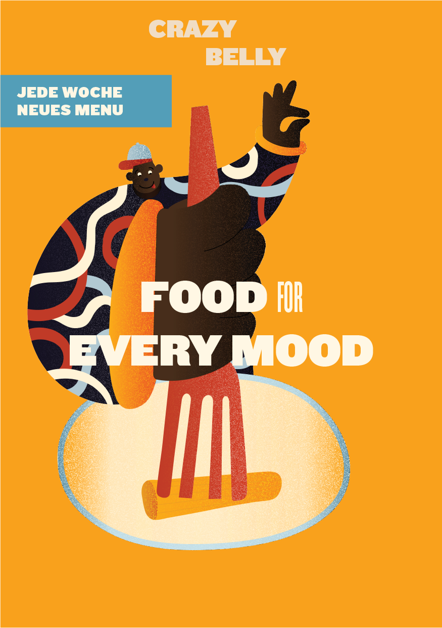


Taking the visual identity onto the truck, the front of the truck was kept simple with the logo and illustration. The two sides of the truck were made cherry and interactive so that people click pictures and upload pictures on social media, bringing awareness to the brand.
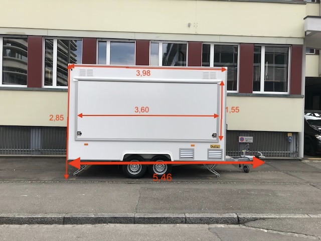


On one side of the truck, an engagement experience was created. Deriving from the tagline, people queuing up to pick up their orders were asked “What mood are you in today?” On the window, different emotion-stickers, customised for Crazy Belly, were placed which people can pick and stick on the truck.


On the other side, a complete “Craziness Scale” was created. People can stand near the scale and measure how crazy they are. This was made keeping in mind an average height of the people in Switzerland and range was chosen. The design and language of the scale was kept simple and fun.

While designing the packaging for the brand, we decided to make it ergonomic and created stickers for tops of the boxes and sleeves for the sushi boxes. Each dish was given a name. For example Slurppy Suppe for soup bowls, Loco for Koko for Thai Curries and so on.


