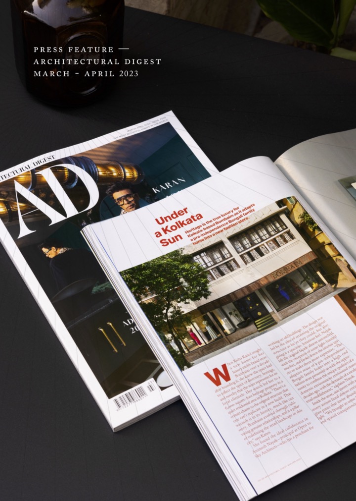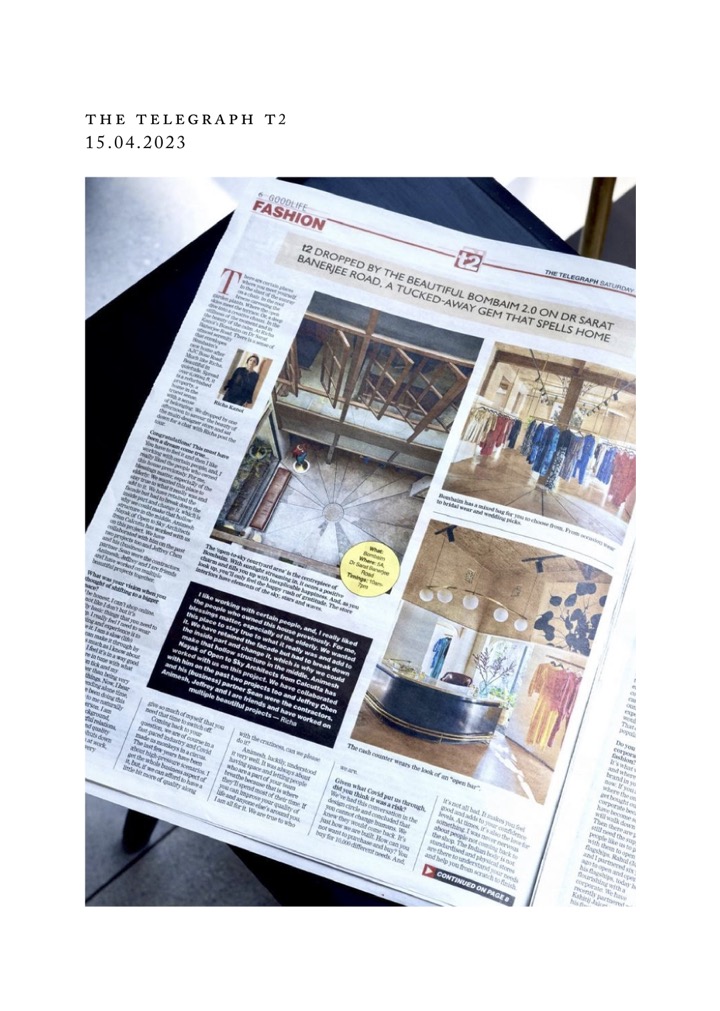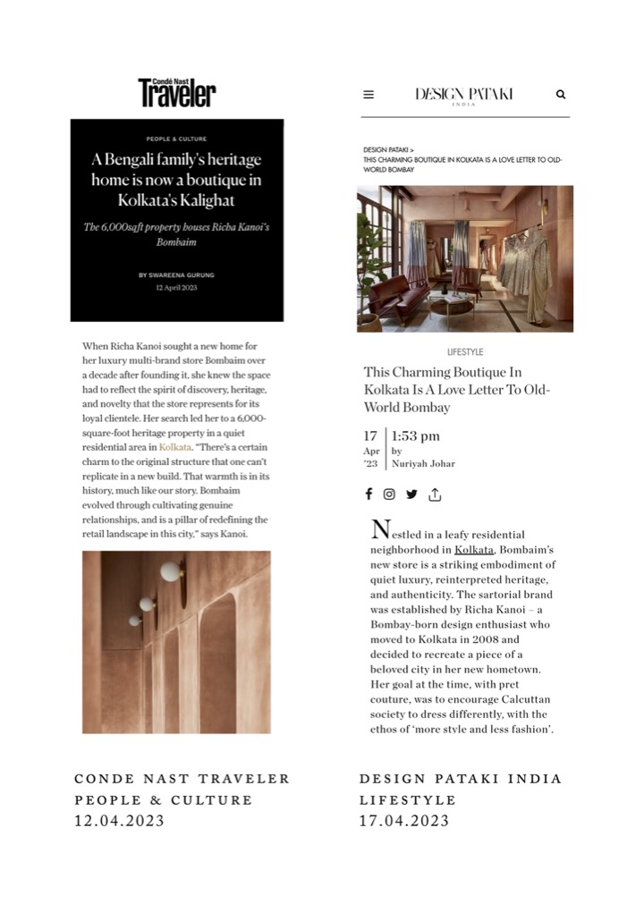
BOMBAIM
visual IDENTITY DESIGN
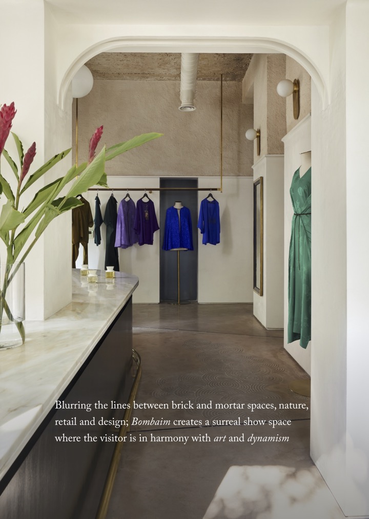
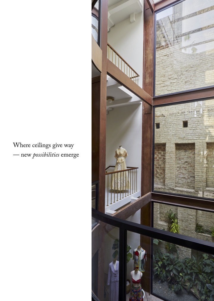
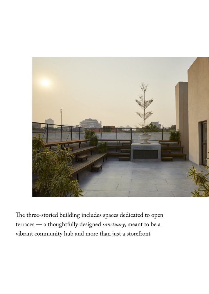
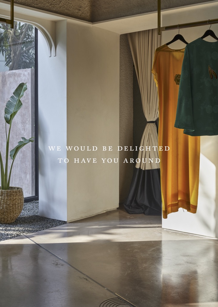
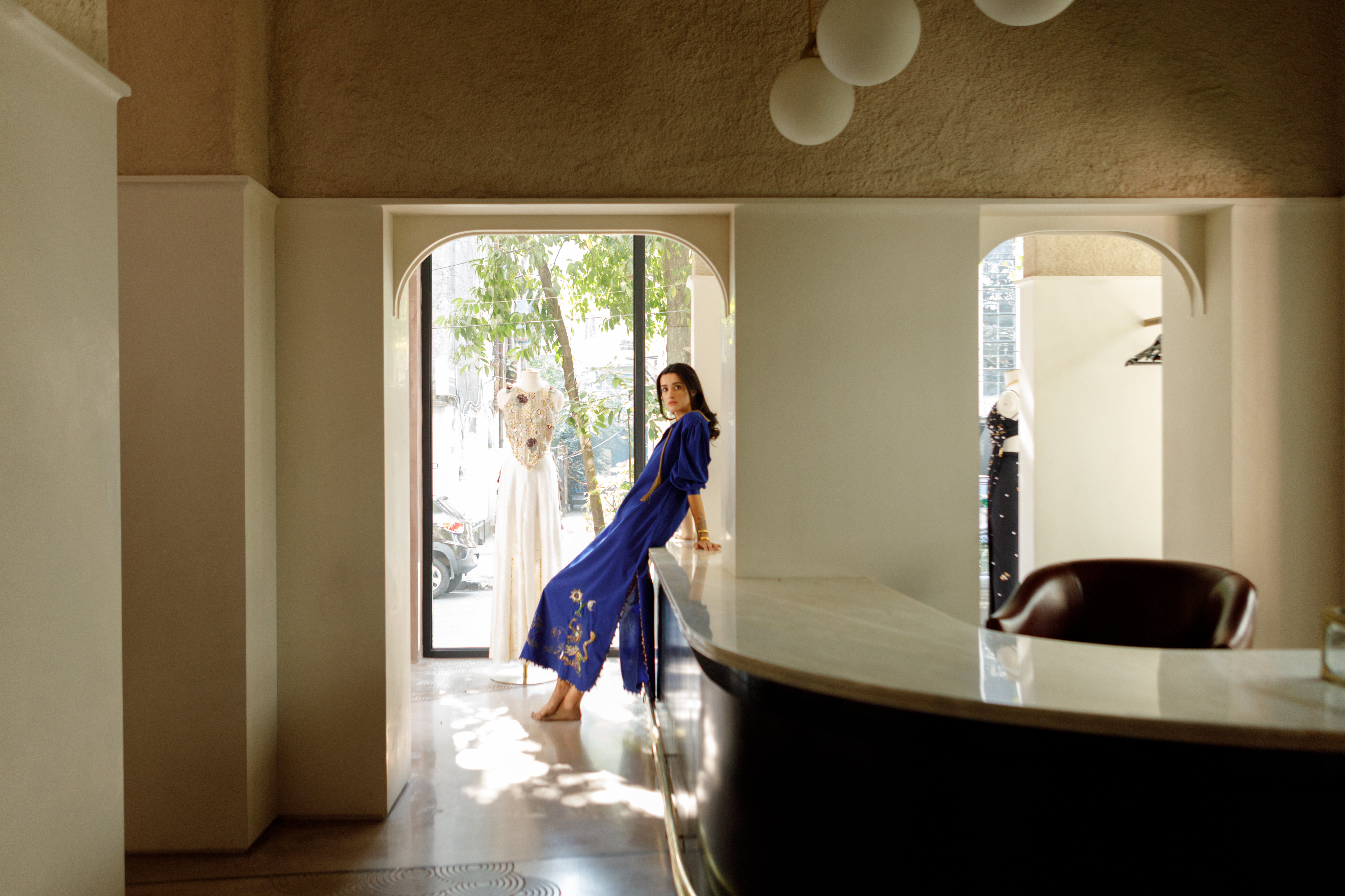
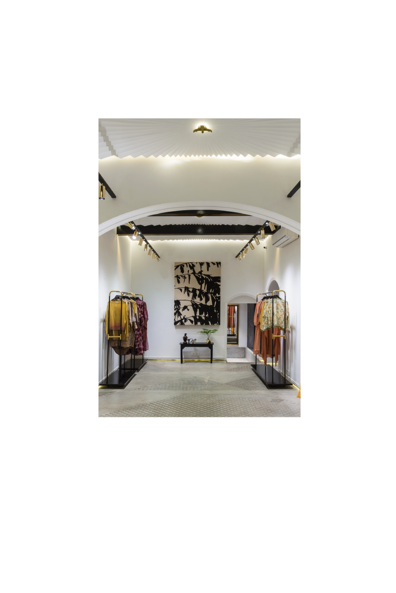
Retail spaces should be considered spaces — they make you feel a certain magic.
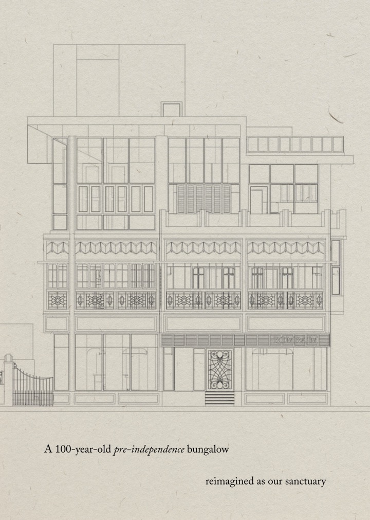
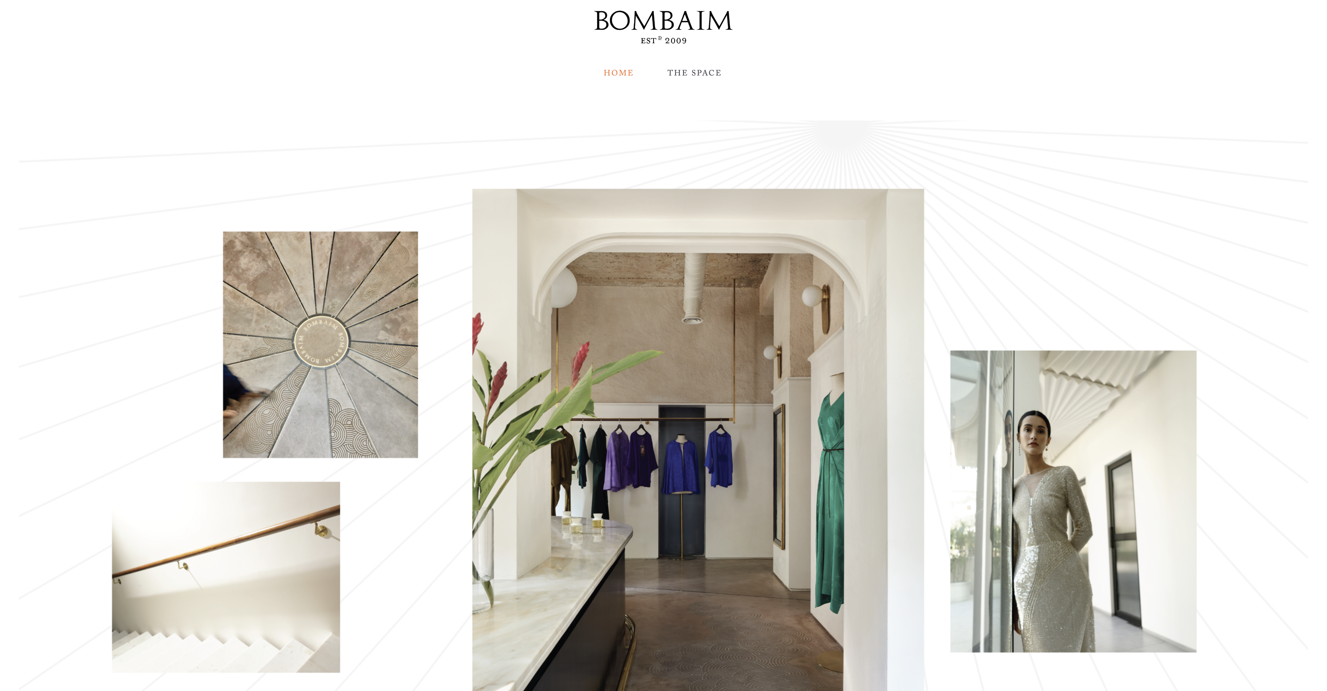
Introducing our identity design for Bombaim, which has been taking shape from 2017 — present. It’s through the process of time that you find things most intimate — to disclose, to connect and build associations.
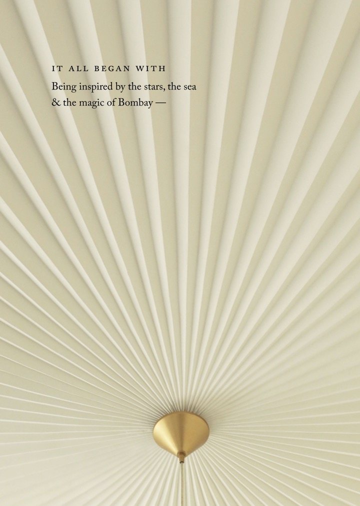
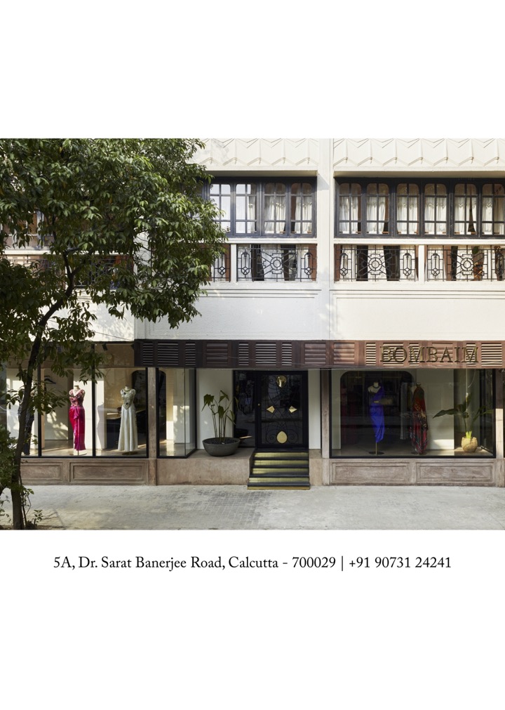
Bombaim’s spatial design is a modern adaptation of Art Deco, an era of scientific inquiry and experimentation, which directly correlates to founder, Richa Kanoi’s interest in stargazing and cosmic exploration. This formed the basis of the identity design.

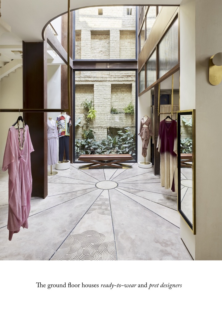
The sun burst pattern, a prominent detail on the store’s ceiling, was used to develop a custom width radial that has been kept dynamic and used extensively across digital and print media.
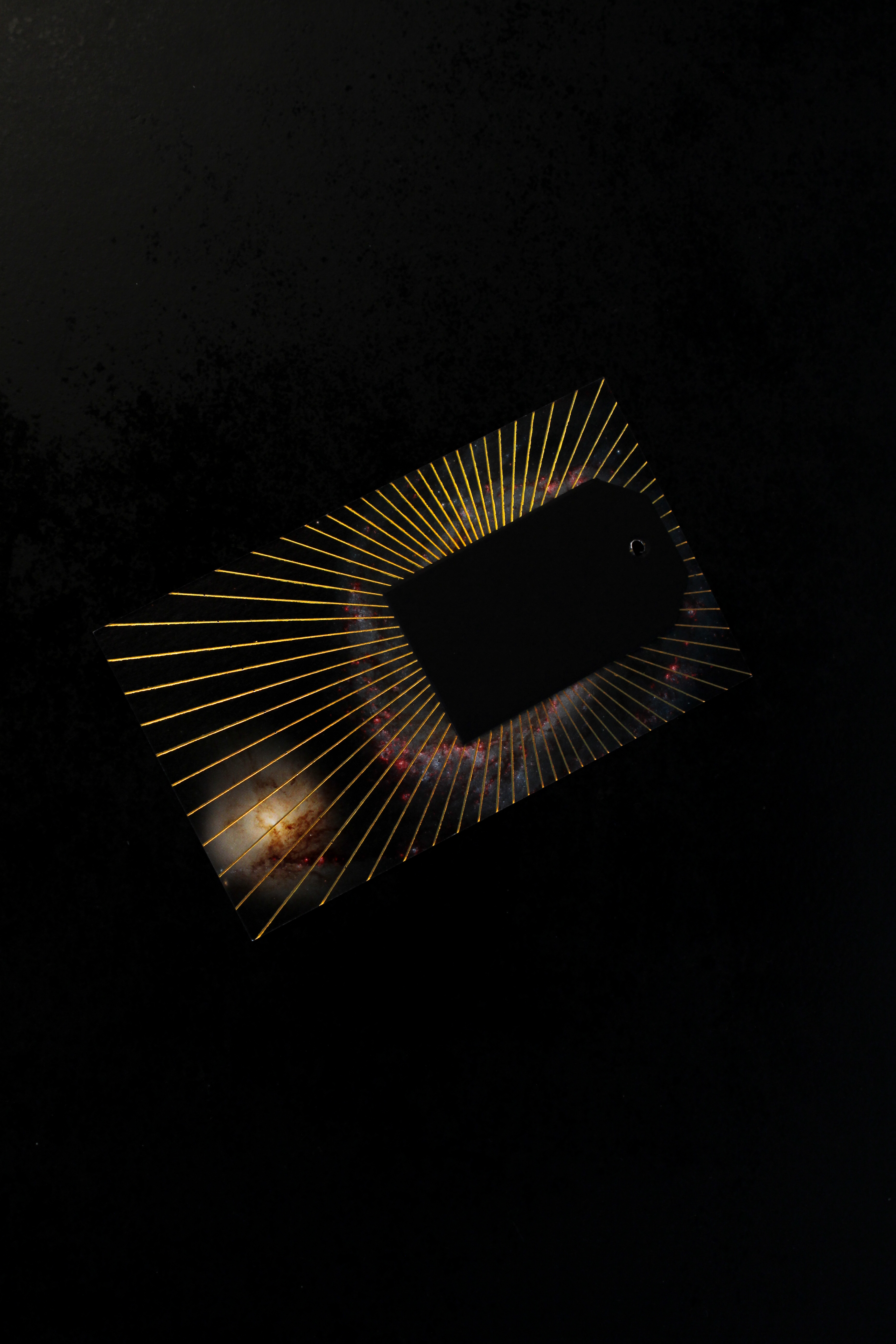
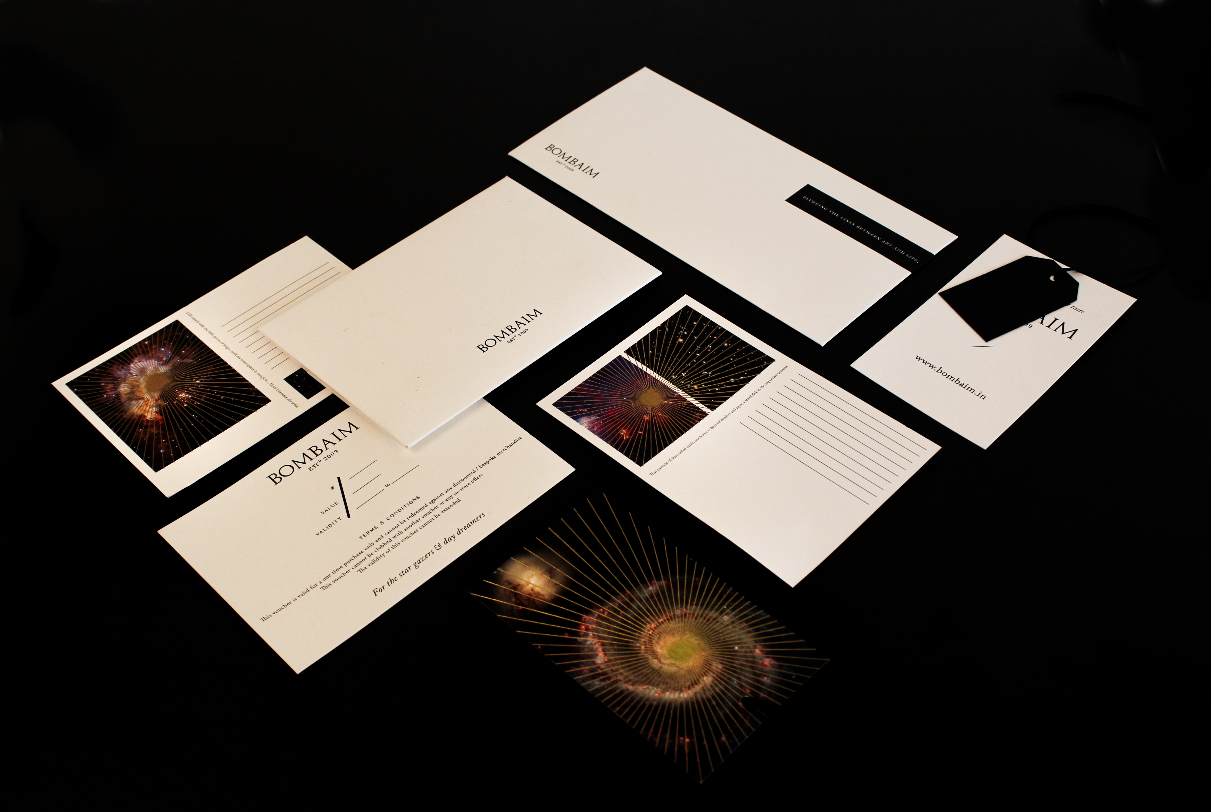
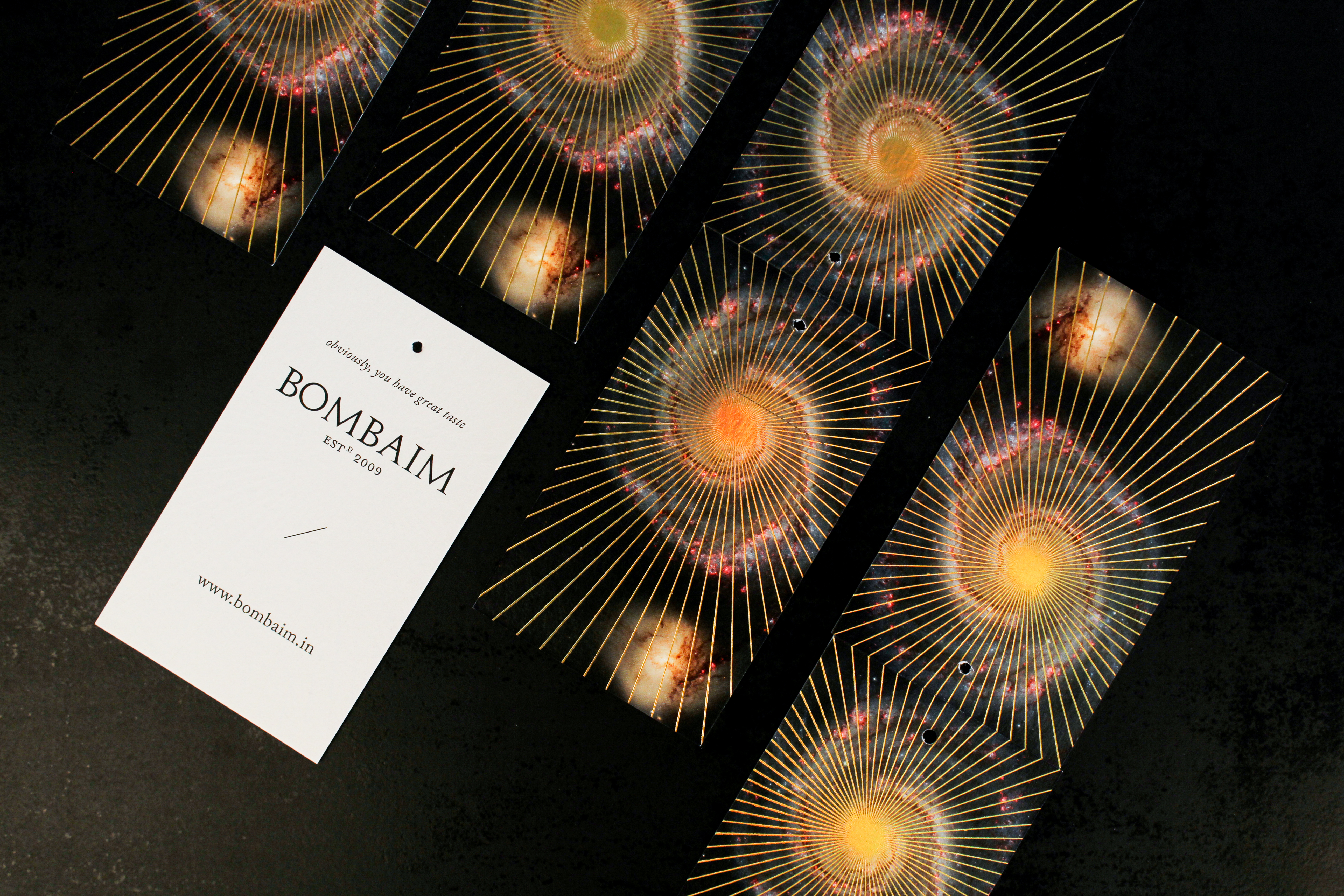
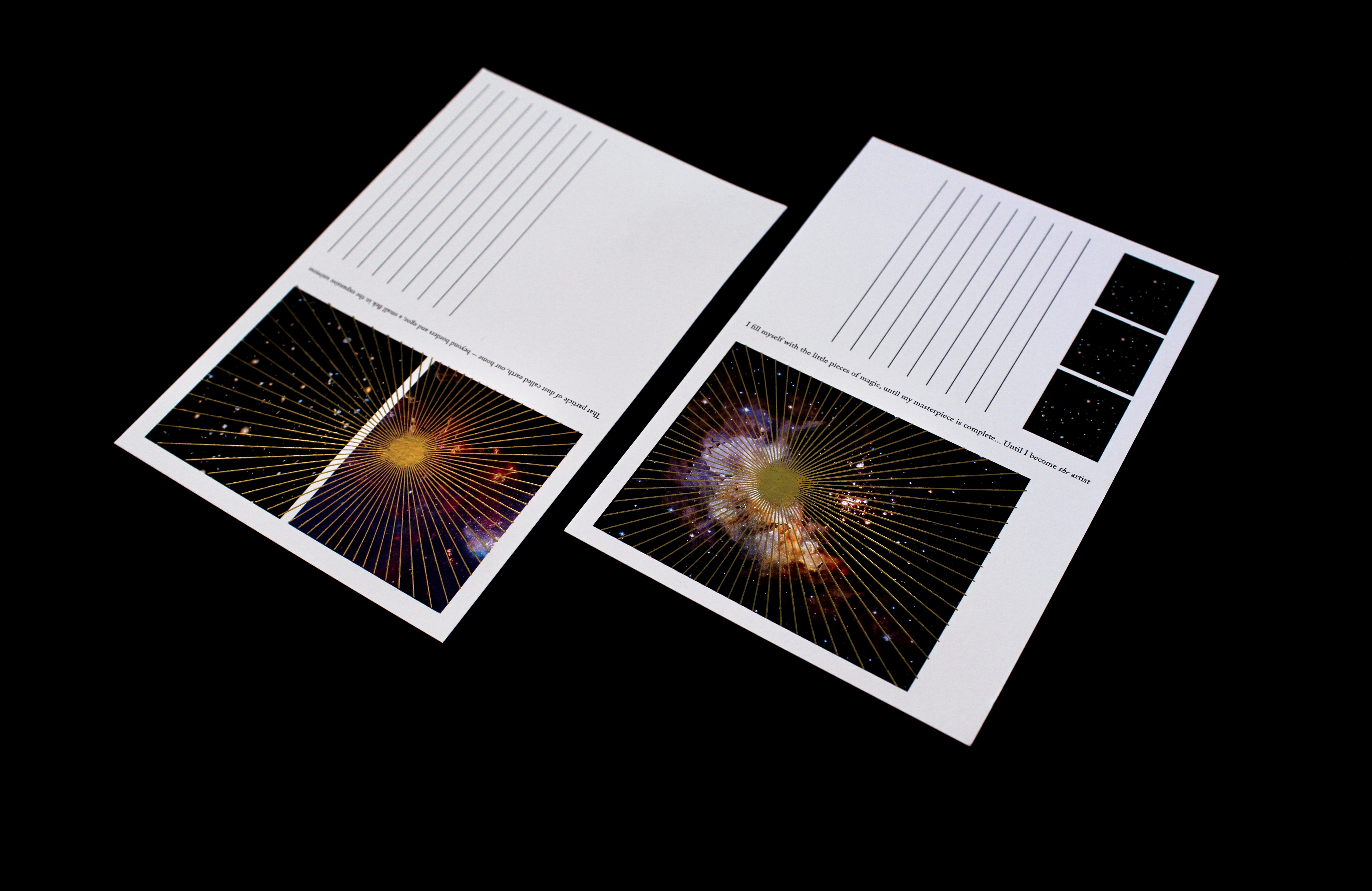
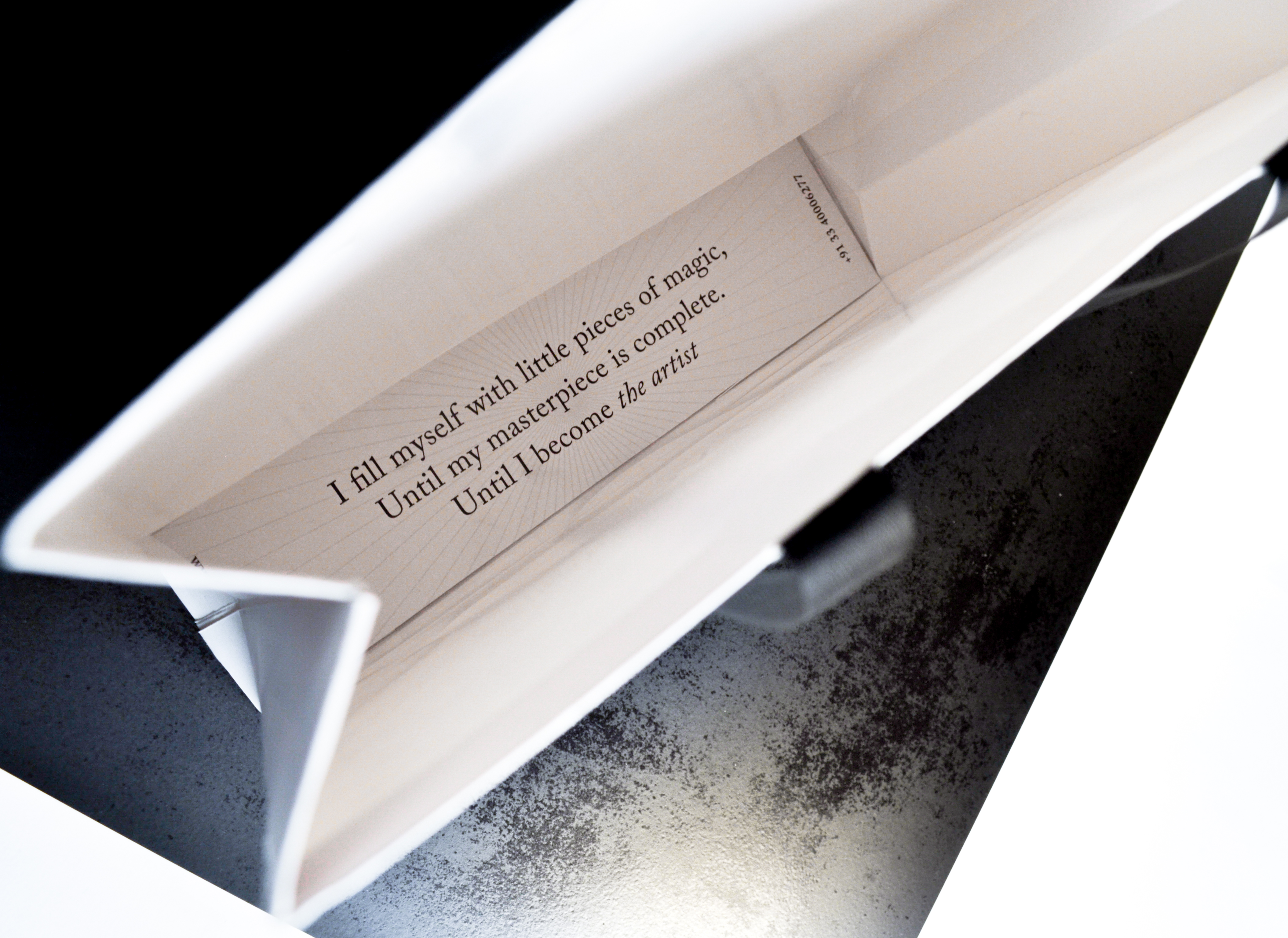
For the collaterals, consistencies were established. Tags and postcards used high resolution images of galaxies (so generously made available by NASA) and textured with a holographic gold foil radial.

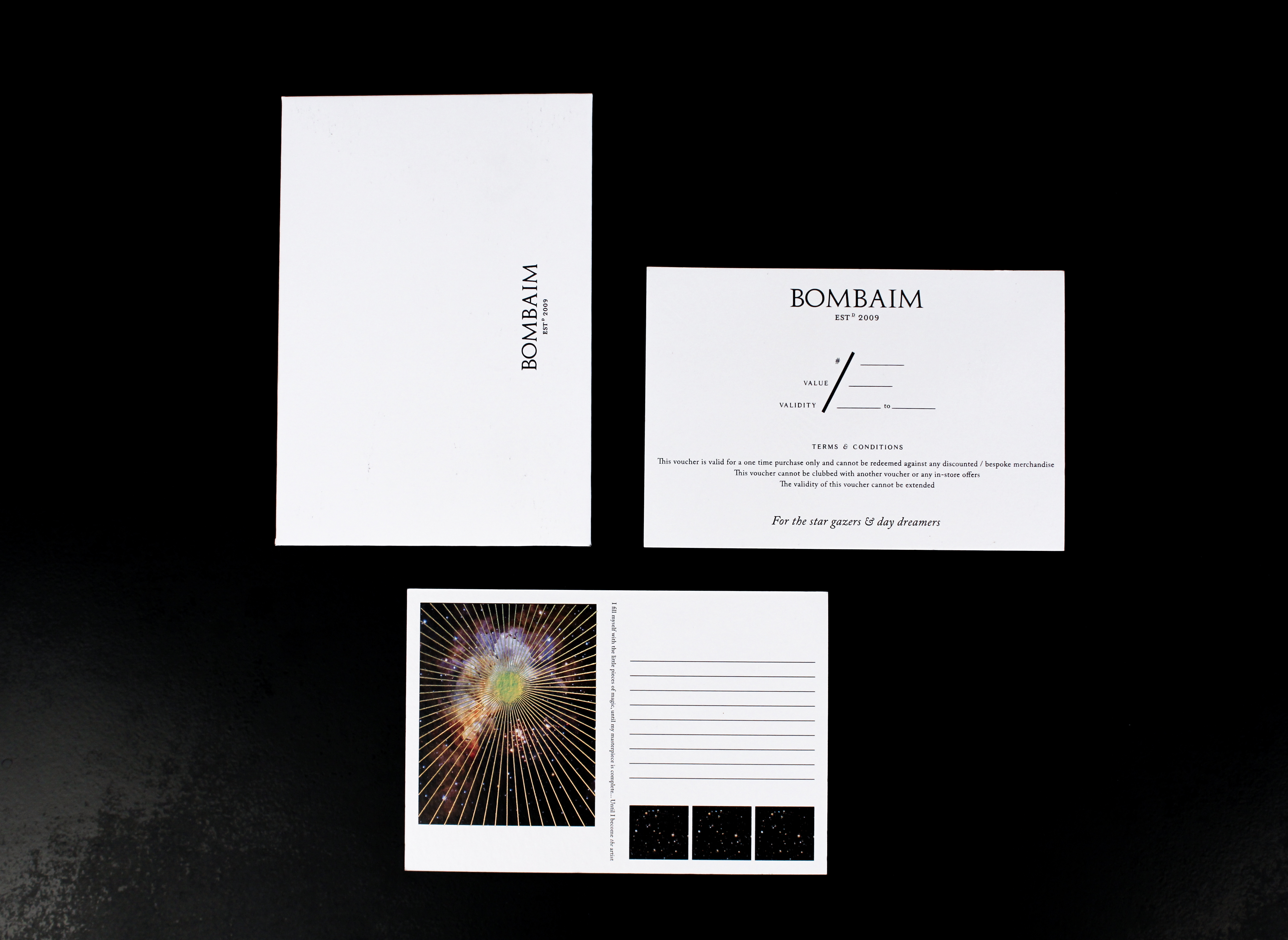
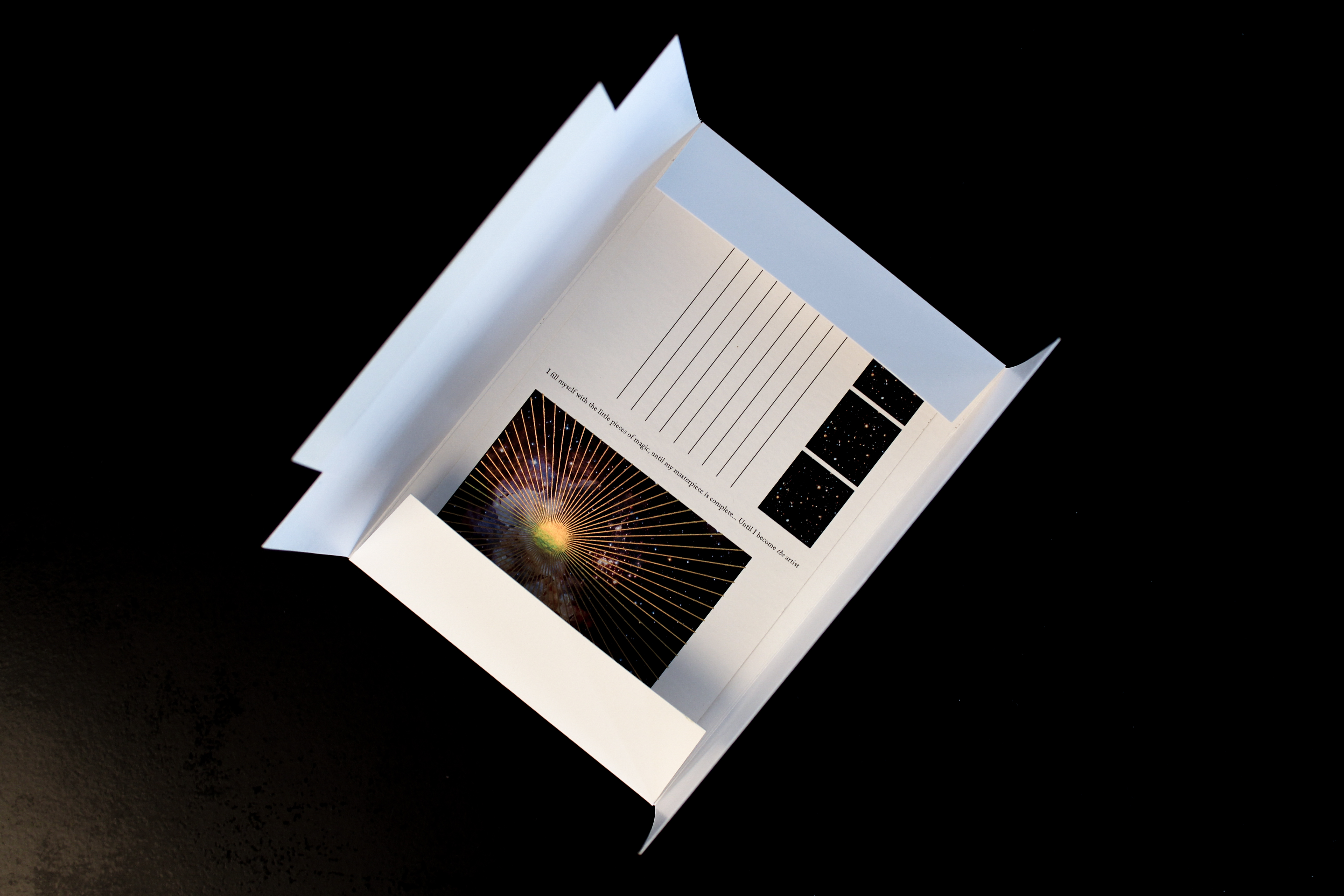
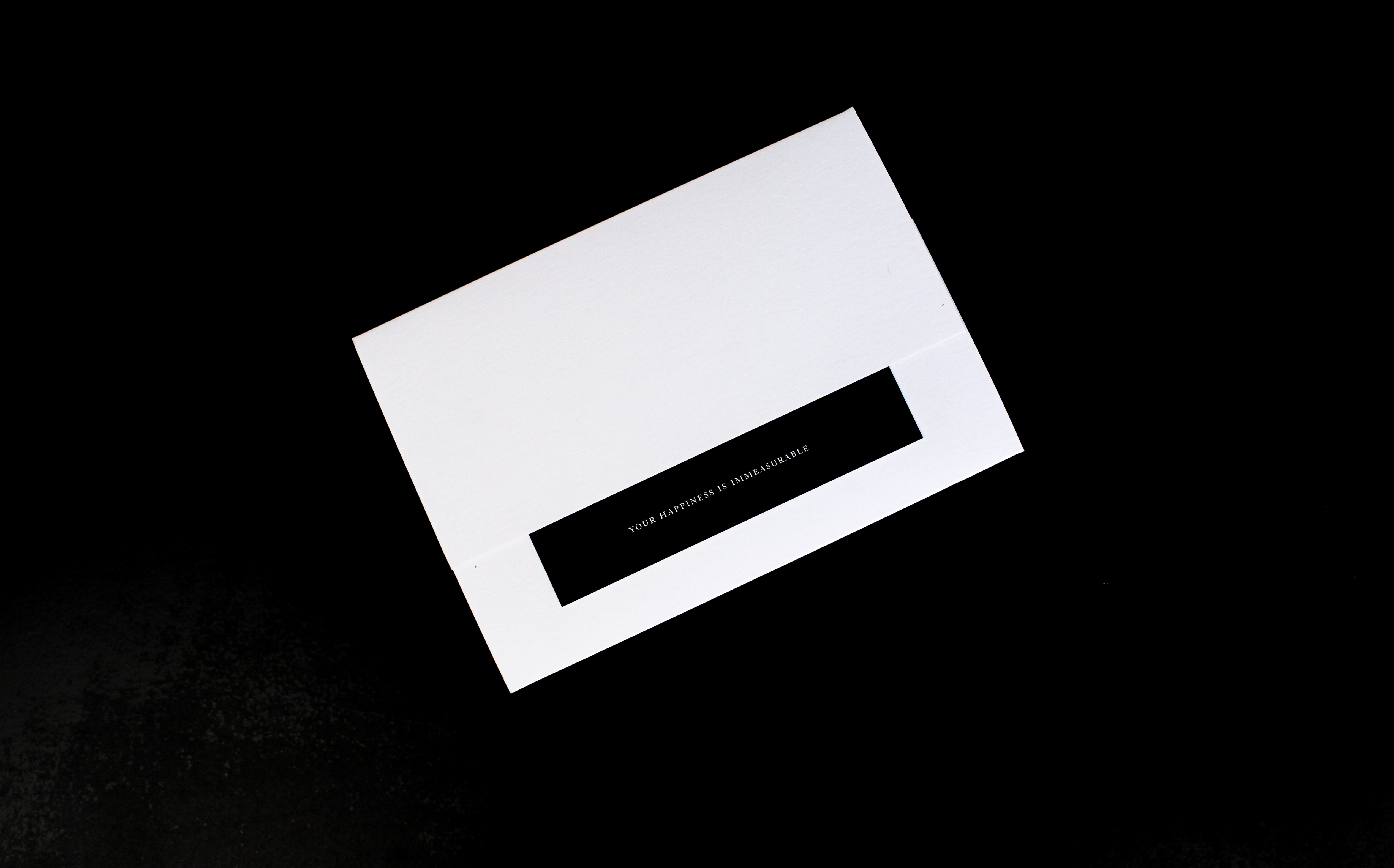
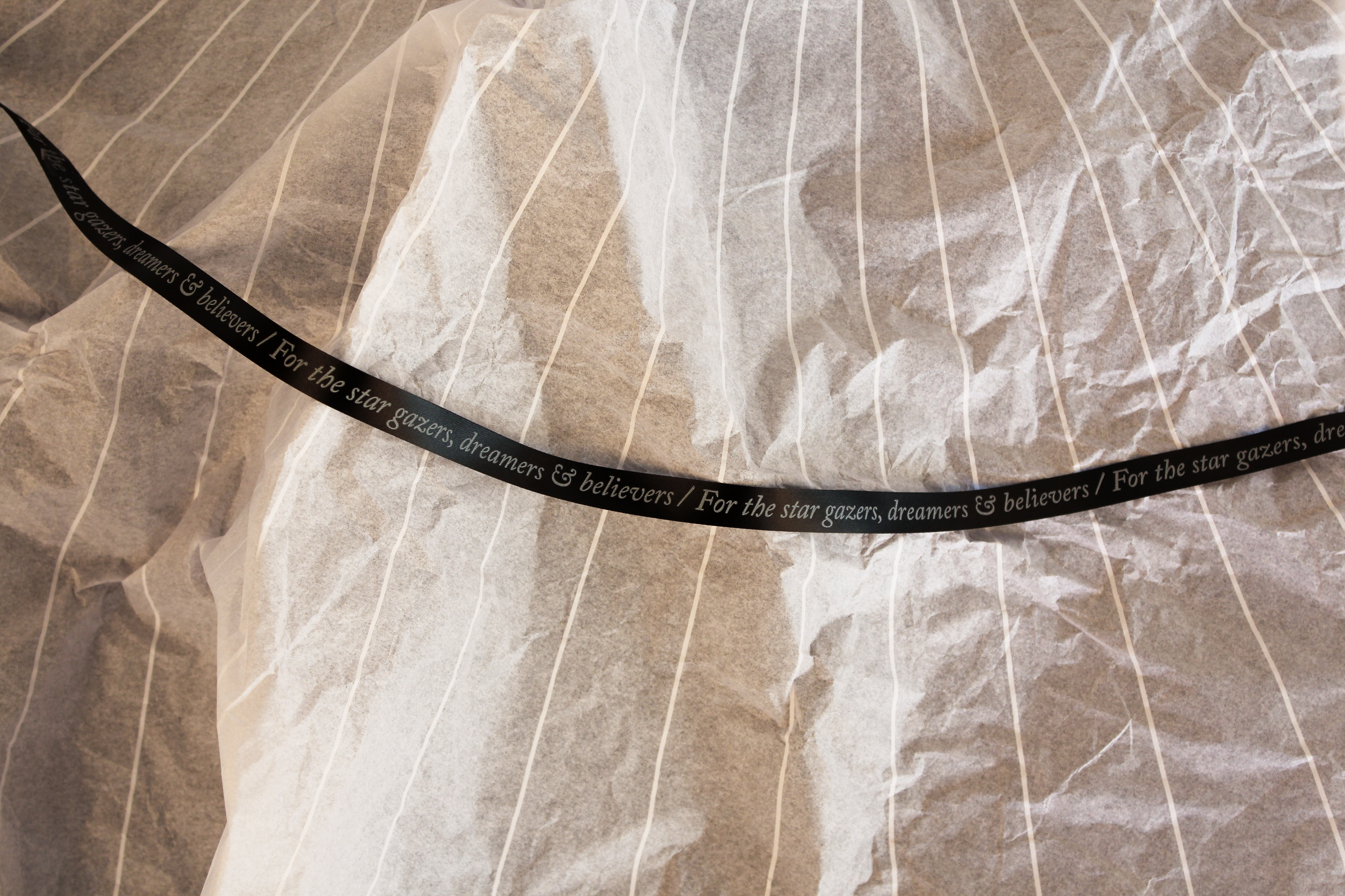
All envelopes and packets were kept a pristine white and punctuated with smart, short phrases. These catchlines were hidden for discovery in select places too –
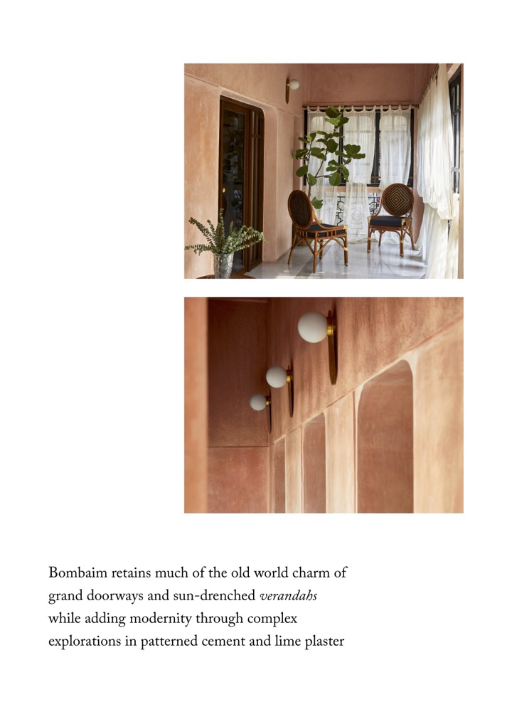
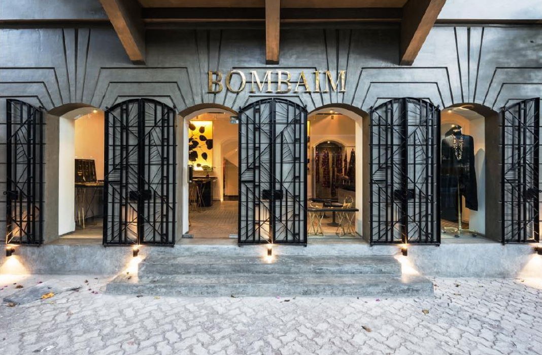
Bombaim, the space, the magic, the feeling, is when Art Deco met Metropolis and found visions of cupric stars on that mid - summer night — to dazzle and hypnotise.


brand manual