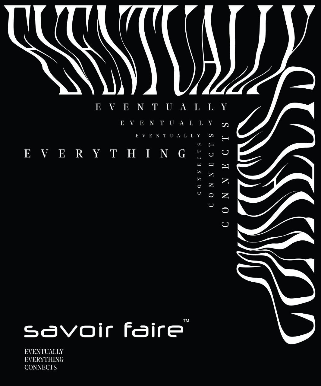
this is luxury - savoir faire winter festive 2018
visual identity and space design
curated by
Gauri Bajoria digital advertising partner
The Hip Element on site production partner
Eventz Inspiredcampaign photography & FILM
Uma DamleSavoir Faire is Calcutta’s only standout luxury exhibit that showcases timeless, modern and novel fashion and design.
The concept for their winter festive edition — This Is Luxury — is an attempt to add emotive value to a term that’s often used to represent decadence. The campaign visualises this by juxtaposing the exhibits’ grandeur with frivolities that make life worth living.
The concept for their winter festive edition — This Is Luxury — is an attempt to add emotive value to a term that’s often used to represent decadence. The campaign visualises this by juxtaposing the exhibits’ grandeur with frivolities that make life worth living.
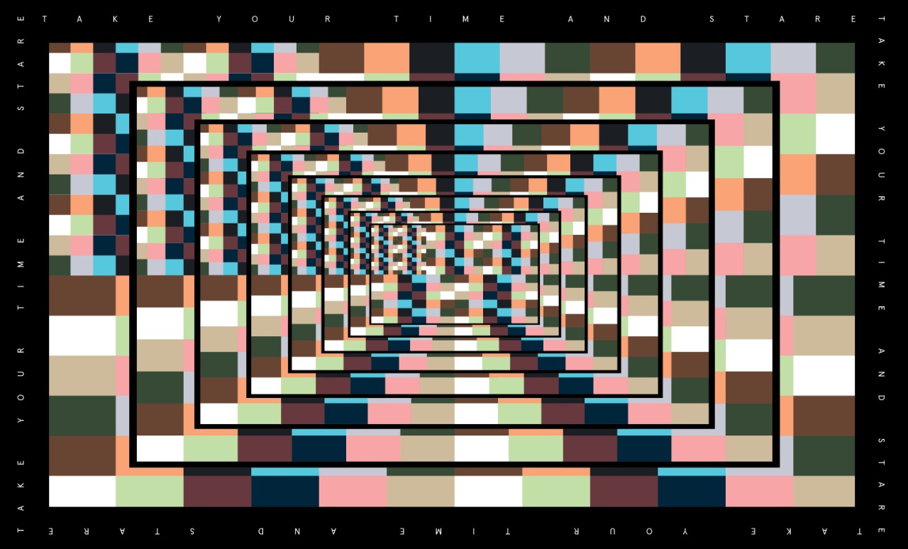
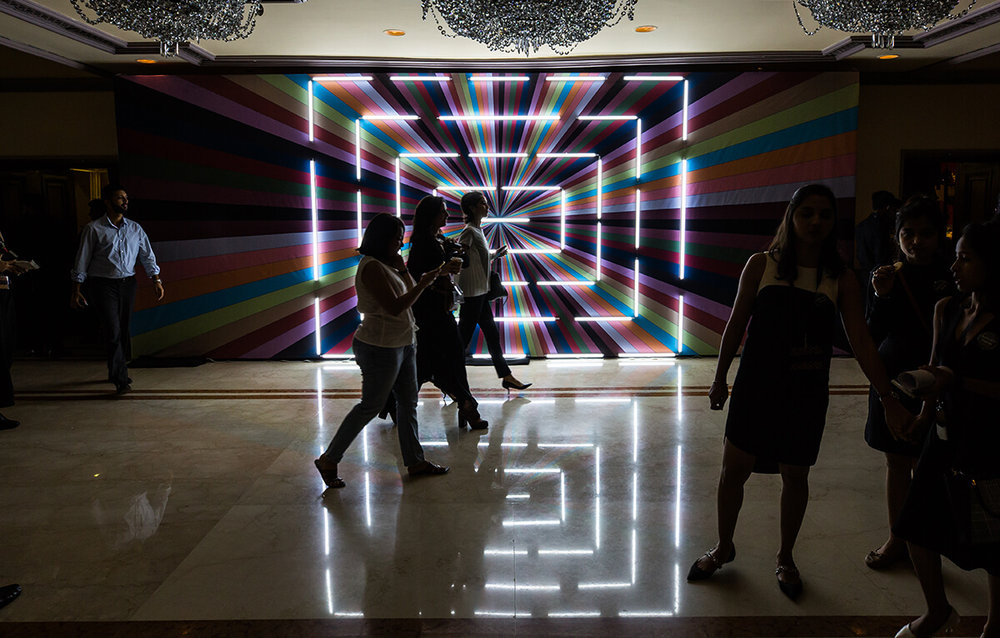
For the designs we aptly combined a bold transitional typeface, Noe Display with the subtle and simple Apercu. The campaign mood was conversational with bursts of videos that encouraged viewers to stop and stare. The primary design language is inspired by mathematical sequences, philosophy and that grey area in between.
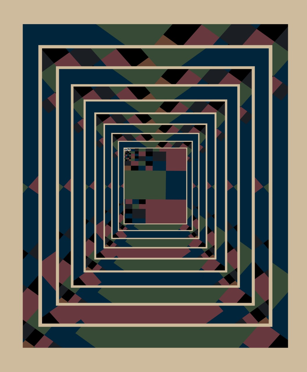
Trippy Perspectives — A series of posters (shown below and the cover on top) designed by The Space At 9/2. It is a visual retelling of the Fibonacci Sequence, when viewed through kaleidoscopic eyes. These have been commissioned by Savoir Faire for use in digital media and a publication (coming soon). PS - #SafeTripping
The direction for the photo series was to keep it dark, contemplative and brooding —
Started in 2009, Savoir Faire is a purveyor of quality craftsmanship and is driven to provide retail excellence to its visitors and participating designers.
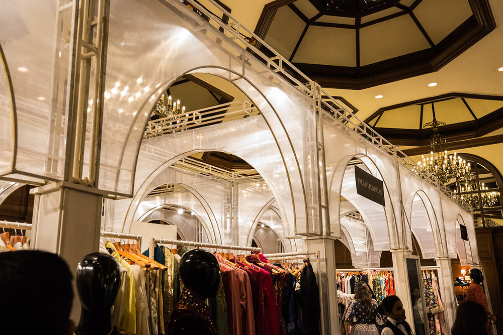
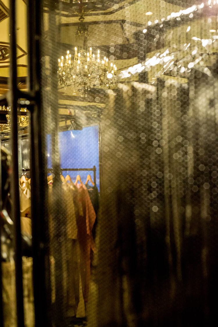
The banquets at Taj Bengal, Kolkata were approached with a practical outlook, ensuring that the designs didn’t interfere with the main aim of the exhibit — retail. The elements and styles were strong juxtapositions: Arches + industrial; sheer fabric + metal sheets and acrylic.