ypo — Calcutta tHEME 2021
brand identity development


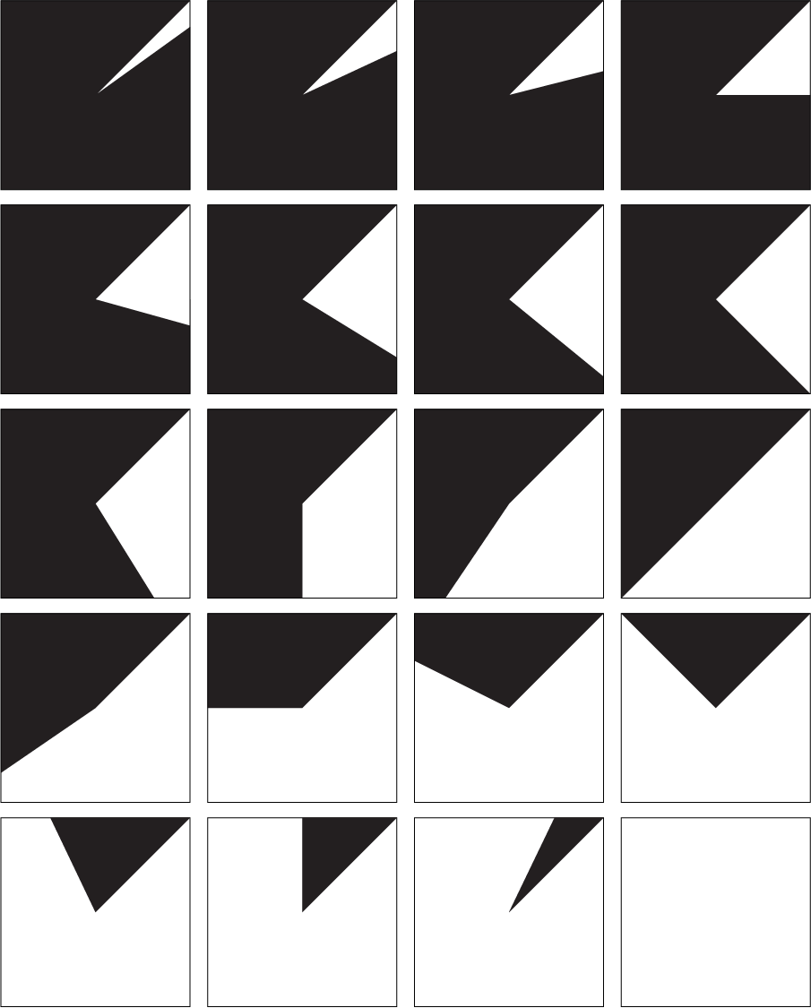
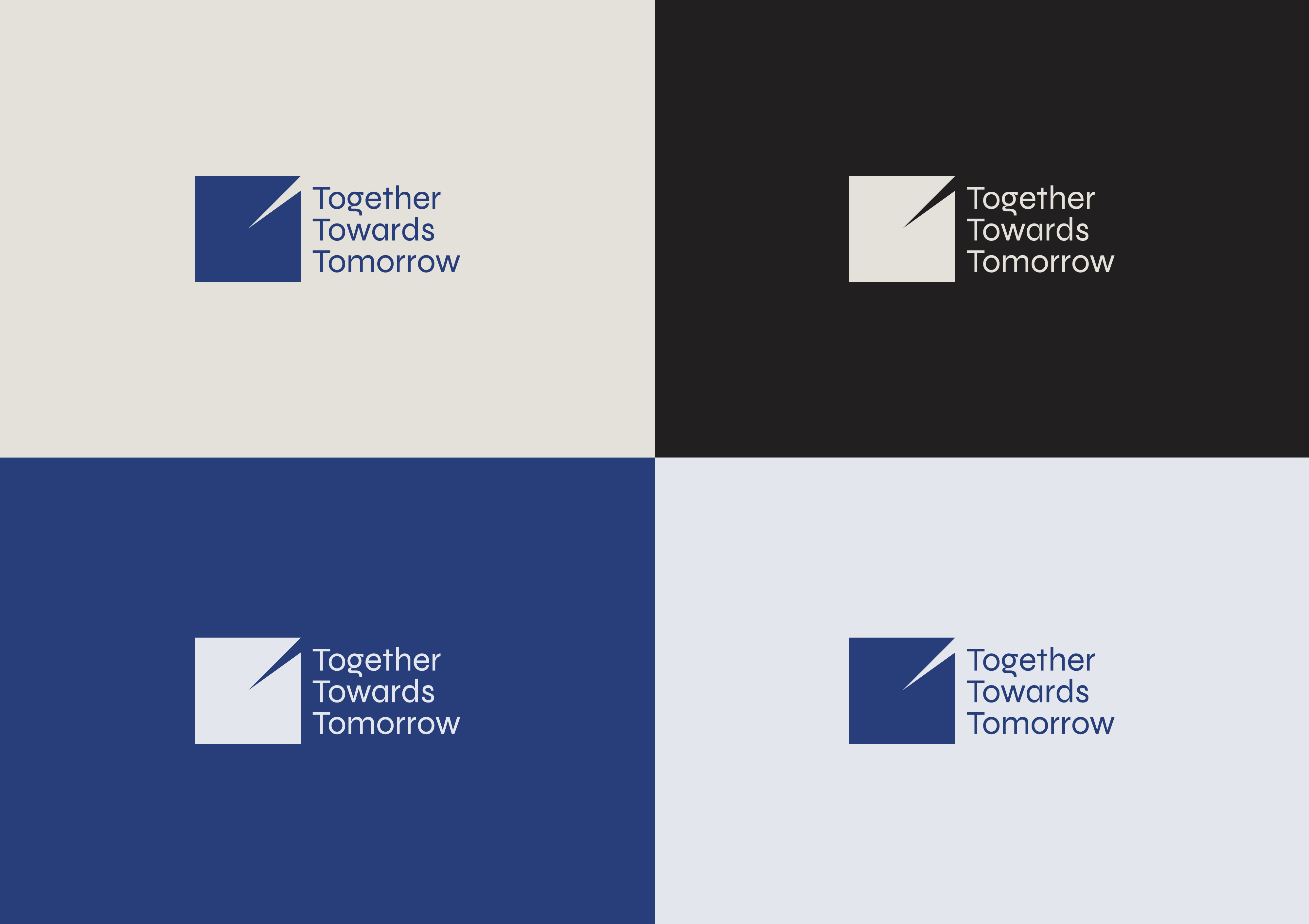
Designed to embody the idea of a ticking clock to fit the theme of YPO 2020-2021 — Together Towards Tomorrow. The logo unit can be used alone or stacked together. In motion, the unit can even showcase a ticking clock off various global locations of YPO.
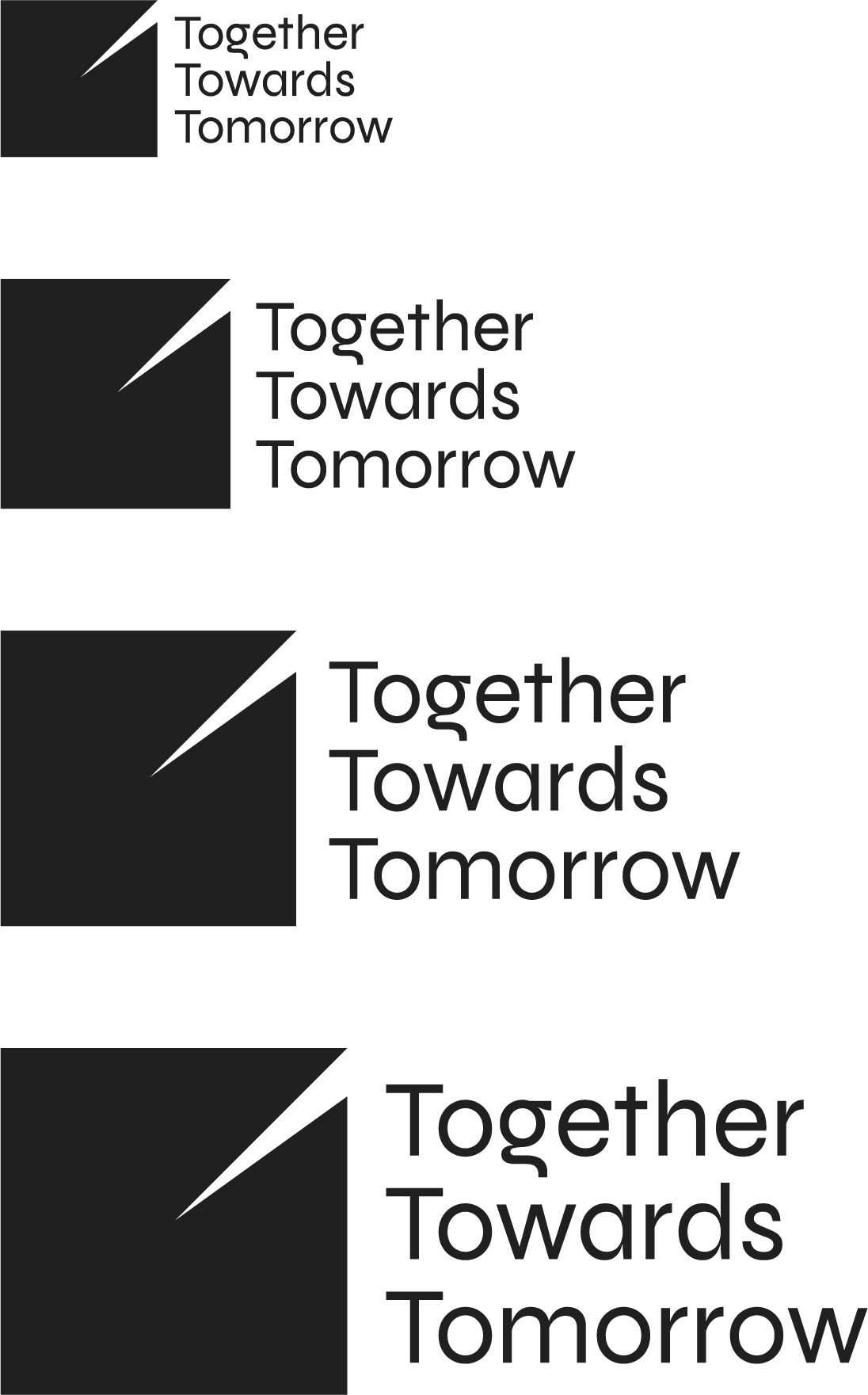
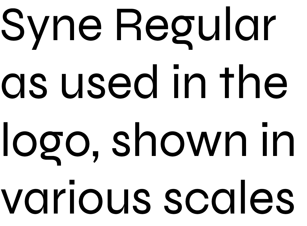
Syne, an archetypal geometric sans-serif was used in the logo for the phrase ‘Together Towards Tomorrow’, When getting bolder, the typeface also gets wider, forcing radical graphic design choices. Syne was conceptualized by Bonjour Monde and designed by Lucas Descroix with the help of Arman Mohtadji. Syne was conceptualized by Bonjour Monde and designed by Lucas Descroix with the help of Arman Mohtadji.
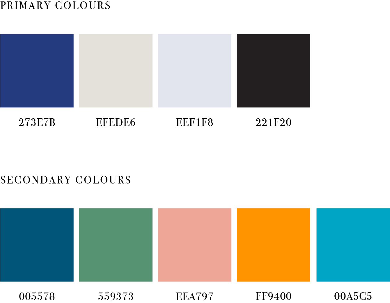

A primary and secondary colour set was developed to add
to the identity. While the primary colours are to be used
for general use, to talk about YPO, the secondary colors are
developed for specifiic verticals as showcased above.
The exclusion zone is designed to maintain clear space around the logo. To ensure clarity, other elements must not include this zone The ratio of the exclusion zone is determined by the X height of the capitalized T from the logo unit. This must remain a constant.


Prefered colour parings for the logo, the only exception being using colours for events using the secondary colour palette.


Looking for a seriously good brand identity? Get in touch

