
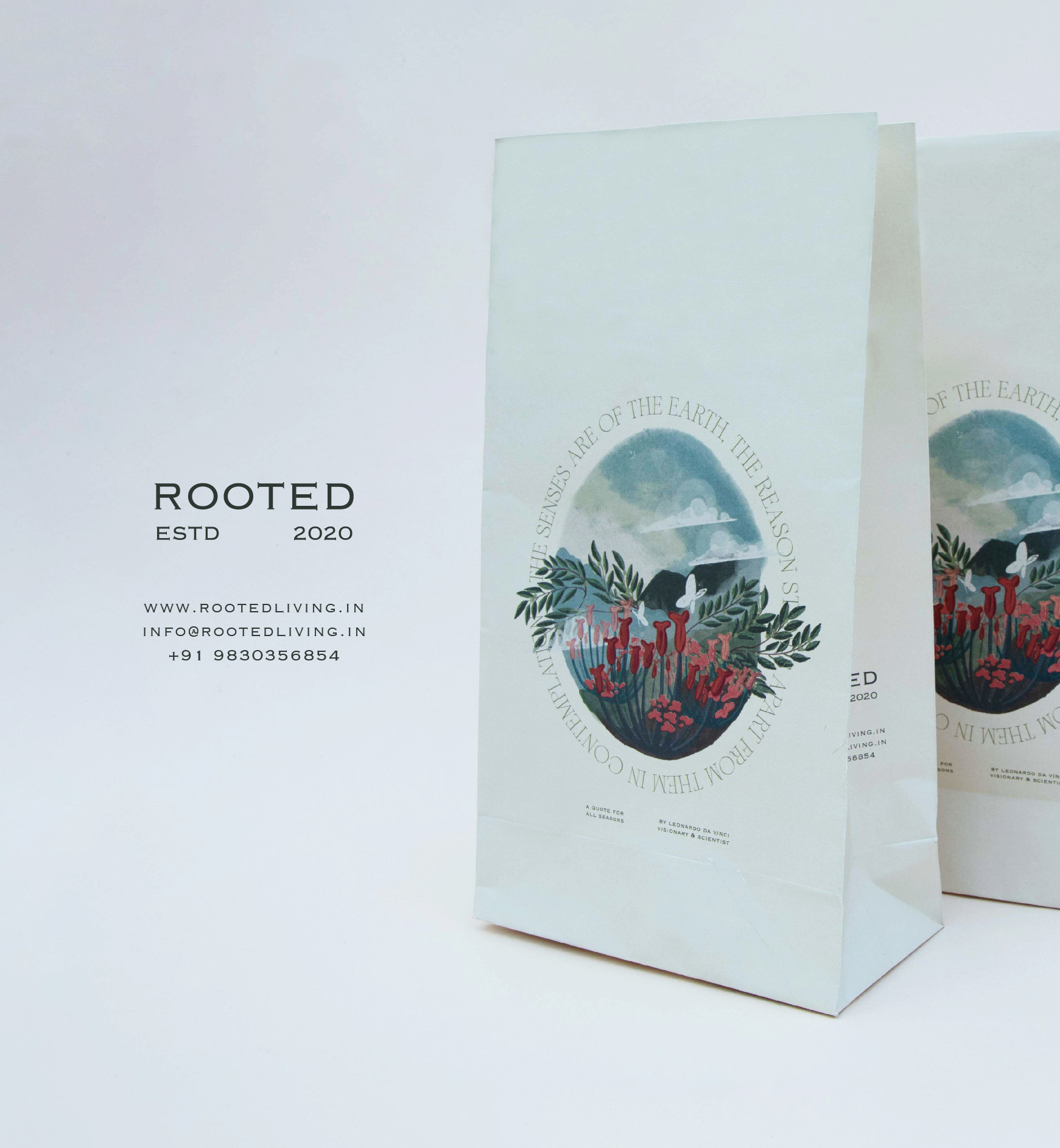
rooted
brand identity and packaging design
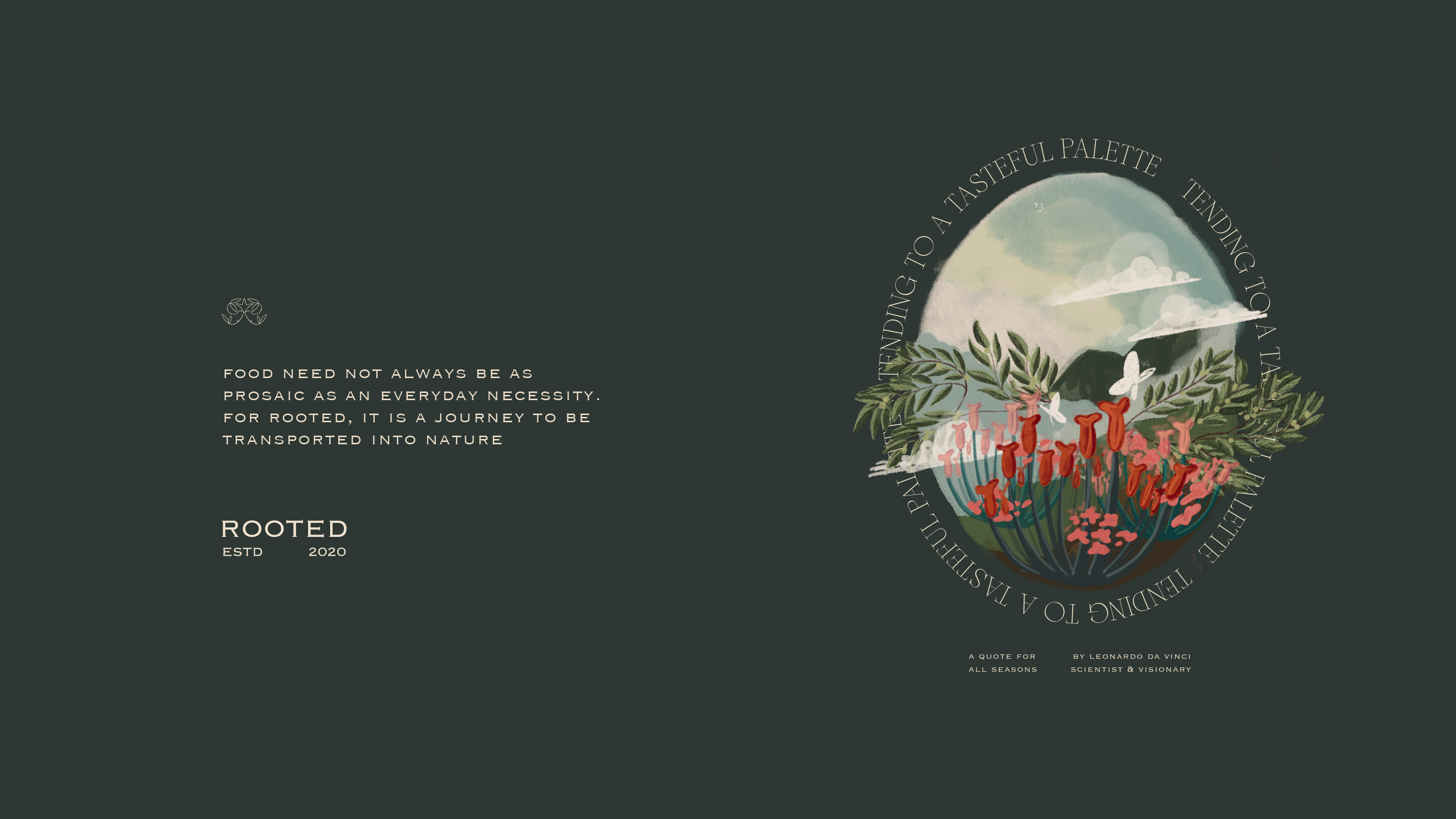
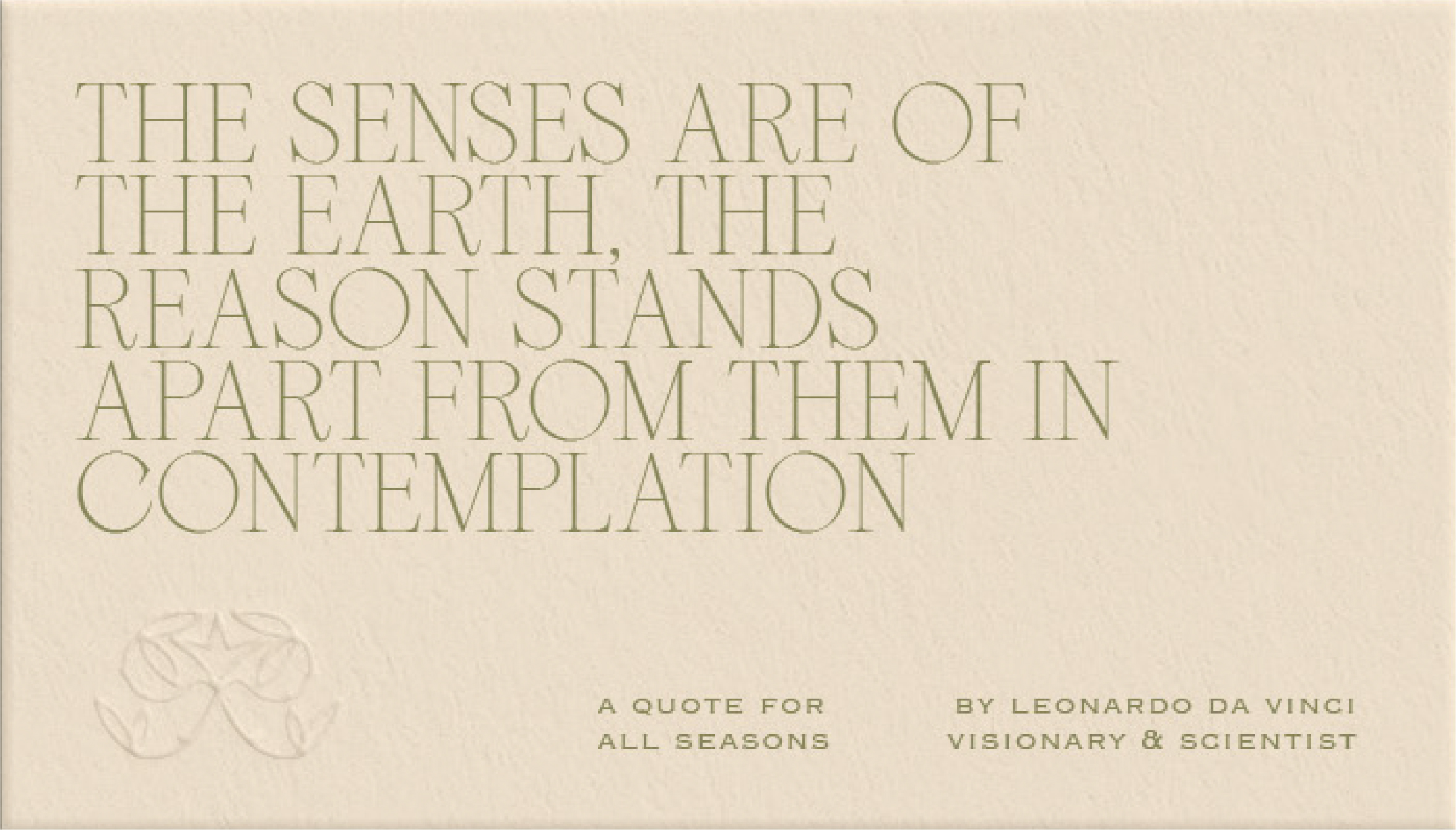
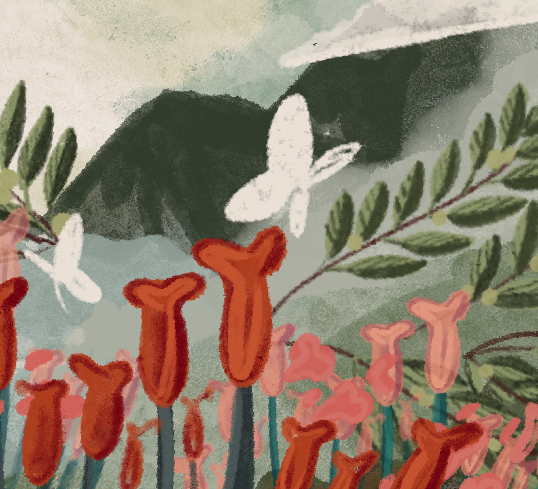
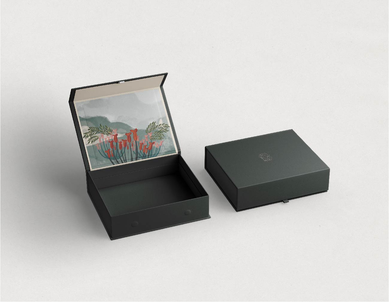
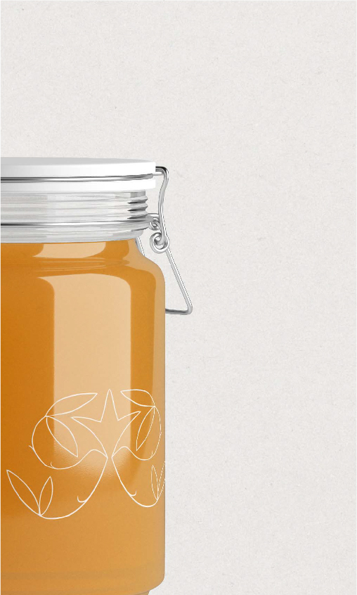
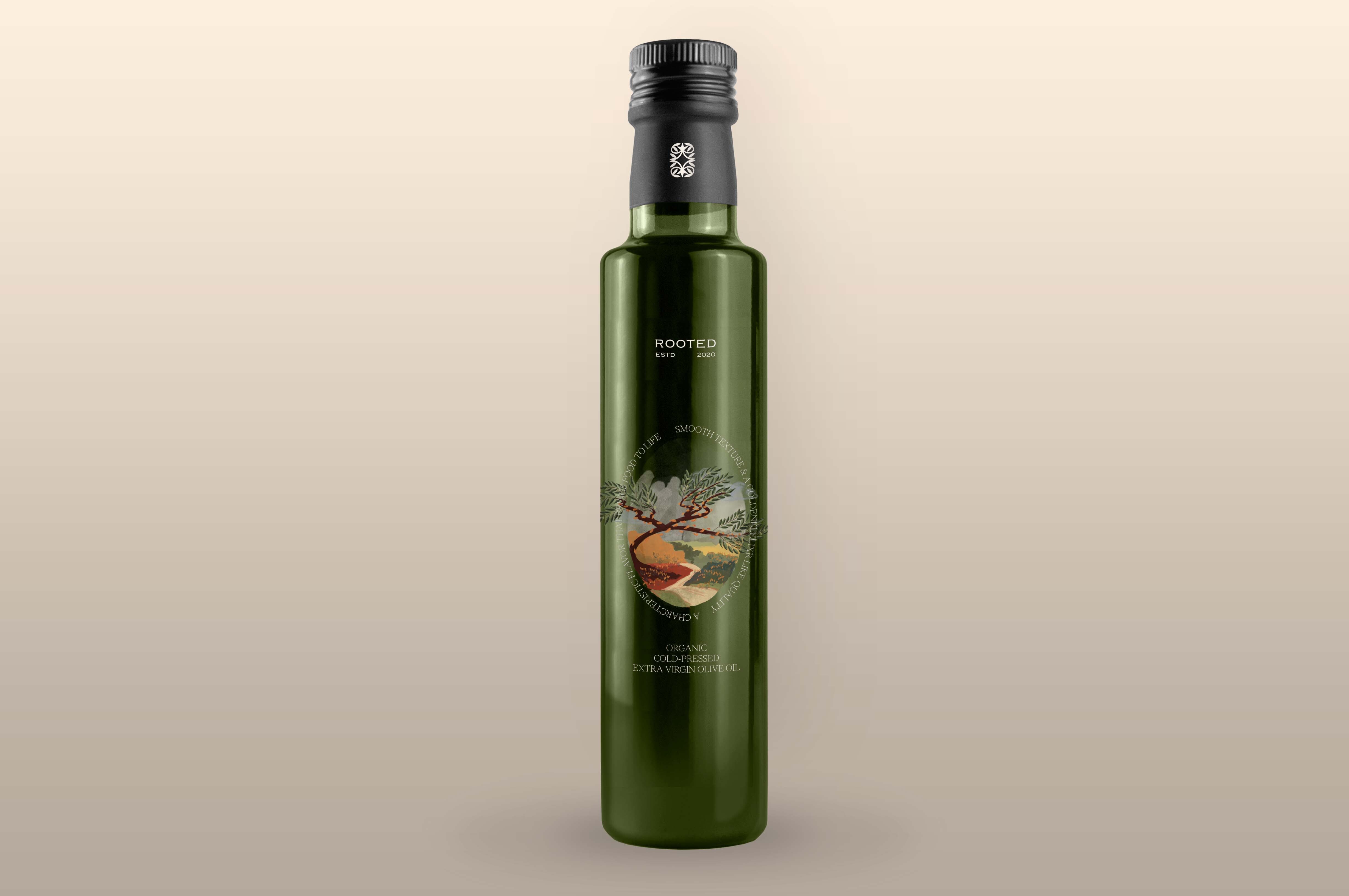
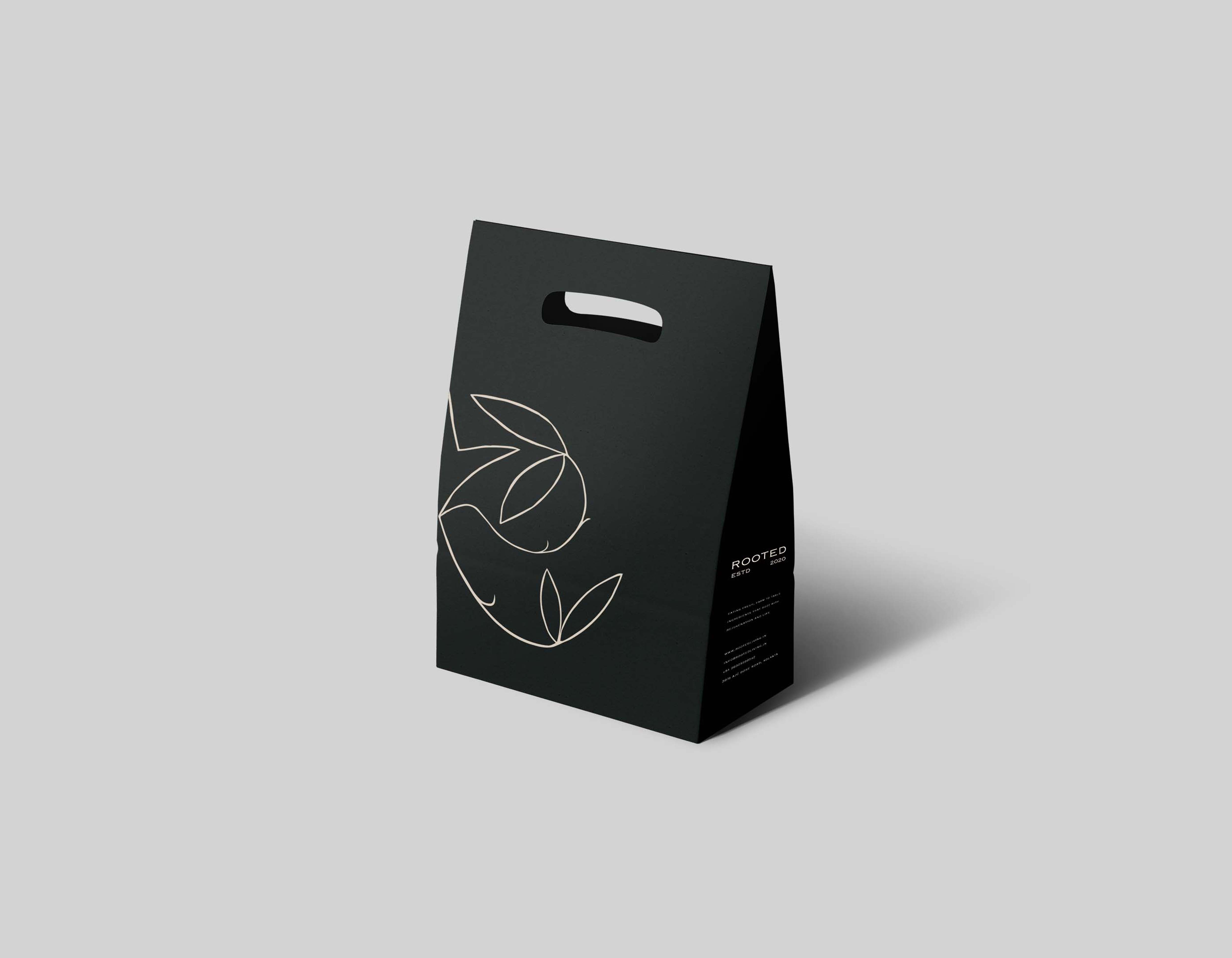
To allow the brand to stand out in an already saturated market, the identity system deviates from the idea of health & wellness, a narrative common in the ‘farm to table’ food space. Rather, it transforms the experience of consuming food into a journey — a window into an inspired and Epicurean way of living— thereby tending to a tasteful palette. The latter also serves as a scrumptious tagline, reminding consumers that food need not always be a prosaic and everyday necessity. The illustration is meant to be a window into a lush landscape that brings together the Fennel flower as well as Olive branches — an ode to Rooted’s keen interest in Indian agronomy but keenly stradling a worldly perspective to gastronomy.
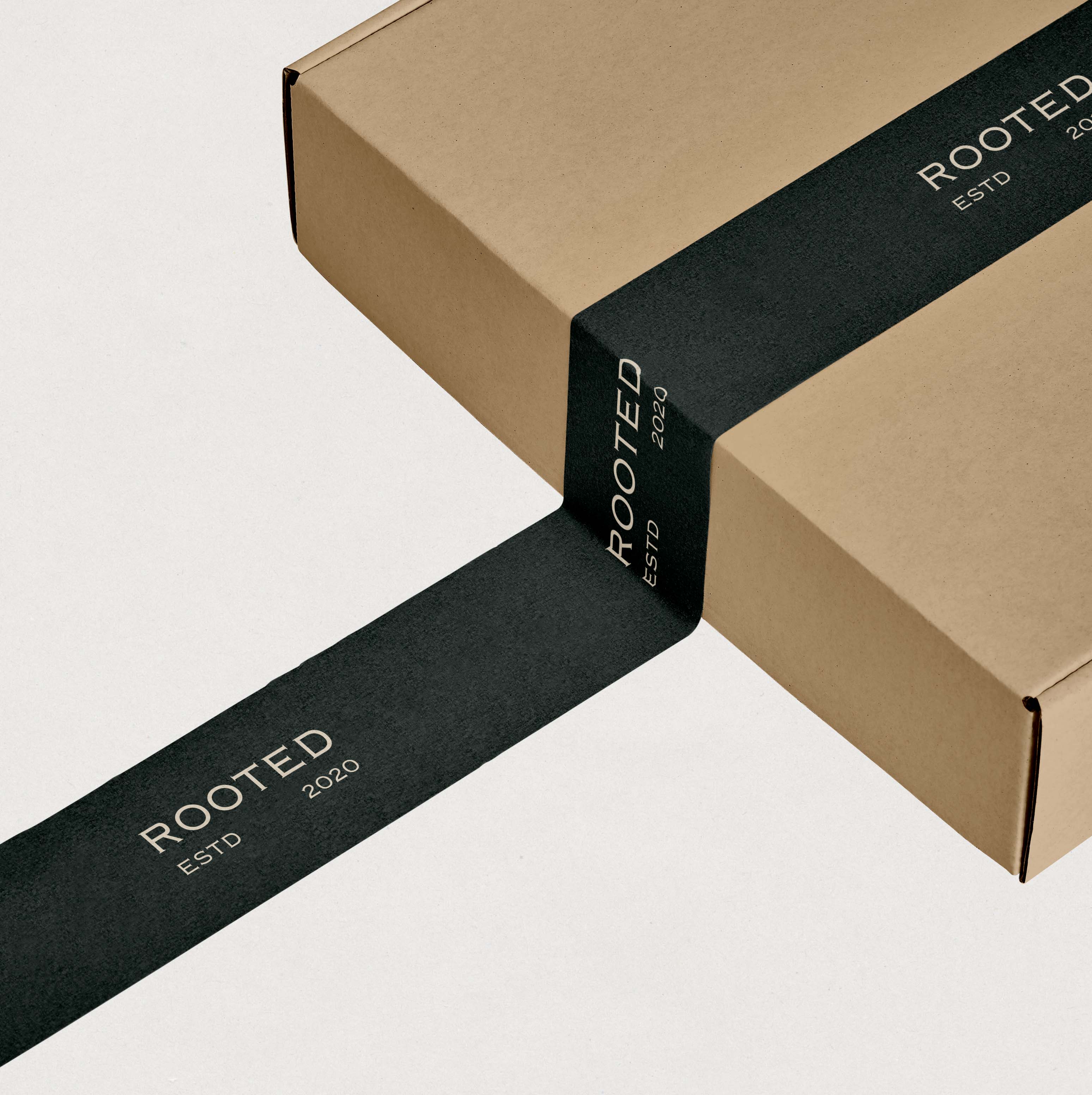
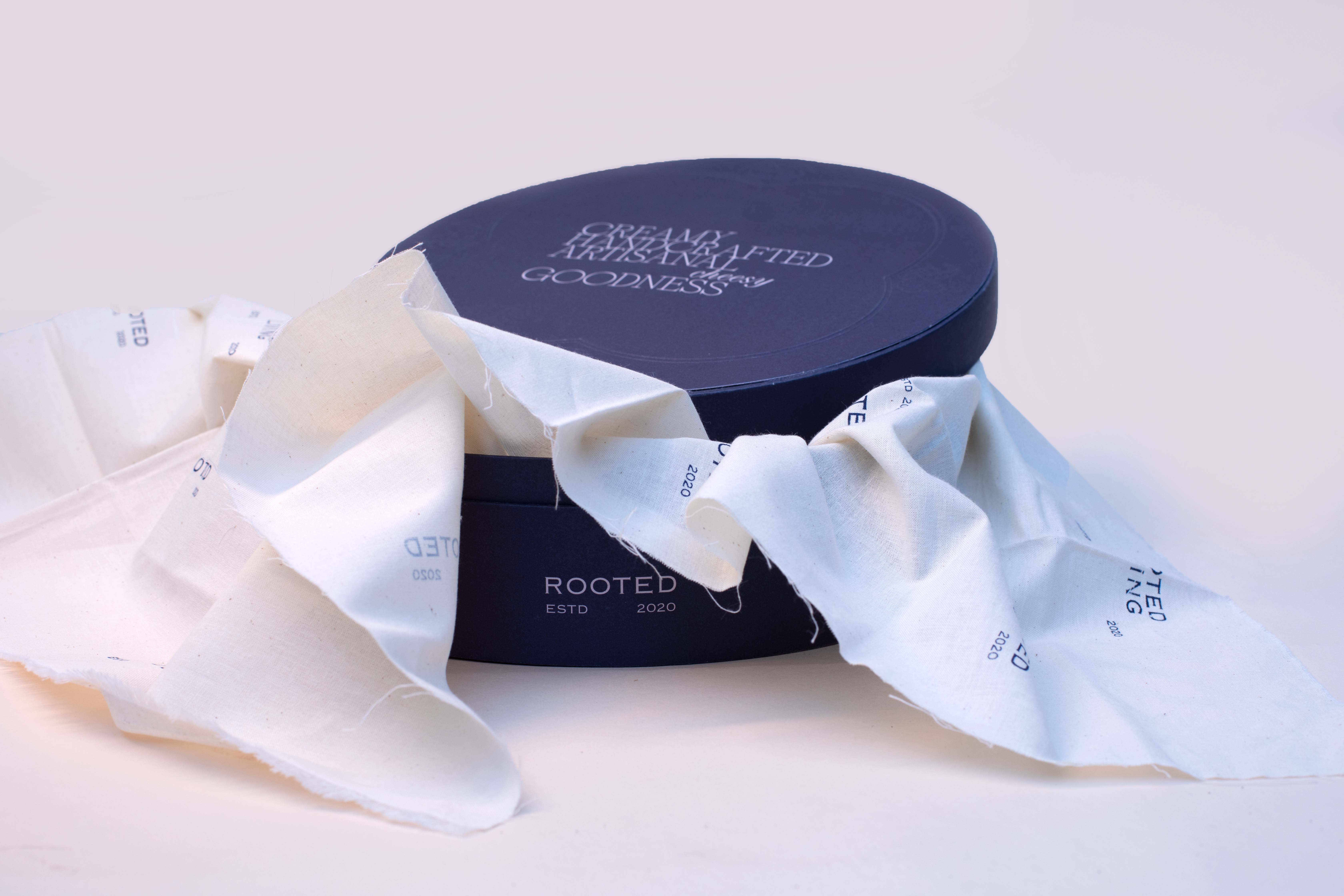
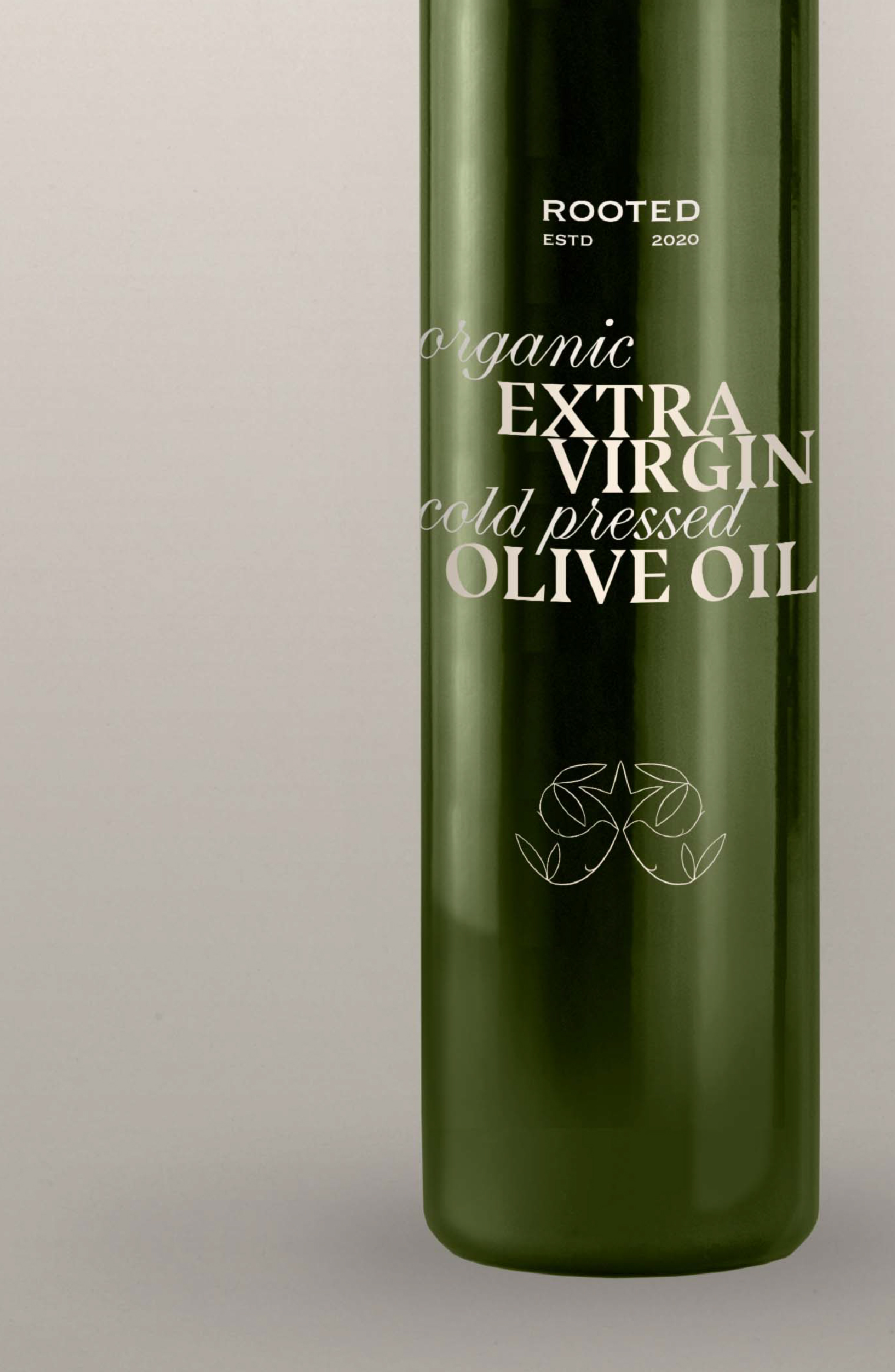
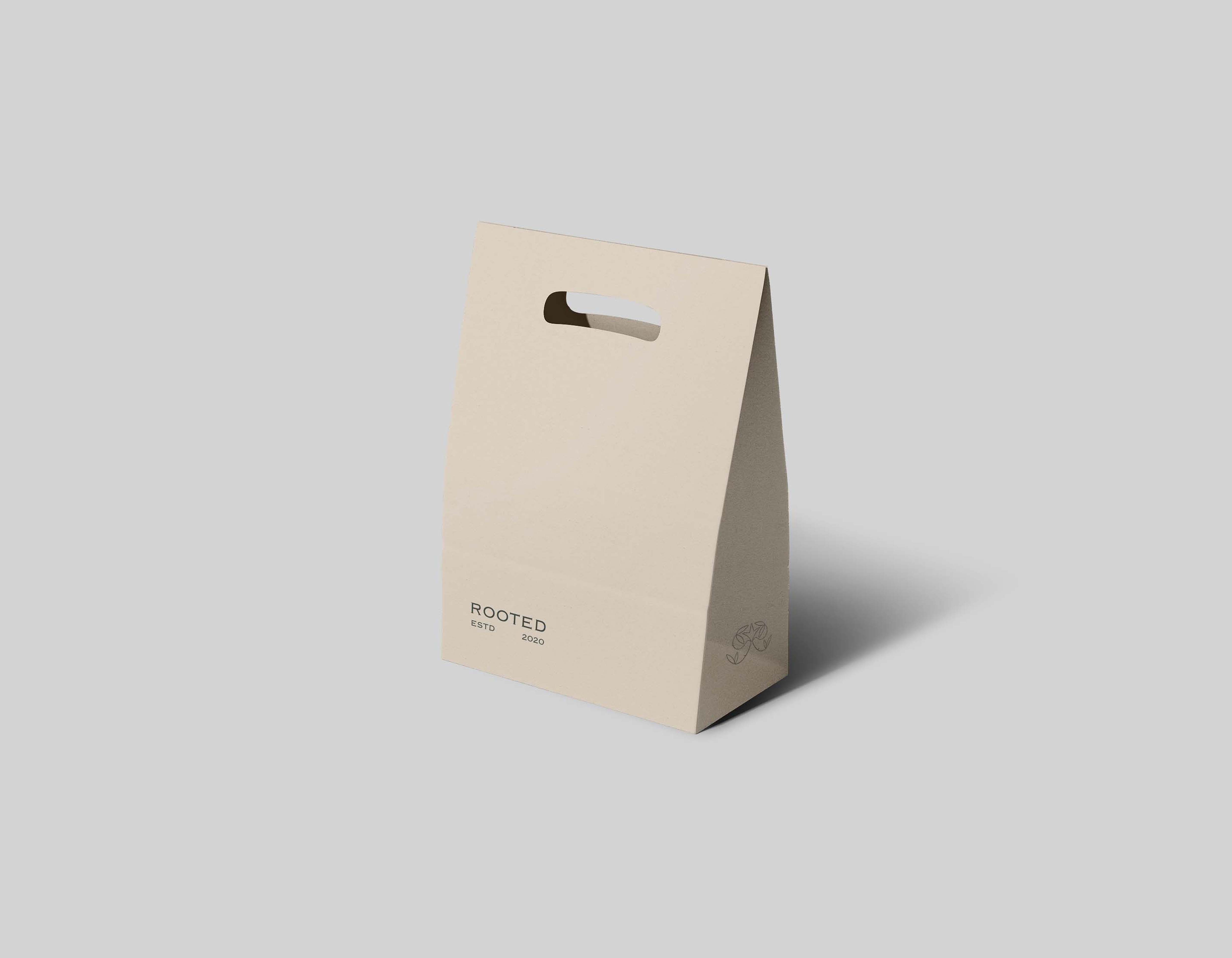
A hand drawn scalable motif along with a classic logo in Copperplate, that work together to create strong brand recall for Rooted. The logo and motif is frequently embossed to give lend tactility to the collaterals
The illustration is hand done with intricate textures – it is used with a lot of consideration to avoid repetition. The bold hue of Rooted’s green is used as a strong colour to complement the intricacies of the illustration. The logo and motif are frequently embossed in use cases to add an element of subtle tactility.


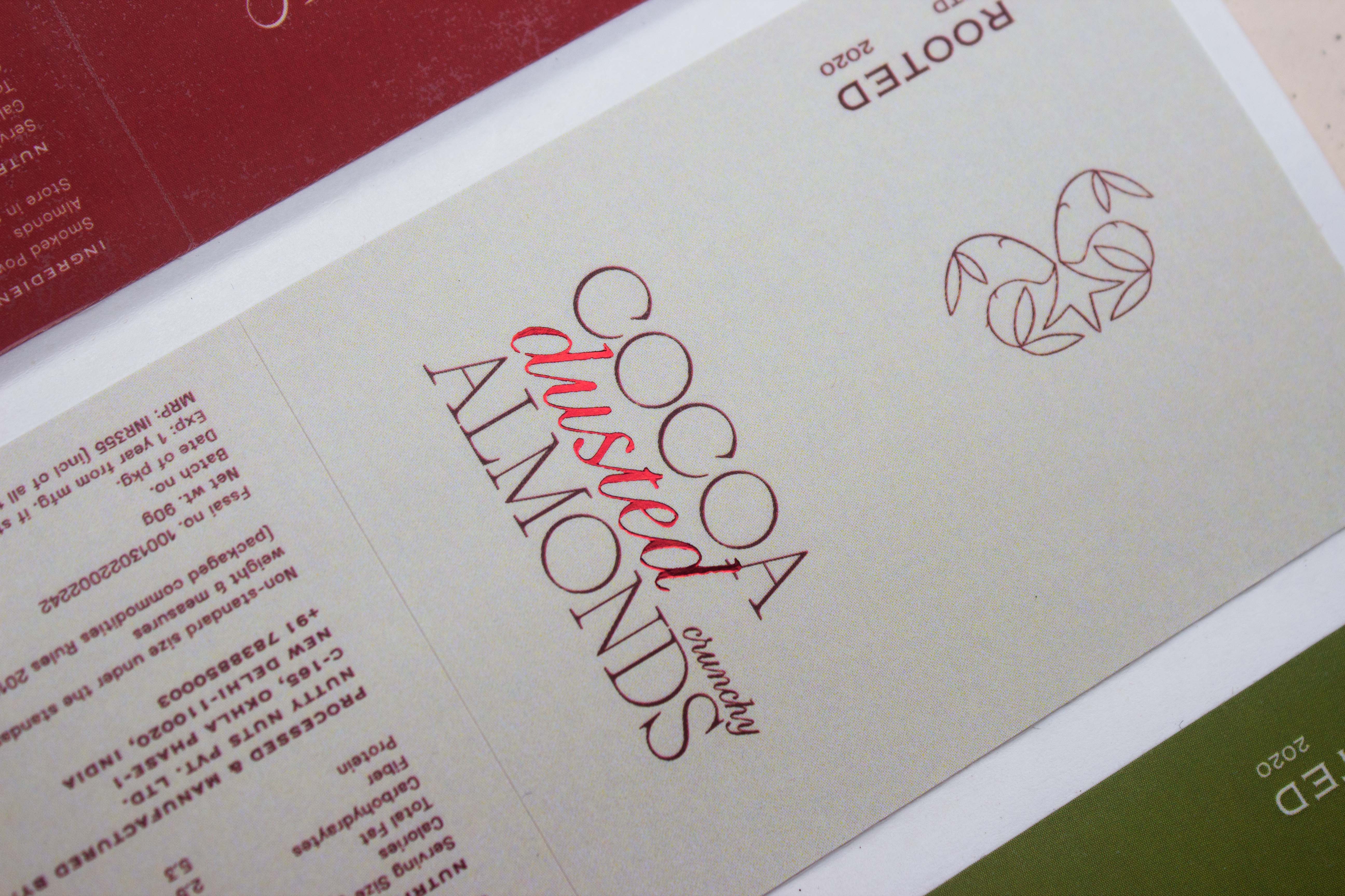
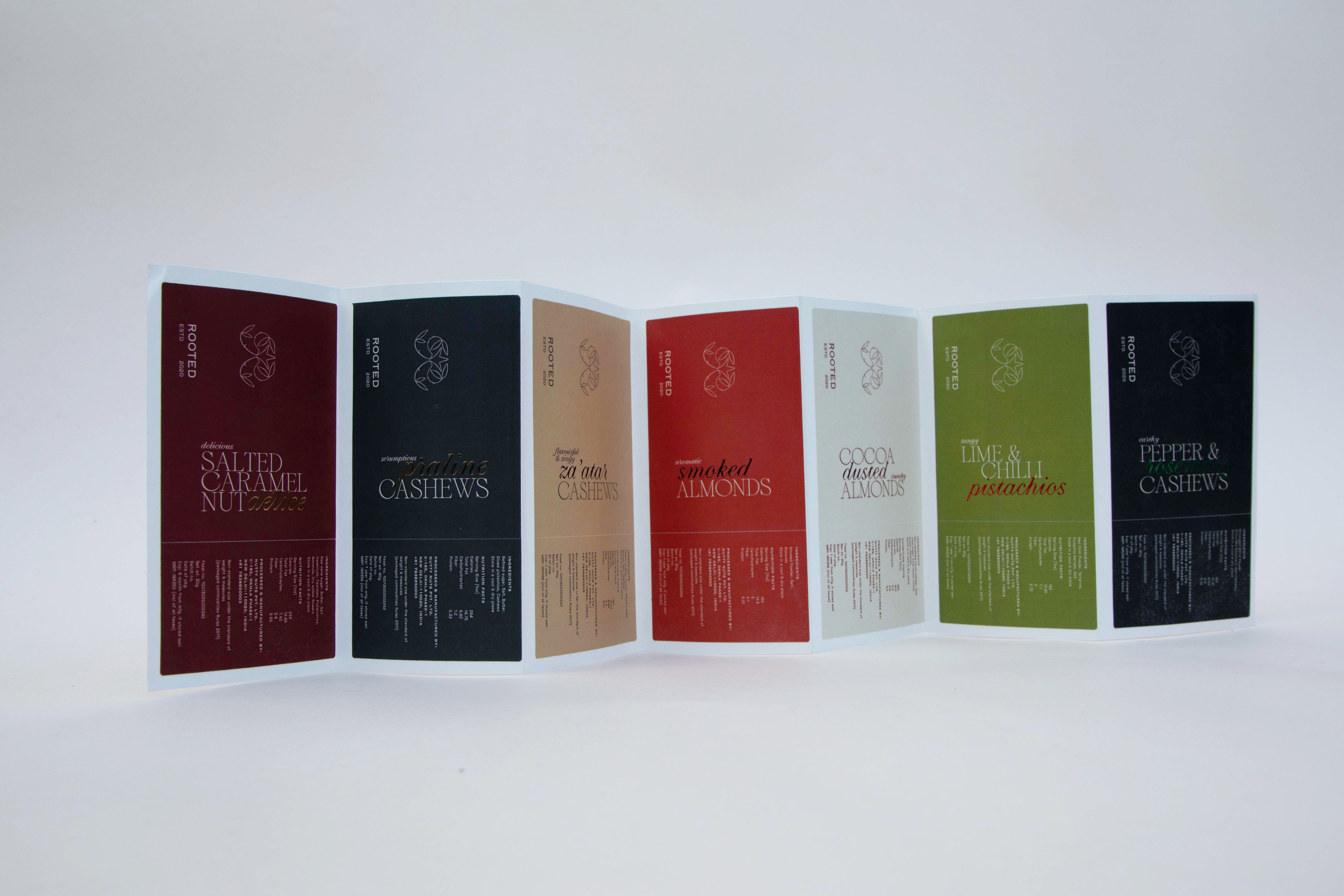
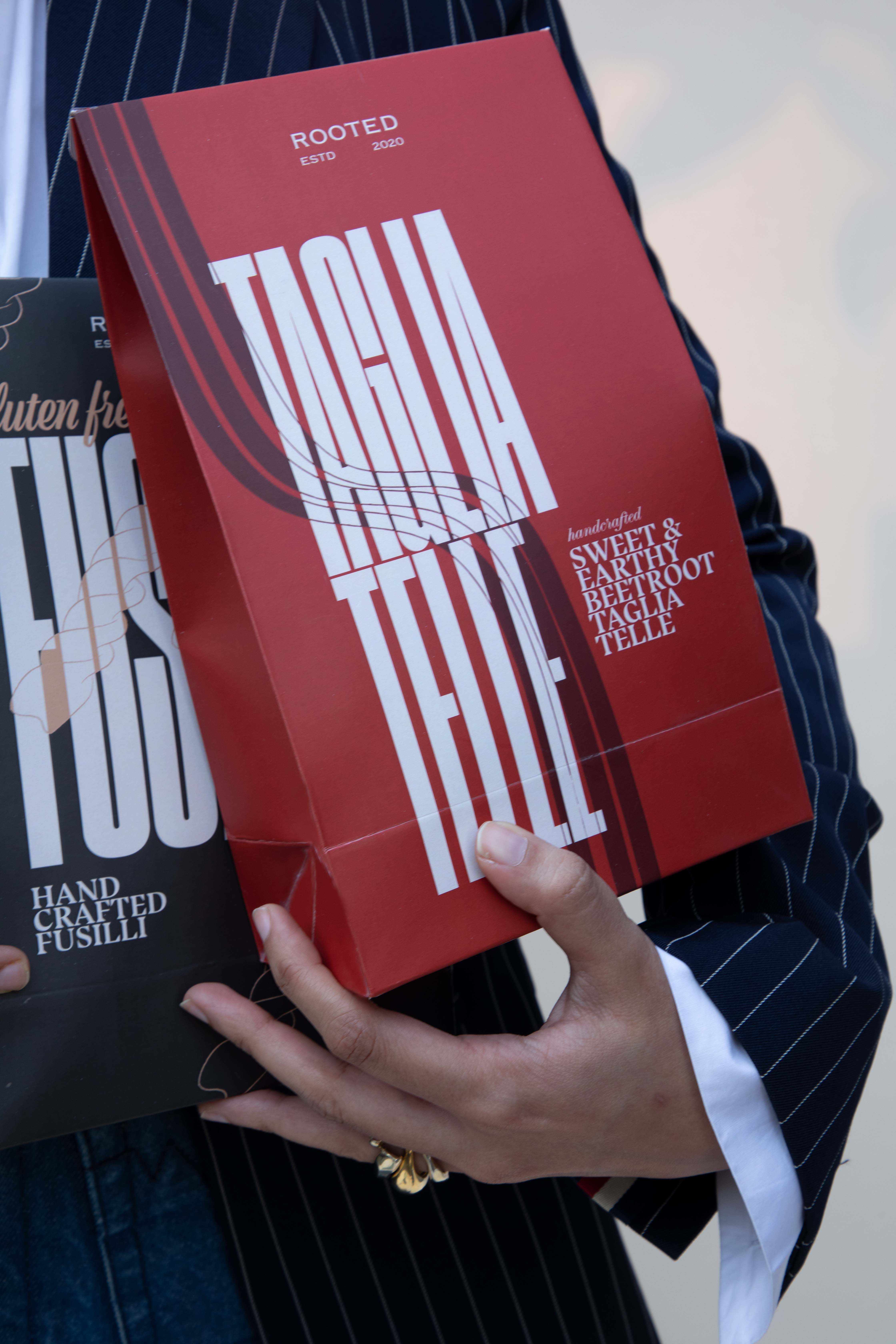
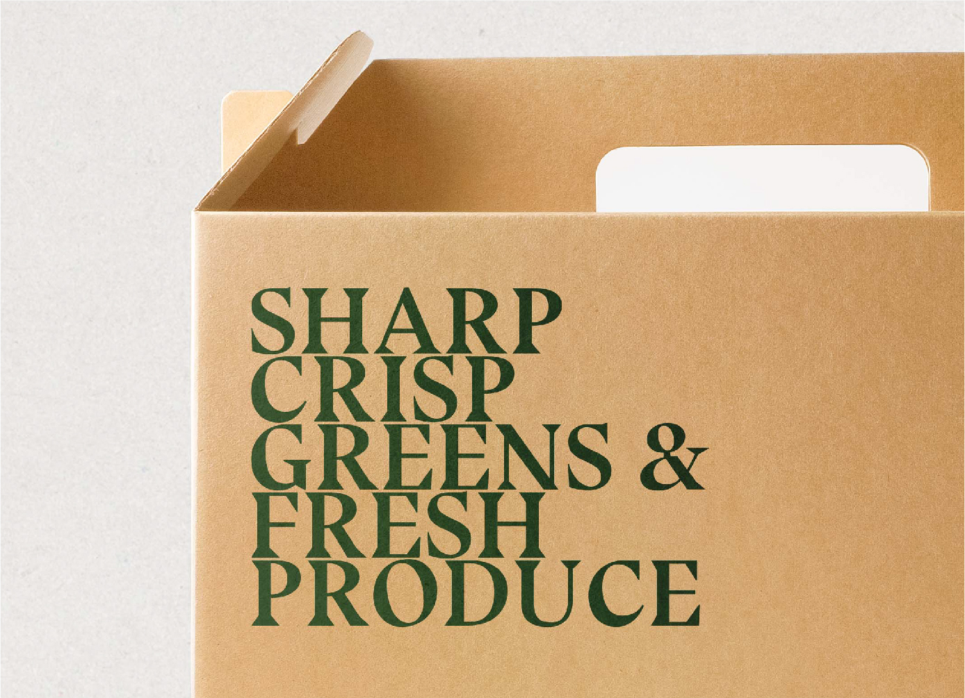
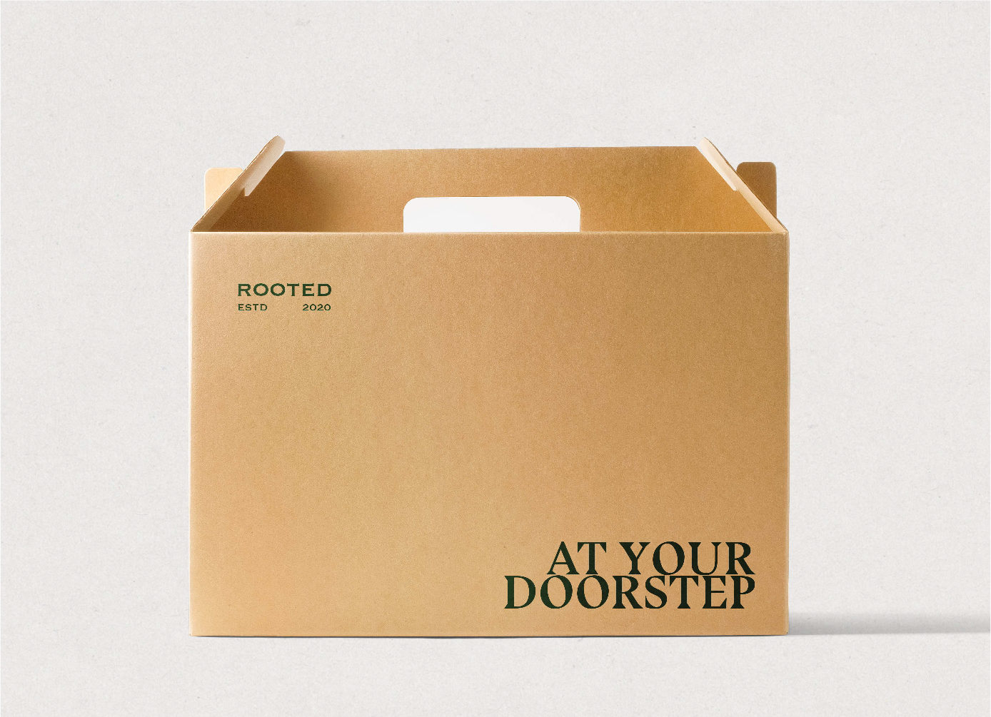
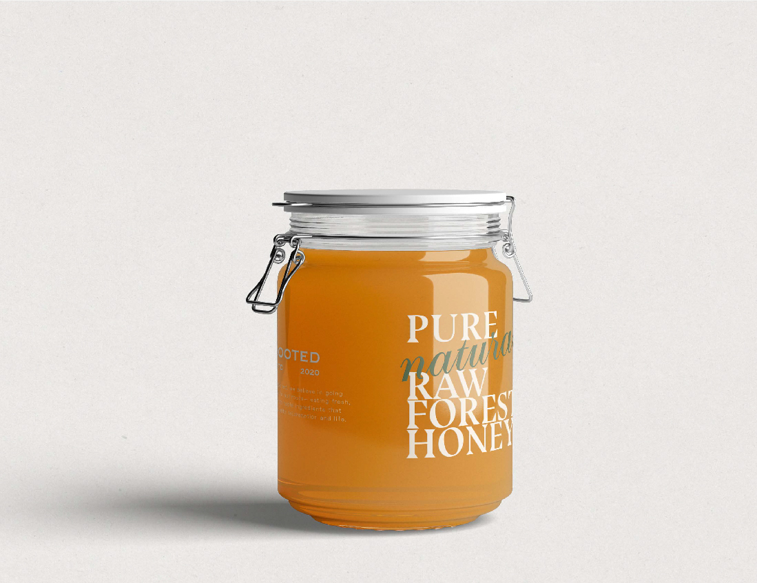
A system was developed using bold expressive typefaces and colours to transcend beyond obvious visuals and create a sensorial experience in sync with the contents of the packaging.
The typesetting was taken forward onto a range of products:

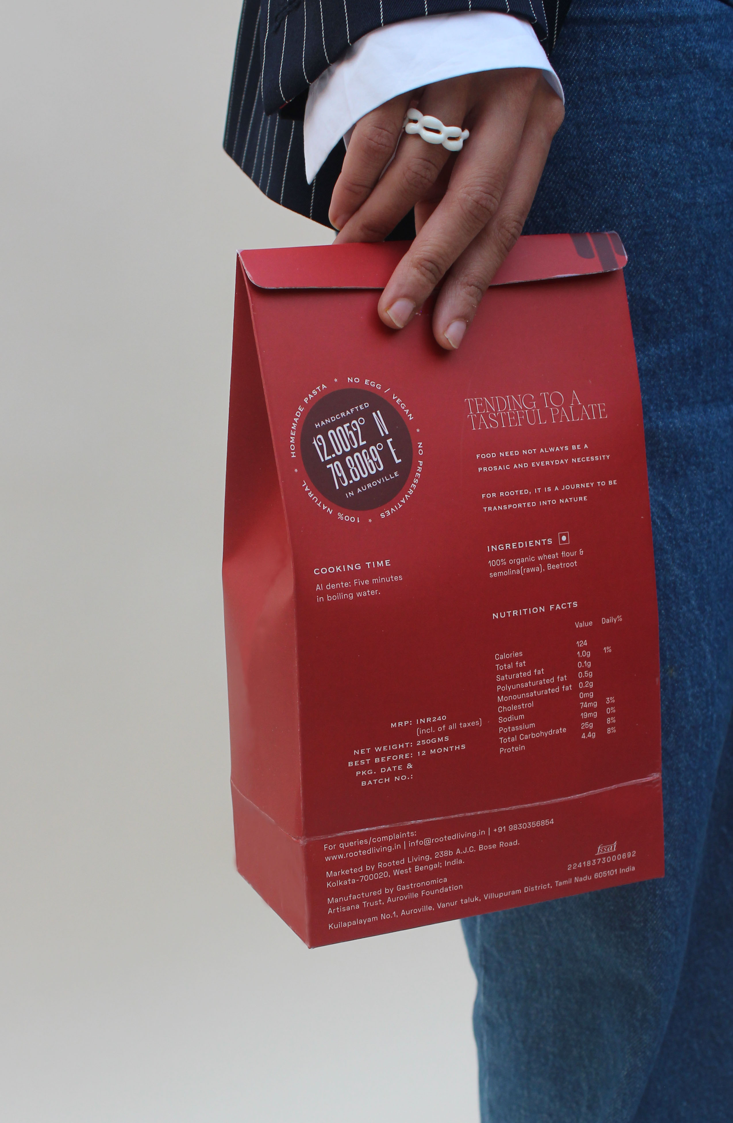
Keeping the type play in action, a striking identity was established for the pasta packaging — surely catching the consumers eye, whether on the shelf or even if one chooses to carry it around. Druk XX Super Condensed combined with colours from the Rooted palette and descriptive text in Bluu Next Bold to create a fun visual to represent the flavour and type of pasta


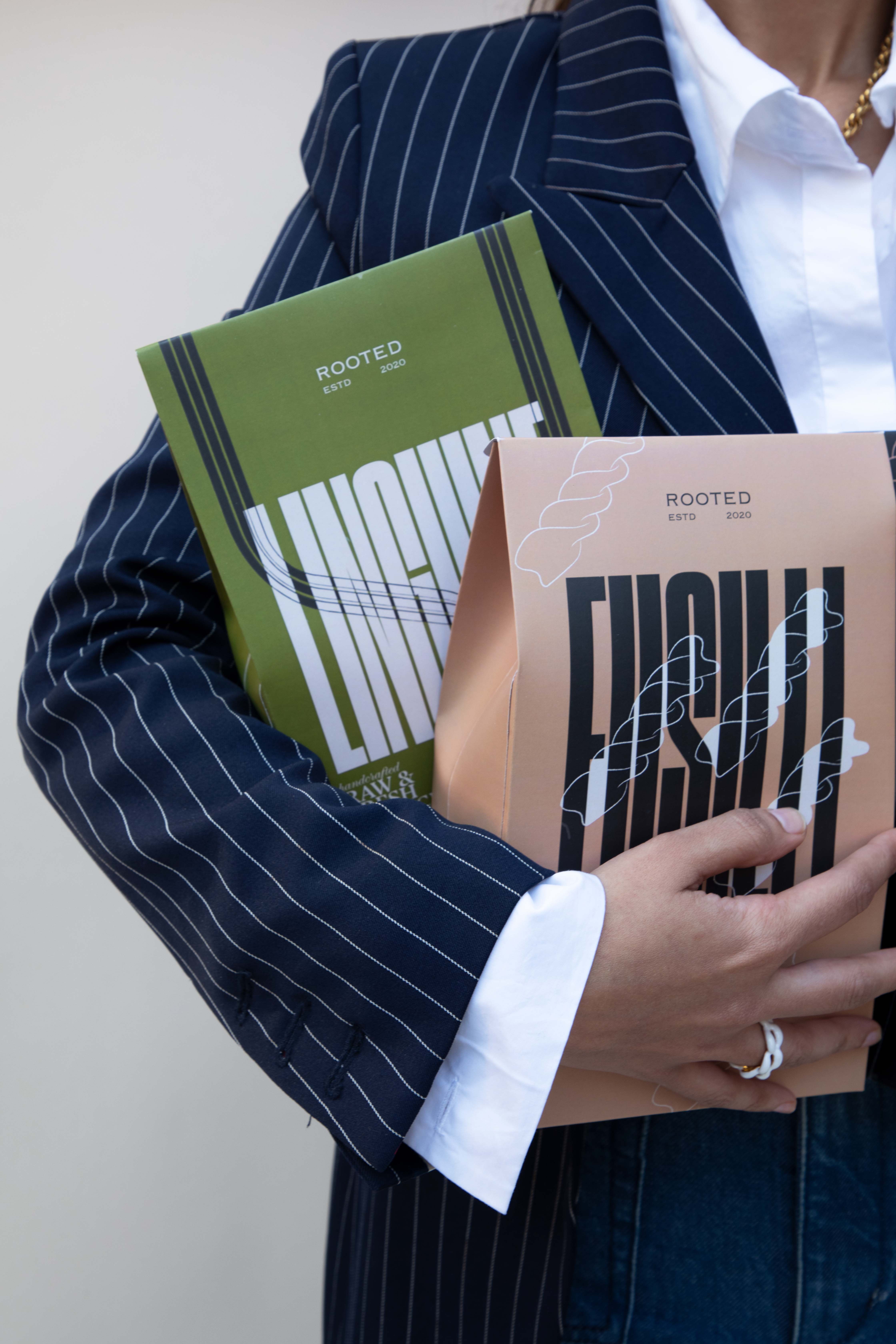


Quirky copy in Bluu Next Bold and Selva Script combined with the Rooted Fresh Green operates at the confluence of the visual and gustatory senses.

Want an identity system for you brand with strong recall? Get in touch.