
OUTLIVE
PACKAGING

Outlive is a scientific, data-driven aimed towards human wellness and healthy aging.
Their first offer is a 5 day fast mimicing diet (FMD) program that sends a boxed meal program to tackle disease prevention on a cellular level by rejuvenating the body from within.
The packaging takes forward the visual identity. The meals come in 5 boxes (one for each day) with representative colours and words for each day of the week —
strategically designed to support the user throughout their journey.
Understanding the internal journey a user goes through, the products are built to support, uplift and prepare

type heirarchy
The primary typesetting is inspired by the design of the logo — tightly kerned words with exaggerates spaces in between. These are to communicate the objective / item in clear terms. The subtitles in h2 are to give context. The body text is to give a description. All information is neatly set in
visual elements & colours
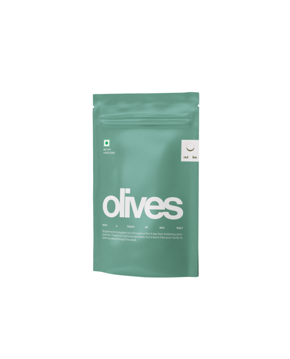
The packaging incorporates visualisations of motivational words — assigned to each day — as an incentive to complete the program and attain its benefits. This is seen across the range of plant-based energy bars, soups, a variety of snacks, drinks and supplements. The eating cycle is represented through symbols so that users can easily identify what is to be consumed, when. These elements, which represent an upward trajectory, are created to incentivise users to easily incoporate Outlive’s program into their daily routine
Below is a library of visuals developed for Outlive for the 5-Day program kit.
Arrange these ︎︎︎ into 5 sets - each set consisting of a visual, text and colour. Send a screenshot of your outcome ︎
![]()
![]()
![]()
The packaging incorporates visualisations of motivational words — assigned to each day — as an incentive to complete the program and attain its benefits. This is seen across the range of plant-based energy bars, soups, a variety of snacks, drinks and supplements. The eating cycle is represented through symbols so that users can easily identify what is to be consumed, when. These elements, which represent an upward trajectory, are created to incentivise users to easily incoporate Outlive’s program into their daily routine
Below is a library of visuals developed for Outlive for the 5-Day program kit.
Arrange these ︎︎︎ into 5 sets - each set consisting of a visual, text and colour. Send a screenshot of your outcome ︎


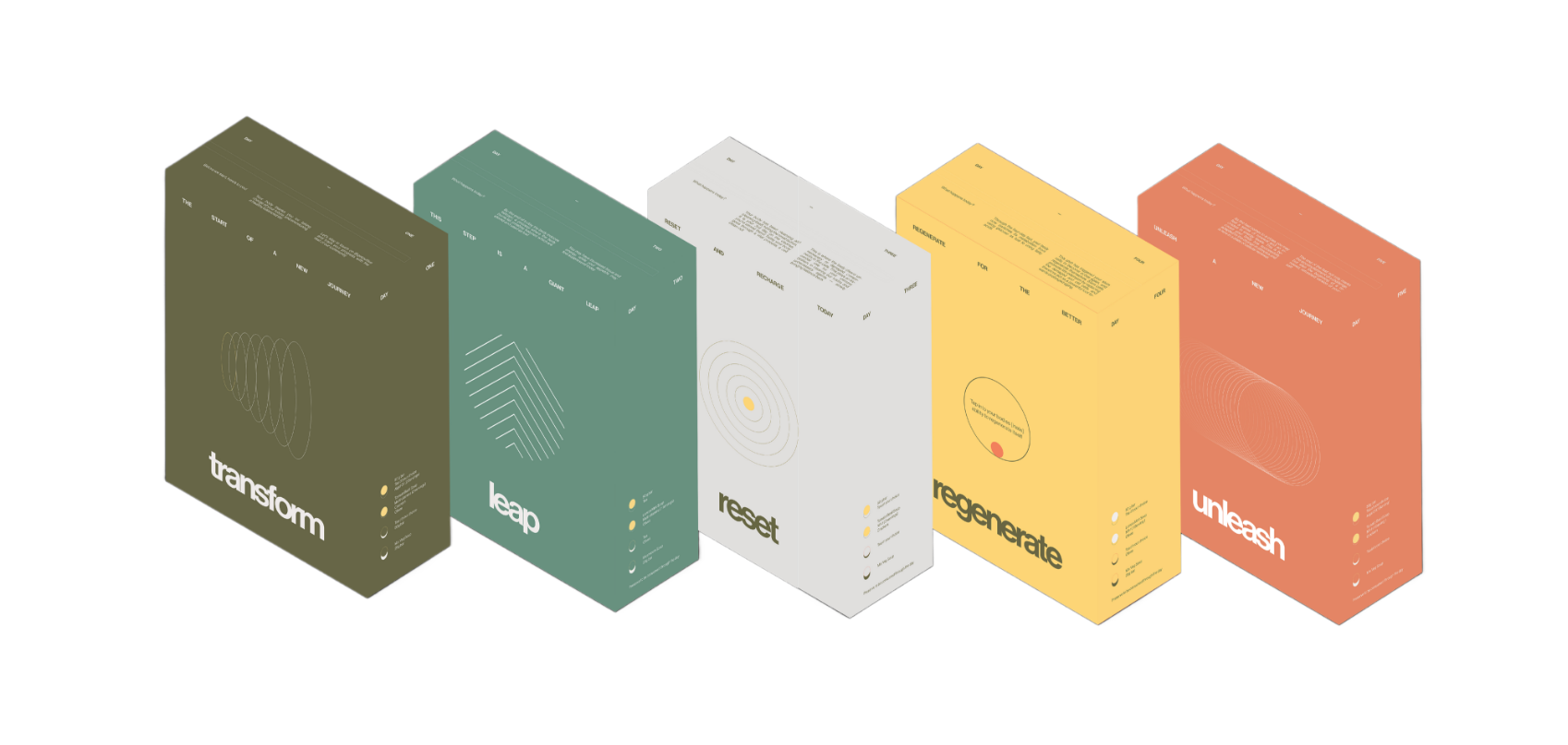 THE 5 DAY BOX
For a brand backed-by-science, The Space At 9/2 defined Outlive’s colours to play a vital role in Outlive’s visual identity. Built upon the base of colour psychology, Outlive’s colours are strategically designed to support the user throughout their journey — from the first day, to their last. Understanding the internal journey a user goes through, the products are built to support, uplift and prepare them before they know what they’re feeling. All items for that day also follow the colour assigned to that day


The journey is described in detail via a fold out placed inside the box

