
outlive
brand identity design
With a mission to elevate consciousness about guided fasting so as to help users live proactively, Outlive needed a visual identity to reflect the brand’s bold yet empathetic personality. As a young brand launching in an unexplored segment in India, Outlive strives to bring awareness of an fmd program suited for Indians. With a brand name that urges a consumer to take action, the visual identity aims to reflect a similar tone of voice urging users to move away from the comfortbale, and towards the better.
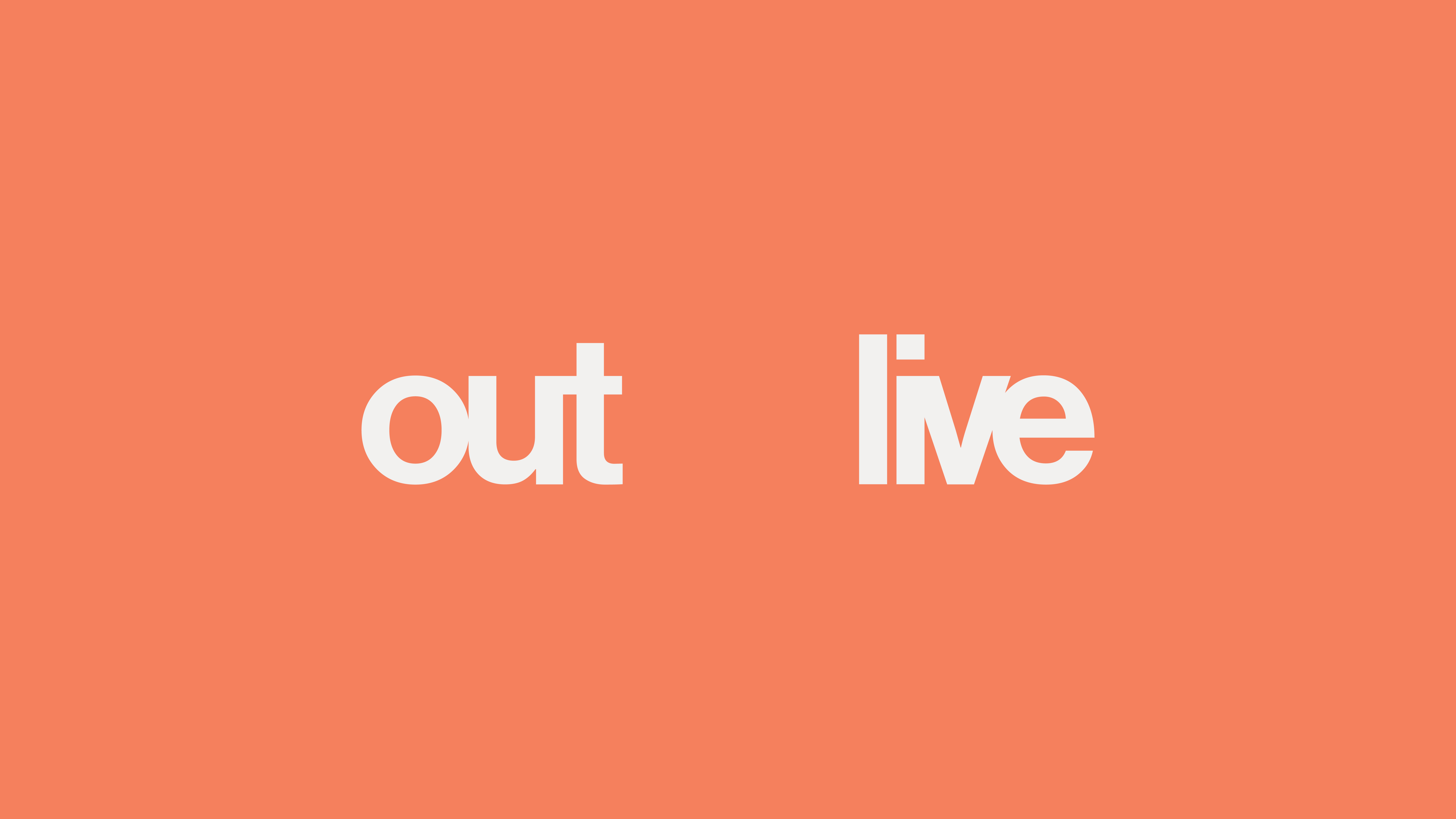
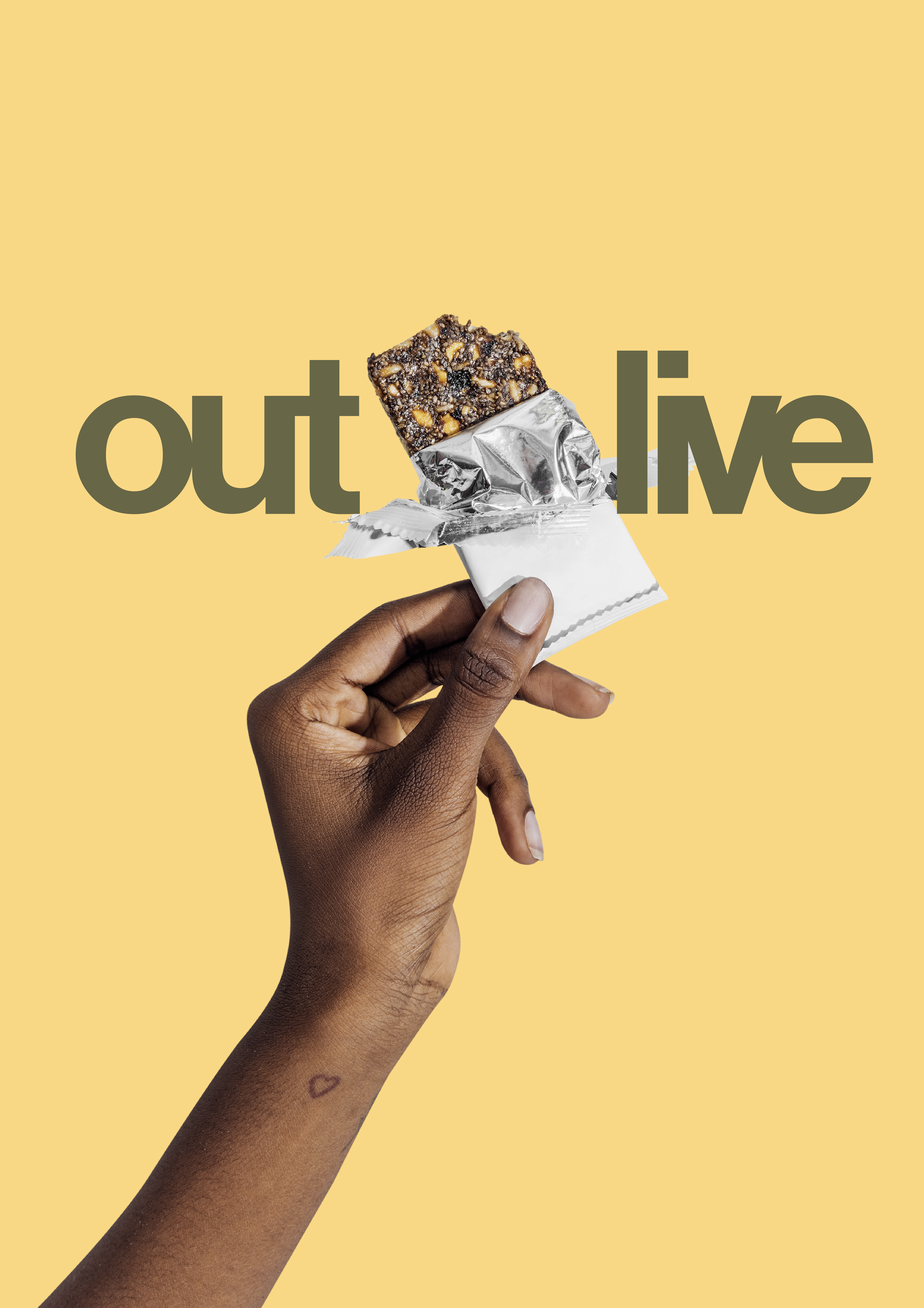
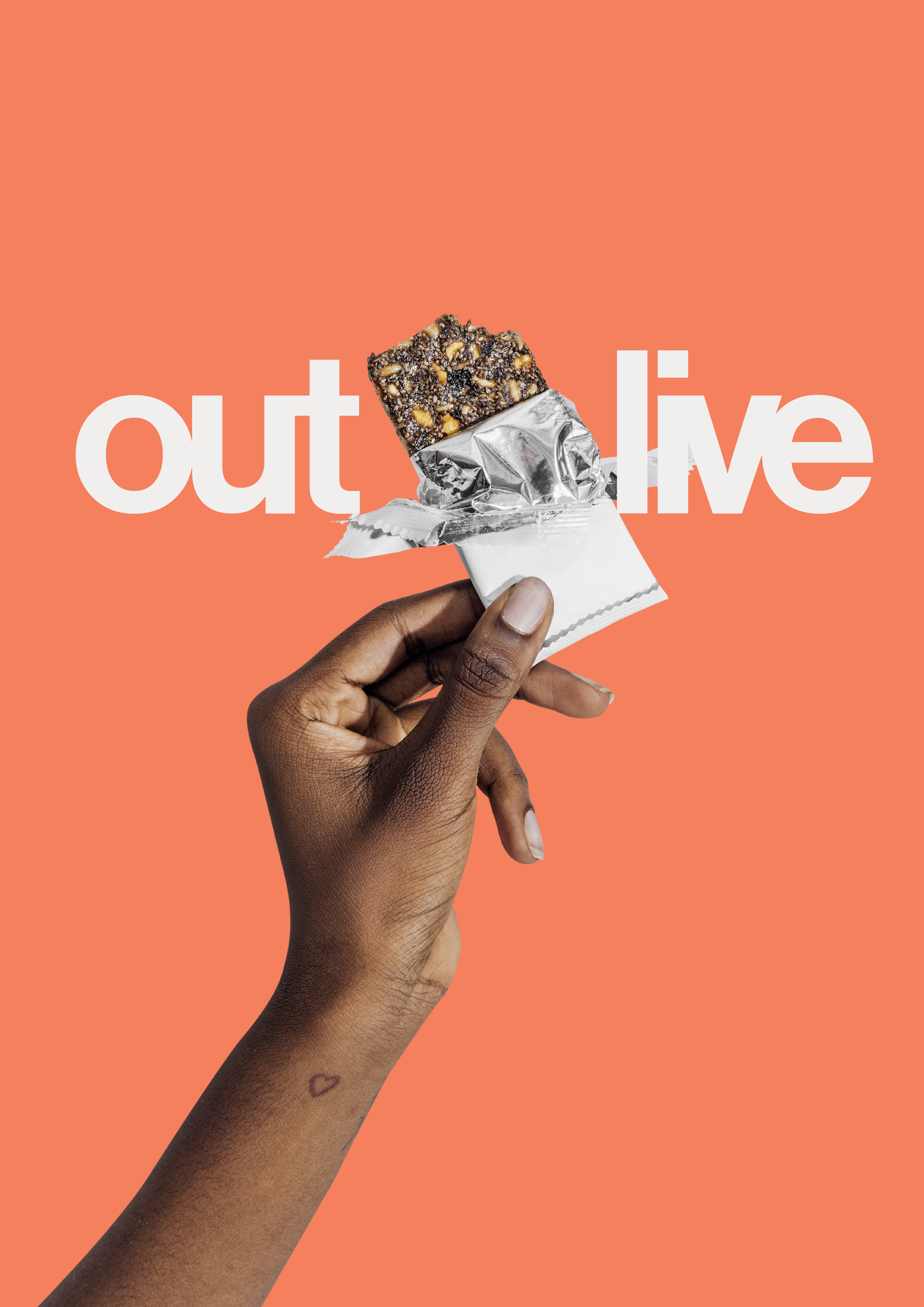
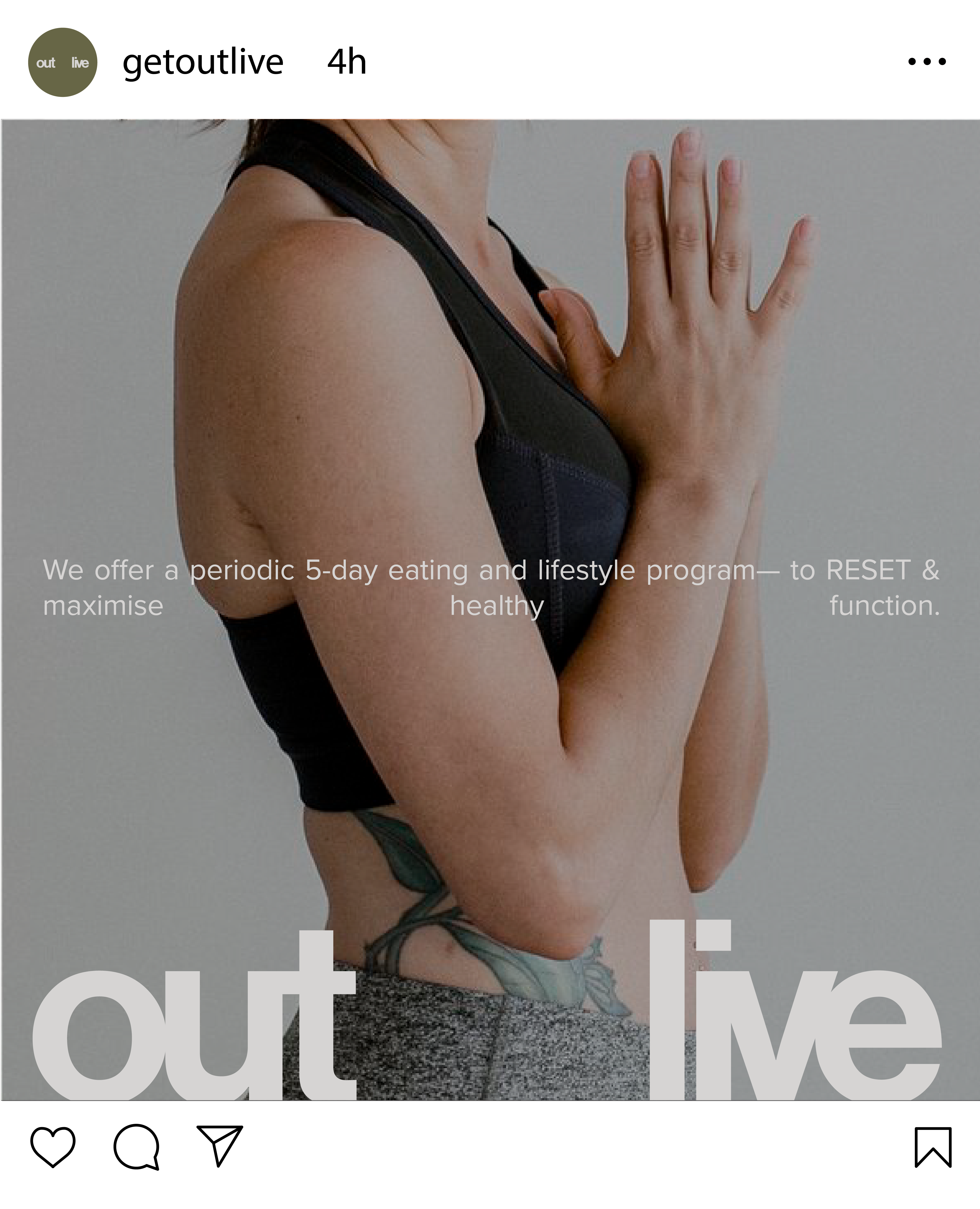
The Outlive logo is a modified logotype made using a singular typeface creating a confident statement — to out live.
The Outlive logotype has intentionally been designed with a space separating the ‘out’ and ‘live’, creating a logotype built for scalability. Understanding the vision, mission and potential Outlive has, the logotype has been created to grow alongside the brand. The negative space within the words can be used to explore and communicate products, people and experiences that Outlive curates
The Outlive logotype has intentionally been designed with a space separating the ‘out’ and ‘live’, creating a logotype built for scalability. Understanding the vision, mission and potential Outlive has, the logotype has been created to grow alongside the brand. The negative space within the words can be used to explore and communicate products, people and experiences that Outlive curates


Designed to be progressive, precise and sensitive — while staying empathetic and credible, Outlive’s backed-by-science personality has been smartly designed to entice the users on what the brand aims to achieve, and more importantly; how it can help you. The Space At 9/2 understood the boldness a brand like Outlive needs to assert, in order to grasp consumer trust and loyalty.
As a pioneer brand working in the FMD space in India, the intention was to spread awareness and voice the vision across to the consumers, visually, to repetitively align them to the brands goals, vision and mission.
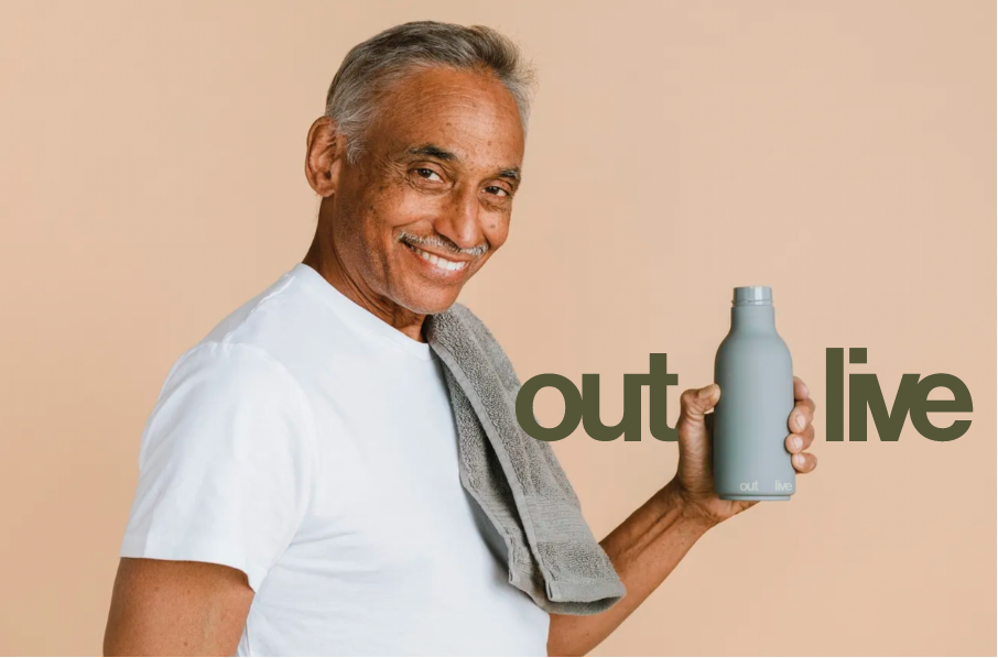
Essentially, Outlive is a lifestyle change — Evolving for the better. The scalability of the logotype offer Outlive unlimited potential.

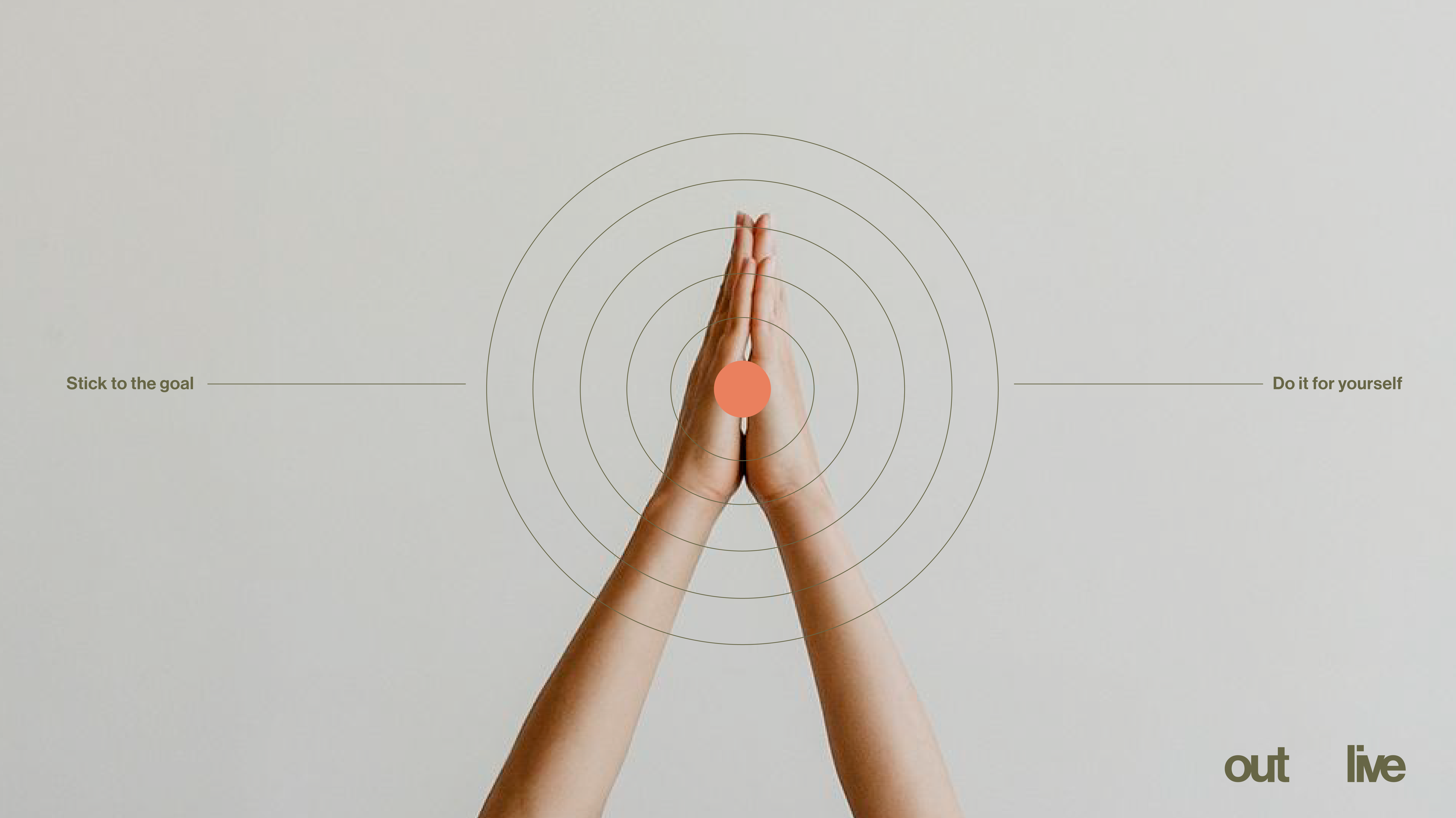
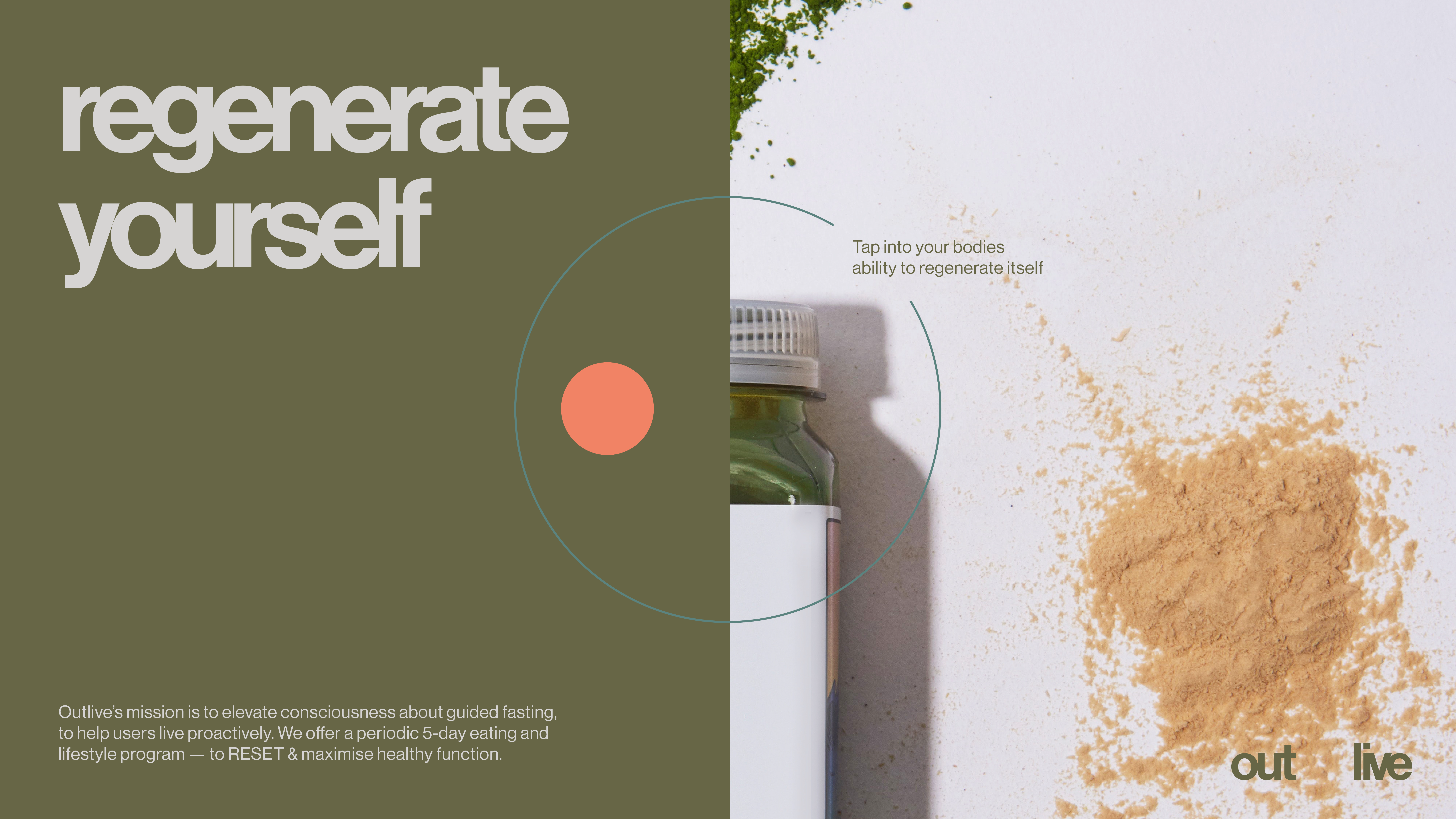
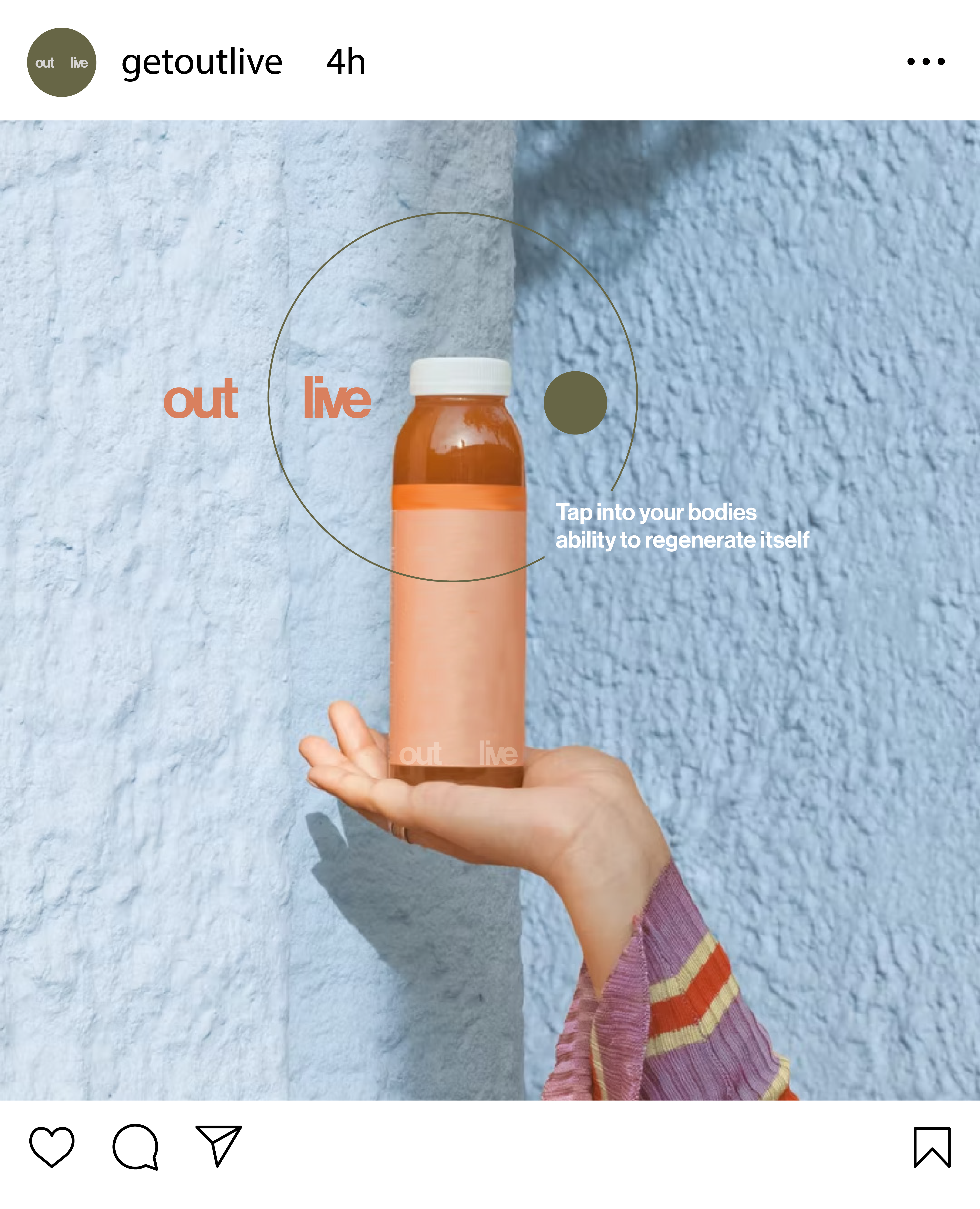
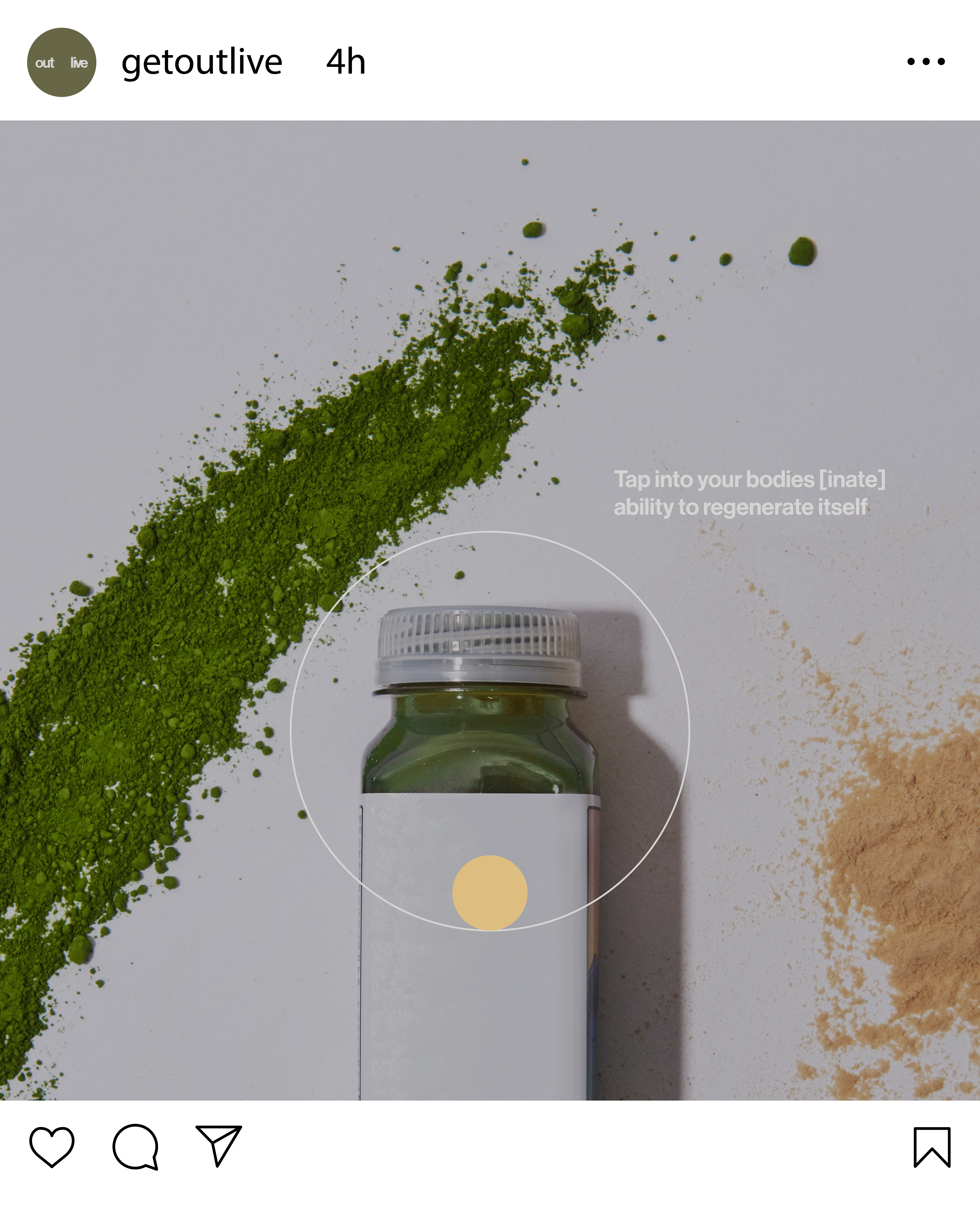
For a brand backed-by-science, The Space At 9/2 defined Outlive’s colours to play a vital role in Outlive’s visual identity. Built upon the base of colour psychology, Outlive’s colours are strategically designed to support the user throughout their journey — from the first day, to their last. Understanding the internal journey a user goes through, the products are built to support, uplift and prepare them before they know what they’re feeling.

Above is an example of how the 5 day journey has been enhanced for the user experience.
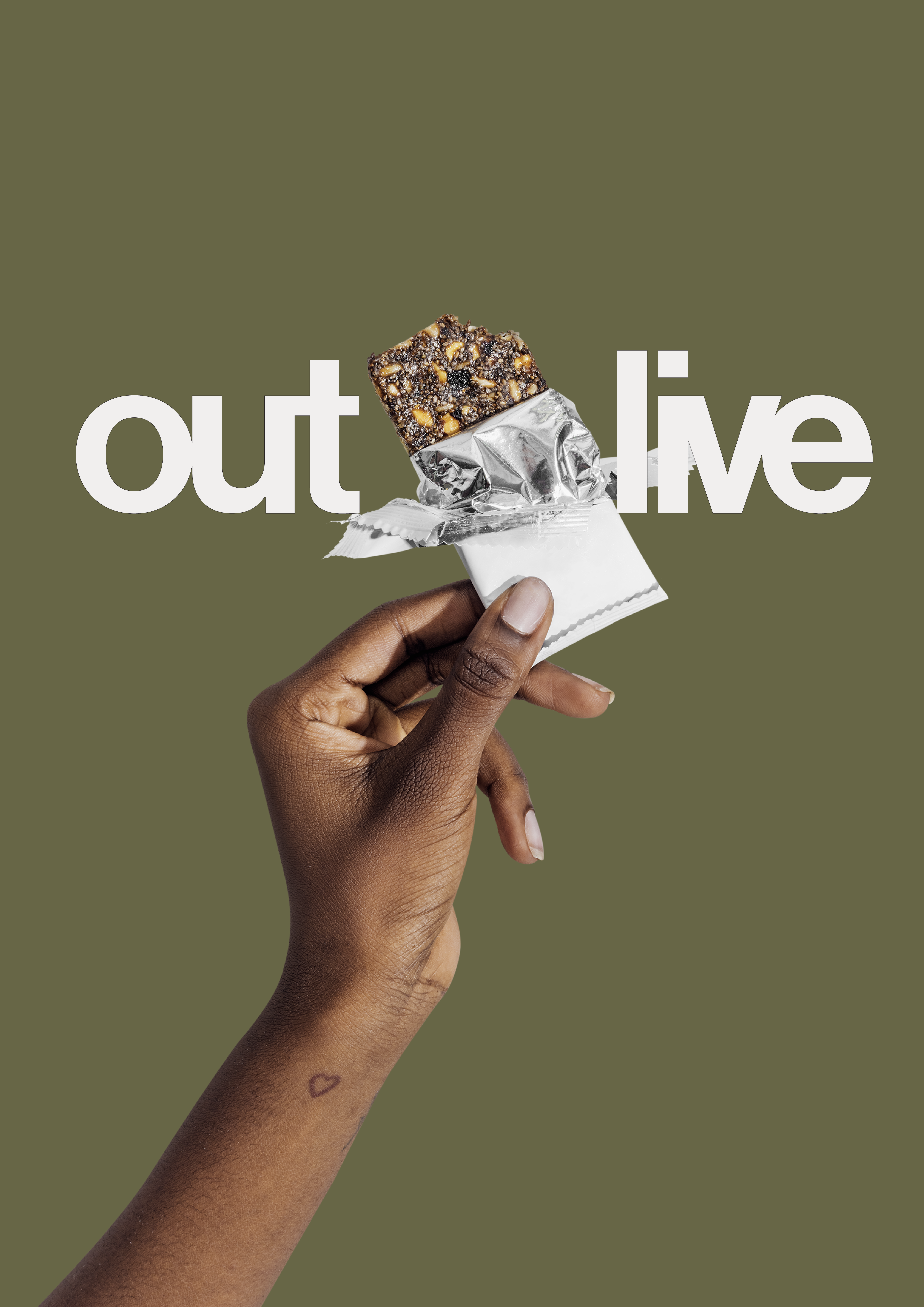
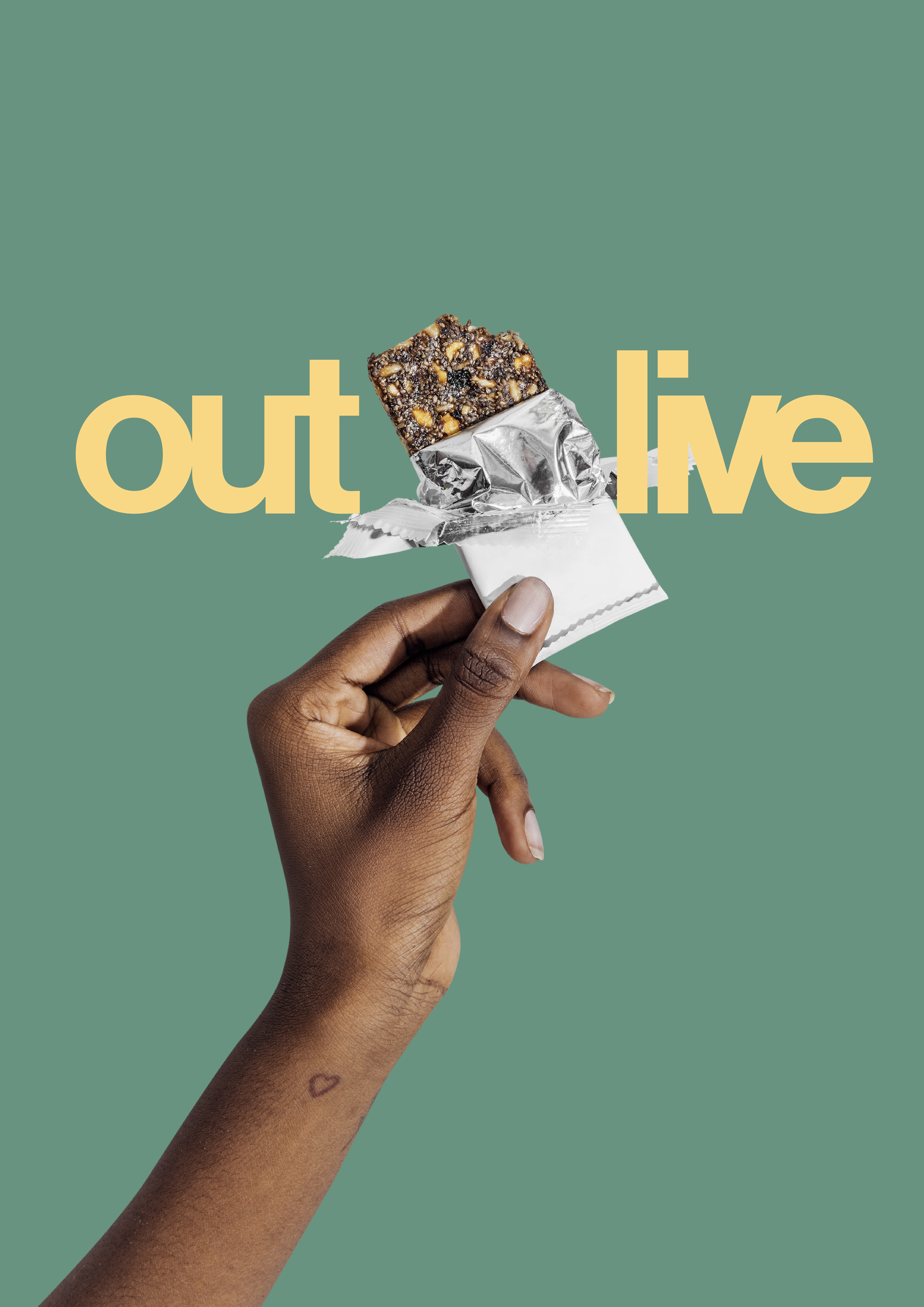
Keeping the visual identity dynamic, graphics created for Outlive were brought to life retaining the brands essence — built using fundamental building blocks to create effective and straightforward visuals to share the brands vision.


A library of visuals was developed for Outlive that support the brand communication across all collaterals. They have been intentionally designed to break down the communication into visually digestive that help graphically narrate a specific aspect of the communication.
Bold type paired with resonating visuals helping Outlive to translate scientific jargon to understandable information.
Want an identity system for you brand with strong recall? Get in touch.