MUSICVERSE
visual BRANDING & IDENTITY DESIGN

MusicVerse is an aggregator for musical talent. They allow visitors to book bands and musicians for events and concerts. The key was to build an identity that was vibrant and yet account for the diversity of music preferences.
For our logo mark explorations we derived symbols from the various ways one consumes or makes music — electronic, sheet music, and sound waves.
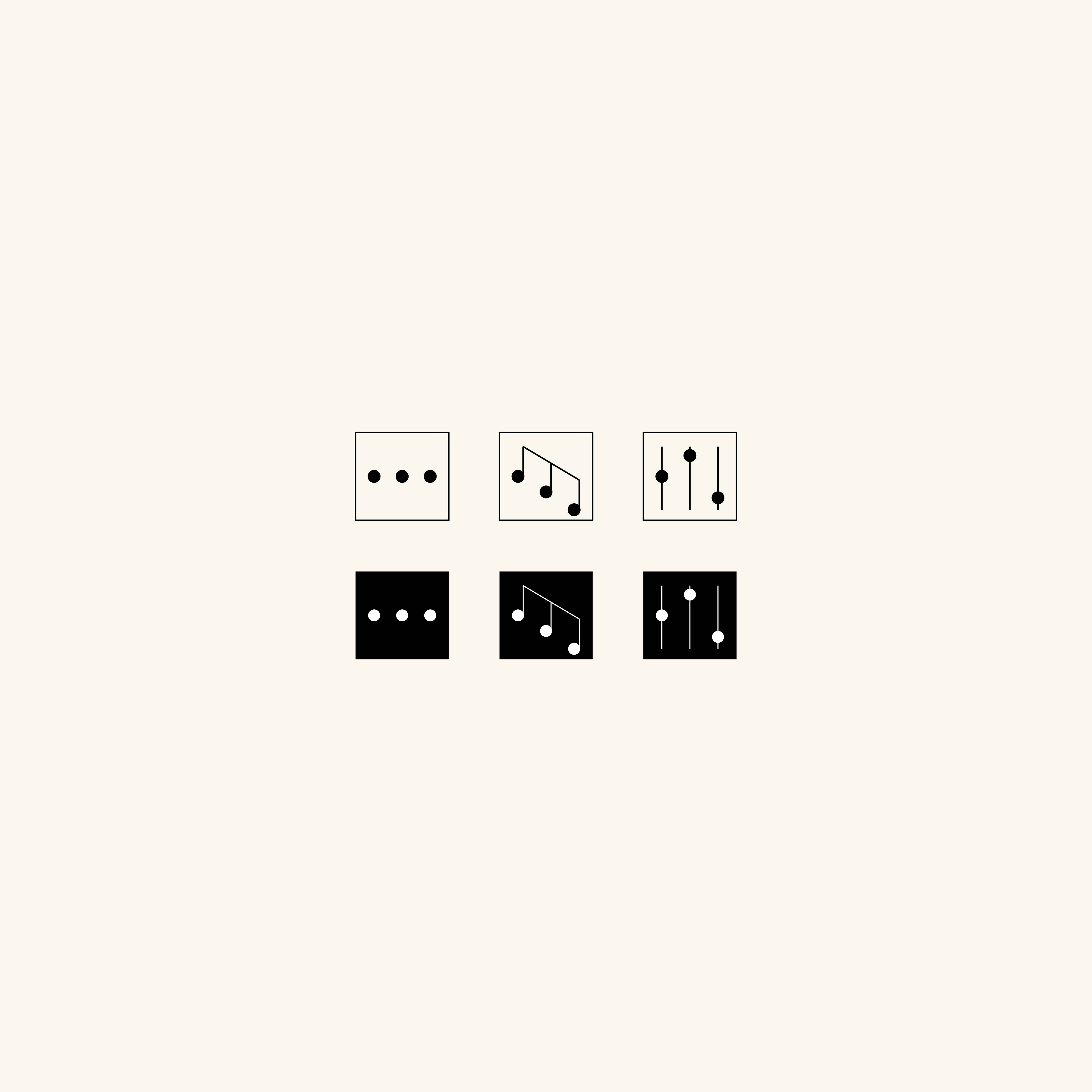


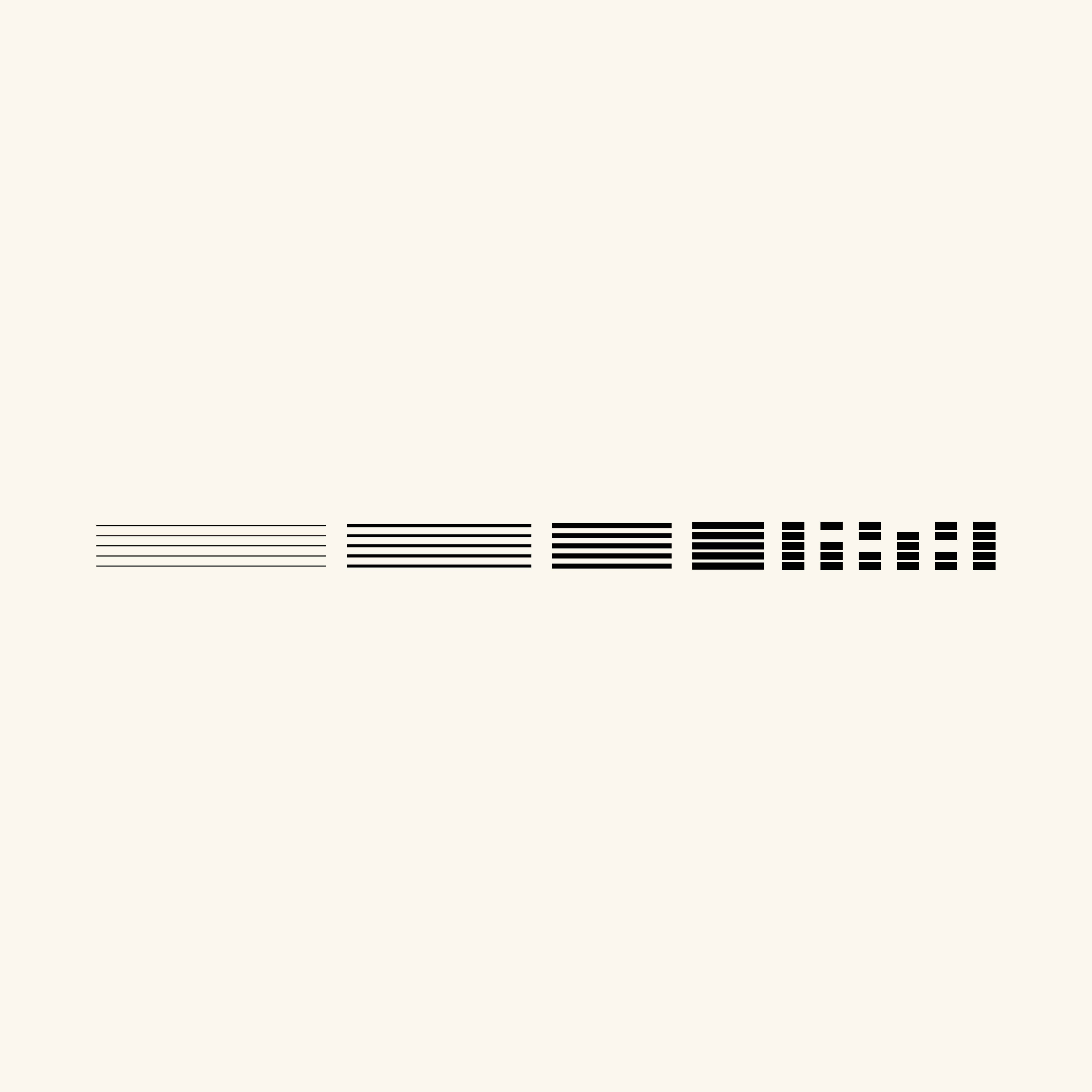
The logotype uses the humanist Glysa, which to us was reminiscent of writing sheet music.

We developed patterns derived from musical notation, the explorations are to be used to develop the visual identity of the brand, across web (WIP) and print -
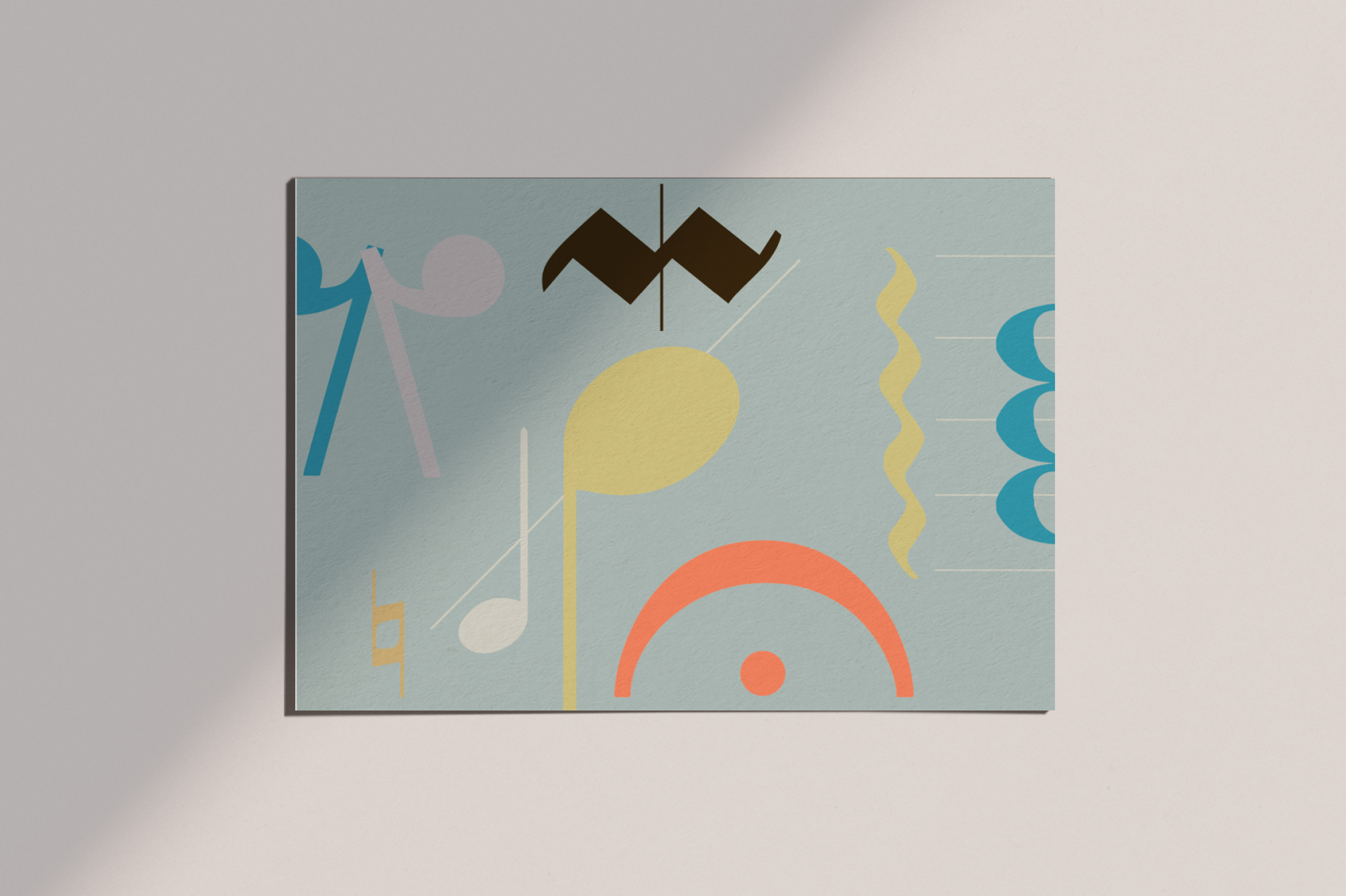
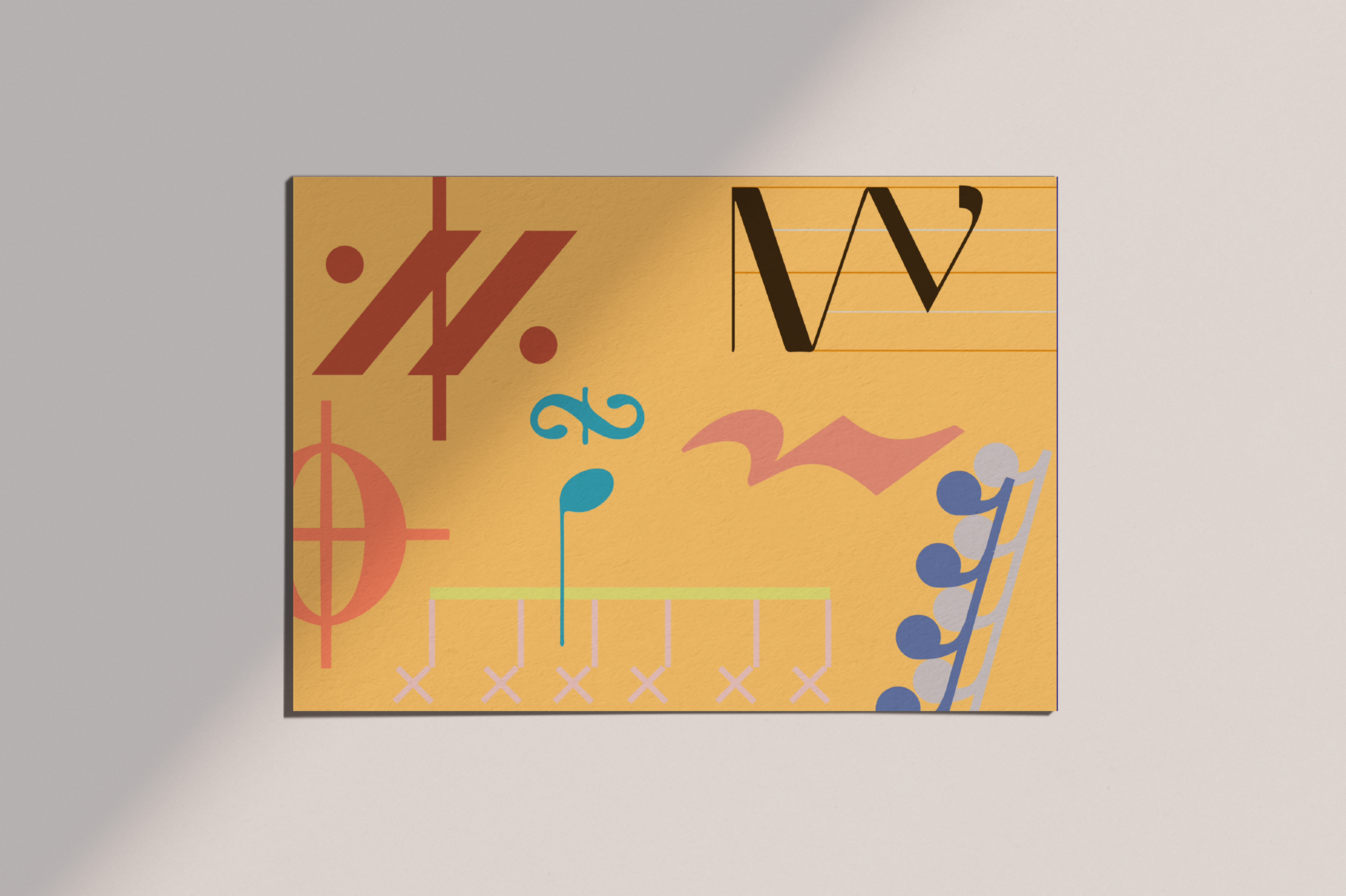
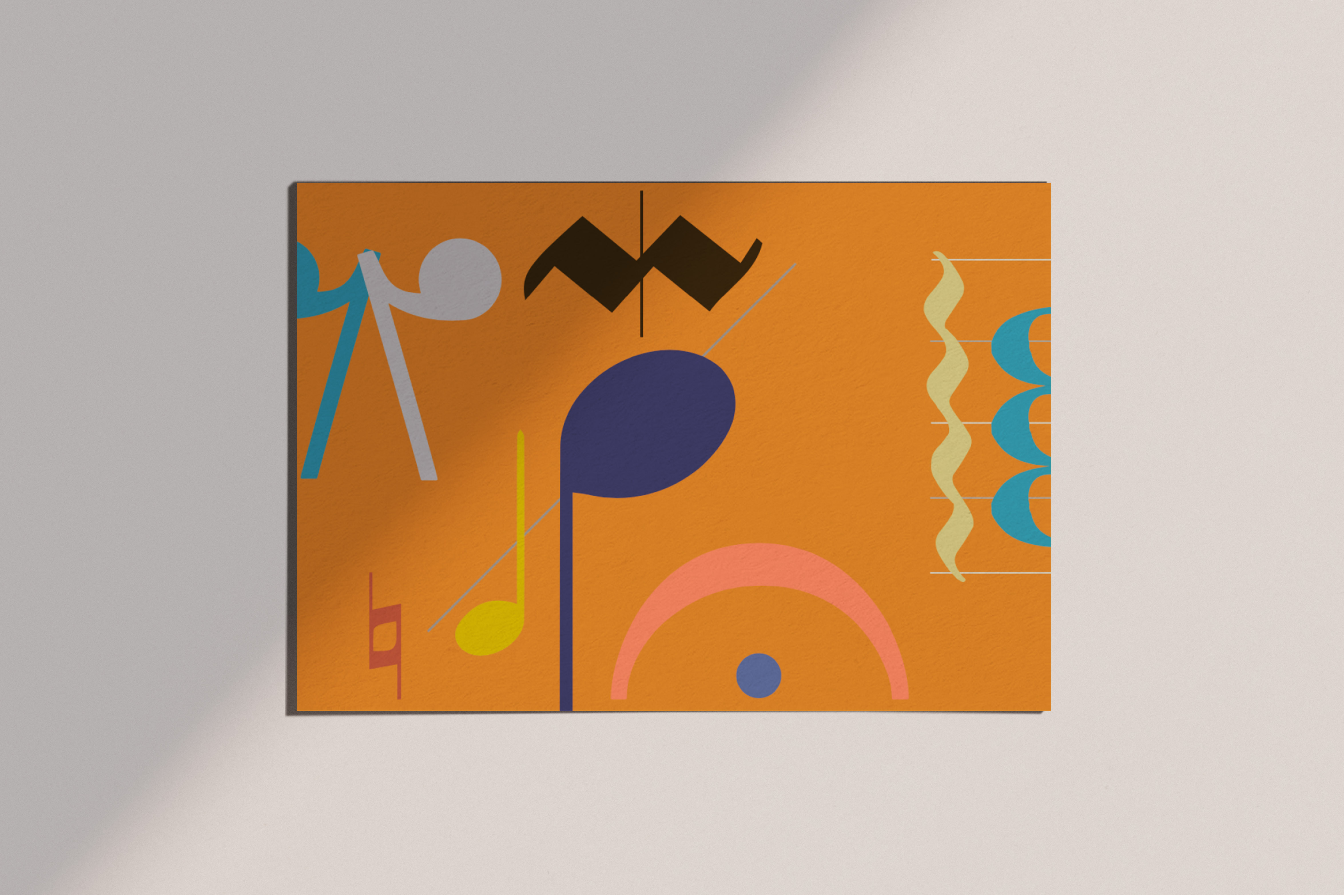

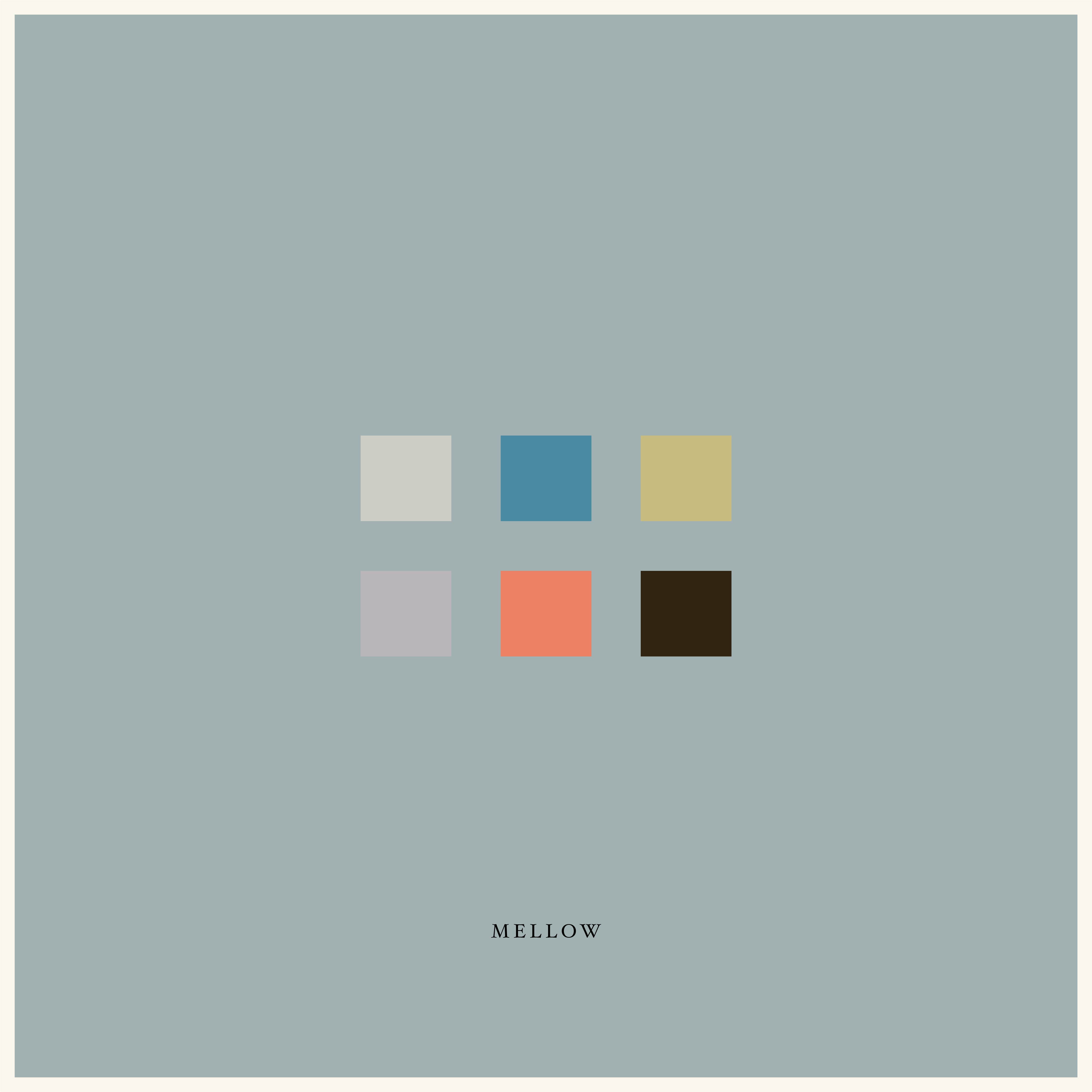
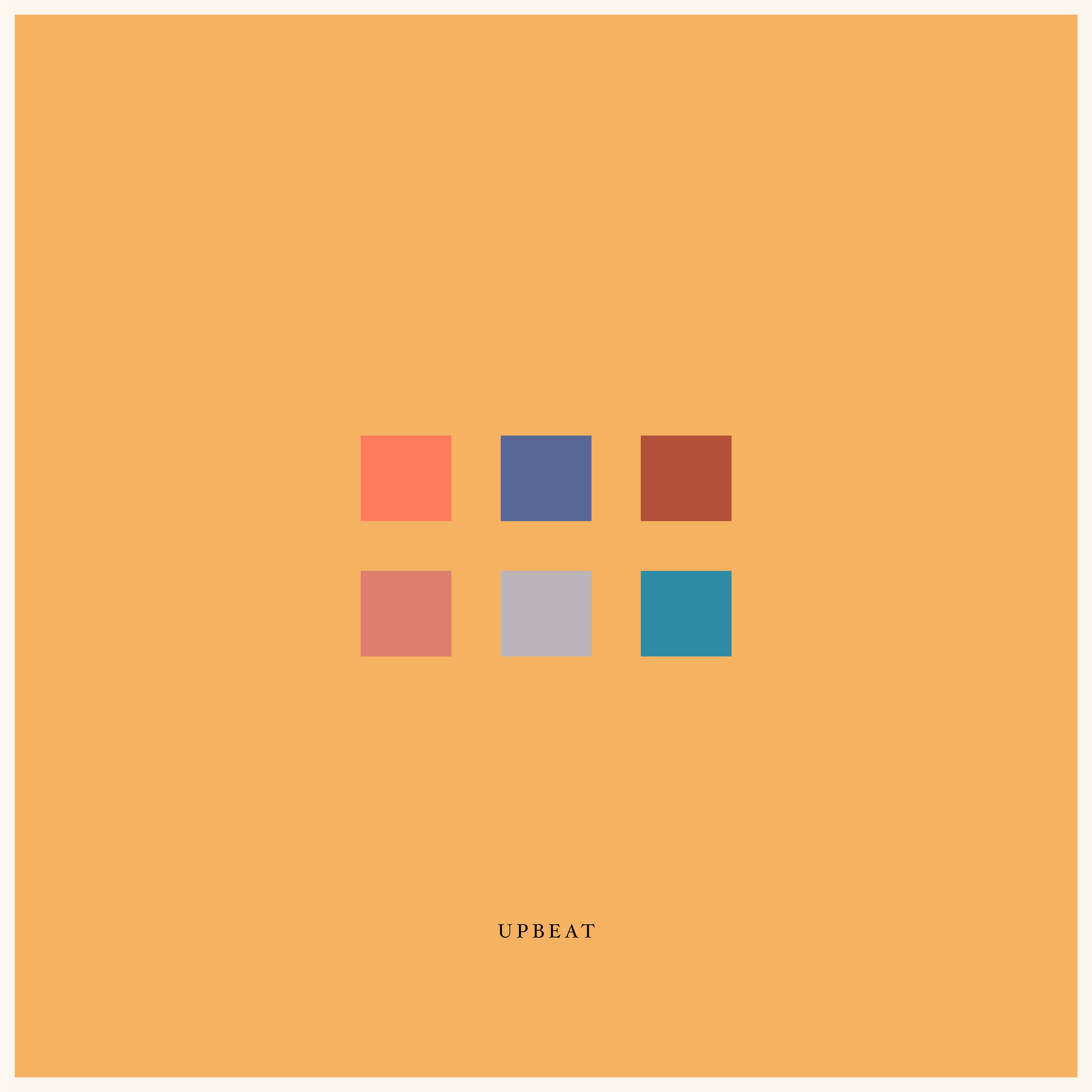
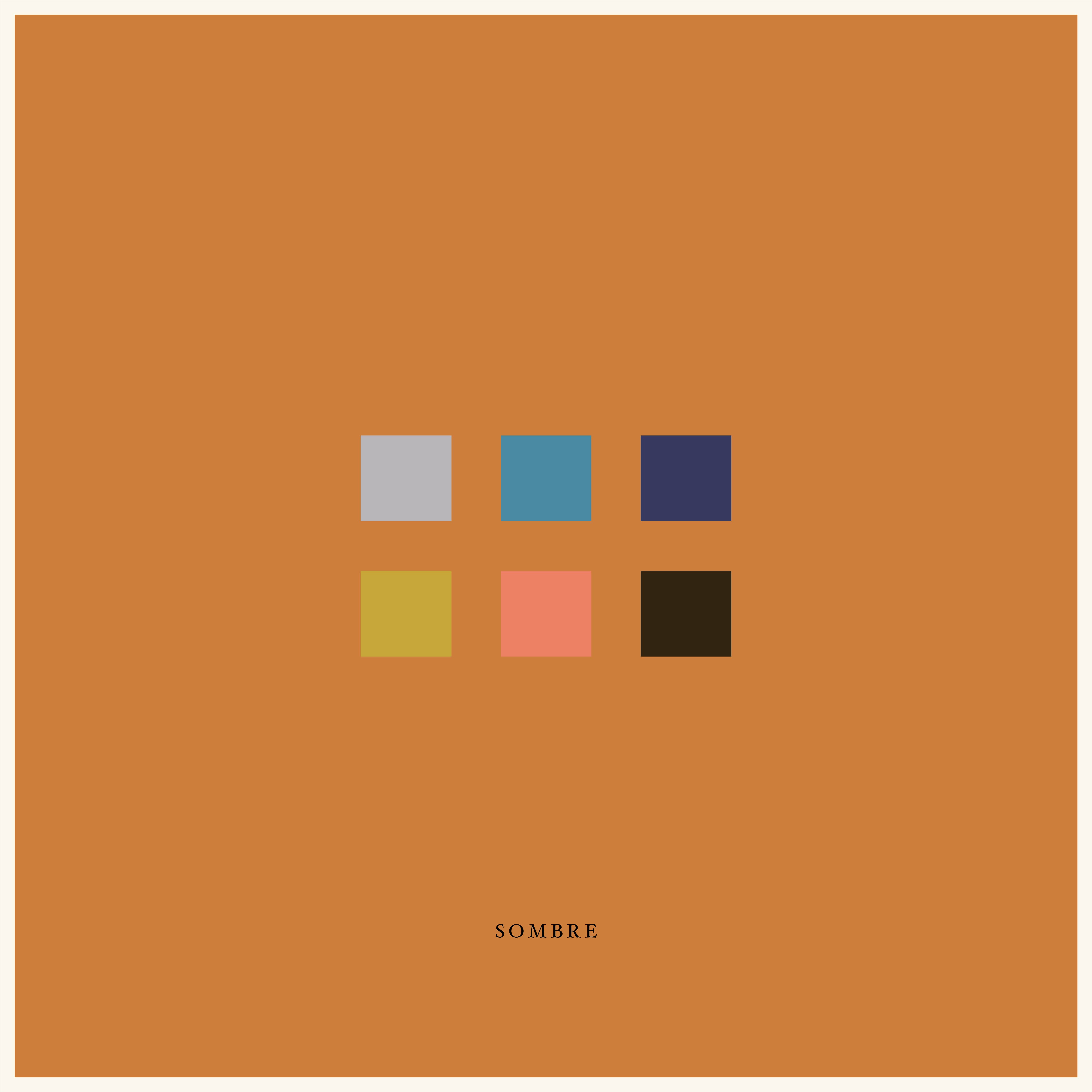
The colour story for MusicVerse included a varied palette that was created based on how people generally describe their tunes - show trials from this -

For us, branding begins with getting playful. These videos showcase our experimentations for an upcoming project that is centred around music. Very often the explorations are at odds with the final piece but are pivotal to arrive at our eureka moment.

