
Infinite
naming, branding & visual identity
Designing for resonance – with an undercut of magic – for Infinite Fertility. Branding for healthcare needs to be empathetic and even enchanting, much above the sterile, serious tones that most institutions or clinics employ.
This can extend to the choice of name too:
The name ‘Infinite’ represents the endless possibilities of parenthood even with a finite number of eggs women are born with.
Infinite uses modern science to create a first of its kind fertility assessment & egg freezing facility. Infinite aims to challenge the traditional understanding through a more empathetic approach and the use of magic realism in the visual design.
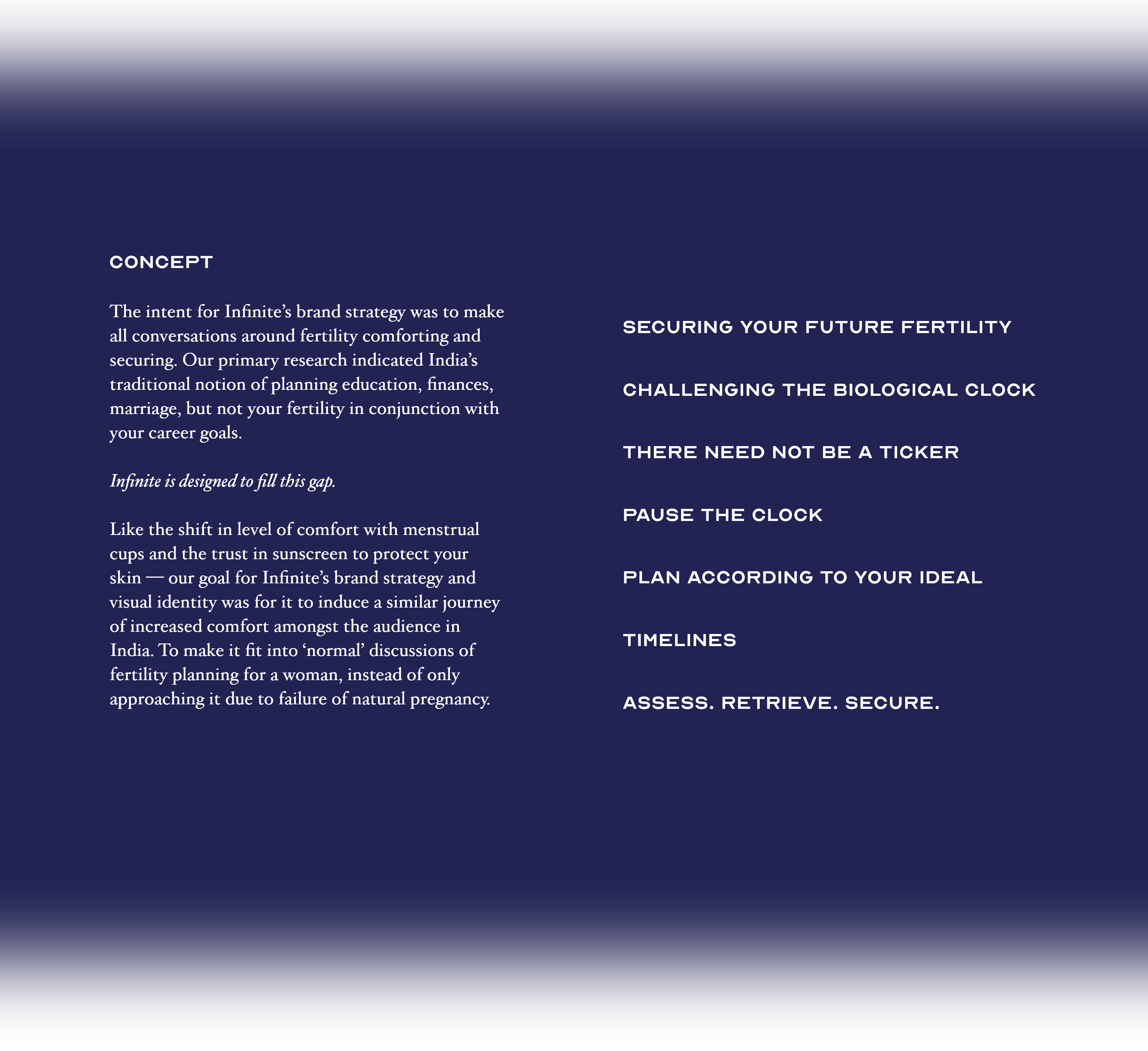
the brand concept —
time travel & an undercut of magic
for
New possibilities beyond the realities
of fertility timelines.
To enable individuals to achieve their
goals, according to their ideal timelines.
Holistic care & support for life
altering choices
Warmth, empathy and belief
with (the key tagline)
securing your future fertility
LOGO
The logo for Infinite is presented in a custom logo using BL Arctic. The high contrast strokes and curved and sharp edges of BL Arctic imparts contemporary sensibilities and confidence to the logo. The ascender of alphabet ‘f,’ the ligature between the ‘fi’ add the tittle of the ‘I’ are distinct features to look out for.
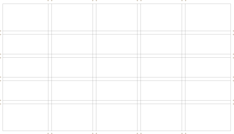

GRID SYSTEM
A three and five column grid system has been to break the symmtery.
A three and five column grid system has been to break the symmtery.
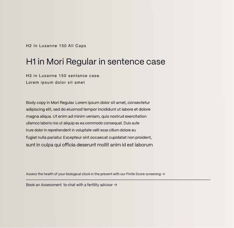
TYPOGRAPHY
Mori is a versatile and sophisticated gothic sans serif inspired by contemporary Japanese design, best suited for editorial, graphic design and branding.
Lausanne is an extraordinarily sophisticated sans seri font with an ultra-organic aesthetic, very legible in small sizes and full of refined details in display sizes.
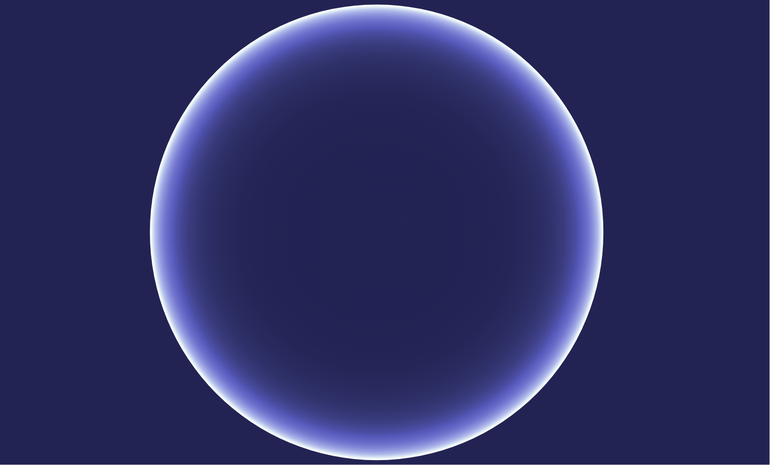
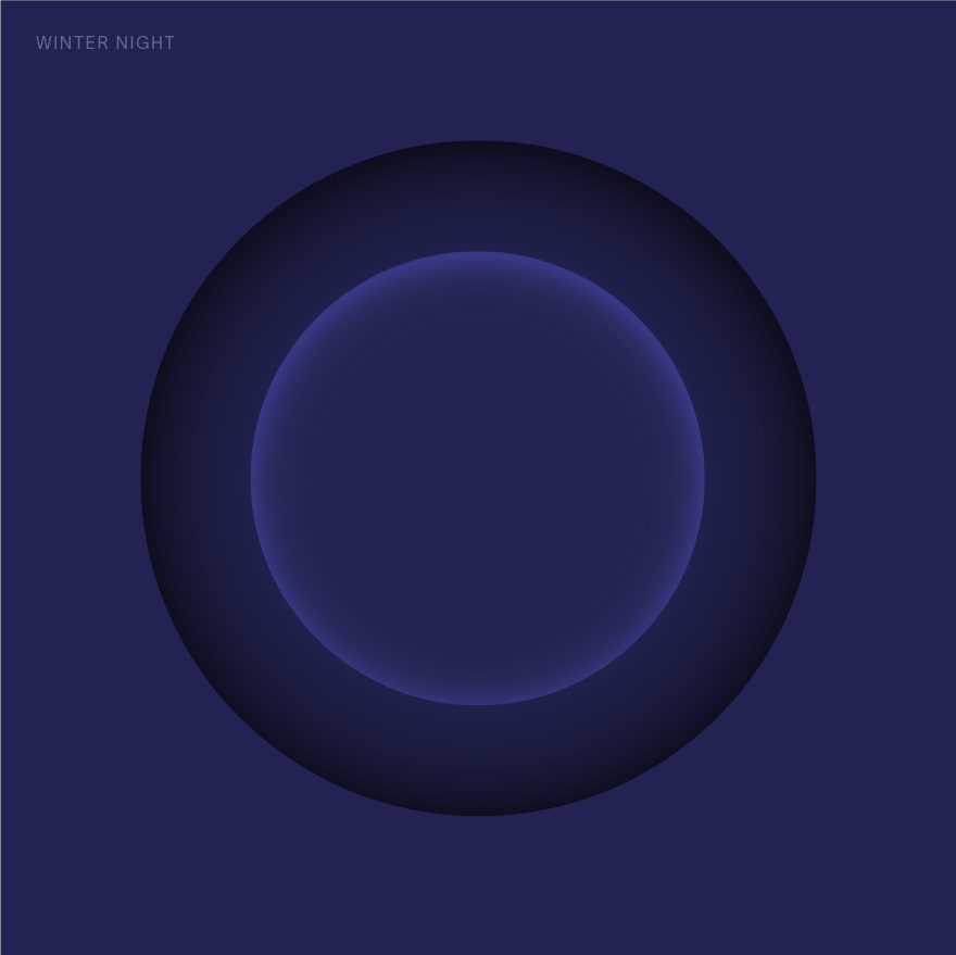
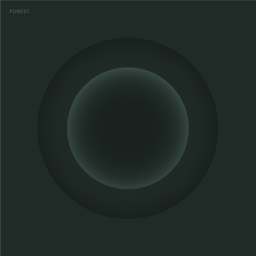
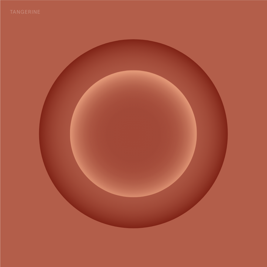
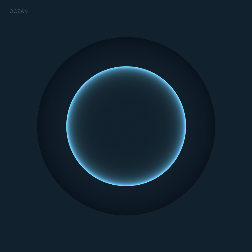
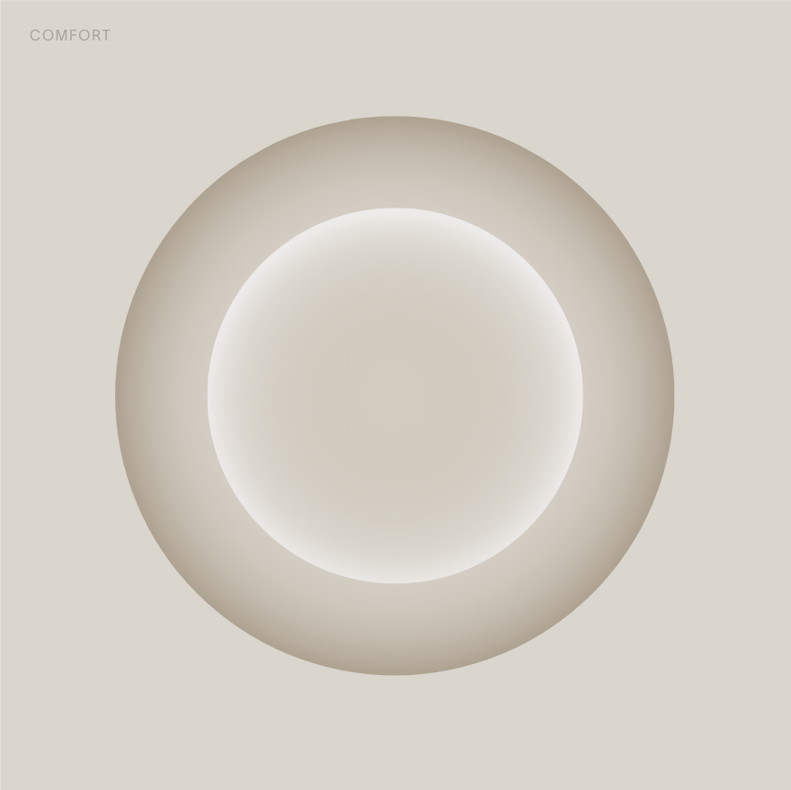
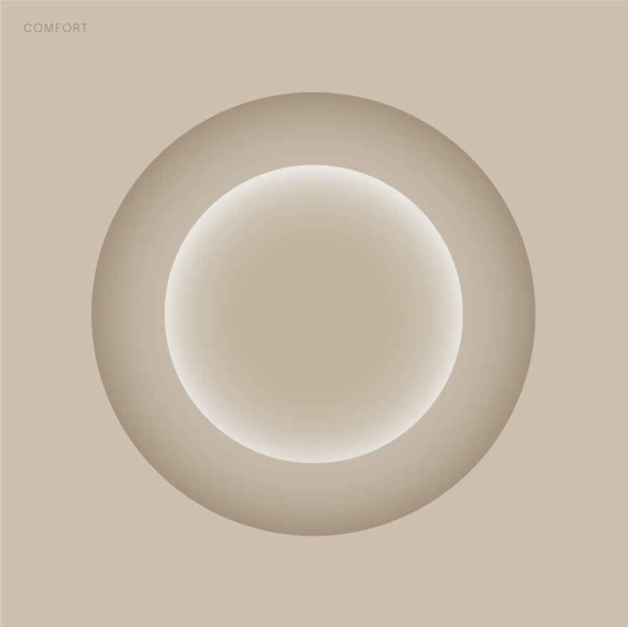
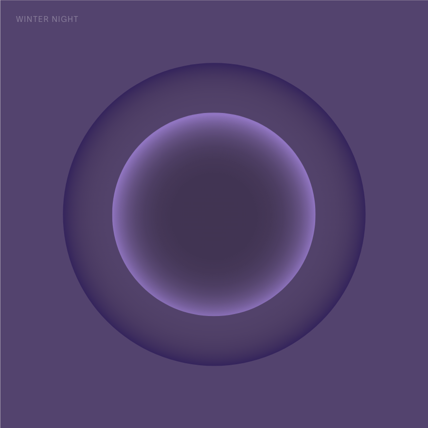
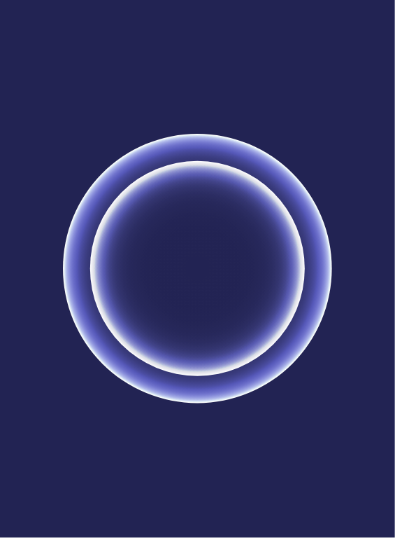
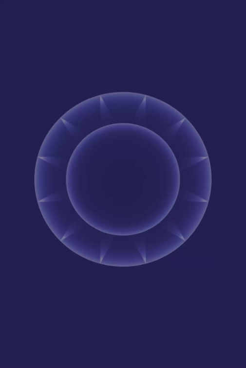
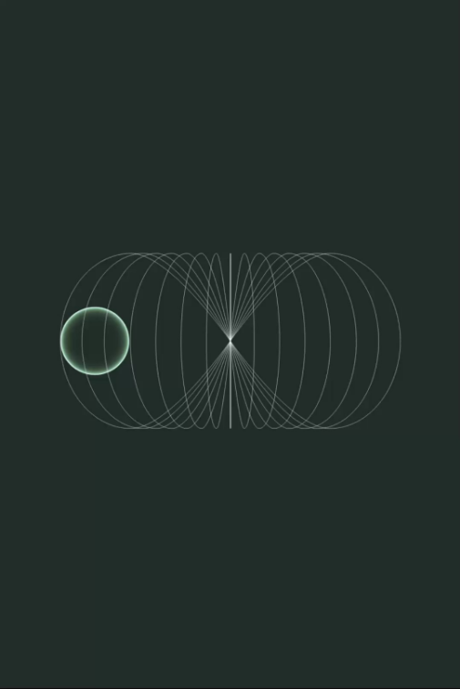
origin
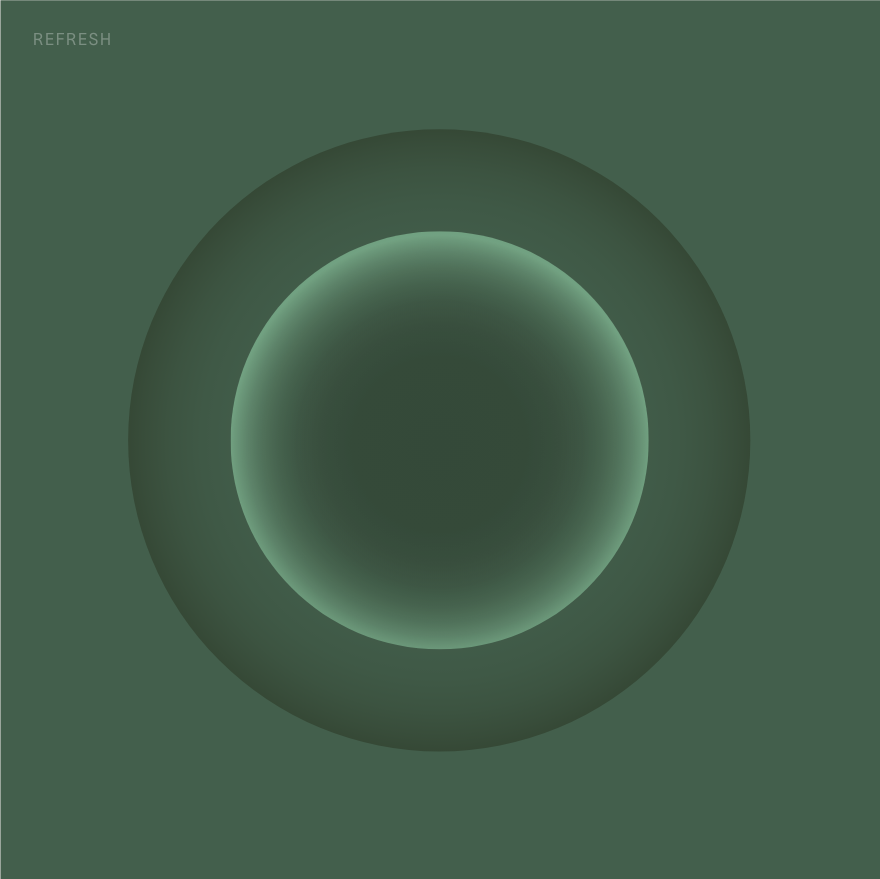
The brand orbs are created to bring in the above
sensibilities and create a vast range of illustrations
to support brand communications
![]()
The brand orbs are created to bring in the above
sensibilities and create a vast range of illustrations
to support brand communications
In developing the visual identity for Infinite, we have been guided by key adjectives that have influenced every design decision and can be felt throughout our brand —
Magical realism / Time-travel
Ensure / Believe / Possibilities
An under cut of magic
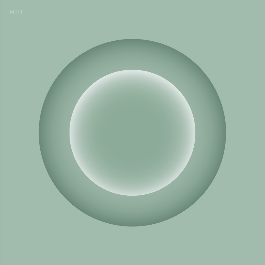
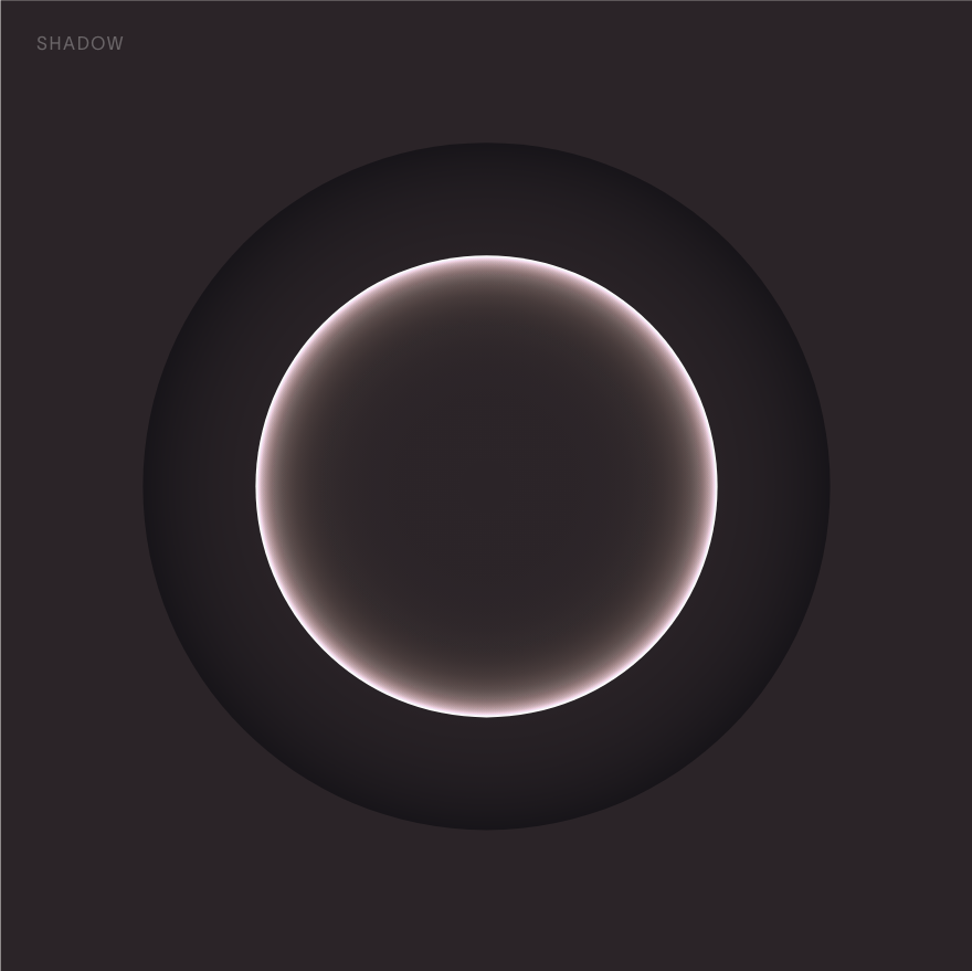
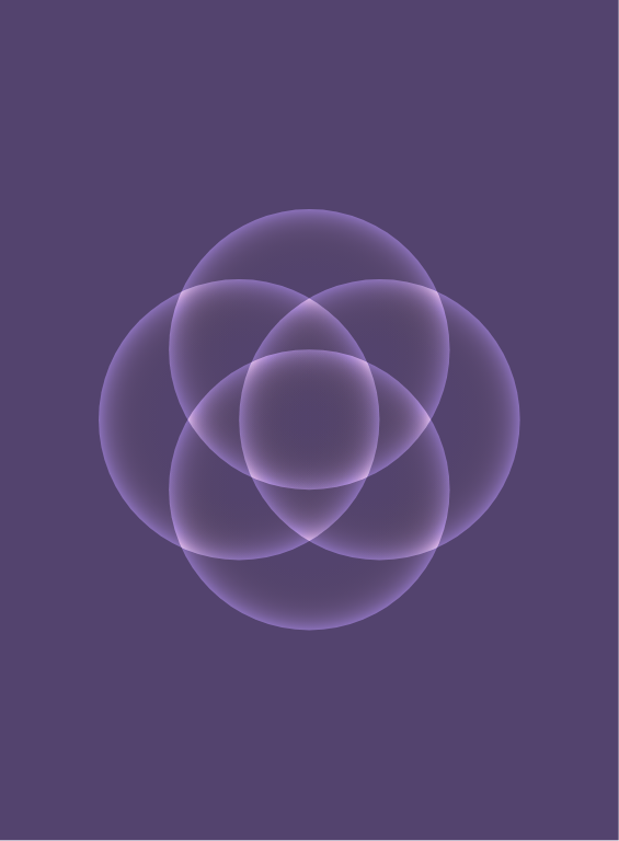
To build distinct moods for services provided by Infinite, key colors were developed for quick recall These are further combined with illustrations to create a distinct graphic representation for each.
Magical realism / Time-travel
Ensure / Believe / Possibilities
An under cut of magic
Colour
To build distinct moods for services provided by Infinite, key colors were developed for quick recall These are further combined with illustrations to create a distinct graphic representation for each.
To support the ideas around future possibilities, the identity is created to be surreal with a high suspension of belief to persuade the viewer to immerse into the possibilities enabled through this one step. The brand orbs are created to bring in the above sensibilities and create a vast range of illustrations to support brand communications.
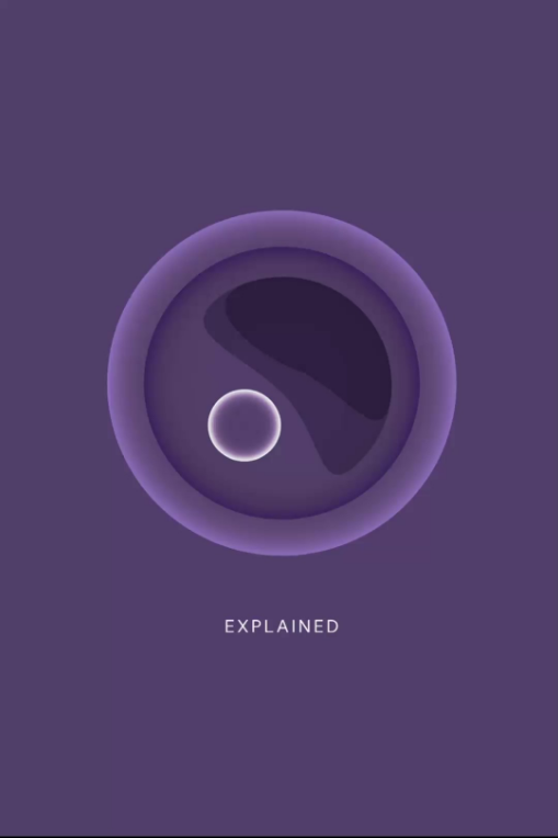
![Egg Freezing]()
![Infinite]()
![Egg Freezing]()
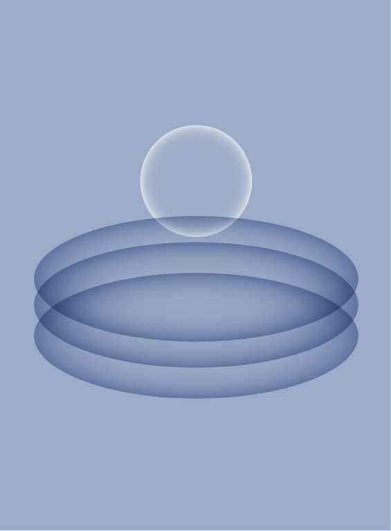
A specific animation style is used to bring life to the illustration set created for Infinite. These animations are used extensively on the website and are designed to support to content on the blog and Instagram. The following pages showcase some key frames for illustrations. An open file for all animations can be found within the brand assets.
The color palette for the visual identity for infinite is designed in such a way that the lighter hues can be used extensively for prints and spatial design elements.
![]()
