EXPERTEETH
BRANDING & identity
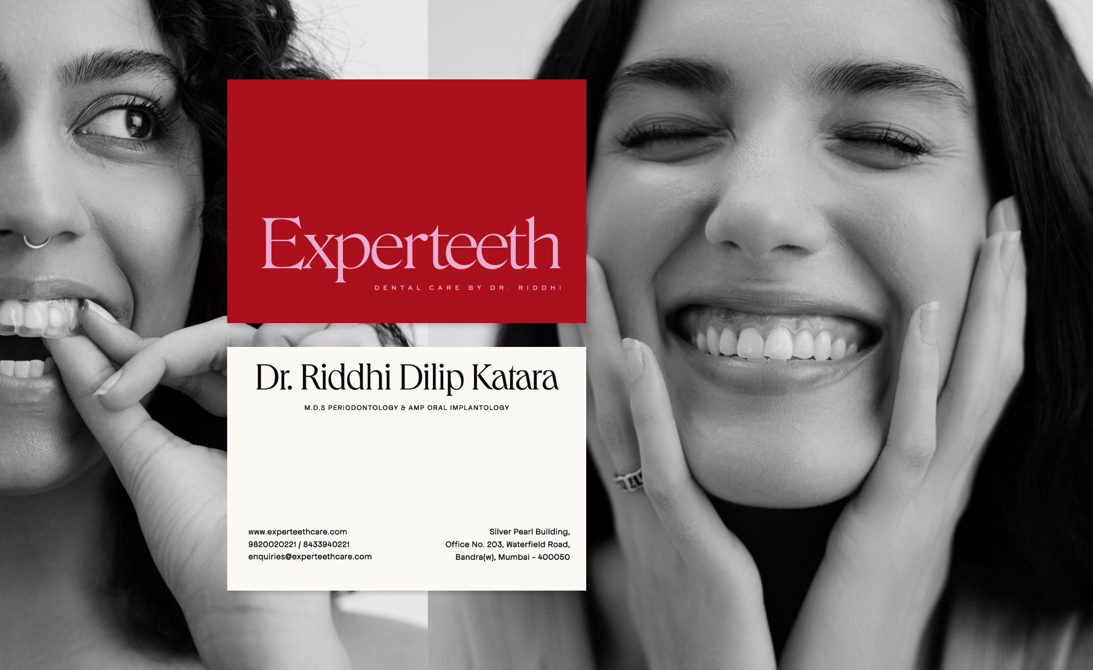
Experteeth Dental Care’s studio crafts confidence through timely, skillful dental-facial medical interventions. Spearheaded by Dr. Riddhi’s Midas touch every visitor’s transformation is done with empathy, care and personalization.
A dialogue beyond beauty ideals,
A dialogue beyond beauty ideals,

A destination for Individualism, Empowerment & Aspiration.
the brand IDENTITY
![]()
The Experteeth logotype has been designed using the Roslindale Display Light typeface.
A stunning modern retro serif font that effortlessly combines aesthetic charm with captivating alternate characters.
![]()
![]()

The Experteeth logotype has been designed using the Roslindale Display Light typeface.
A stunning modern retro serif font that effortlessly combines aesthetic charm with captivating alternate characters.

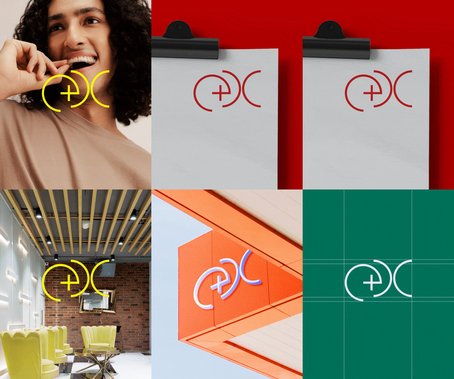
The Experteeth Logomark was created using simple semi circular shapes that represent EDC (Experteeth Dental Care).
The intersection between the E and D form a cross, indicating the sense of a medical clinic.
For Typography - Weaving a seamless story of confidence and charm.



Queens commands the headlines with elegance and playfulness, while Sweet Sans Pro brings a timeless touch to subheadings, honoring craftsmanship with a contemporary ease.
Apfel Grotezk, is used for body copy, adds soft curves and a friendly feel, creating a warm, approachable tone throughout.
Apfel Grotezk, is used for body copy, adds soft curves and a friendly feel, creating a warm, approachable tone throughout.
THE MAGIC LINES
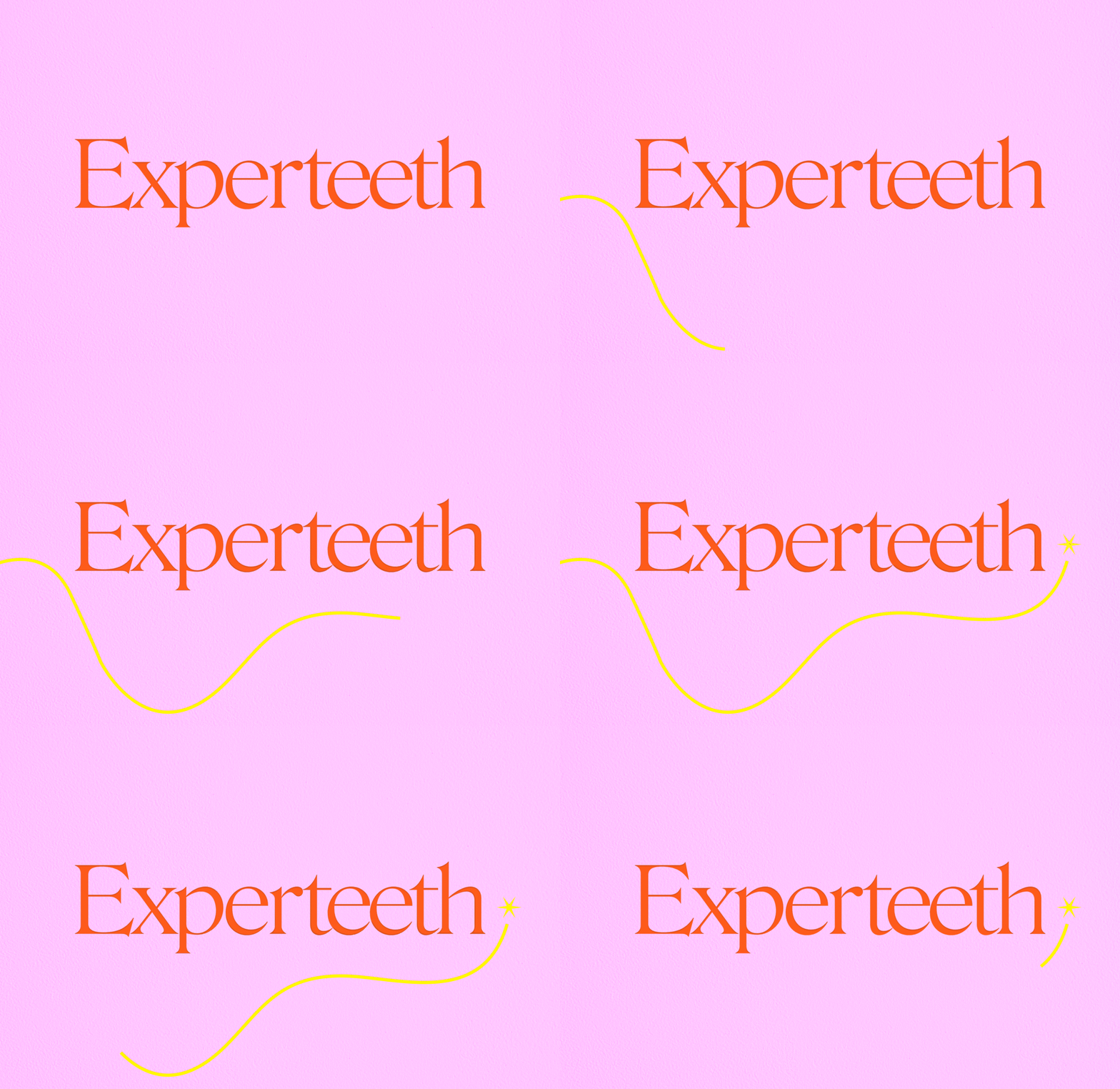
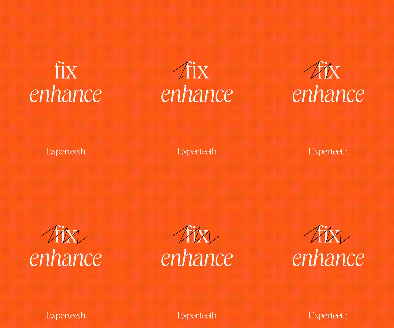
Incorporating playful lines that capture the dynamic motion of a magic wand.
These lines, characterized by swashes and sparkles, bring an element of movement and enchantment to the design.
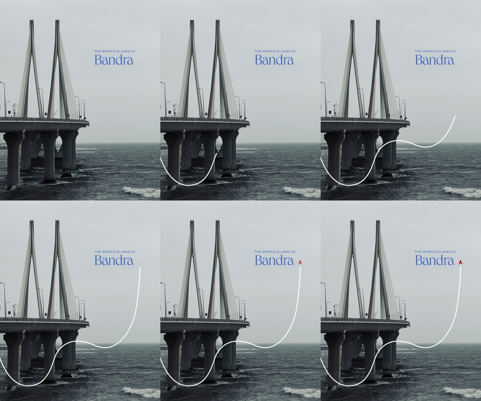
They are versatile and adaptable, allowing their forms and trajectories to change based on the context in which they are used.
These lines, characterized by swashes and sparkles, bring an element of movement and enchantment to the design.
They are versatile and adaptable, allowing their forms and trajectories to change based on the context in which they are used.
THE COLOUR PLAY
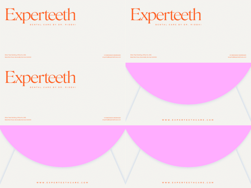
The brand’s vibrant color palette marks a bold shift from the traditional medical blues and greens.
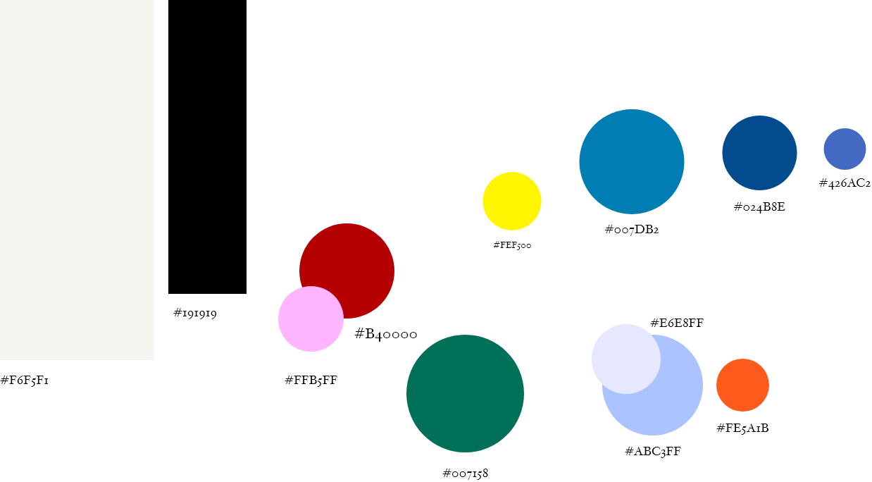
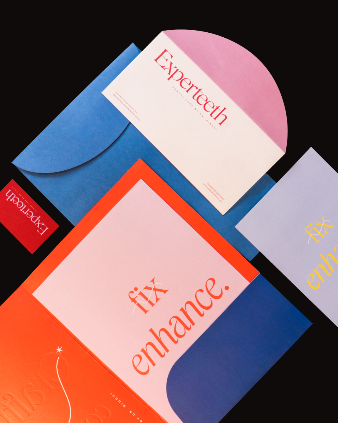
Embracing a cosmetic aesthetic, we infused their visual identity with bright, dynamic hues that reflect the friendly and unique personality of Experteeth.



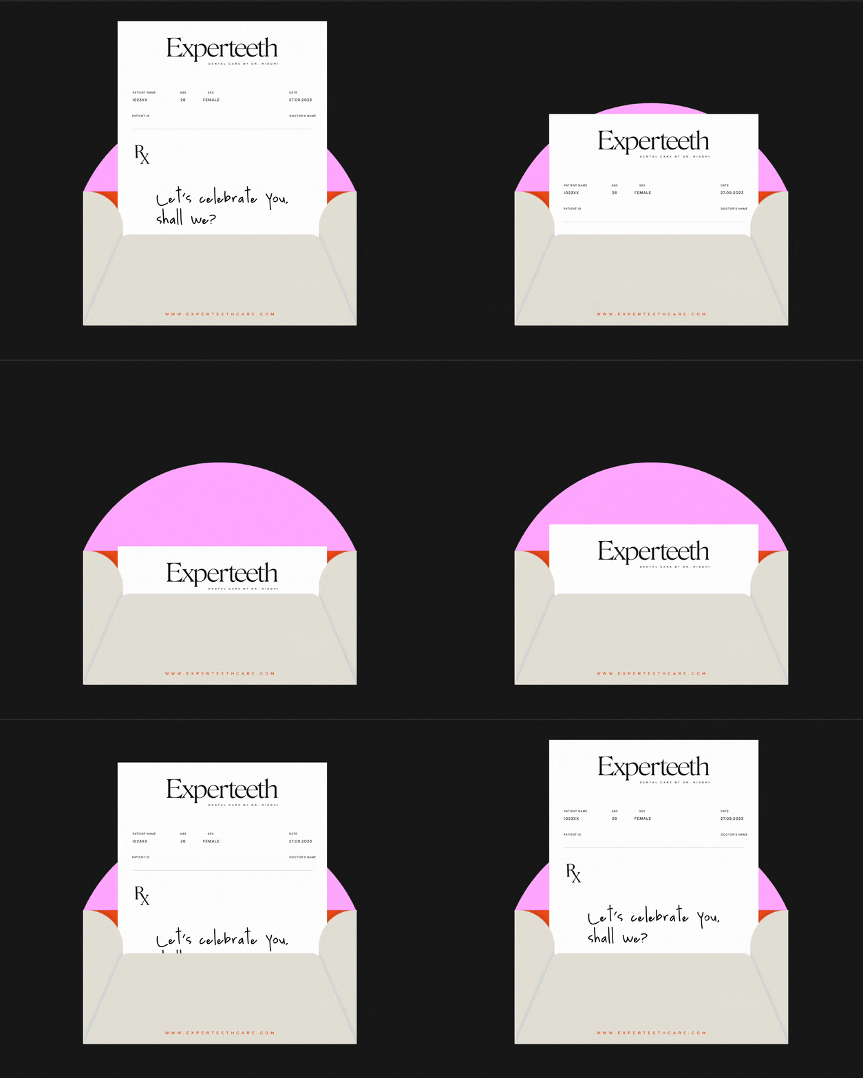
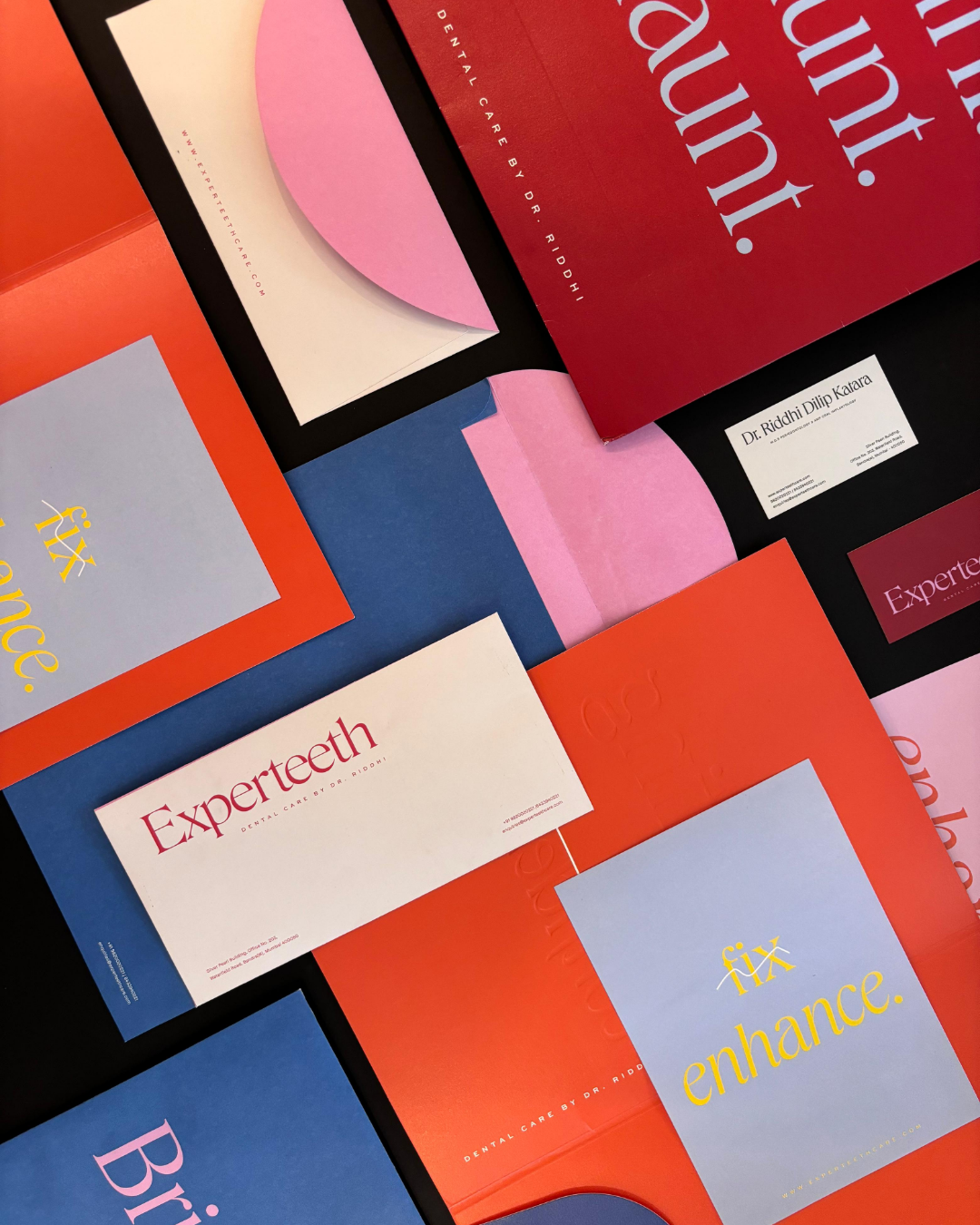
The subtle details, such as the curved tops of the envelopes resembling a smile, contribute to the friendly and welcoming brand image.

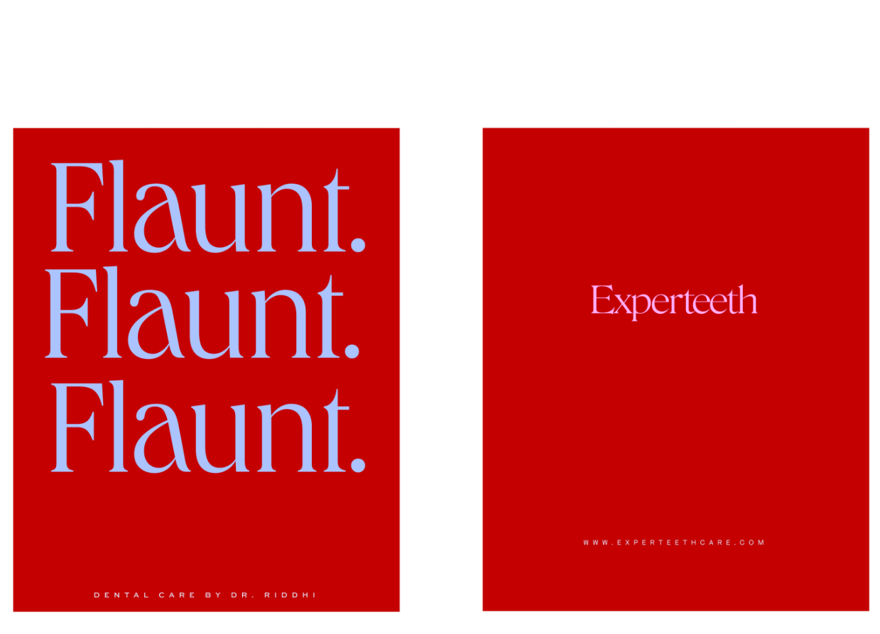
The refined yet playful approach reinforces a confident stance in the industry
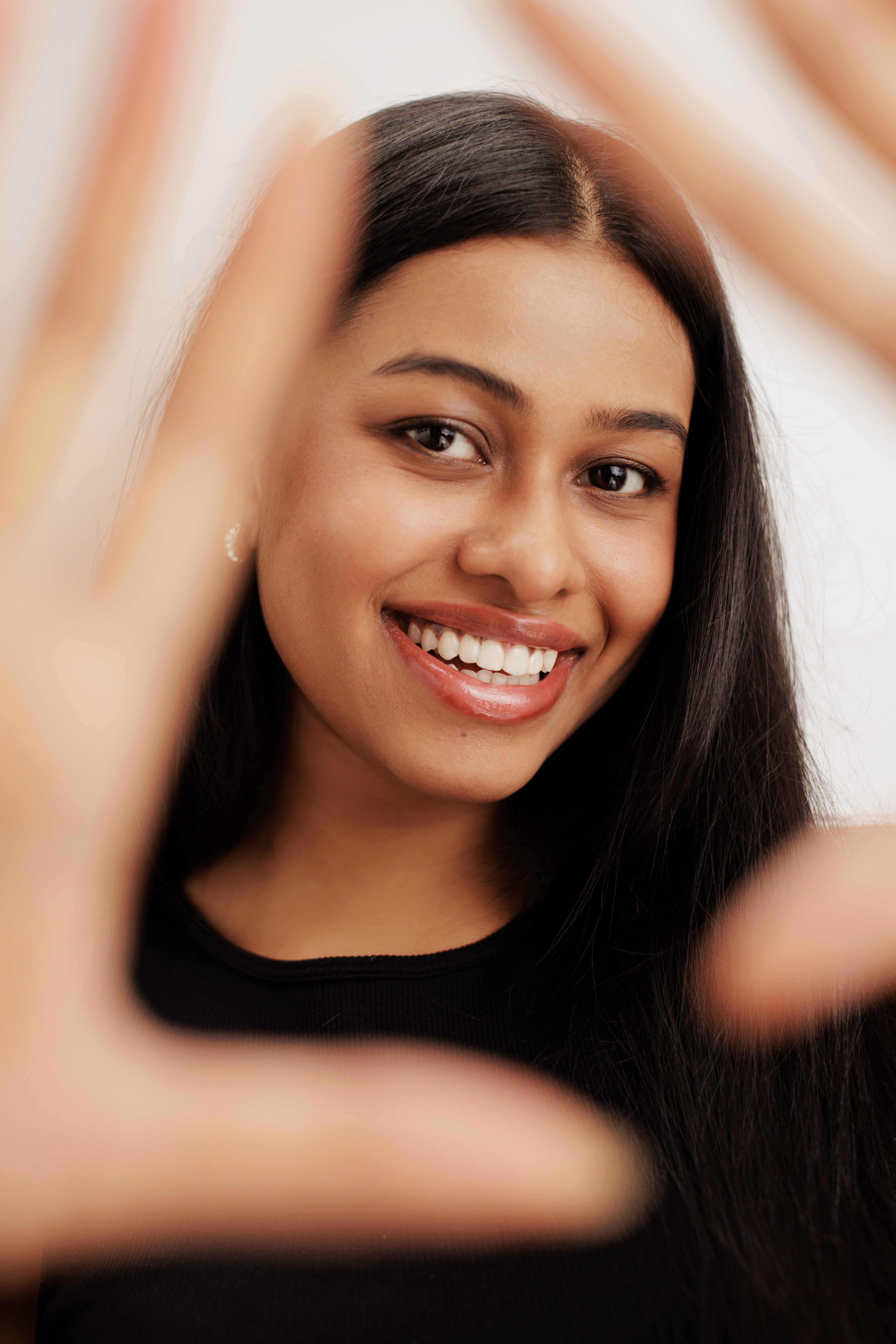
REPRESENTING CONFIDENT SMILES
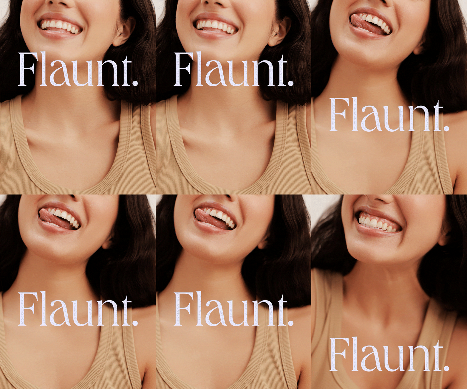
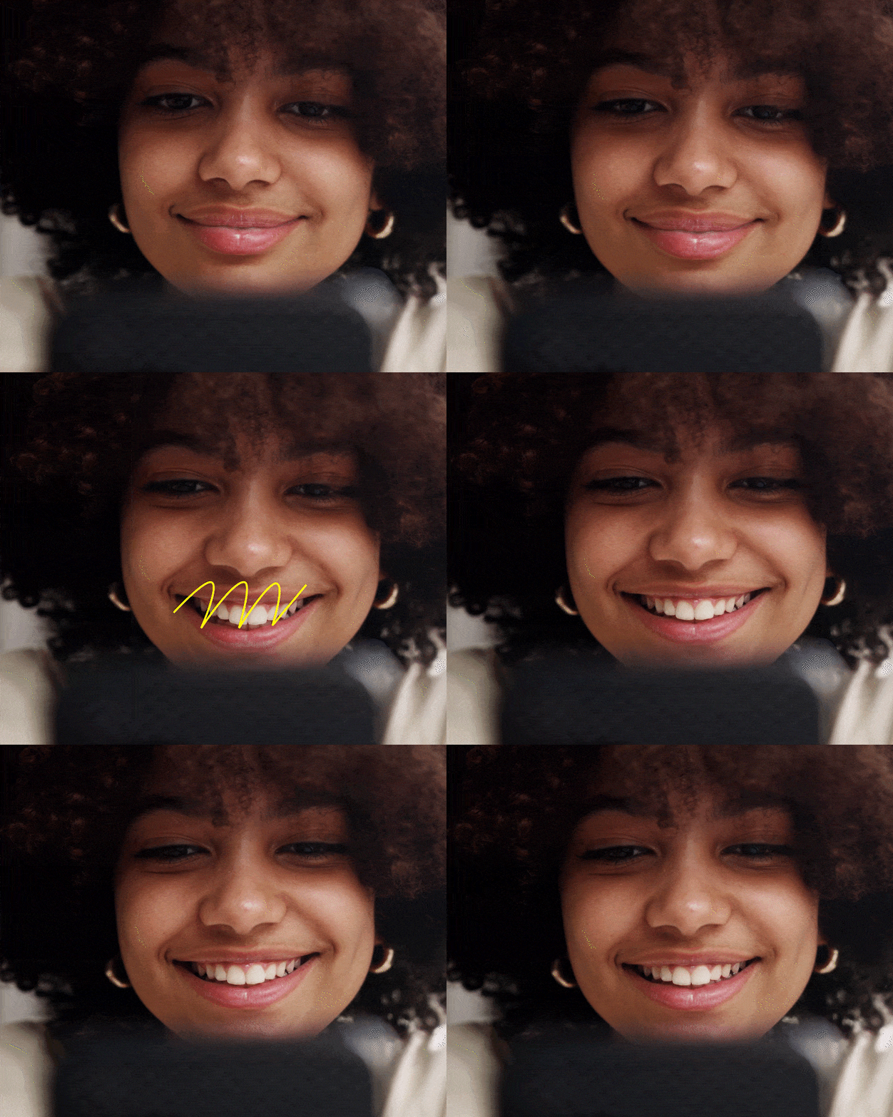
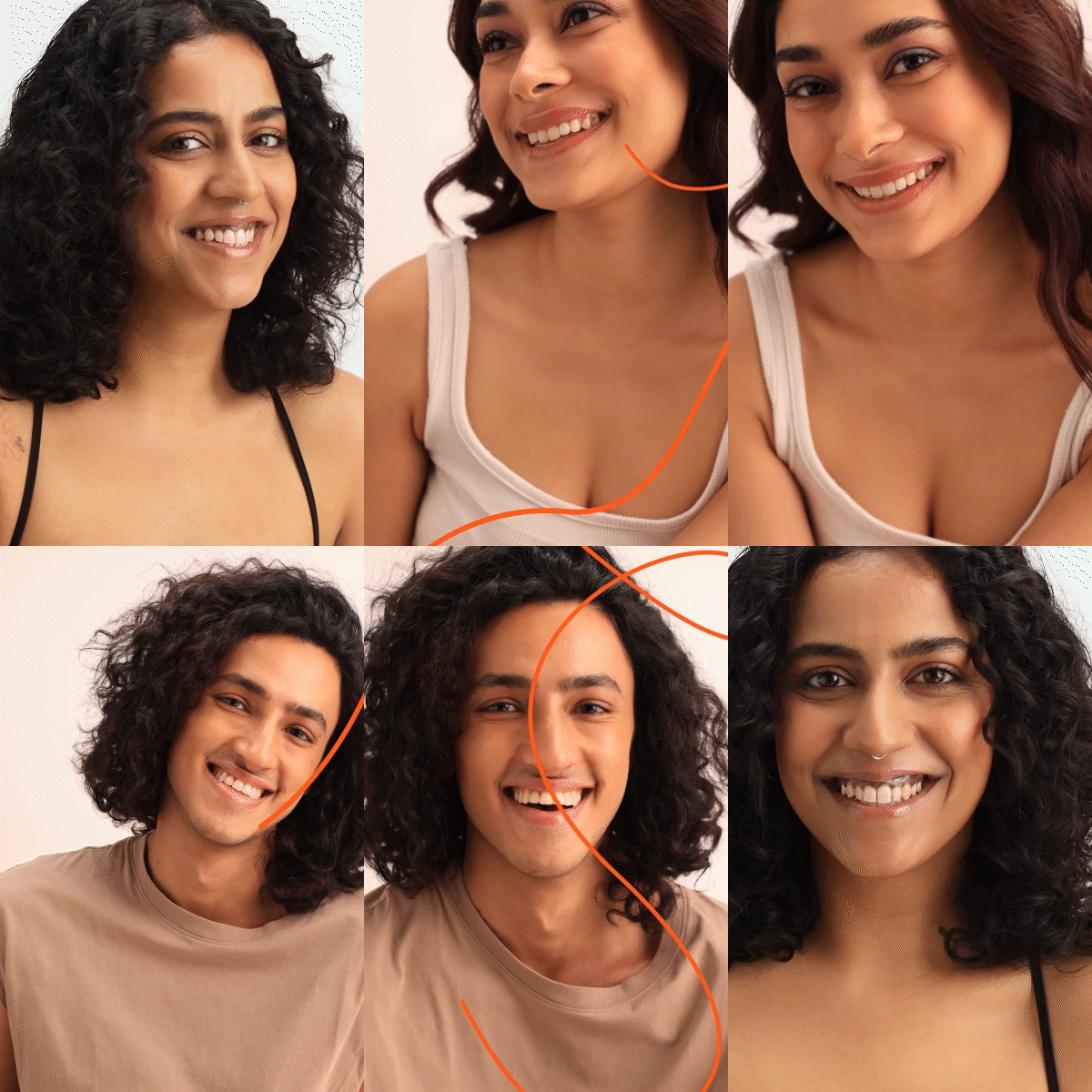
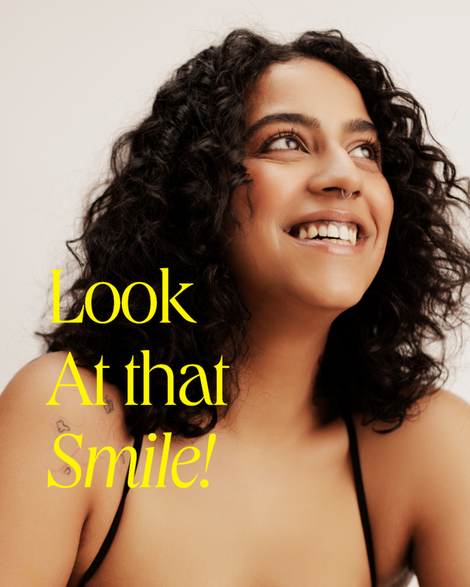
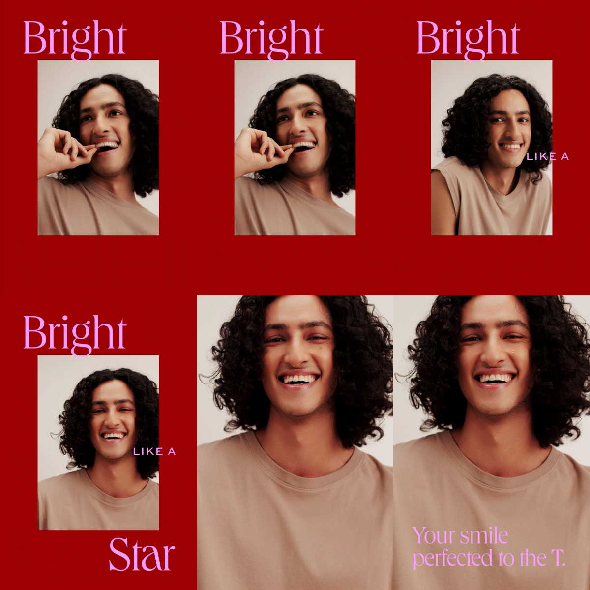
The photography style chosen for Experteeth Dental Care focuses on enhancing self-confidence and celebrating individuality.

Experteeth’s editorial aesthetic blends fashionable sophistication with a fearless, authentic personality. The visuals capture a natural, unrefined vibe, avoiding overly staged or playful looks.
Explore a cohesive extension of Experteeth’s Visual Identity,
Learn more about Experteeth’s Website here.

Discover more about Experteeth’s Photography here.

