
Drayp
VISUAL identity deSIGN & strategy
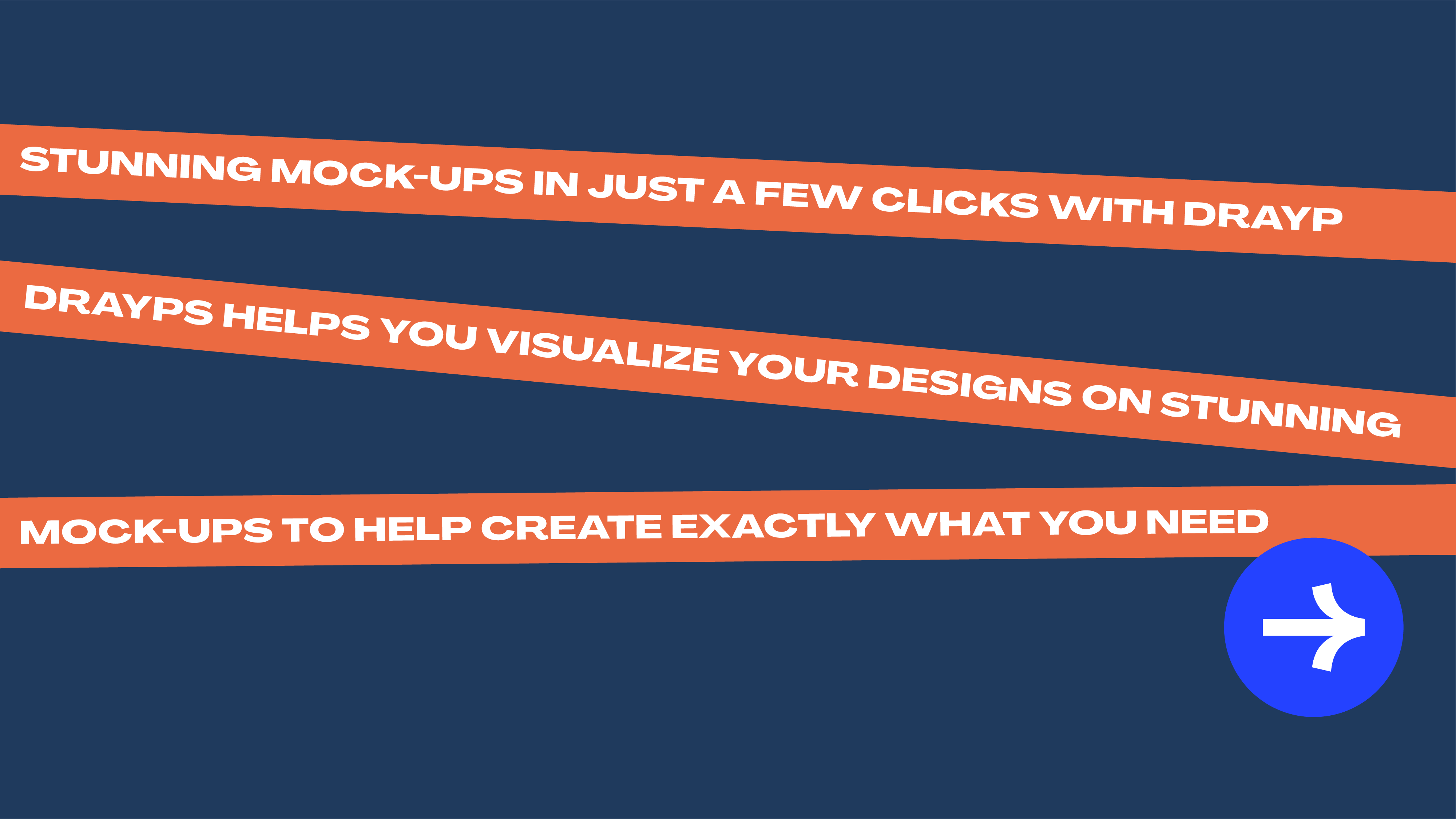
DraypLite is an AI-powered cloud service that allows you to create stunning mock-ups in just a few clicks. The Space At 9/2 has developed a colourful and bold identity with geometric shapes & characters, used along with smart and humerous phrases that encourage users to incorporate Drayp into their daily workflow.
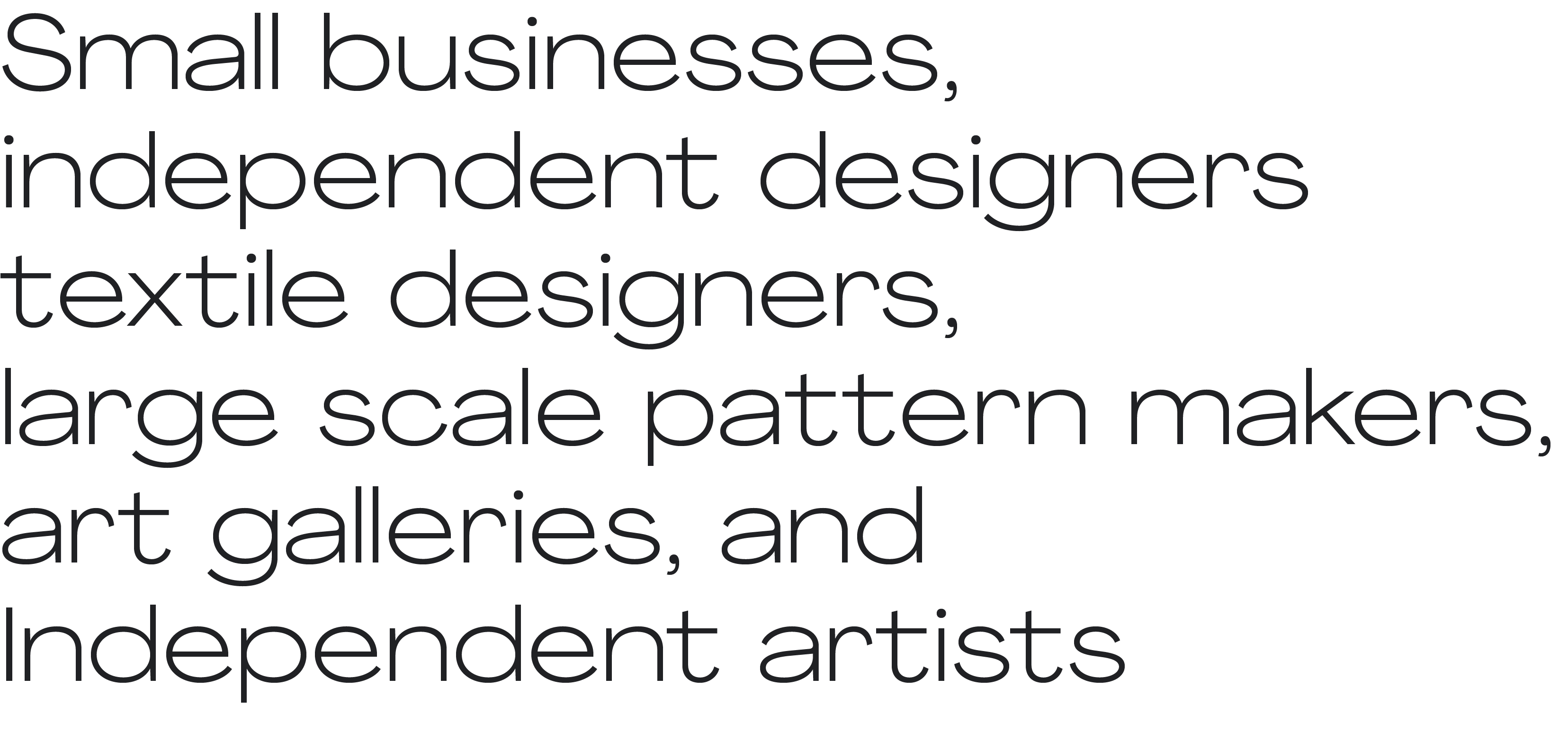
Our study indicated that the target audience for Drayp
were individuals who either were not accustomed to using softwares to mock up their works or found it to be a tedious process to do so.
For either category, it was essential for Drayp to create a demand for its easy-to-use service – through action-oriented graphics, toungue-in-cheek humour and short statements that described what the SaaS product could be used for.
Hence, the visual identity and language developed for it was required to be simple and friendly yet knowledgeable and witty — almost as if it was the user’s Right-hand-man.
Keeping these factors in mind, the USP, Boilerplate, Brand Voice and Brand Personality was developed; key for decision making for crucial factors for Visual Identity design such as colours, typefaces, animation style, and symbols.

we developed a set of characters with some sass & snazz
Encouraging users to try something new to improve their workflows – and perhaps help their clients visualise their designs on to everyday objects. 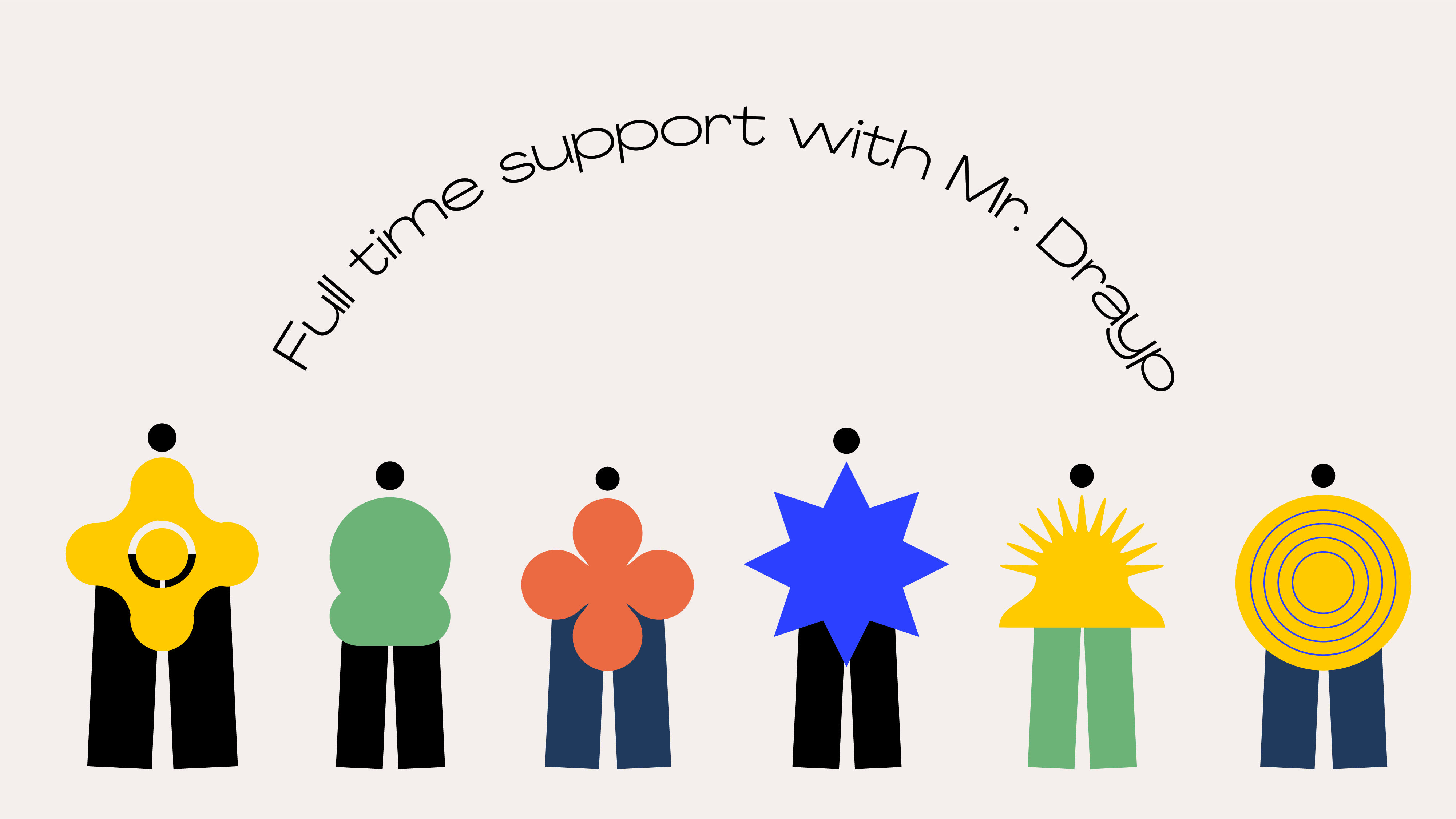
Mr. Drayp(s) — personified to create an emotive connect between the user and the tool, making them feel as if they're constantly assisted and not left alone with a new, intimidating technology.
Since we have your attention —
why not try a game of making your own persona? Move the objects below and assemble for a witty one!


Along with the playful persona, the catchphrases developed for Drayp were meant to clearly state the purpose of the product but with all the fun & charm, for better recall and loyalty.


A few catchphrases set for Drayp Pro Plus
Store your work
Find your work
Share your work
Showcase your work
Drayp your work
Drayp is where you are.
Drayp stores your files and is accessible anywhere, anytime. No downloads necessary
Expand the strength of your team with Drayp Pro Plus.
Find your work
Share your work
Showcase your work
Drayp your work
Drayp is where you are.
Drayp stores your files and is accessible anywhere, anytime. No downloads necessary
Expand the strength of your team with Drayp Pro Plus.
Catchphrases for Drayp Lite based on the brand strategy and research

Agradir is a sans-serif family that has several weights, is easy on the eye, and attractive – which made it a perfect choice for us to use it for the identity developed for Drayp. It’s need to be purposeful on a user interface as well as social media fit in perfectly with the overall personality set for Drayp. The colour palette was distinguished for use on social media and the web-based product. A striking blue was incorporated for action-items and CTAs
A seriously fun colour palette
The colours are the used with playful measure and is offset by a distinct charcoal and grey that give it the sleek and professional appearance
a seriously fun graphic vocabulary
Although the geometric shapes appear to be simple forms, its use case calls for a playful and purposeful approach. The iconic Drayp arrow is used prominently to bring to attention the action of uploading the files and on CTAs. The star is used for the files to be ‘Drayp-ed. This is done to ease users to get comfortable with a new yet resourceful tool and encourage them to use it in their everyday workflows.
Discover our work for the Drayp Lite UI here
Interested to develop a simply wonderful identity for your brand? Get in touch