borrowed earth
branding, visual identity and collaterals


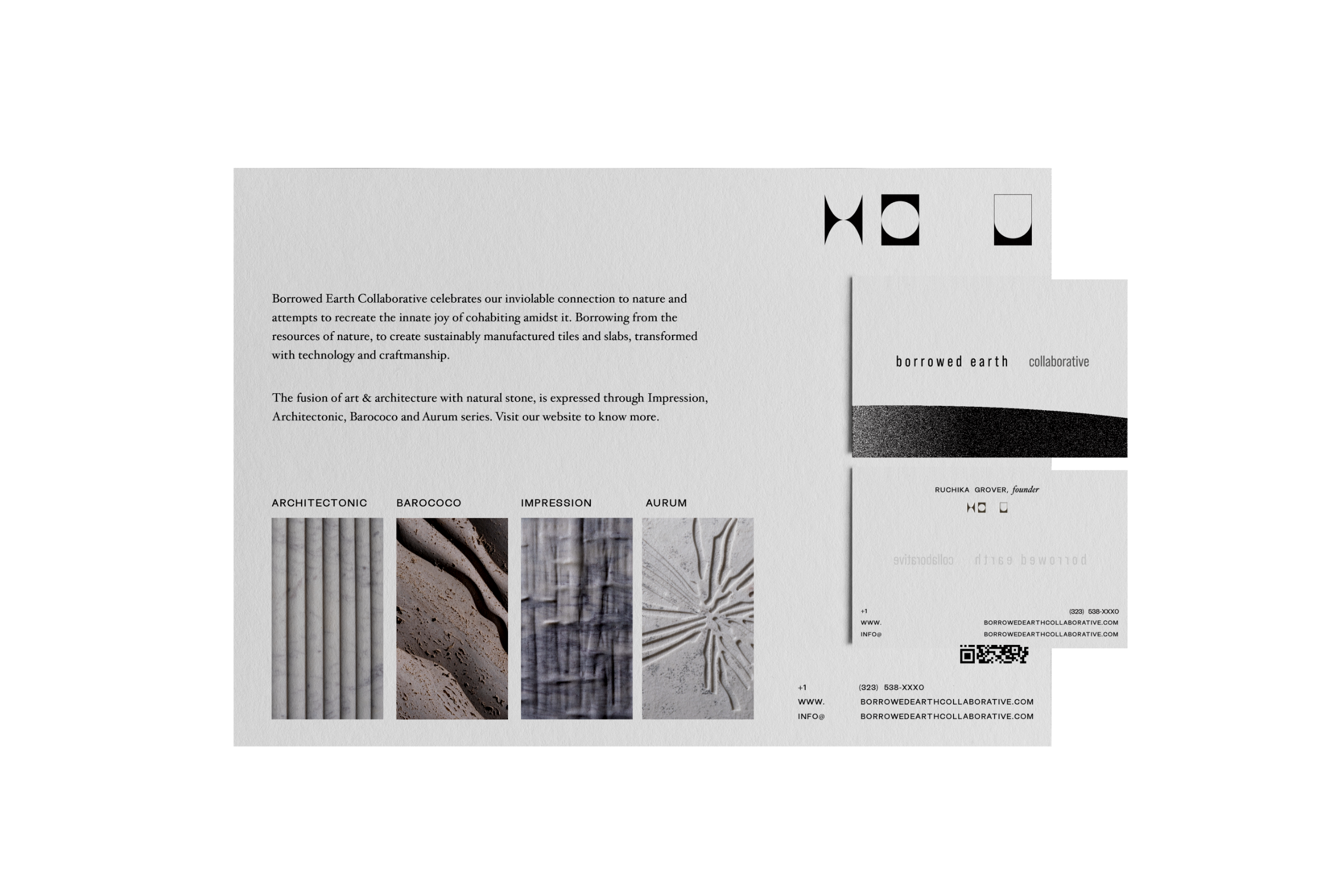
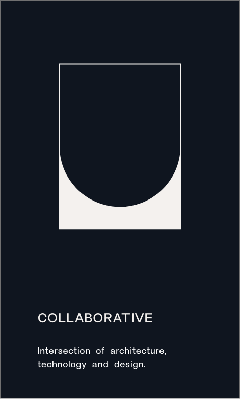
The Logo Mark – Simple pictograms but with an intense correlation to the brand name (and in effect it’s principles) — Borrowed Earth Collaborative — going back to primal marks of communication. The identity for Borrowed Earth Collaborative is a modern take on these intuitive responses and reactions to ‘living.’
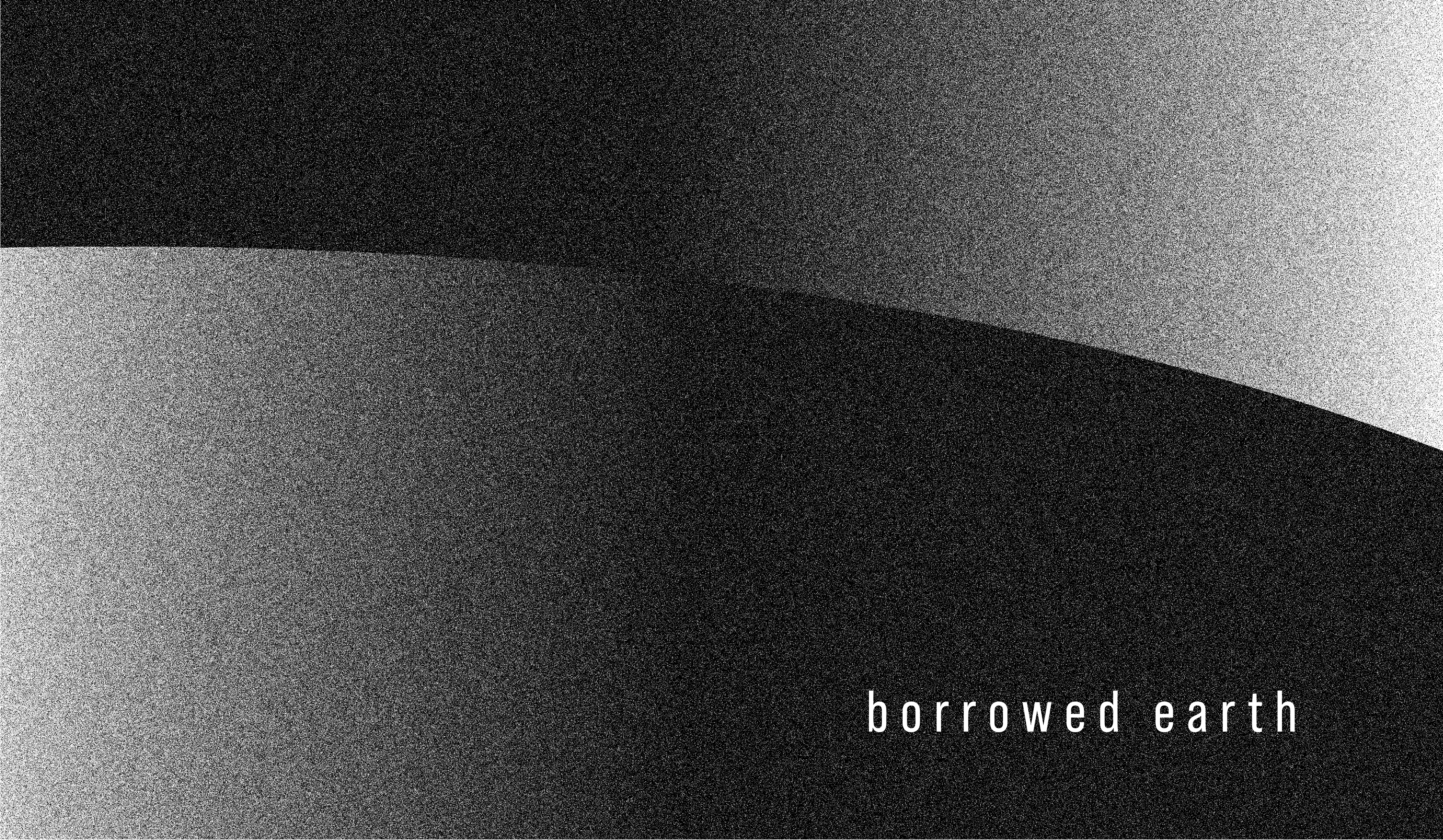
The identity brings in depth and texture through the fluid cruves of a gradeint representing all forms of duality. The stippling of the gradient brings in visual texture.
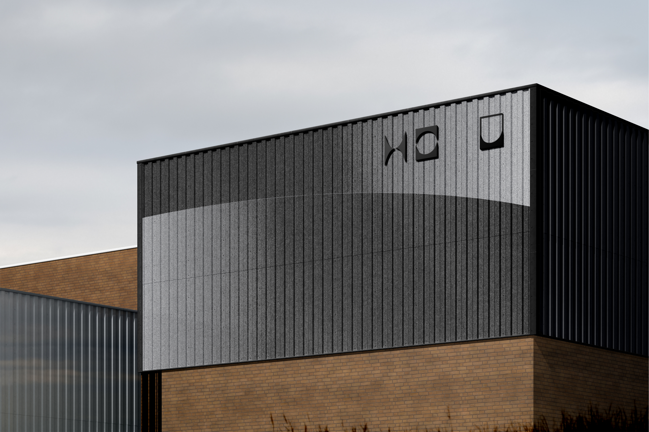
In certain cases, these have been transformed as three dimensional surfaces which react to light on all its facets, yet retain its linearity — much like a horizon seen in reality.


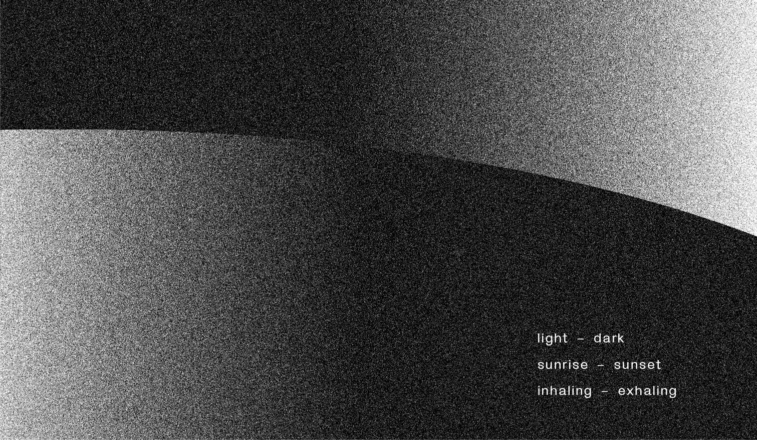


The photography for Borrowed Earth Collaborative draws parallels between the vast landscapes of earth and the body of work — poetically showcasing what has been borrowed from the Earth and transformed into ’pieces of artistic and architectural worthiness.”


A debossed logotype


An embossed logo mark